The US economy sucks, no matter our befuddled President tries to tell you. And it sucks because his party’s policies are insane. Our enemies could not design worse policies for us. One of the problems is that we don’t have enough people working to sustain real economic growth. That may sound good for those who are working and therefore can get paid more, but they are paying more for everything as well, and losing ground overall. That higher pay is a big contributor to inflation, and we don’t have higher productivity to compensate for the higher labor costs. Why don’t we have more workers? It is amazing anyone works in whacko-Dem land. You can get free everything from the government–food, housing, transportation, medical care, phones, internet, and on and on, so why work. And you can always make up some health problem and go on disability if you want a little more money. Oh wait, now you can claim you have long CV and use that to get disability and free health care. Until we change our systems of handouts, which also is beset by massive fraud, not much will happen to help increase the labor force. And another contributor is the awful public school system. During the epidemic parents figured out they were better off home-schooling–their children might actually learn something useful. But that means at least one parent must work less.
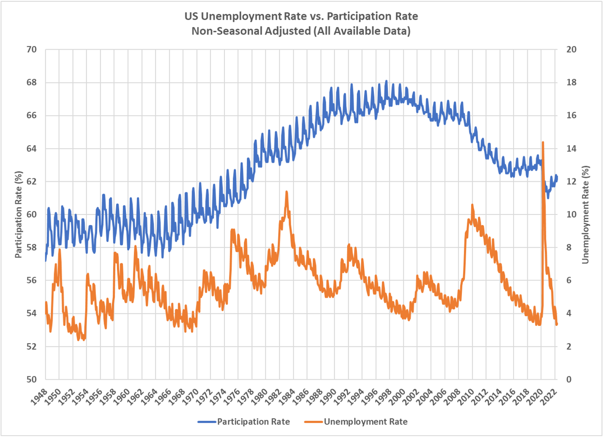
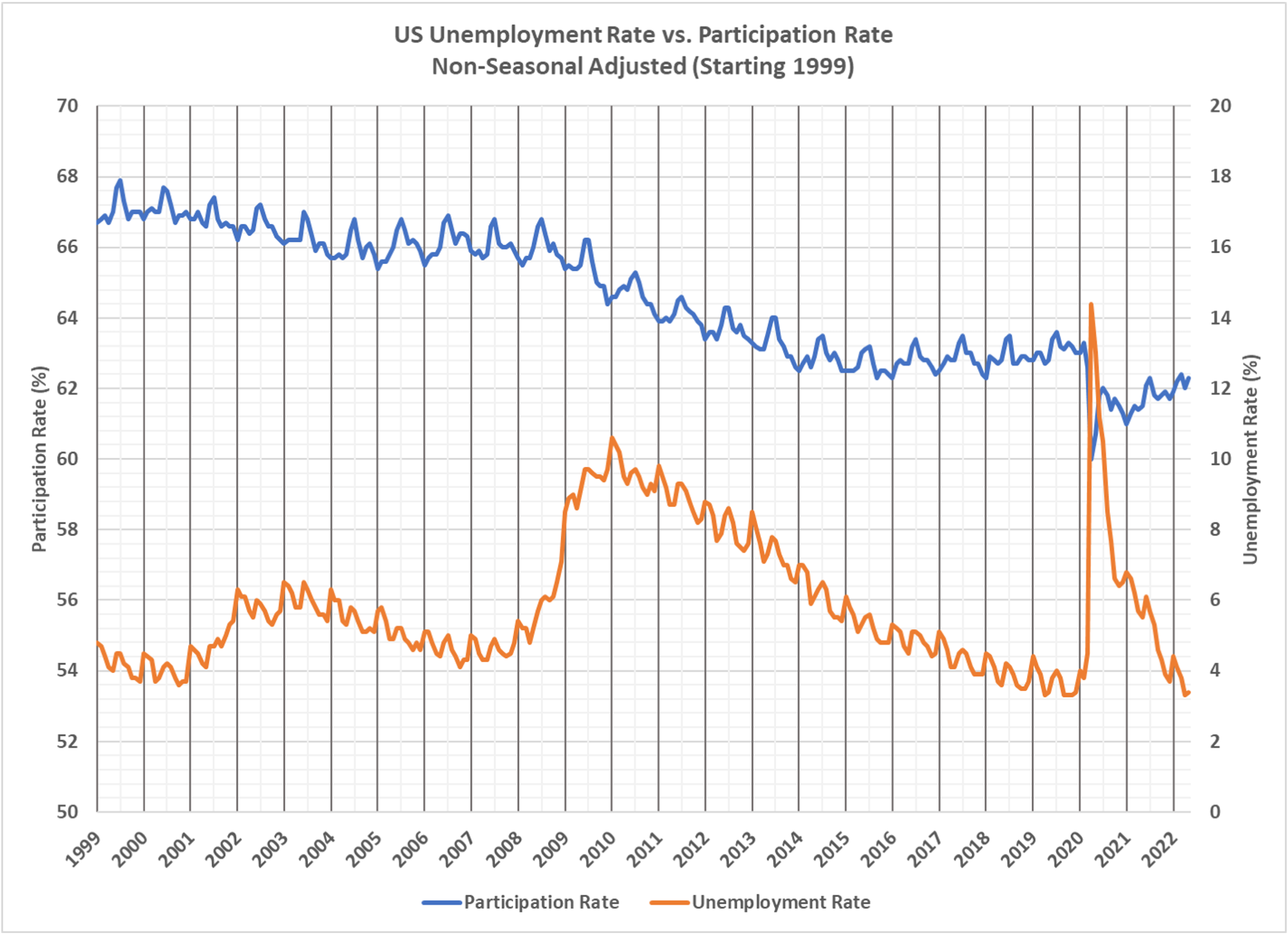
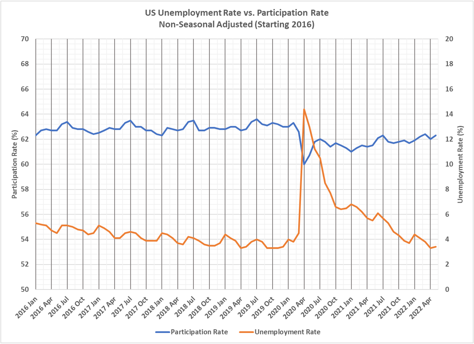
Dave Dixon found this interesting data and made the charts showing the history of labor force participation. You will note the long-term fall in the participation rate. Looking solely at the unemployment rate, especially the headline unemployment rate, does not give you the full picture. The participation rate is also important. If people aren’t even trying to work, they are not part of the productive economy and the total pool of people availabe to work is lower than optimal. And that is exactly where we are.


 Dave’s notes:
- In these charts we display the overall unemployment rate and overall labor participation rate for the US. We can see that in recent months the unemployment rate has recovered to per-Covid levels, however the participation rate is still slightly lower than it was pre-Covid.
- It is also interesting to see how the participation has behaved since peaking in 1997. Since then the participation rate has generally declined, except for roughly 4 years of recovery starting in 2004 and in 2016.
- I had seen charts of the unemployment rate and participation rate some years ago on this web site, https://market-ticker.org/ , and was curious to see how much the participation rate had recovered in the aftermath of Covid shutdowns. These three charts display the unemployment rate and participation rate on three timescales; 1). All data since 1948. 2). Starting 1999 to show the dot.com collapse and the 2009 housing collapse. 3). Starting 2016 to show more recent data along with the Covid era.
- Unemployment data shown is from the US Bureau of Labor Statistics (BLS) available here from the Current Population Survey (CPS): https://www.bls.gov/cps/ We are displaying the unadjusted unemployment rate for those 16 and older, using BLS Series ID LNU04000000. This data can viewed or downloaded here: https://beta.bls.gov/
dataViewer/view/timeseries/ LNU04000000. This unemployment rate is based on the BLS Household Survey, and the most recent report is available here: https://www.bls.gov/cps/#news. - Participation rate data is for the civilian population 16 and older, using BLS Series ID LNU1300000, and can be viewed or downloaded here: https://beta.bls.gov/
dataViewer/view/timeseries/ LNU01300000. This series is also unadjusted.


The single most effective anti poverty program since the great depression was clinton’s “ending welfare as we know it” (forced upon clinton by the republican congress ) with the basic premise that if you could work, then you could no longer collect welfare.
The progressives have done everything possible to undermine the most successful anti poverty program ever.