Recall that these reports are lagged by about four weeks to allow identification of the fully vaxed. You can see that in all recents weeks the vast majority of all events are in the fully vaxed and boosted. The proportion compared to vax and boosted proportions is more important, and there we see little protection among the boosted, and somewhat paradoxically, the appearance of more protection among the fully vaxed but unboosted. Age group charts will be out shortly. Low numbers of deaths means interpret those proportions with caution.
 Dave’s notes:
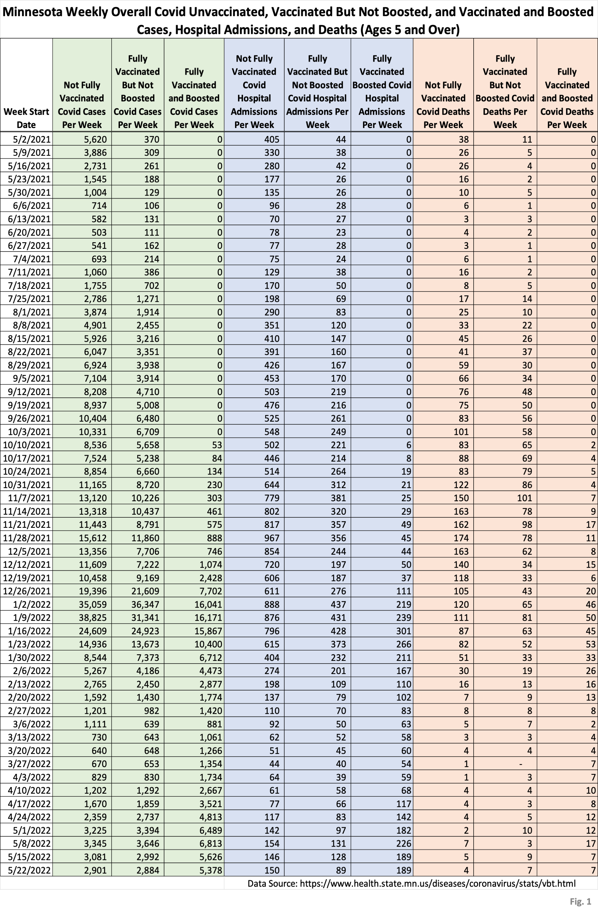
- This is an update of overall population breakthrough data that the Minnesota Department of Health (MDH) first published on 5/23/2022 and updated each Monday since. The breakthrough data is available here: https://www.health.state.mn.us/diseases/coronavirus/stats/vbt.html.
- We last published data tables and charts for the overall age group on 6/08/2022 here, for the data released by MDH on 6/06/2022: https://healthy-skeptic.com/2022/06/08/breakthrough-events-june-6/. The general trends continue, at overall lower levels of Covid activity as the last surge flattens.
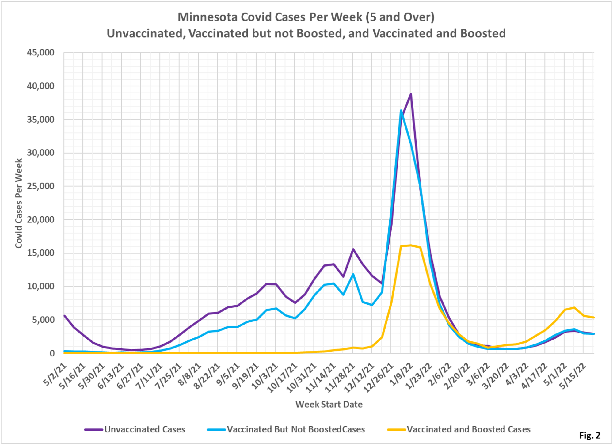
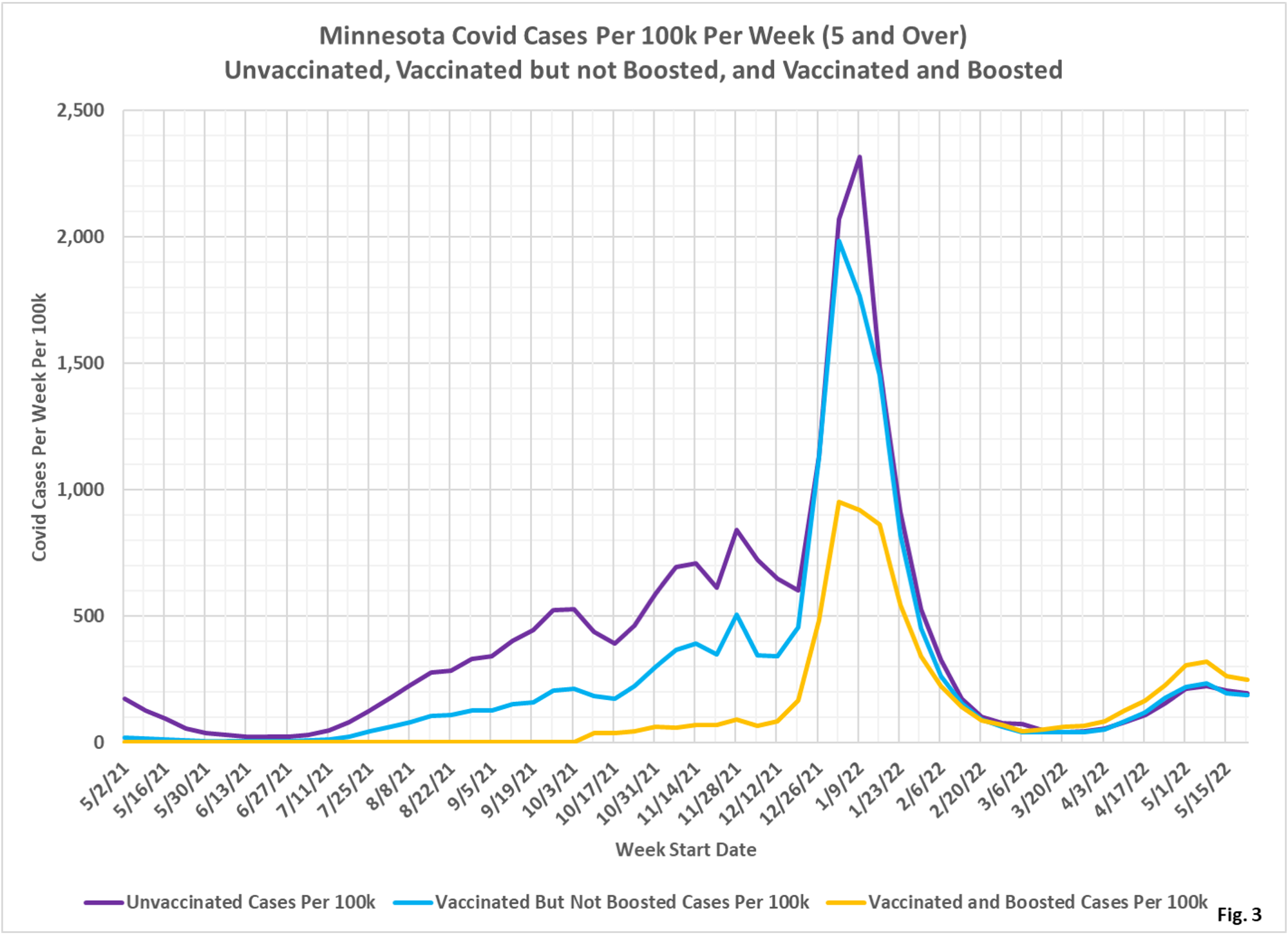
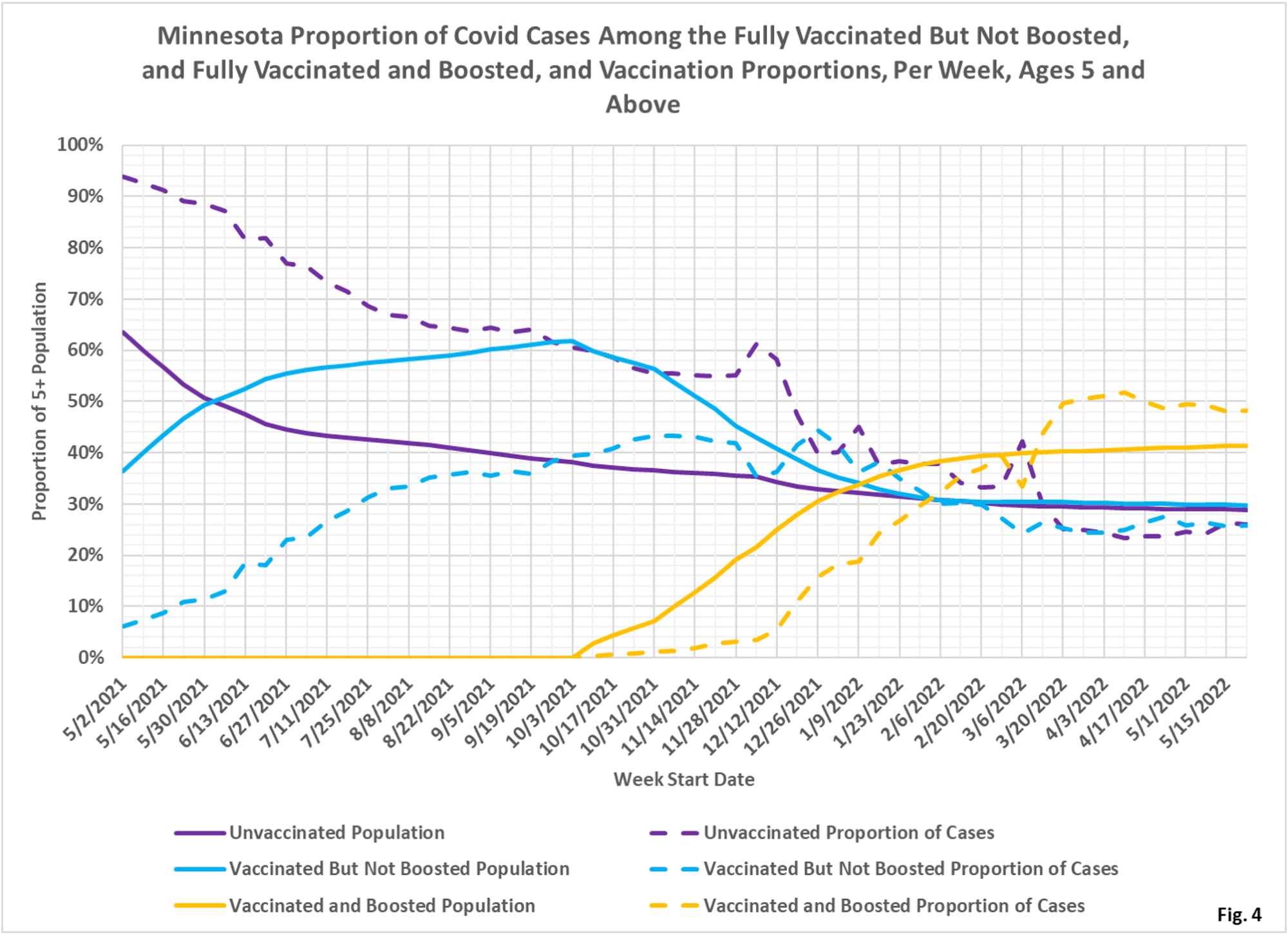
- The charts in Fig. 2 through 10 contain 3 charts for each type of event (cases, admissions, or deaths). The first chart for each type is the number of events each week. This chart helps illustrate the overall trend on the pandemic for the overall population, and what the impact is on society. The second chart is the rate of events per 100k each week. This chart displays the risk to an individual of the each category at different times during the pandemic. The third chart for each type of event is the proportions of event compared to the proportion of the population type (unvaccinated, vaccinated, or boosted). This chart helps show whether or not vaccination or boosting is effective in reducing the impact of the pandemic, by comparing the proportion of events to the proportion of the population.
- Fig. 1: This table displays the total cases, hospital admissions, and deaths that occurred each week among the unvaccinated, vaccinated but not boosted, and vaccinated and boosted populations, with the latest week of 5/22/2022, one additional week compared to last week’s publication. This data is obtained from the data files vbtadultcirates.xlsx and vbtpedocirates.xlsx, available in the notes under the graphics on the MDH Vaccinate Breakthrough Weekly Update web page https://www.health.state.mn.us/diseases/coronavirus/stats/vbt.html. The week of 5/22/2022 was past the peak in cases in Minnesota, and the last row of data shows that cases, hospital admissions, and deaths continue to slowly decline.
- Fig. 2: This chart simply plots the cases among the unvaccinated, vaccinated but not boosted, and vaccinated and boosted populations each week, as found in Fig. 1. Note that the greatest number of cases continue to be among the boosted in the most recent weeks, in contrast to earlier in the pandemic when the unvaccinated and the unboosted had the largest number of cases earlier in the pandemic.
- Fig. 3: This chart displays the case rates per 100k for each group. Note that since March 2022 the highest case rates continue to be among the boosted, while the case rates among the unvaccinated and unboosted are almost identical, really since the trailing portion of the initial Omicron surge around 1/30/2022.
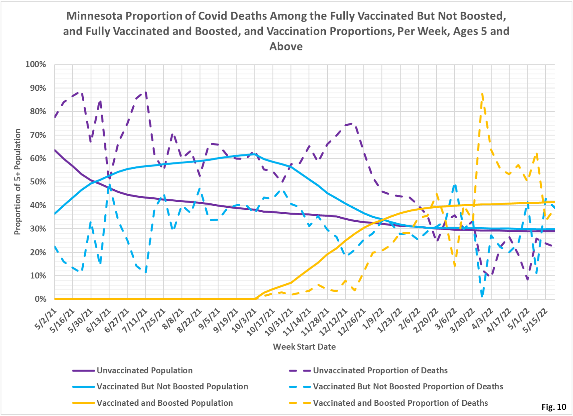
- Fig. 4: This chart displays the proportion of the 5 and over population who are unvaccinated (solid purple), vaccinated but not boosted (solid blue), and vaccinated and boosted (solid gold). For each population group we also display the proportion of cases each week (dashed lines of same color). The way to interpret this chart is to compare the proportion of breakthroughs to the proportion of vaccinations for each group. Whenever the dashed breakthrough proportion line is below the solid vaccination line of the same color, then that category is underrepresented for population, and when the dashed line is above the solid line of the same color then that category is overrepresented. For the week of 5/22/2022, for example, 41% of the population was vaccinated and boosted (solid gold line) while this group accounted for 48% of the cases (dashed gold line). We would interpret this to show that being boosted did not reduce an individual’s chances of testing positive for Covid for that week, when considering the overall population. This matches the case rates per 100k seen in Fig. 3, where the boosted have the highest rates of testing positive. On the other hand, on the left side of the chart showing older data, the dashed case proportions are significantly below the solid vaccination proportion lines, showing that vaccination and boosting did significantly reduce the chances of testing positive, while the unvaccinated proportion of cases (dashed purple line) is much higher than the unvaccinated population line (solid purple).
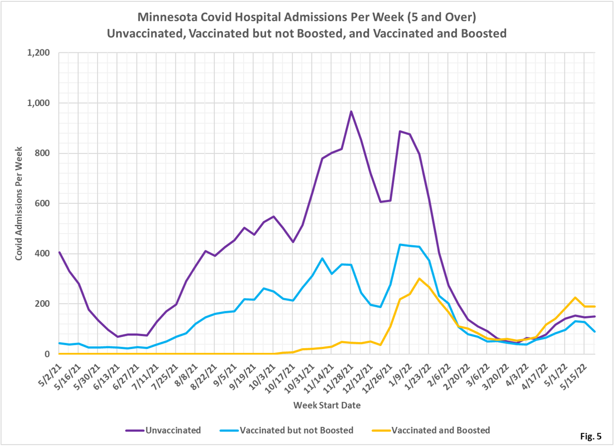
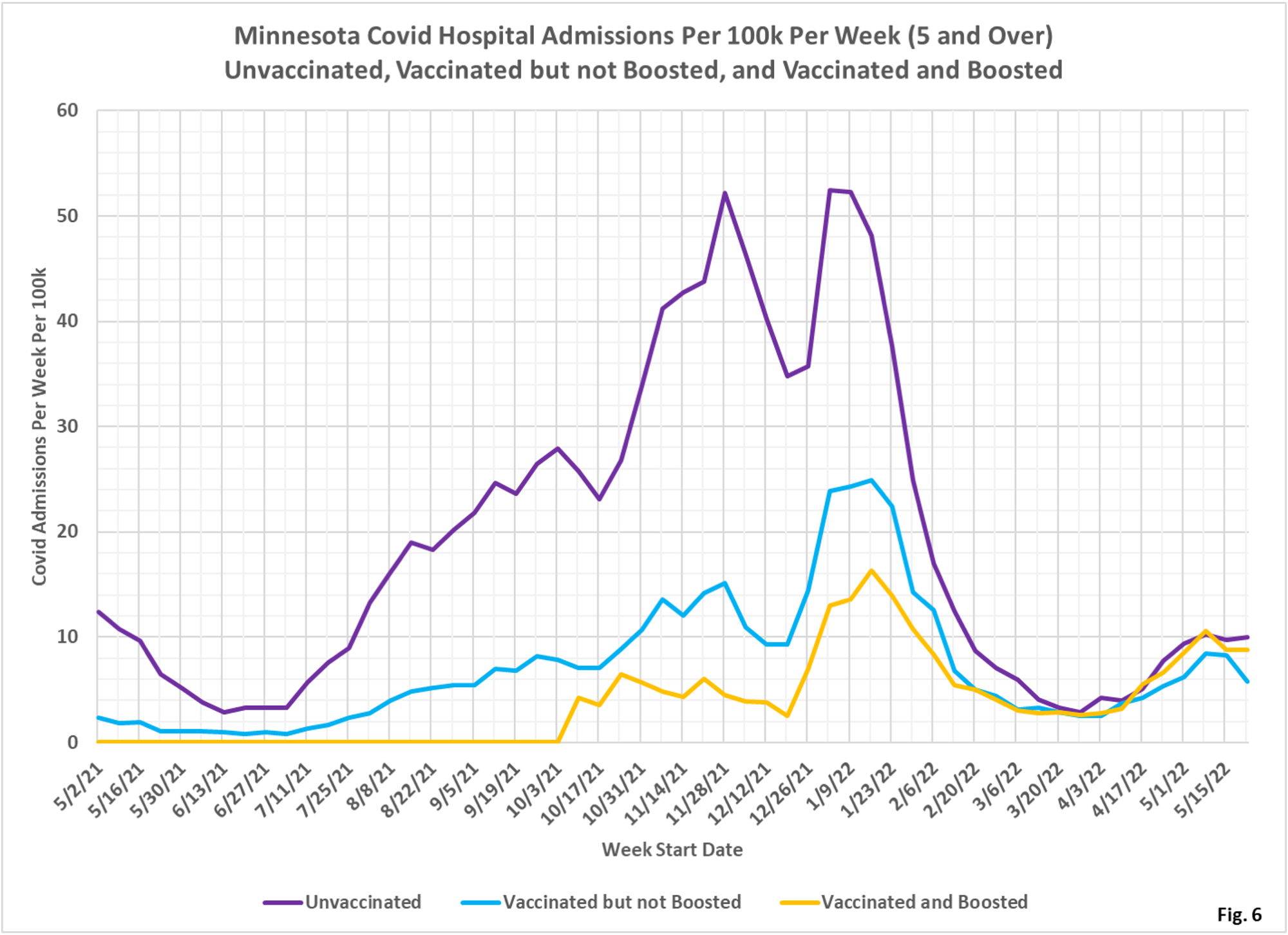
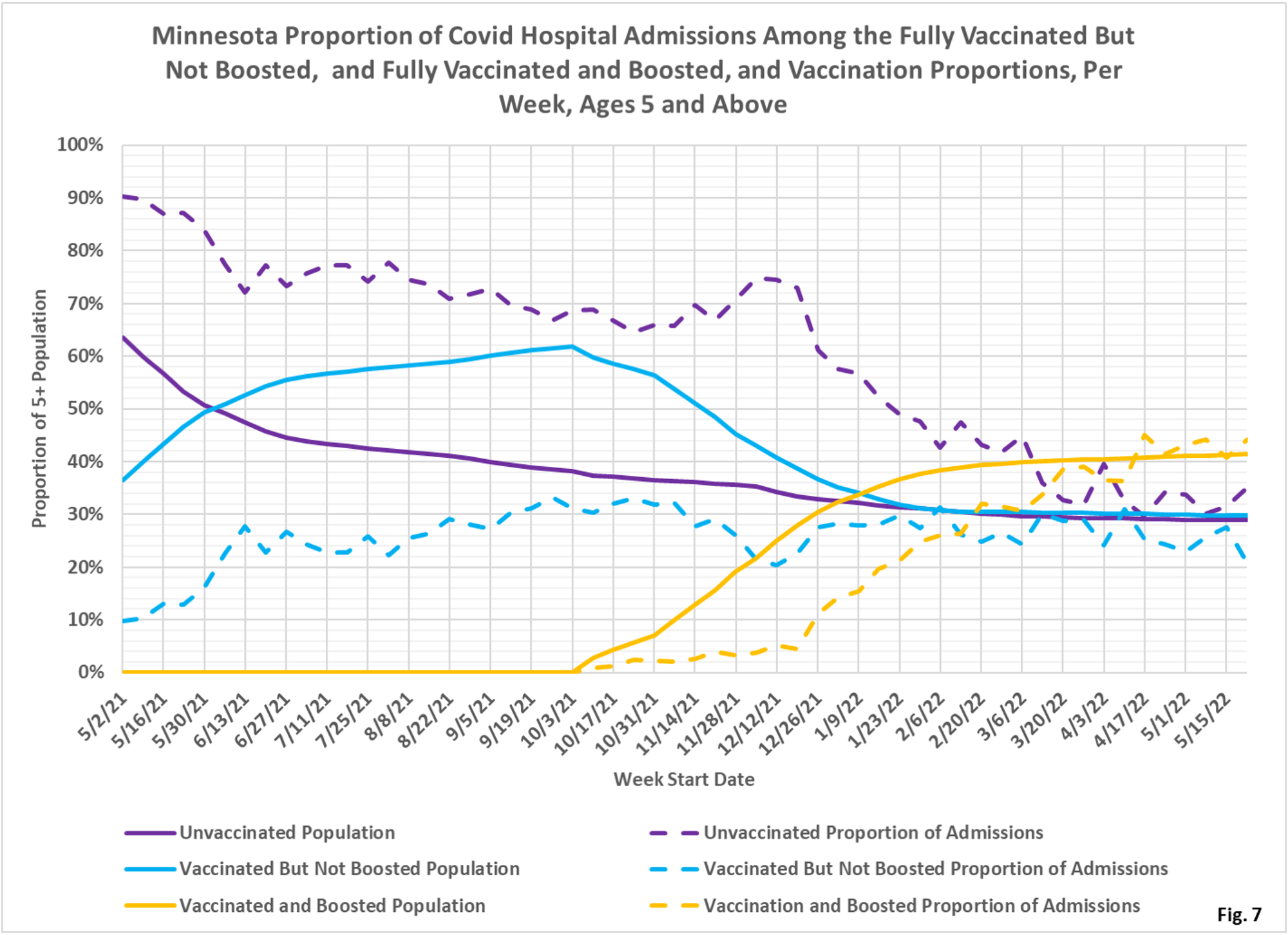
- Fig. 5-7: These charts display the hospital admissions, hospital admission rates per 100k, and hospital admissions proportions for the 5+ age group, in an identical format to the case charts in Fig. 2 through Fig. 4. Similar to cases, the boosted have a majority of the admissions (Fig. 5), however the admissions per 100k for the unvaccinated are slightly higher than the admissions per 100k of the boosted, while the vaccinated but not boosted have the lowest admission rates (Fig. 6). Fig. 7 shows that admissions among the unvaccinated have been disproportionately high throughout the pandemic until quite recently, where the proportion of admissions now are close to the same as the proportion of population for each group, meaning that for the overall population admissions are neutral as to vaccination status.
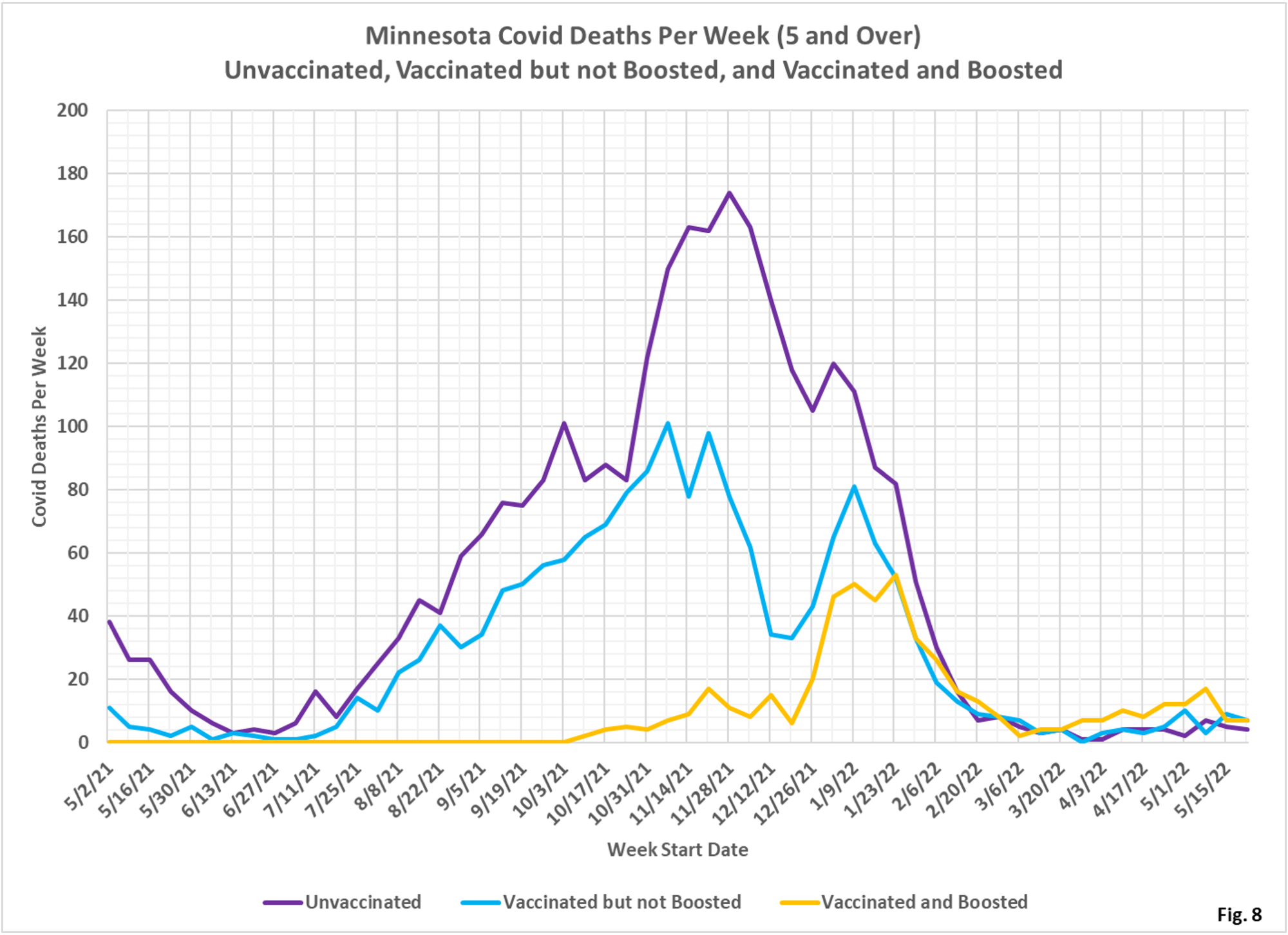
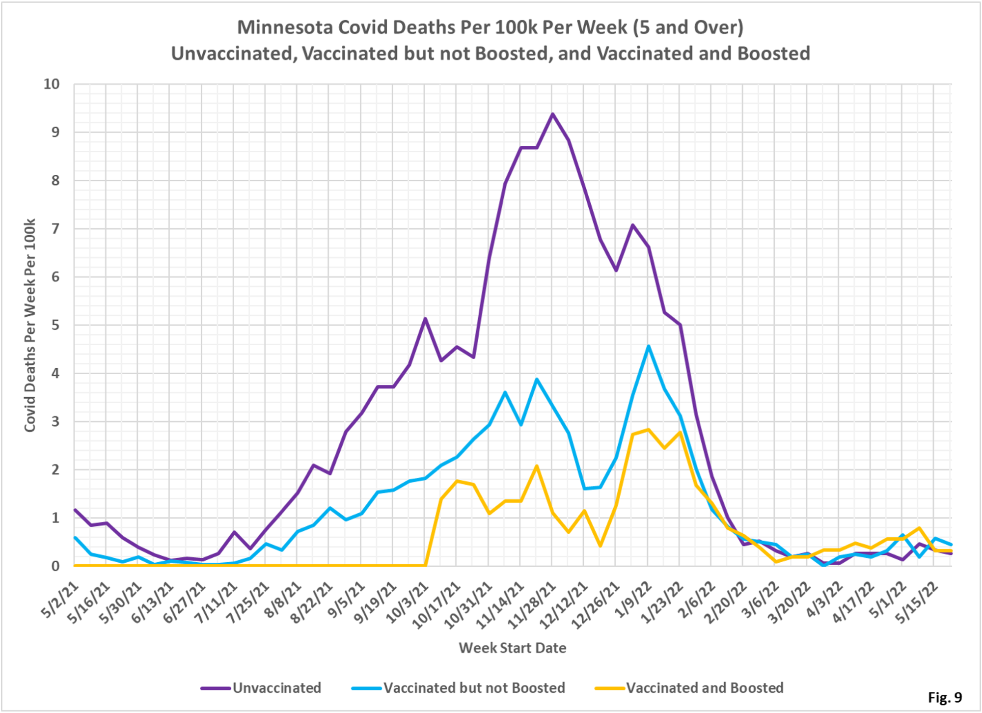
- Fig. 8-10: These charts display the deaths, deaths rates per 100k, and deaths proportions for the 5+ age group, in an identical format to the case charts in Fig. 2 through Fig. 4. Deaths have now decreased, with the boosted having the number of deaths as the vaccinated but not boosted for the week of 5/22/2022 (Fig. 8), while Fig. 9 shows that the vaccinated but not boosted have the highest rate of deaths per 100k for the week of 5/22/2022 followed by the vaccinated and boosted, with the unvaccinated having the lowest death rate per 100k. Fig. 10 shows that deaths proportion are highly variable, especially in recent weeks when there are relatively few deaths.
- MDH defines the fully vaccinated (what we have termed vaccinated but not boosted) as those who have not received a booster after completing their primary vaccination series, and had been vaccinated at least 14 days prior to testing positive.
- MDH defines the boosted as those who have received any additional vaccination shots after completing their primary vaccination series, and also received the booster at least 14 days prior to testing positive. In addition, booster doses were only counted after 8/13/2021, the date the CDC first began recommending booster shots.
