Below are charts on the national and local sources of electricity production. Dave’s notes relating to the US charts are set below first and the ones relating to the Minnesota update are second. Please note that electricity prices have increased by over 15% in the last year nationally and even more in states that rely on renewables. So much for renewables being cheap. They are expensive, unreliable and environmentally harmful. But rich people make a lot of money from subsidies for renewables and make a lot of contributions to politicians, so renewables keep getting pushed on the public. Expect more expensive electricity for years to come, if you can get it at all. A sensible energy policy would focus on maximizing US natural gas production and plants and on nuclear. That would result in a far lower electricity cost.
Dave’s notes:
For the US:
- We recently published charts showing sources of electricity generation for the Midwest region of the US, https://healthy-skeptic.com/
2022/07/29/renewable-energy- is-a-fantasy/. This new set of charts above shows sources of electricity generation for the United States as a whole. The data is for the Lower 48 states only, and includes only utility-level electrical generation sources. - The U.S. Energy Information Administration (EIA) publishes a wide variety of energy information. Data for the United States (Lower 48) is available here: https://www.eia.gov/
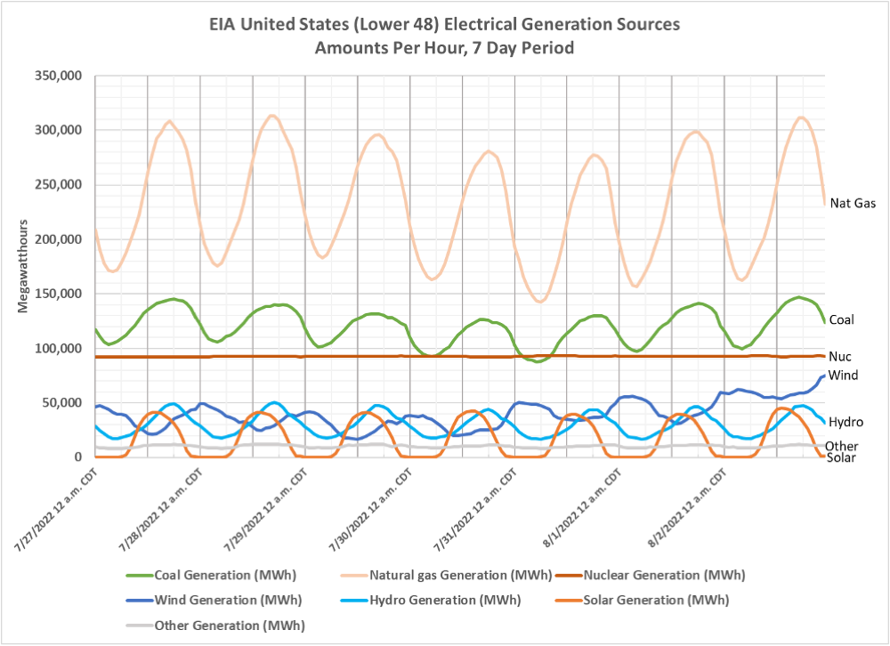
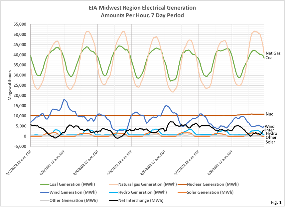
electricity/gridmonitor/ dashboard/electric_overview/ US48/US48. The fourth chart on this page is “U.S. electricity generation by energy source”. By clicking on the gear symbol on this chart we are able to select up to a 31 day time period, and then to download the data as a csv file. The data for the charts presented here was obtained in this manner. The charts match those published by the EIA, except that we have modified the colors used for clarity. The amounts data in Fig. 1 and Fig. 3 are directly from the EIA without modification. We are calculating the proportions in Fig. 2 and Fig. 4 from the amounts data. - Fig. 1 shows the amounts of electricity generated by source each hour over a 7 day period. Note that coal and natural gas generation is highly cyclical, in order to match the daily demand cycle. Nuclear is almost perfectly constant. Note that the amount of electricity generated from natural gas is much higher than from coal on a national basis. For the Midwest region natural gas and coal-generated electricity were roughly equal. One surprising feature on this chart is that wind power peaks nationally at midnight or shortly after, and is at daily low power generation around noon. Wind power in the Midwest region did not have a daily cyclical pattern. Possibly this is due to offshore wind power generation, or wind power in mountainous regions? More investigation is necessary.
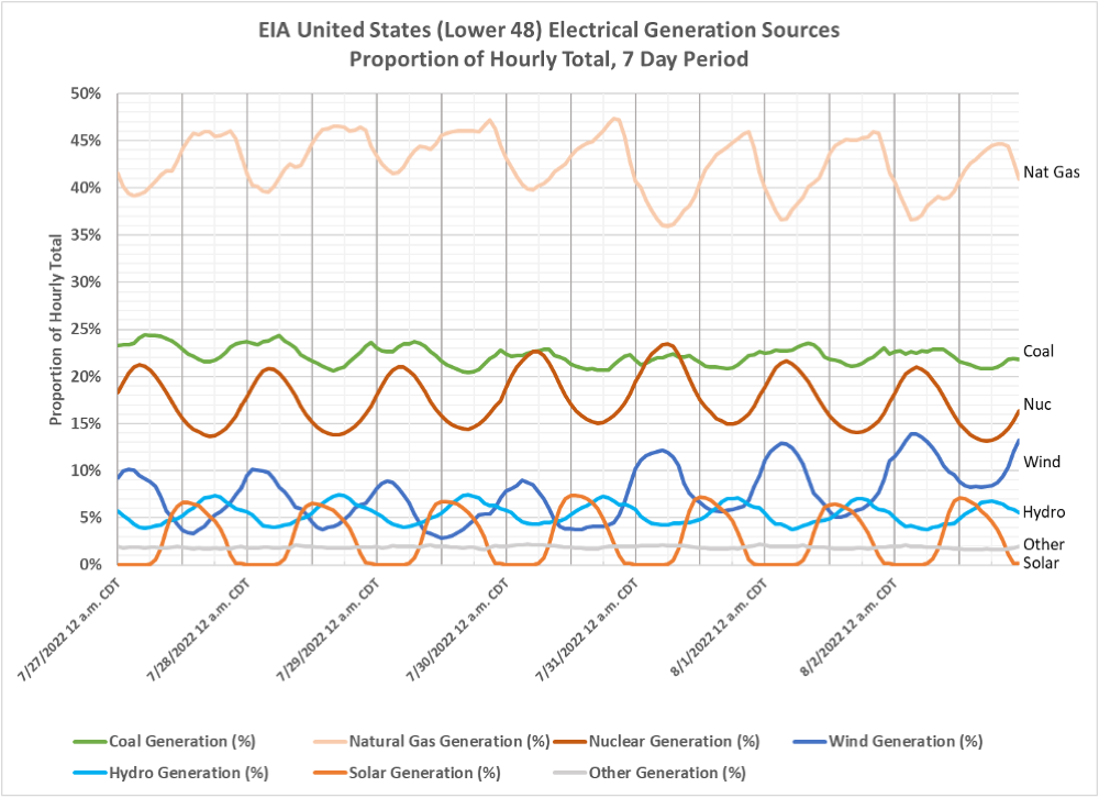
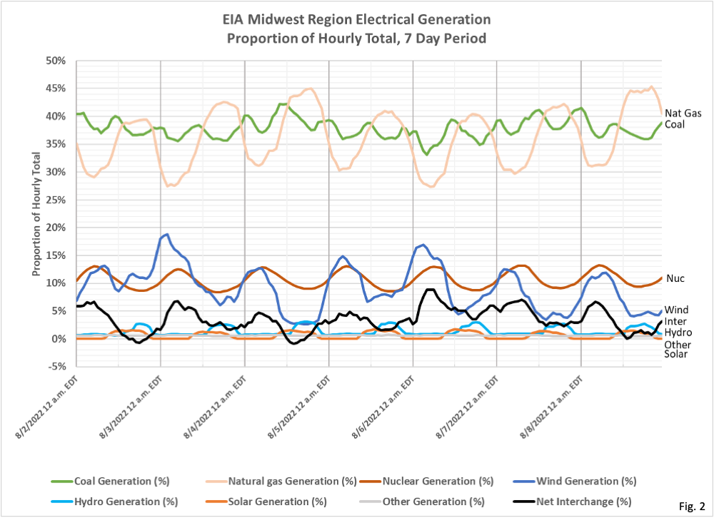
- Fig. 2 shows the amounts of electricity generated by each source each hour as a proportion of the hourly total over a 7 day period. During this period wind power peaked at 13%, and solar peaked daily at 7%. Over the entire 7 day period coal and natural gas averaged 64.8% of total generation, and wind and solar averaged 10.4% of total generation.
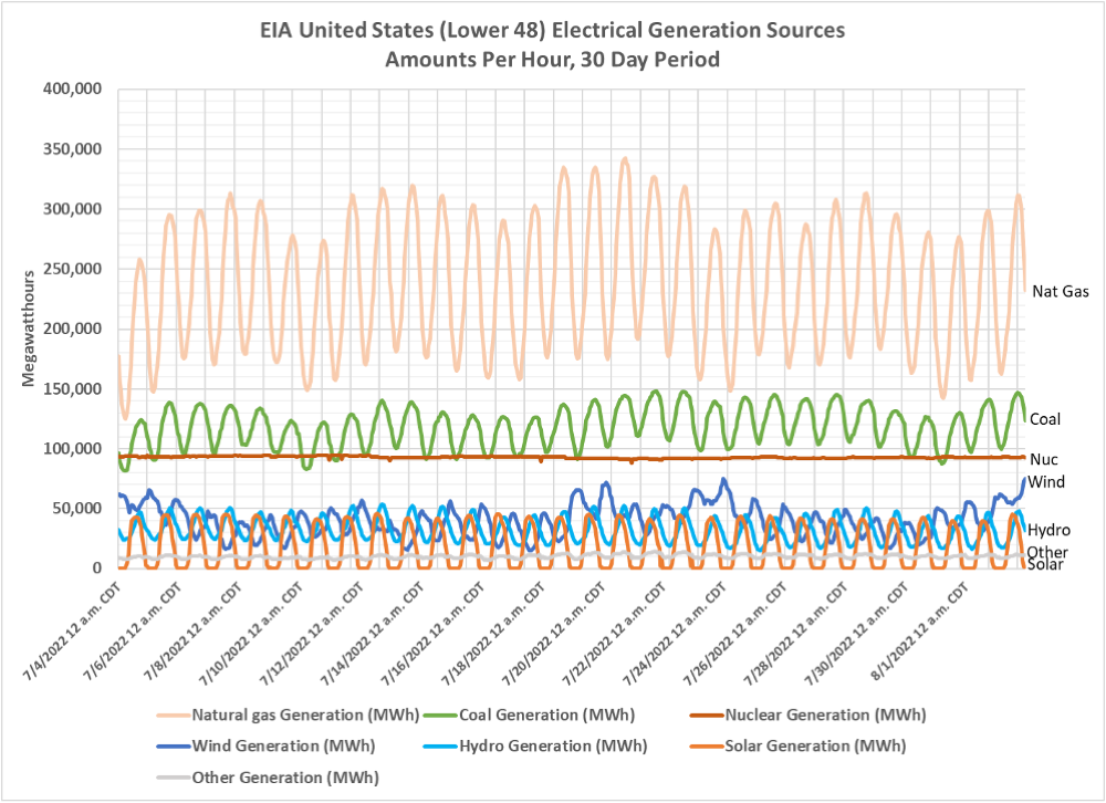
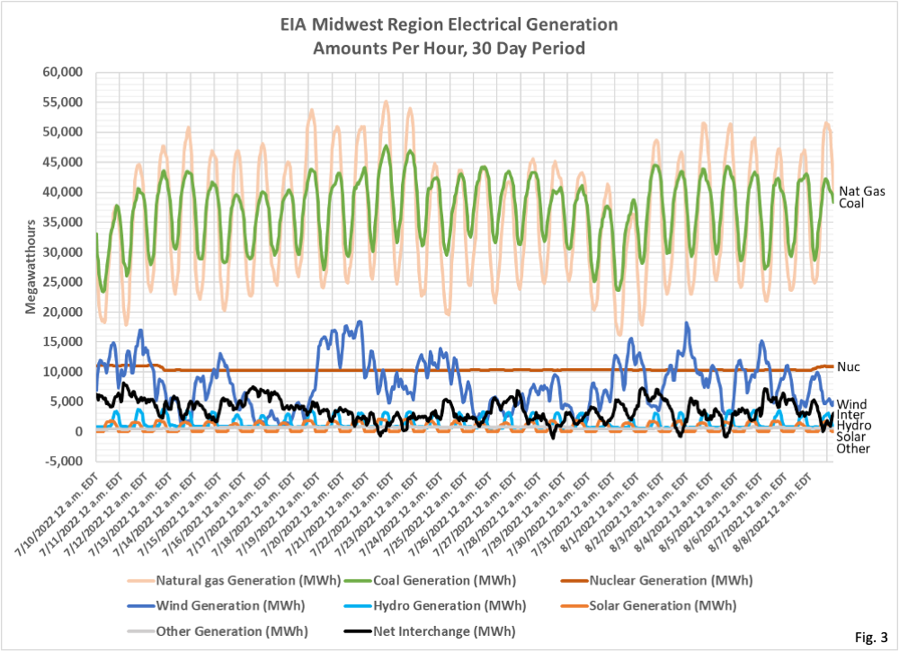
- Fig. 3 shows the same hourly generation data as Fig. 1, but over a 30 day period. Wind generation is cyclical on a daily time period, and also has trends on a longer time period. It appears that coal and natural gas are ramped up and down to compensate for variability of wind and solar power, both on a daily basis and also over longer periods of time.
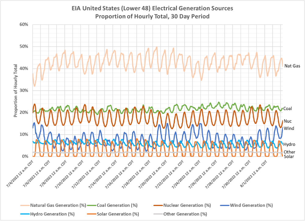
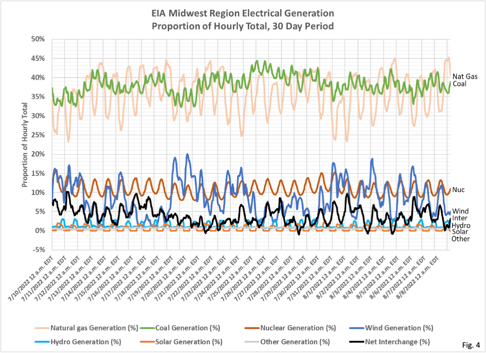
- Fig. 4 shows the same hourly proportion data as Fig. 3, but over a 30 day period. Coal and natural gas averaged 64.4% over this time period, and wind and solar averaged 10.6% of total generation.
For Minnesota:
- This post is an update to the U.S. Energy Information Administration (EIA) Midwest Region charts we published on 7/29/2022 here: https://healthy-skeptic.com/
2022/07/29/renewable-energy- is-a-fantasy/. These new charts update the date range to the latest data, and we have also added a curve displaying the Net Interchange (black curve on each chart). The Net Interchange is the amount of electricity entering or exiting the region from other regions (or other countries). We are plotting Net Interchange entering the Midwest Region as positive, meaning that this electricity is consumed in the Midwest Region. - Fig. 1 shows the amounts of electricity generated by each source each hour over a 7 day period. The new Net Interchange amount is shown in black, with energy entering the region shown as positive values. The Net Interchange appears to peak typically in the early morning hours, when Natural Gas and Coal are ramped down due to low demand in the Midwest Region. There are several instances where the Net Interchange is slightly negative, indicating net exports from the Midwest. These instances appear to occur when Natural Gas and Coal generation amounts are high, and not due to excess Wind or Solar generation. It appears that these energy exchanges are simply part of normal operations, and not because the Midwest Region is lacking energy generation capacity.
- Fig. 2 shows the amounts of electricity generated by each source each hour as a proportion of the hourly total over a 7 day period. We can see here that Net Interchange peaks between 5% and 10% of total energy consumption each day.
- Fig. 3 shows the same hourly generation data as Fig. 1, but over a 30 day period. In this chart we can see that coal is also ramped up and down to compensate when wind generation is low over longer periods, and that coal and natural gas also vary over longer time periods to account for longer term trends in energy consumption in this region.
- Fig. 4 shows the same hourly proportion data as Fig. 3, but over a 30 day period. The highly variable nature of wind energy generation is very apparent in this chart, varying from 0% to 20% over this period.
- The EIA publishes a wide variety of energy information. We were interested in the sources of electricity generation, and how they change on a daily or weekly basis. The EIA publishes data and charts for the Midwest Region here: https://www.eia.gov/
electricity/gridmonitor/ dashboard/electric_overview/ regional/REG-MIDW . - One of the charts the EIA publishes on the page referenced above is “Midwest (MIDW) region electricity generation by energy source”. By clicking on the gear symbol on this chart we are able to select up to a 31 day time period, and then to download the data as a csv file. The data for the charts presented here was obtained in this manner. The charts match those published by the EIA, except that we have modified the colors used for clarity. The amounts data in Fig. 1 and Fig. 3 are directly from the EIA without modification. We are calculating the proportions in Fig. 2 and Fig. 4 from the amounts data. The data for Net Interchange is downloaded by the same method from the graphic titled “Midwest (MIDW) region electricity overview”.
- Note that the Midwest Region covers an area of the US from Louisiana to Michigan to North Dakota. This region is operated by the Midcontinent Independent System Operator, Inc. (MISO), and has a real time dashboard available here: https://www.misoenergy.org/
markets-and-operations/real- time–market-data/operations- displays/ .

The EIA . gov link you provided is one of the best sources demonstrating the futility of converting to renewables.
Go to the 4th chart – “US energy Generation by Source”
Select any grid – select any time period
A few things stand out
1) for the months of July and part of august, it should be noted that electric generation from Wind peaked almost every day near midnight, and the low production period was generally mid day. Just the opposite of what is needed in the summer.
2) Texas / Ercot grid failure during Feb 2022. Across the entire north american continent, electric generation dropped 70%-90% for 90 days, while the election generation from fossil fuels only lost 35%-40% for 48 hours.
the green advocates thing that you can solve the problem by converting more energy usage to electricity and that electricity storage can be solved with more renewables and batteries – The US currently has battery storage capacity for less than 3 minutes
on point #2, Ercot, – typo – that should read 9 days that electric generation from wind lost 70-90% instead of 90 days. The point remains, electric generation from fossil fuels saved ERCOT from complete and total devastation during the February 2020 ice freeze.
Need to mention natural gas does have a drawback. It cannot be stored or stockpiled, so if line pressure drops generation will go offline. Gas turbines became popular because of cheap price of natural gas and the fact they could be brought online much quicker than nuclear or coal. Just stupid they are shutting down nuclear power / coal power plants thinking wind and solar is the replacement.
In reply to James Z’s comment
Greens/advocates are fixated on converting to all electric generated by “renewables” because
A) its clean (supposedly)
B) the levelized cost of energy (LCOE) is so low.
Though they fail to realized extremely expansive footprint required
and the fail to realized the low LCOE is meaningless when wind provides too much power and LCOE is meaningless when the wind doesnt blow. So while LCOE means the costs drop, the overall costs of operating the entire grid goes up.