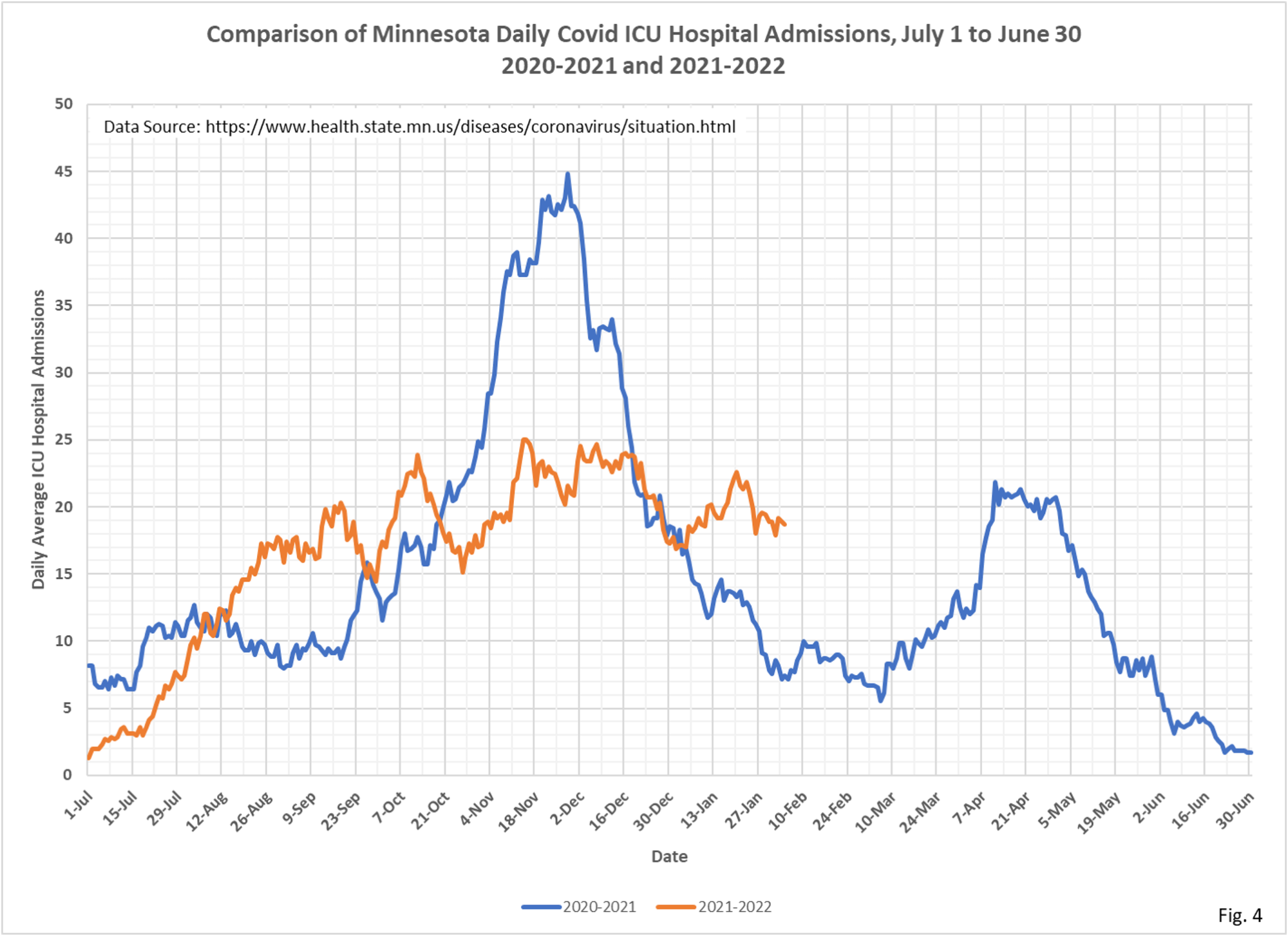
Here we are again with the big picture. I suspect the differences in ICU and non-ICU hospitalization trends have something to do with the level of incidental hospitalizations. Dave’s notes:
- For this version of the yearly comparison charts the date axis is formatted to display from July 1 to June 30, for 20220-2021 and 2021-2022. Data before July 1, 2020 is not shown.
- For all charts the last 7 days of data is excluded to avoid charting incomplete data. For the deaths chart data from the last 14 days is excluded.
- All data is taken from the Minnesota Department of Health Situation Update for OCVID-19 web page https://www.health.state.mn.
us/diseases/coronavirus/ situation.html and from the Response and Preparation web page https://mn.gov/covid19/data/ response-prep/response- capacity.jsp. - All data is shown as 7 day running averages.
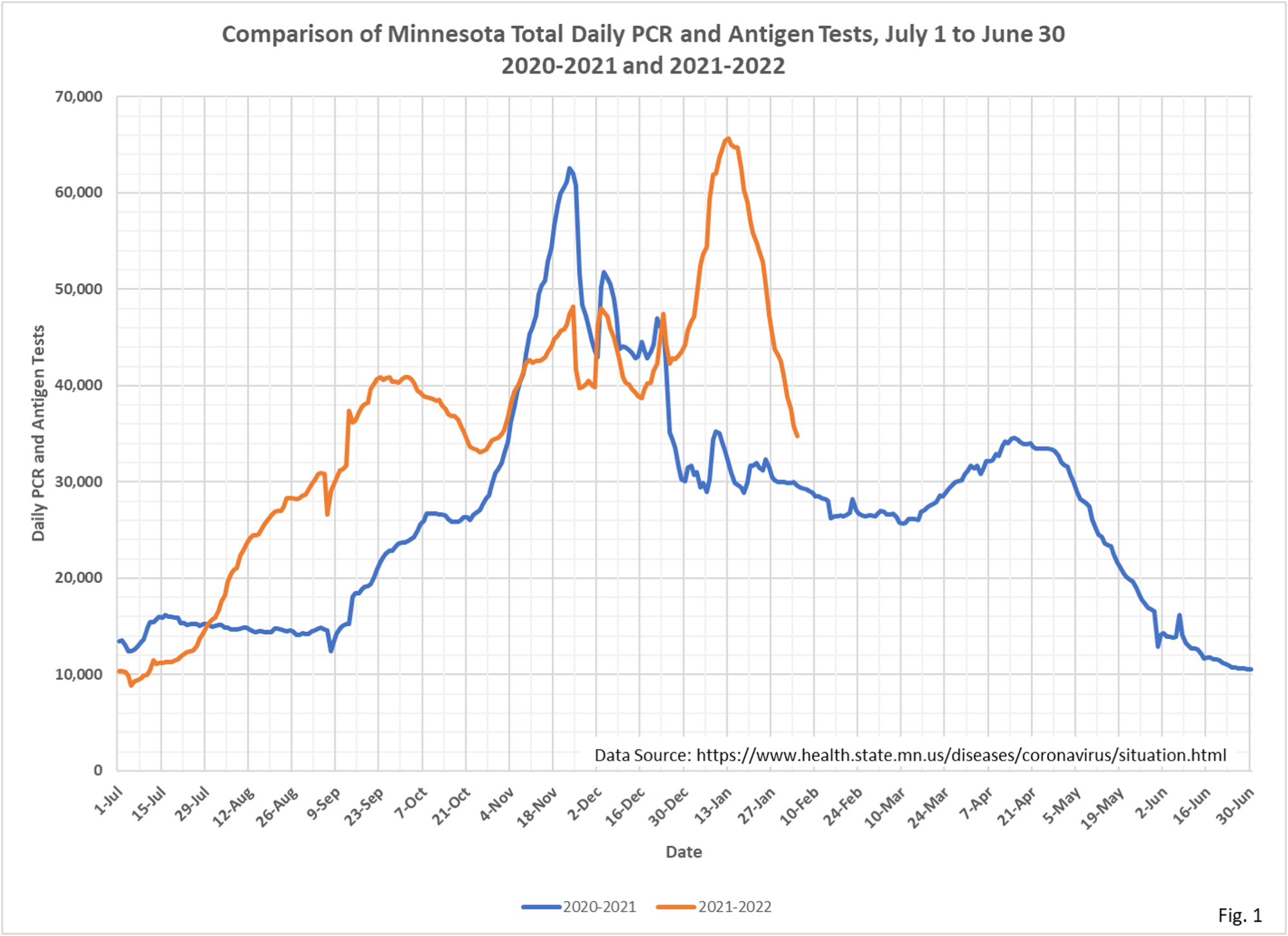
- Fig. 1: Average tests per day continue to drop sharply, now approaching testing levels seen at this time last year.
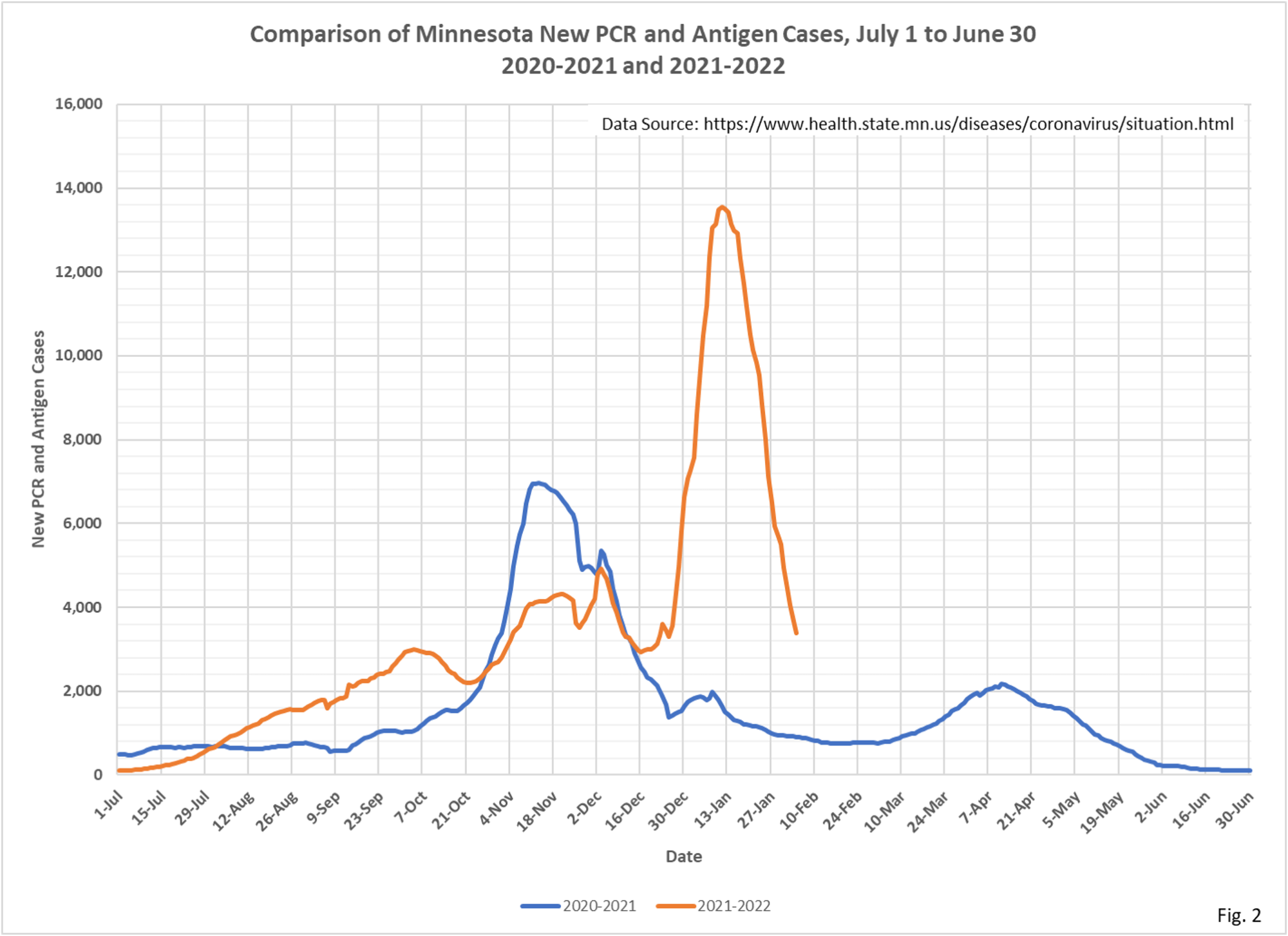
- Fig. 2: New daily cases per day continue to decline rapidly. The next question is; where will cases per day level off, at cases levels similar to last year, or lower or higher? It would also be interesting to know if any cases of the Delta variant are still in circulation, which had different transmission characteristics and different degrees of severity in patients. Various news reports claim that the recent surge is almost entirely due to Omicron, and that Delta cases are a minuscule number of recent cases.
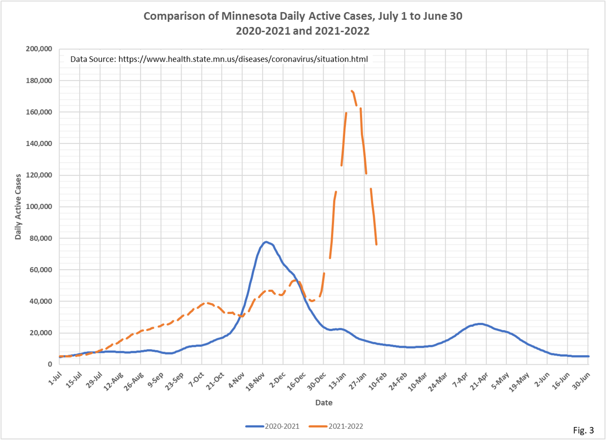
- Fig. 3: Active cases dropping sharply, lagging slightly behind new daily cases per day.
- Fig. 4:ICU admissions per day continue to follow a gradual arc that goes all the way back to July 1, 2021. I continue to be mystified by the differing appearances of the ICU admissions and Non-ICU admissions charts. ICU admissions continue to show no apparent change in response to the surge in Omicron cases.
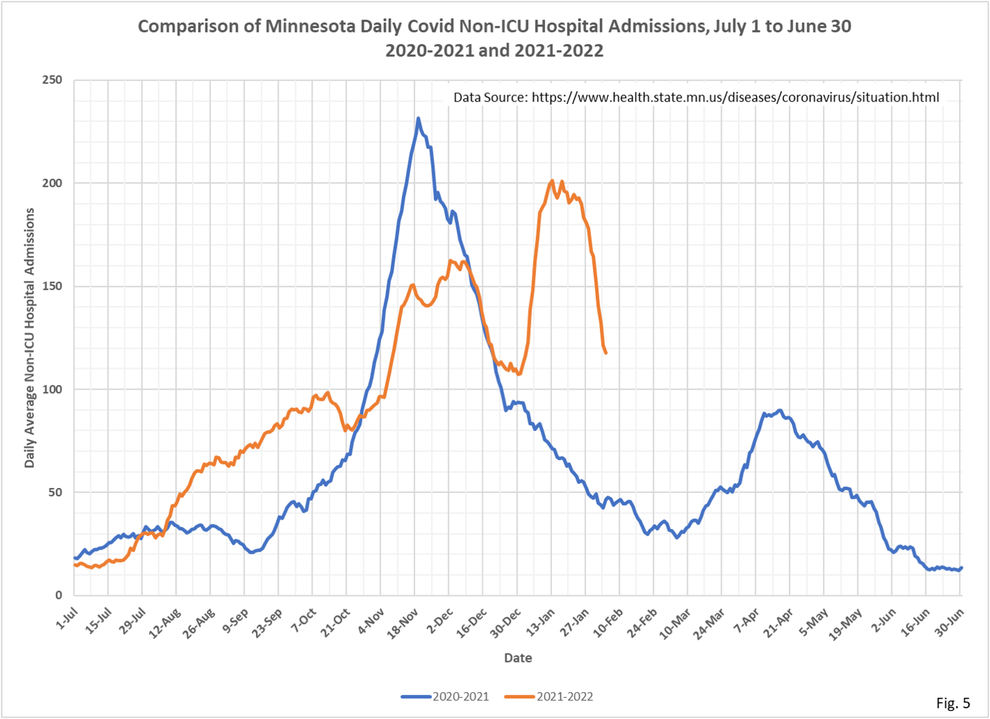
- Fig. 5: Non-ICU admissions per day have fallen nearly to the level of admissions per day present at the start of the Omicron surge, just as new daily cases have fallen nearly to the level of cases per day at the start of the Omicron surge.
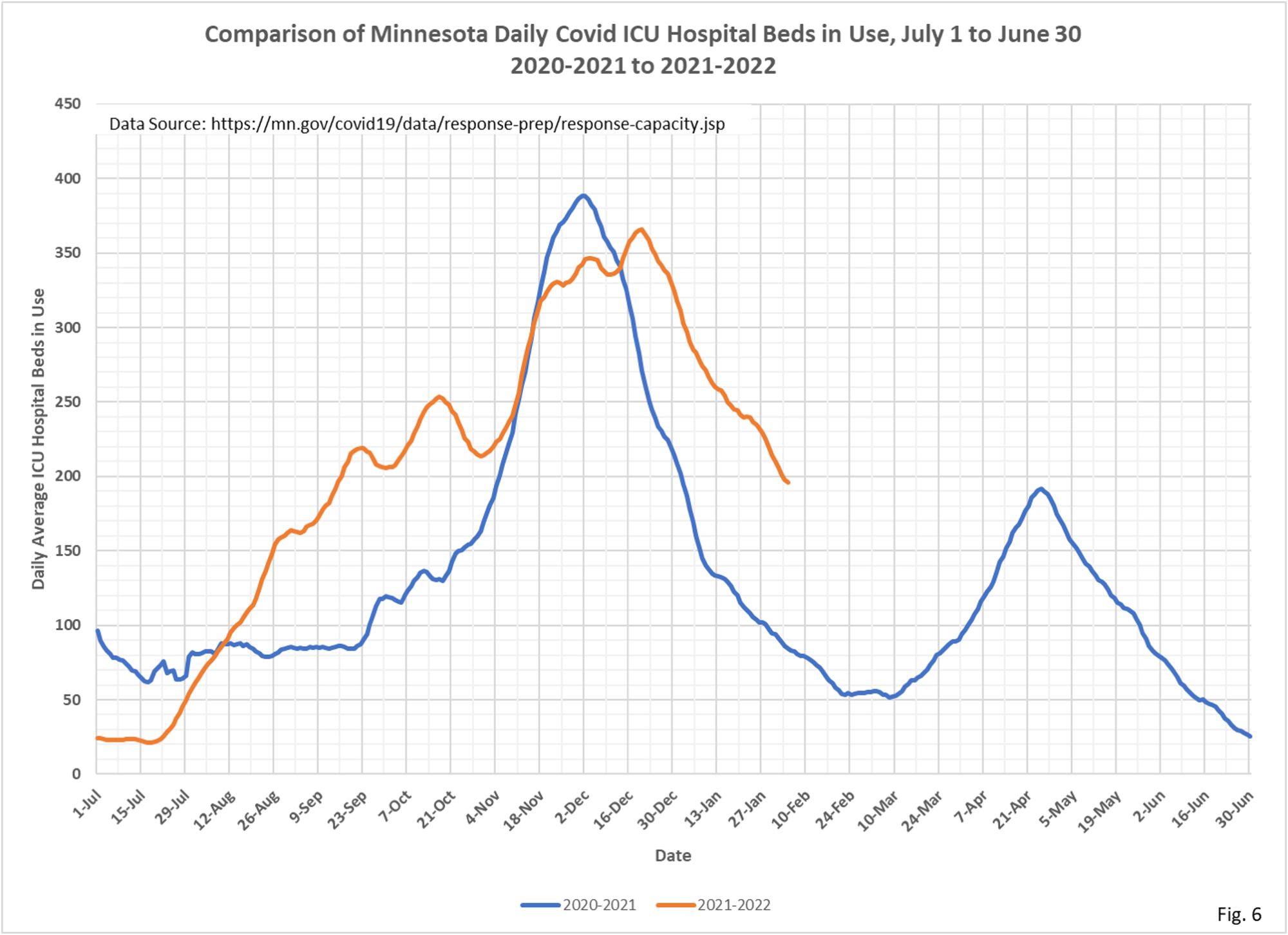
- Fig. 6: ICU Covid hospital beds in use continuing to fall, reaching levels of usage last seen around 9/1/2021.
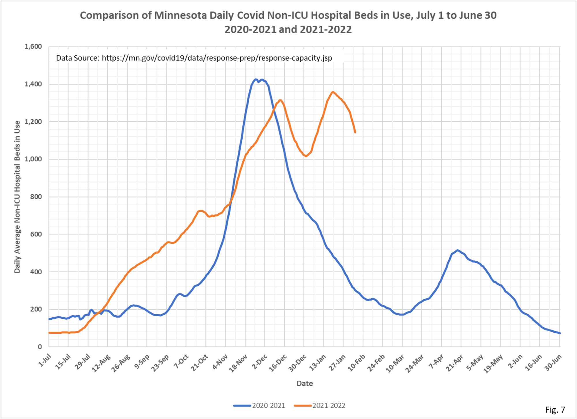
- Fig. 7: Non-ICU Covid hospital beds in use are falling, but still appear relatively elevated compared to the drop in new cases per day. And are still elevated compared to the start of the Omicron surge.
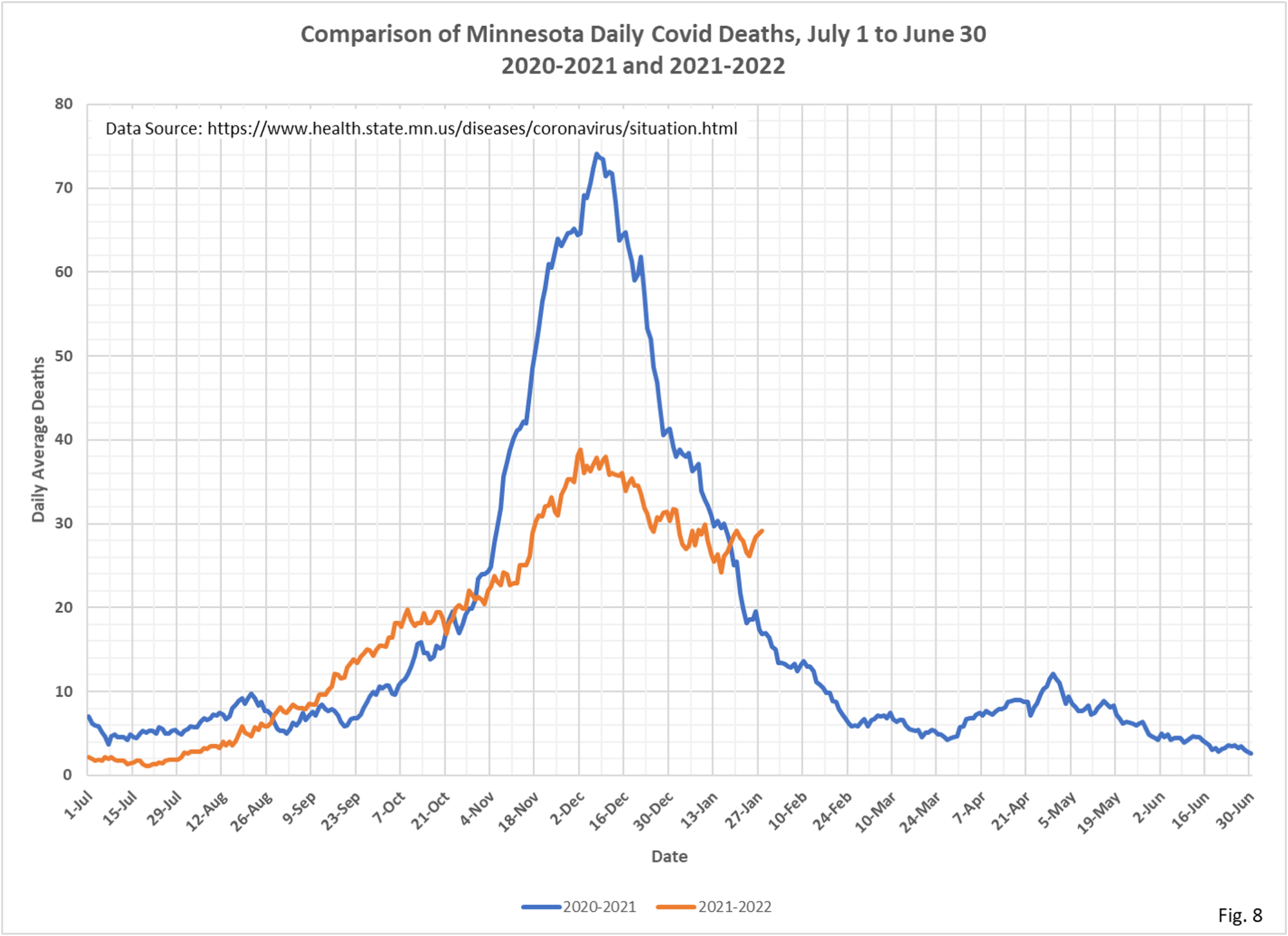
- Fig. 8: Deaths attributed to Covid continue to drift generally lower, and still show no apparent change in trend due to the Omicron surge in cases.