This is the first of a very large dump of charts and animations today–you will be all caught up.
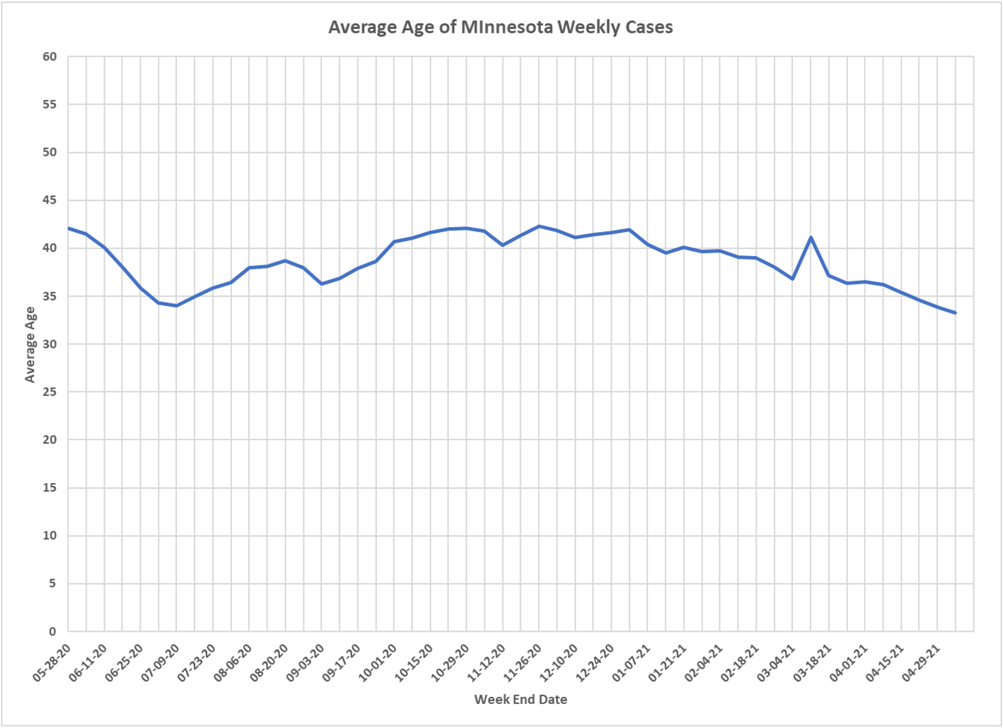
Interesting to see if the average age of a case has changed during the course of the epidemic. DD came up with this chart, little bump up in the fall/winter wave, heading down during the vaccination period.


