I haven’t had time to do this for Minnesota lately, but I will. Here is the national data showing how the epidemic curve looks different when you see deaths by the date they actually occurred versus when they were reported by states. You can see that the epidemic clearly peaks earlier and higher by actual date of death. If this was what the public saw, the period of panic over large numbers of deaths would be shorter. Yet we keep getting lots of deaths added from weeks ago. Almost like someone is trying to maintain the panic. Thanks to Todd Lowdon on Twitter for the chart.
Deaths by Date of Death Versus Date Reported, Updated
✅ Subscribe via Email
About this Blog
The Healthy Skeptic is a website about the health care system, and is written by Kevin Roche, who has many years of experience working in the health industry. Mr. Roche is available to assist health care companies through consulting arrangements through Roche Consulting, LLC and may be reached at [email protected].
Healthy Skeptic Podcast
Research
MedPAC 2019 Report to Congress
June 18, 2019
Headlines
Tags
Access
ACO
Care Management
Chronic Disease
Comparative Effectiveness
Consumer Directed Health
Consumers
Devices
Disease Management
Drugs
EHRs
Elder Care
End-of-Life Care
FDA
Financings
Genomics
Government
Health Care Costs
Health Care Quality
Health Care Reform
Health Insurance
Health Insurance Exchange
HIT
HomeCare
Hospital
Hospital Readmissions
Legislation
M&A
Malpractice
Meaningful Use
Medicaid
Medical Care
Medicare
Medicare Advantage
Mobile
Pay For Performance
Pharmaceutical
Physicians
Providers
Regulation
Repealing Reform
Telehealth
Telemedicine
Wellness and Prevention
Workplace
Related Posts
Commentary
May 4, 2024
Too Much Research on Everything, So Some Quick Hits, First on Climate
I have too much stuff sitting around so just going to try to quickly clear…
Commentary
May 3, 2024
Jobs in April
A jobs report disappoints to the downside for once, but who knows how reliable the…
Commentary
May 2, 2024
A Couple of Pretty Obvious CV-19 Findings
We are relearning a lot of basics about respiratory viruses that were forgotten during the…
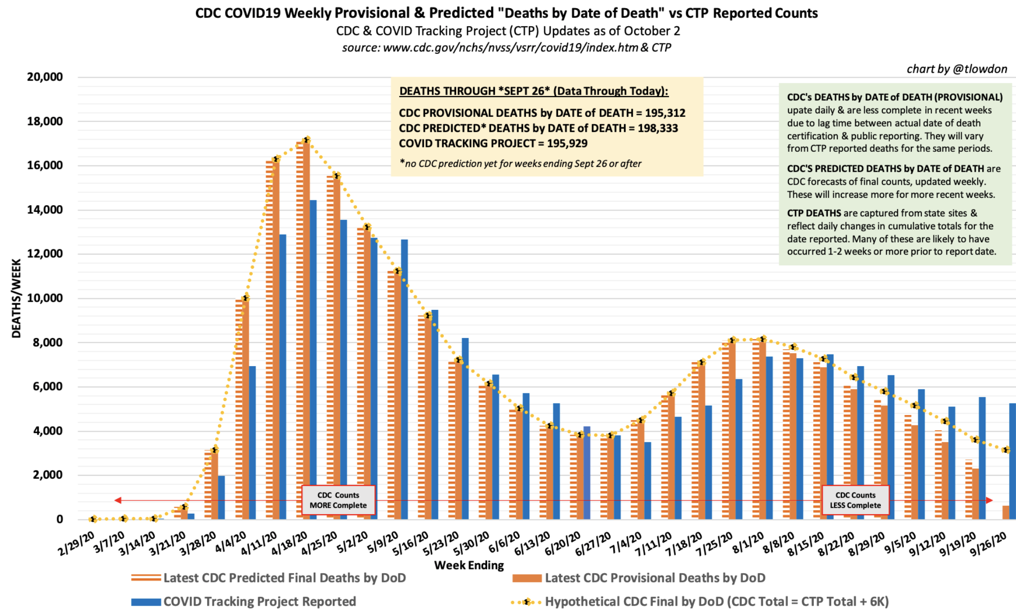
This is an exceptionally useful graph which proves a point I’ve often made in the past. Neither listing deaths by the day of death (solid blue) or by the day the death is reported (solid orange) gives an accurate view of the pandemic. The truth (dotted line) is in the middle. We should have been normalizing (predicting) the data in this manner all along.
Absent a true second wave, (which is not the same thing as the same wave going though yet another population center), we are in the tail end of the pandemic and hopefully close enough to population immunity that viral seasonality will be muted. The danger is mostly over. It remains to be seen how long the media can keep up the panic but they are very skilled at panic mongering. I’m sure they will mine everything and everywhere they can for bits and pieces of bad news they can use to stoke up fear and use ear plugs to prevent them from hearing the tsunami of good news which is about to hit us.