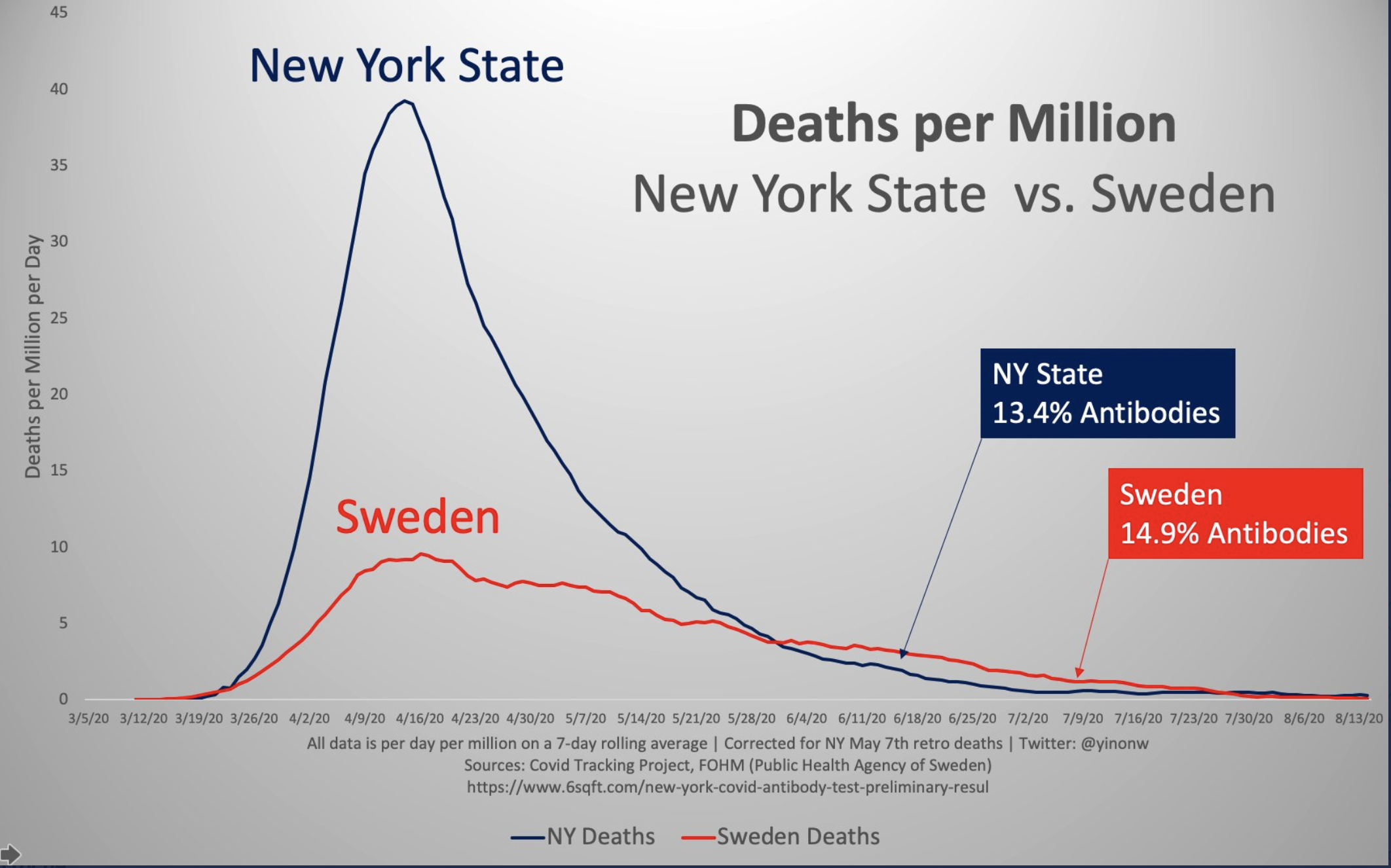
Due to media determination to tell the story a certain way, you might not realize the extreme difference in how the epidemic has played out in various areas. Below is another chart of Sweden versus New York, on a population basis. Note that according to surveys, the two locations have a similar prevalence in the population, yet somehow, with no extreme lockdown and without people wearing masks, Sweden had far less of a death toll.
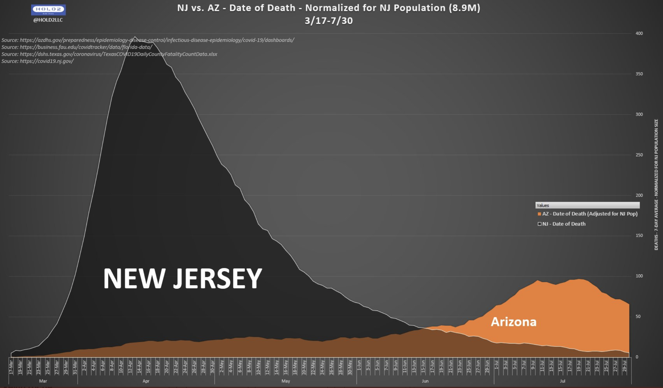
The second chart is New Jersey versus Arizona, and again, pretty obvious which area did a better job of “flattening” the curve. The general media ignores this kind of information because it isn’t consistent with the fear they want to spread and it makes certain politicians that they don’t like, look good. Thanks again to Twitter users for the charts.