The main takeaway for this age group is no benefit in preventing infection, modest impact on hospitalization risk.
 Dave’s notes:
- The following charts show how vaccination status affects the risk of testing positive, being hospitalized, or dying of Covid for the 18-49 age group. We find that boosting appear to offer significant benefit to the 18-49 age group until March of 2022, similar to the benefit received by the 65+ age group. Since March 2022 vaccination and boosting appears to some benefit for reducing hospital admissions, but cases and deaths appear largely unaffected by vaccination or boosters.
- We have recently documented fairly extensively the issue of the population basis used by the Minnesota Department of Health (MDH) affecting the 65+ age group. Note that MDH calculates the unvaccinated population by starting with the estimated age group population and then subtracting the vaccinated and the boosted populations. Any discrepancy made in the initial population assumption then directly causes the same size discrepancy in the size of the unvaccinated population. The 18-49 age group population has increased slightly in recent years, as we discuss here: https://healthy-skeptic.com/
2022/12/02/census-estimate- background/, When the population increase in taken into account, by using the 2021 American Community Survey (ACS) 1-Year population estimate, we find that the unvaccinated rates per 100k for cases, hospital admissions, and deaths are somewhat lower than the rates published by MDH - This post is an update to the chart set for the 18-49 age group most recently published on 12/14/2022 here: https://healthy-skeptic.com/
2022/12/14/breakthrough- events-as-of-the-week-of- december-8-ages-18-to-49/. Data is published by MDH through the week starting 12/11/2022. - There are 9 charts in this set, 3 charts each for cases, hospital admissions, and deaths. Each set of 3 charts consists of the actual events per week (cases, admissions, or deaths); the rate per 100k each week, and the proportion of events compared to the proportion of the vaccinated population. Note that on the rate per 100k charts for cases, hospital admissions, and deaths we are displaying both MDH’s rates (solid lines) and our calculated rates per 100k using the 2021 ACS 1-Year population estimate for 2021 (dotted lines). For the proportion charts are only displaying data using the 2021 ACS 1-Year population estimates.
- Fig. 1: This chart plots the number of cases in the 18-49 age group per week among the unvaccinated, vaccinated but not boosted, and vaccinated and boosted populations each week. These cases are plotted from the MDH data files without modification. The number of cases continue to follow a decreasing trend since the May 2022 peak, although the numbers of cases have been relatively constant in the last several months.
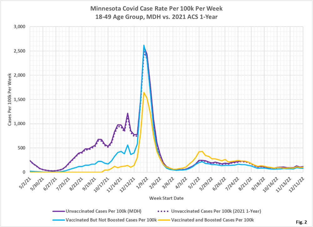
- Fig. 2: This chart displays the case rates per 100k for each subgroup in the 18-49 age group. The impact of the choice in population estimate is minimal, as the unvaccinated case rate the 2019 ACS 5-Year population as used by MDH (solid purple line) almost exactly matches the case rate calculated with the 2021 ACS 1-Year population estimate (dotted purple line). We can see that initial vaccination without booster shots ceased to cause a lower case rate in December 2021, compared to the unvaccinated. In the spring and summer of 2022 the boosted actually had the highest case rate. Since August 2022 the unvaccinated, vaccinated, and the boosted all have almost identical case rates, meaning that vaccination status has little to no effect on testing positive for Covid.
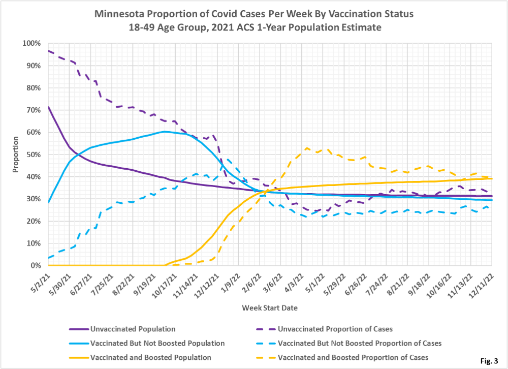
- Fig. 3: This chart displays the proportion of the 18-49 population who are unvaccinated (solid purple), vaccinated but not boosted (solid blue), and vaccinated and boosted (solid gold). This chart uses the 2021 ACS 1-Year estimated population to calculated the size of the unvaccinated group. A group is under-represented whenever the dashed line is below the solid line of the same color. For example, the boosted proportion of cases (dashed gold line) is lower than the boosted proportion of population until March of 2022, after which the boosted have a higher proportion of cases than the boosted proportion of the population. In the most recent weeks the proportion of cases has converged on the proportion of the population, meaning that vaccination status has little impact on the likelihood of testing positive.
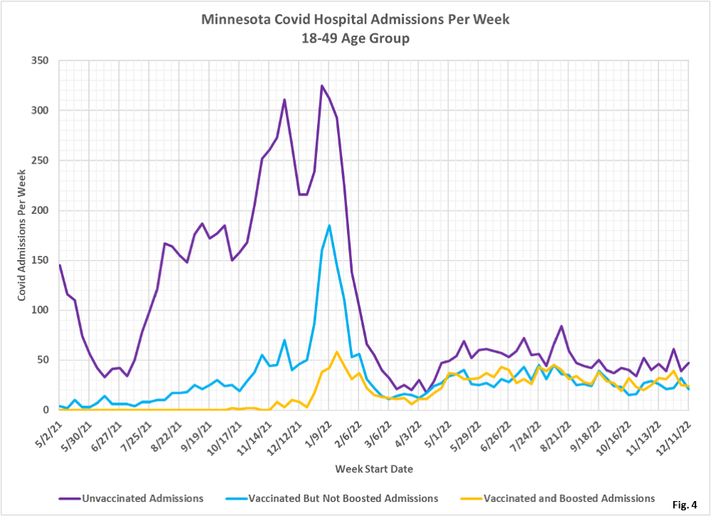
- Fig. 4: This chart plots the number of hospital admissions in the 18-49 age group per week among the unvaccinated, vaccinated but not boosted, and vaccinated and boosted populations each week. These admissions are plotted from the MDH data files without modification. The number of weekly admissions have been relatively constant in recent months.
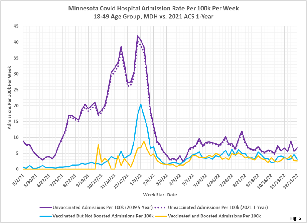
- Fig. 5: This chart displays the hospital admission rates per 100k for each subgroup in the 18-49 age group. We can see that using the 2021 ACS 1-Year population estimate slightly reduces the hospitalization rates, but doesn’t materially impact the analysis. Even in recent weeks vaccination and boosting reduces the hospitalization rates.
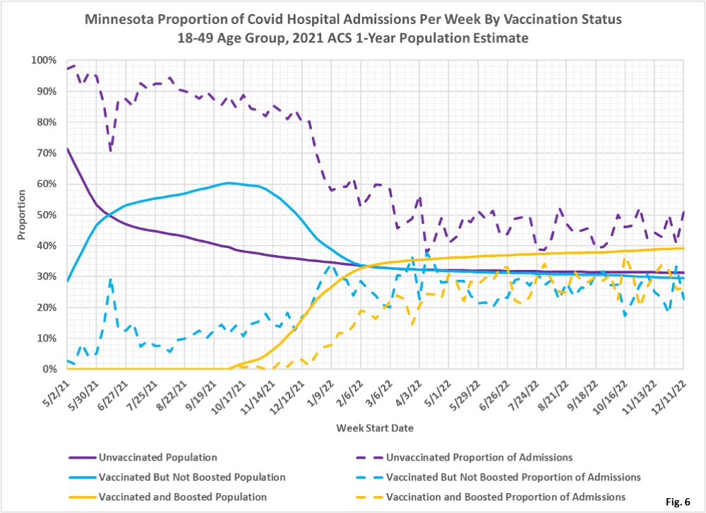
- Fig.6: This chart displays the proportion of hospital admissions compared to the proportion of the population for the unvaccinated, vaccinated, and boosted, for the 18-49 age group. The boosted have a lower proportion of admissions (dashed gold line) than the boosted proportion of the population (solid gold line), showing that boosters appear to have a positive effect throughout the pandemic. For the week of 12/11/2022 the unvaccinated made up 31% of the age group and accounted for 51% of the admissions. The boosted made up 39% of the age group but accounted for only 26% of the admissions.
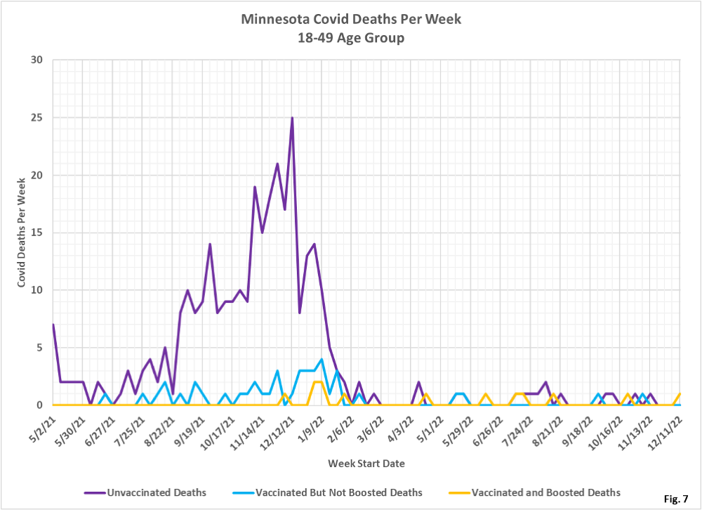
- Fig. 7: This chart plots the number of deaths in the 18-49 age group per week among the unvaccinated, vaccinated but not boosted, and vaccinated and boosted populations each week. The number of deaths each week are plotted from the MDH data files without modification. Since March 2022 there have been relatively few Covid deaths, regardless of vaccination status.
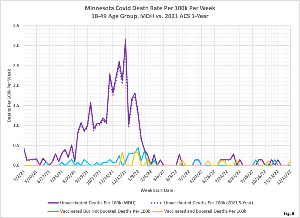
- Fig. 8: This chart displays the death rates per 100k for each subgroup in the 18-49 age group. There is little difference in the death rates per 100k among the three groups since March 2022.
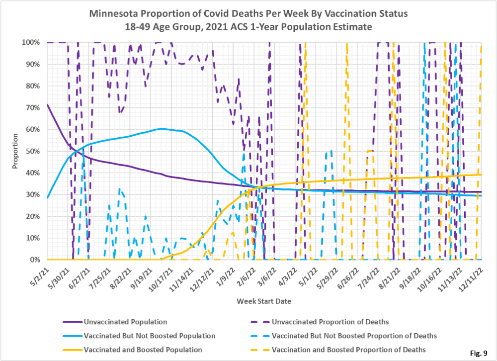
- Fig. 9: This chart displays the proportion of deaths compared to the proportion of the population for the unvaccinated, vaccinated, and boosted, for the 18-49 age group. Until March 2022 the unvaccinated proportion of deaths (dashed purple curve) is significantly higher than the unvaccinated proportion of the population (solid purple curve), meaning the unvaccinated were more at risk. Since March 2022 there are so few deaths that it is difficult to interpret the effectiveness of vaccination or boosters.
- All data is obtained from the Minnesota Department of Health (MDH) Vaccine Breakthrough Weekly Update web site https://www.health.state.mn.
us/diseases/coronavirus/stats/ vbt.html. A data file on this site, vbtadultcirates.xlsx, contains all of the age group data. - MDH defines the fully vaccinated (what we have termed vaccinated but not boosted) as those who have not received a booster after completing their primary vaccination series, and had been vaccinated at least 14 days prior to testing positive.
- MDH defines the boosted as those who have received any additional vaccination shots after completing their primary vaccination series, and also received the booster at least 14 days prior to testing positive. In addition, booster doses were only counted after 8/13/2021, the date the CDC first began recommending booster shots.
