It is apparent in this week’s breakthrough data that last week’s was indeed screwed up, likely by holiday processing. DOH has yet to fix it. This week returned to prior trends with all deaths in the vaxed or boosted population, 67% of hospitalizations and 74% of cases. Half of cases were in the boosted group.
Dave’s notes:
1. This post is an update to the breakthrough data table and charts
published on 7/11/22 here:
https://healthy-skeptic.com/20
noted in that post that for the week of 6/12/2022 there was a sharp increase
in cases among the unvaccinated, accompanied by a decrease cases among the
vaccinated and boosted groups. This week’s update adds the data for the week
of 6/19/2022, where this anomaly has reversed back to the prevailing
declining trend. The anomaly noted last week has the appearance of cases
that actually occurred among the vaccinated or boosted being misclassified
as occurring among the unvaccinated. This is plausible because the data for
6/12/2022 was published on 7/07/2022, meaning that delays in evaluating
breakthrough cases may have been due to the Fourth of July holiday. Our
theory is that cases are initially classified as unvaccinated, and only when
the Minnesota Department of Health (MDH) matches cases to vaccination
records are they classified as vaccinated or boosted. This is a
semi-automated process at best, and is susceptible to missing data and data
matching errors.
2. The breakthrough data files are available here,
https://www.health.state.mn.us
notes under the graphic images.
3. We last published data tables and charts for the overall age group
on 6/28/2022, for the data released by MDH on 6/27/2022, here:
https://healthy-skeptic.com/20
4. The charts in Fig. 2 through 10 continue 3 charts for each type of
event (cases, admissions, or deaths). The first chart for each type is the
number of events each week, illustrating in raw numbers the overall trend on
the pandemic for the overall population, and the impact is on society of
each sub-group. The second chart is the rate of events per 100k each week,
displaying the risk to an individual of the each category at different times
during the pandemic. The third chart for each type of event is the
proportions of event compared to the proportion of the population type
(unvaccinated, vaccinated, or boosted). This chart helps show whether or not
vaccination or boosting is effective in reducing the impact of the pandemic,
by comparing the proportion of events to the proportion of the population.
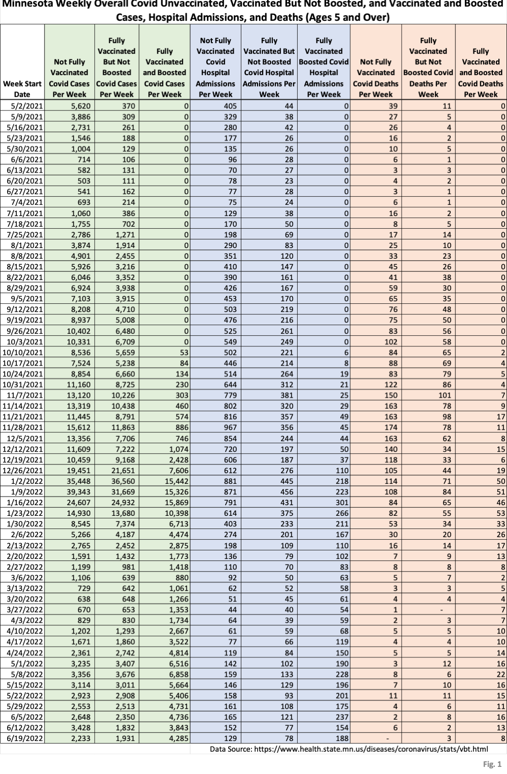
5. Fig. 1: This table displays the total cases, hospital admissions,
and deaths that occurred each week among the unvaccinated, vaccinated but
not boosted, and vaccinated and boosted populations. The week of 6/19/2022,
one additional week compared to last week’s publication. This data is
obtained from the data files vbtadultcirates.xlsx and vbtpedocirates.xlsx,
available in the notes under the graphics on the MDH Vaccinate Breakthrough
Weekly Update web page
https://www.health.state.mn.us
of 6/19/2022, last row of data, shows that the sharp increase in cases for
the week of 6/12/2022 has reversed back to trend. However, MDH has not
revised the 6/12/2022 unvaccinated case total downward. In fact, it was
further increased from 3420 cases to 3428 cases. We believe that the high
unvaccinated case total for 6/12/2022 is an anomaly based on incomplete data
analysis caused by the July 4th holiday, but there is no sign that MDH has
gone back and reviewed or revised that week’s data.
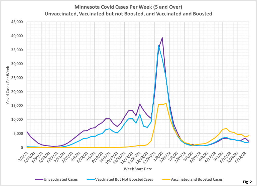
6. Fig. 2: This chart simply plots the cases among the unvaccinated,
vaccinated but not boosted, and vaccinated and boosted populations each
week, as found in Fig. 1. Note that the sharp increase in unvaccinated
cases (purple curve) for 6/12/2022 has reversed back to the prior general
trend on 6/19/2022. It is likely that at least some of the variations in the
last couple weeks are data processing anomalies, and not due to changes in
the underlying pandemic.
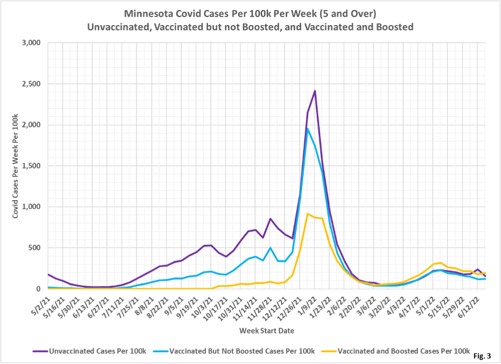
7. Fig. 3: This chart displays the case rates per 100k for each group.
Similar to the cases in Fig. 2, the rates per 100k have returned to trend
after the anomalous increase the unvaccinated the week of 6/12/2022.
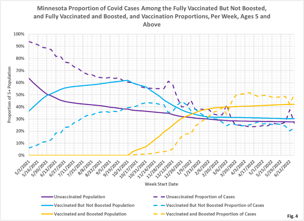
8. Fig. 4: This chart displays the proportion of the 5 and over
population who are unvaccinated (solid purple), vaccinated but not boosted
(solid blue), and vaccinated and boosted (solid gold). For each population
group we also display the proportion of cases each week (dashed lines of
same color). The way to interpret this chart is to compare the proportion of
breakthroughs to the proportion of vaccinations for each group. Whenever the
dashed breakthrough proportion line is below the solid vaccination line of
the same color, then that category is underrepresented for population, and
when the dashed line is above the solid line of the same color then that
category is overrepresented. For the week of 6/19/2022, similar to Fig. 2
and Fig.3, the proportions have returned to the prior trend after the
6/12 anomaly. The proportion of boosted cases (gold dashed curve) has been
over-represented since 3/6/2022, compared to the proportion of boosted
population (solid gold curve).
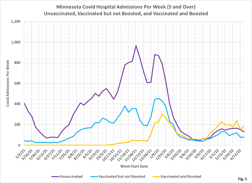
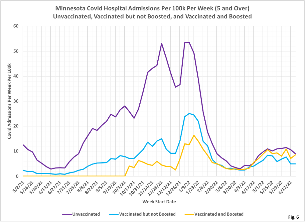
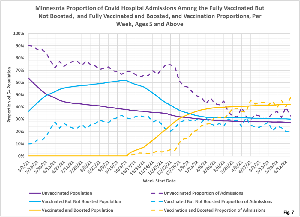
9. Fig. 5-7: These charts display the hospital admissions, hospital
admission rates per 100k, and hospital admissions proportions for the 5+ age
group, in an identical format to the case charts in Fig. 2 through Fig. 4.
Fig. 5 shows that the boosted as a group have the largest number of hospital
admissions. Fig. 6 shows that the unvaccinated and boosted had almost
identical admissions rates per 100k for the week of 6/19/2022, while the
vaccinated but not boosted had a lower rate of admission. Fig. 6 shows that
the vaccinated but not boosted are indeed under-represented blue dashed
curve lower than solid blue curve).
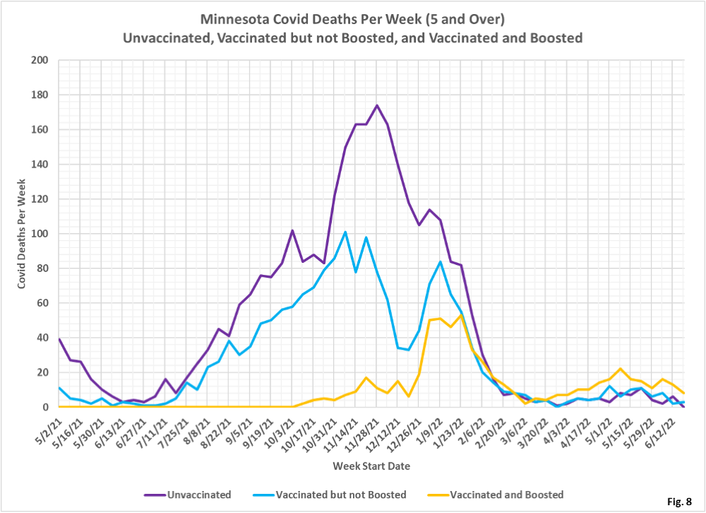
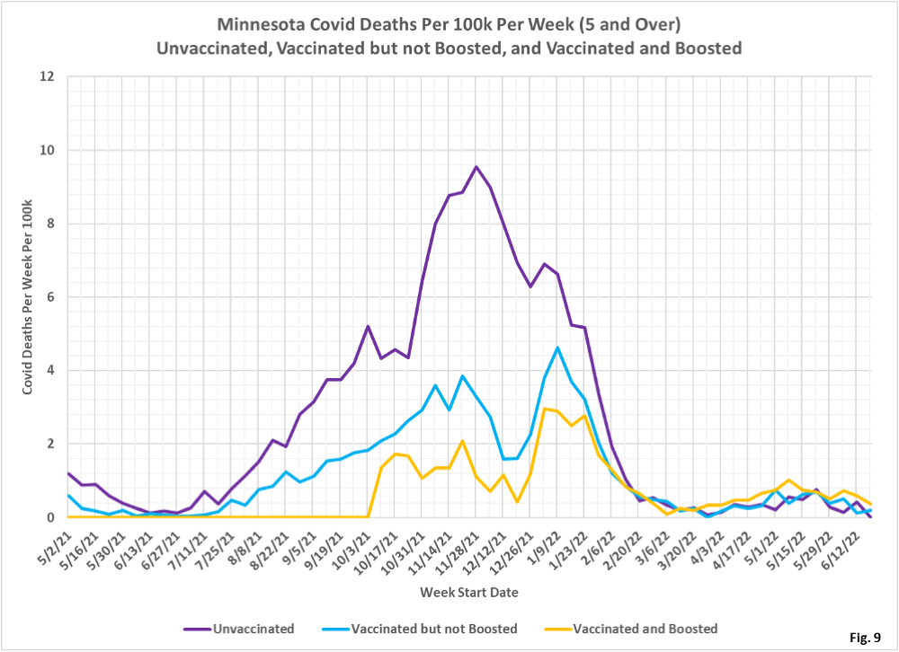
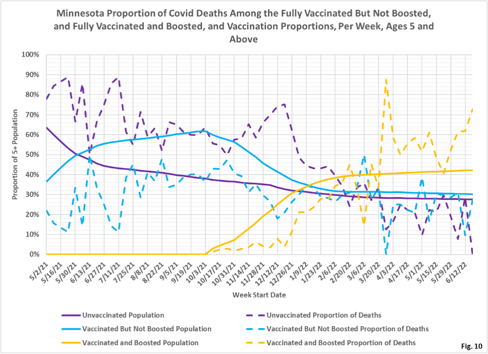
10. Fig. 8-10: These charts display the deaths, deaths rates per 100k,
and deaths proportions for the 5+ age group, in an identical format to the
case charts in Fig. 2 through Fig. 4. The most significant trend is that the
boosted have higher rates of death, although this is undoubtedly due to the
higher rates of booster shots among the older, more at risk populations.
11. MDH defines the fully vaccinated (what we have termed vaccinated but
not boosted) as those who have not received a booster after completing their
primary vaccination series, and had been vaccinated at least 14 days prior
to testing positive.
12. MDH defines the boosted as those who have received any additional
vaccination shots after completing their primary vaccination series, and
also received the booster at least 14 days prior to testing positive. In
addition, booster doses were only counted after 8/13/2021, the date the CDC
first began recommending booster shots.
