The general table of breakthrough events and charts of absolute numbers, population rate and proportion compared to proportion in the population. I get comments on Twitter from people who clearly can’t do math or read a chart, and who keep saying the boosters are wildly effective. They are full of BS to be blunt. The boosters appear to have been effective for a few weeks, but for the population as a whole they are worthless now in terms of either cases or hospitalizations. The boosted group has a higher population case rate than the only vaxed or the unvaxed group. The latter two sub-groups have basically identical rates. The hospitalization population rates show only minor divergence between sub-groups, with the unvaxed having a very slightly higher rate than the boosted, which is a little higher than the merely vaxed. PLEASE NOTE THE CHANGE IN THESE TRENDS OVER TIME, THE VERY, VERY, VERY CLEAR INDICATION THAT BOOSTER AND VAX EFFECTIVENESS HAS DECLINED IN A RELATIVELY SHORT PERIOD. The death rate is low enough that no real conclusions can likely be drawn. The failure of DOH to give data on prior infections, how many boosters a person got, when they got them, etc. makes it impossible to do a really first-rate analysis. But given DOH’s behavior during the epidemic, they don’t do that because it would hinder their pro-vax message. And the message is all they care about, not the actual data or effectiveness.
When we see the age group charts, the vax have some lingering effectiveness in some age groups, but that would mean, by basic math, that they have a negative effectiveness for others.


 Dave’s notes:
- This is an update of overall population breakthrough data that the Minnesota Department of Health (MDH) first published on 5/23/2022 and updated each Monday since. The breakthrough data is available here: https://www.health.state.mn.us/diseases/coronavirus/stats/vbt.html.
- We last published data tables and charts for the overall age group on 6/13/2022, for the data released by MDH on 6/23/2022, here: https://healthy-skeptic.com/2022/06/23/breakthrough-events-june-21/.
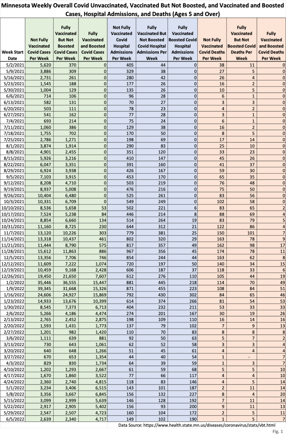
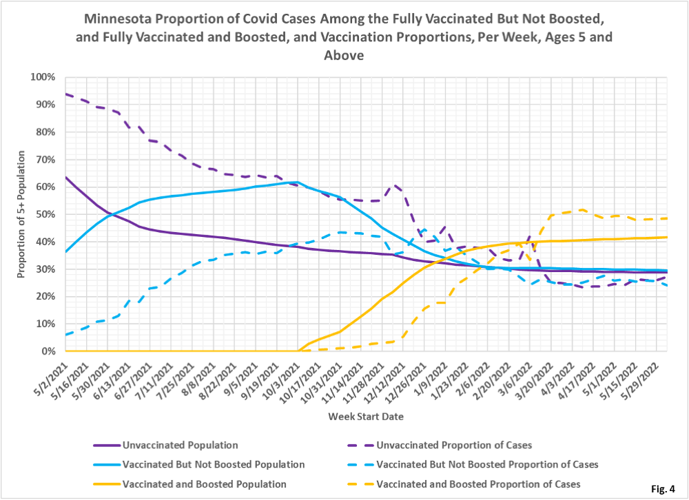
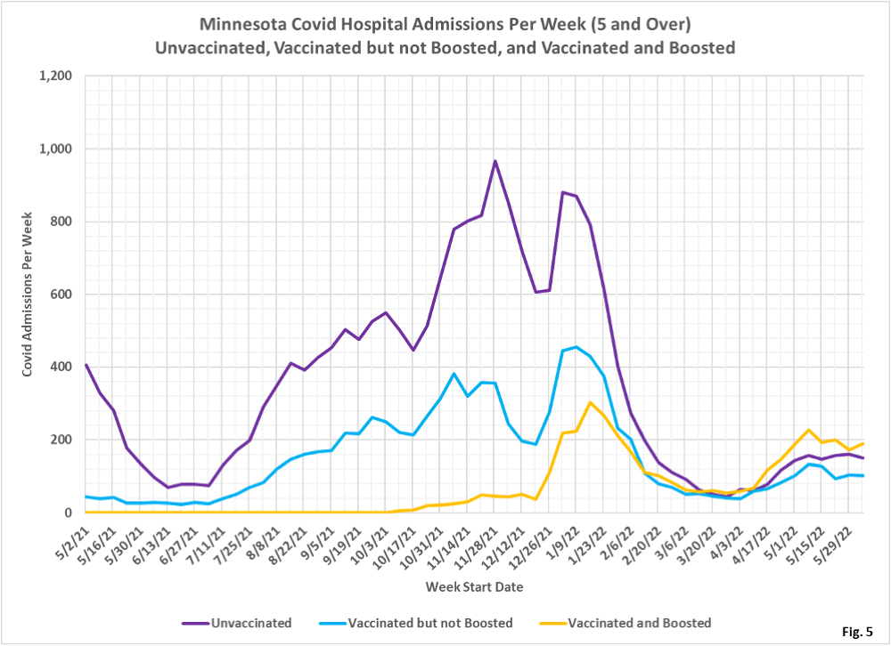
- The charts in Fig. 2 through 10 continue 3 charts for each type of event (cases, admissions, or deaths). The first chart for each type is the number of events each week. This chart helps illustrate the overall trend on the pandemic for the overall population, and what the impact is on society. The second chart is the rate of events per 100k each week. This chart displays the risk to an individual of each category at different times during the pandemic. The third chart for each type of event is the proportions of event compared to the proportion of the population type (unvaccinated, vaccinated, or boosted). This chart helps show whether or not vaccination or boosting is effective in reducing the impact of the pandemic, by comparing the proportion of events to the proportion of the population.
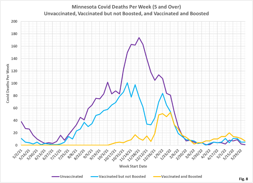
- Fig. 1: This table displays the total cases, hospital admissions, and deaths that occurred each week among the unvaccinated, vaccinated but not boosted, and vaccinated and boosted populations, with the latest week of 6/05/2022, one additional week compared to last week’s publication. This data is obtained from the data files vbtadultcirates.xlsx and vbtpedocirates.xlsx, available in the notes under the graphics on the MDH Vaccinate Breakthrough Weekly Update web page https://www.health.state.mn.us/diseases/coronavirus/stats/vbt.html. The week of 6/05/2022, last row of data shows, that cases, hospital admissions, and deaths continue to slowly decline.
- Fig. 2: This chart simply plots the cases among the unvaccinated, vaccinated but not boosted, and vaccinated and boosted populations each week, as found in Fig. 1. Note that the greatest number of cases continue to be among the boosted in the most recent weeks, in contrast to earlier in the pandemic when the unvaccinated and the unboosted had the largest number of cases earlier in the pandemic.
- Fig. 3: This chart displays the case rates per 100k for each group. Note that since March 2022 the highest case rates continue to be among the boosted, while the case rates among the unvaccinated and unboosted are almost identical, since 1/23/2022.
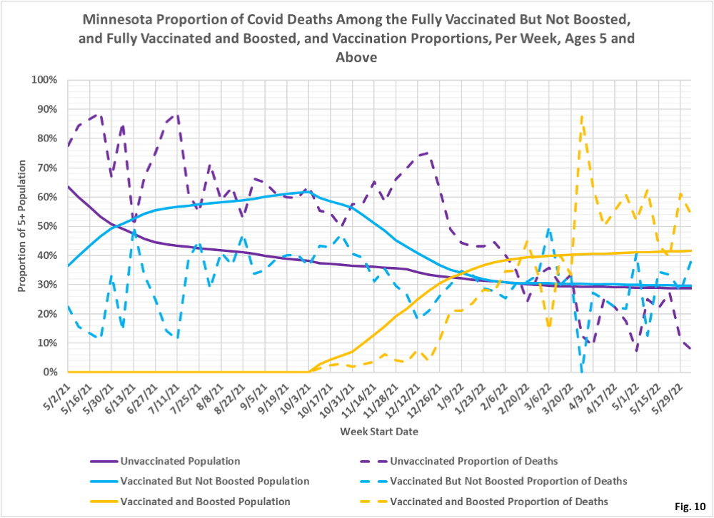
- Fig. 4: This chart displays the proportion of the 5 and over population who are unvaccinated (solid purple), vaccinated but not boosted (solid blue), and vaccinated and boosted (solid gold). For each population group we also display the proportion of cases each week (dashed lines of same color). The way to interpret this chart is to compare the proportion of breakthroughs to the proportion of vaccinations for each group. Whenever the dashed breakthrough proportion line is below the solid vaccination line of the same color, then that category is underrepresented for population, and when the dashed line is above the solid line of the same color then that category is overrepresented. For the week of 6/05/2022, for example, 42% of the population was vaccinated and boosted (solid gold line) while this group accounted for 49% of the cases (dashed gold line). We would interpret this to show that being boosted did not reduce an individual’s chances of testing positive for Covid for that week, when considering the overall population. This matches the case rates per 100k seen in Fig. 3, where the boosted have the highest rates of testing positive. On the other hand, on the left side of the chart showing older data, the dashed case proportions are significantly below the solid vaccination proportion lines, showing that vaccination and boosting did significantly reduce the chances of testing positive, while the unvaccinated proportion of cases (dashed purple line) is much higher than the unvaccinated population line (solid purple).
- Fig. 5-7: These charts display the hospital admissions, hospital admission rates per 100k, and hospital admissions proportions for the 5+ age group, in an identical format to the case charts in Fig. 2 through Fig. 4. Similar to cases, the boosted have a majority of the admissions (Fig. 5), however the admissions per 100k for the unvaccinated are slightly higher than the admissions per 100k of the boosted, while the vaccinated but not boosted have the lowest admission rates (Fig. 6). Fig. 7 shows that admissions among the unvaccinated have been disproportionately high throughout the pandemic until quite recently, where the proportion of admissions now are close to the same as the proportion of population for each group, meaning that for the overall population admissions are close to neutral as to vaccination status.
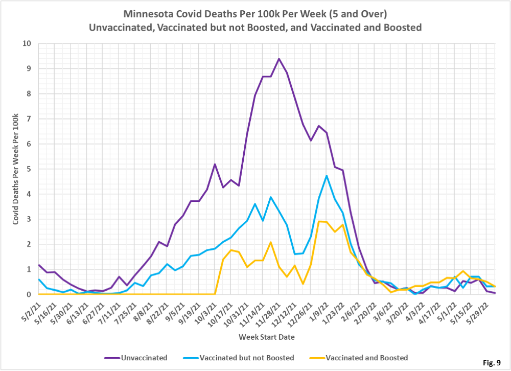
- Fig. 8-10: These charts display the deaths, deaths rates per 100k, and deaths proportions for the 5+ age group, in an identical format to the case charts in Fig. 2 through Fig. 4. Deaths have now decreased, with the boosted having the largest number of deaths for the week of 6/05/2022 (Fig. 8), while Fig. 9 shows that the unvaccinated have the lowest rate of deaths per 100k for the week of 6/05/2022. Fig. 10 shows that deaths proportion are highly variable, especially in recent weeks when there are relatively few deaths. Fairly consistently since 3/27/2022 the proportion of boosted deaths has exceeded the proportion that is boosted, and the unvaccinated proportion of deaths is lower than the proportion of the population that is unvaccinated.
- MDH defines the fully vaccinated (what we have termed vaccinated but not boosted) as those who have not received a booster after completing their primary vaccination series, and had been vaccinated at least 14 days prior to testing positive.
- MDH defines the boosted as those who have received any additional vaccination shots after completing their primary vaccination series, and also received the booster at least 14 days prior to testing positive. In addition, booster doses were only counted after 8/13/2021, the date the CDC first began recommending booster shots.
