The epidemic of the unvaccinated continues apace–oh wait, no it doesn’t, looks more like an epidemic of the vaxed. Still indications, as you will see more clearly in the age groups, that vaccination protects against serious disease, at least for some period of time. You will also note that being vaxed and boosted is not protecting the elderly against death compared to other groups.
Dave’s notes:
- This post is an update to the breakthrough data table and charts published on 7/25/22 here: https://healthy-skeptic.com/
2022/07/25/breakthrough- events-july-21-overall- population/ . This week’s update adds data for the week ending 7/03/2022, newly published by the Minnesota Department of Health (MDH) on 7/28/2022. In addition, there are relatively minor updates to prior weeks as well. - The breakthrough data files are available here, https://www.health.state.mn.
us/diseases/coronavirus/stats/ vbt.html , in the notes under the graphic images. - The charts in Fig. 2 through 10 contain 3 charts for each type of event (cases, admissions, or deaths). The first chart for each type is the number of events each week, illustrating in raw numbers the trend on the pandemic for the overall population, and the impact on society of each sub-group. The second chart is the rate of events per 100k each week, displaying the risk to an individual of the each category at different times during the pandemic. The third chart for each type of event is the proportions of event compared to the proportion of the population type (unvaccinated, vaccinated, or boosted). This chart helps show whether or not vaccination or boosting is effective in reducing the impact of the pandemic, by comparing the proportion of events to the proportion of the population.
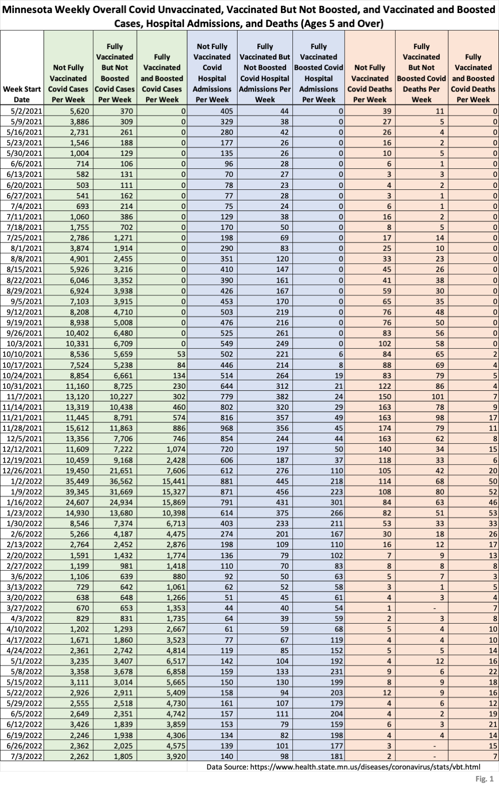
- Fig. 1: This table displays the total cases, hospital admissions, and deaths that occurred each week among the unvaccinated, vaccinated but not boosted, and vaccinated and boosted populations. The week of 7/03/2022 has been added, one additional week compared to last week’s publication. It is quite striking how Covid deaths are mainly occurring in the vaccinated and boosted population over the past several months, which is surely due to the very high percentage of the elderly population which is vaccinated and boosted.
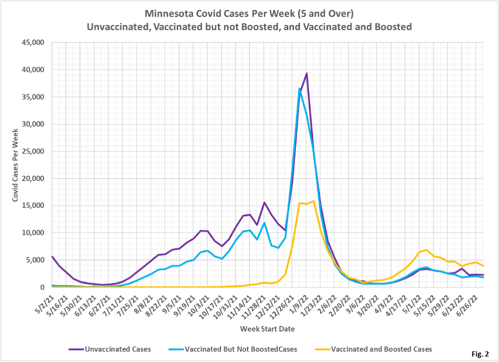
- Fig. 2: This chart simply plots the cases among the unvaccinated, vaccinated but not boosted, and vaccinated and boosted populations each week, as found in Fig. 1. Note that the sharp increase in unvaccinated cases (purple curve) for 6/12/2022 has yet to be revised away. It seems likely that this discontinuity is an artifact of MDH’s data processing, and not a real world behavior of Covid cases.
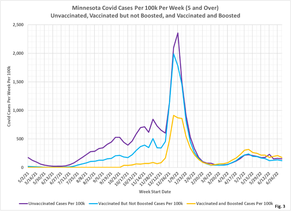
- Fig. 3: This chart displays the case rates per 100k for each group. Similar to the cases in Fig. 2, the rates per 100k have returned to trend after the anomalous increase the unvaccinated the week of 6/12/2022. Most importantly, note that the a vaccinated and boosted individual has the highest rate of testing positive for Covid, and this has been true since 3/13/2022.
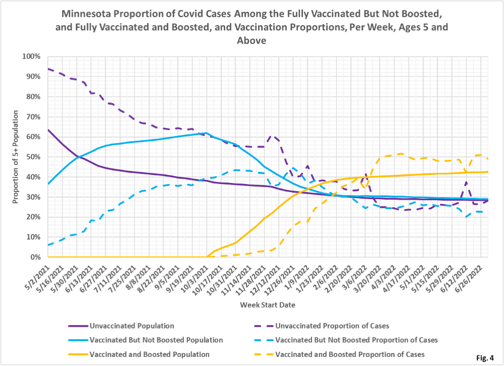
- Fig. 4: This chart displays the proportion of the 5 and over population who are unvaccinated (solid purple), vaccinated but not boosted (solid blue), and vaccinated and boosted (solid gold). For each population group we also display the proportion of cases each week (dashed lines of same color). The way to interpret this chart is to compare the proportion of breakthroughs to the proportion of vaccinations for each group. Whenever the dashed breakthrough proportion line is below the solid vaccination line of the same color, then that category is underrepresented for population, and when the dashed line is above the solid line of the same color then that category is overrepresented. For the week of 7/03/22 the vaccinated and boosted made up 43% of the overall 5+ population but accounted for 49% of the overall cases. The proportion of boosted cases (gold dashed curve) have been over-represented since 3/13/2022, compared to the proportion of boosted population (solid gold curve).
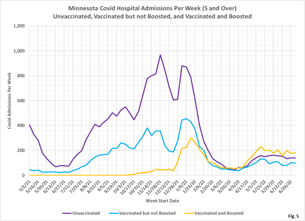
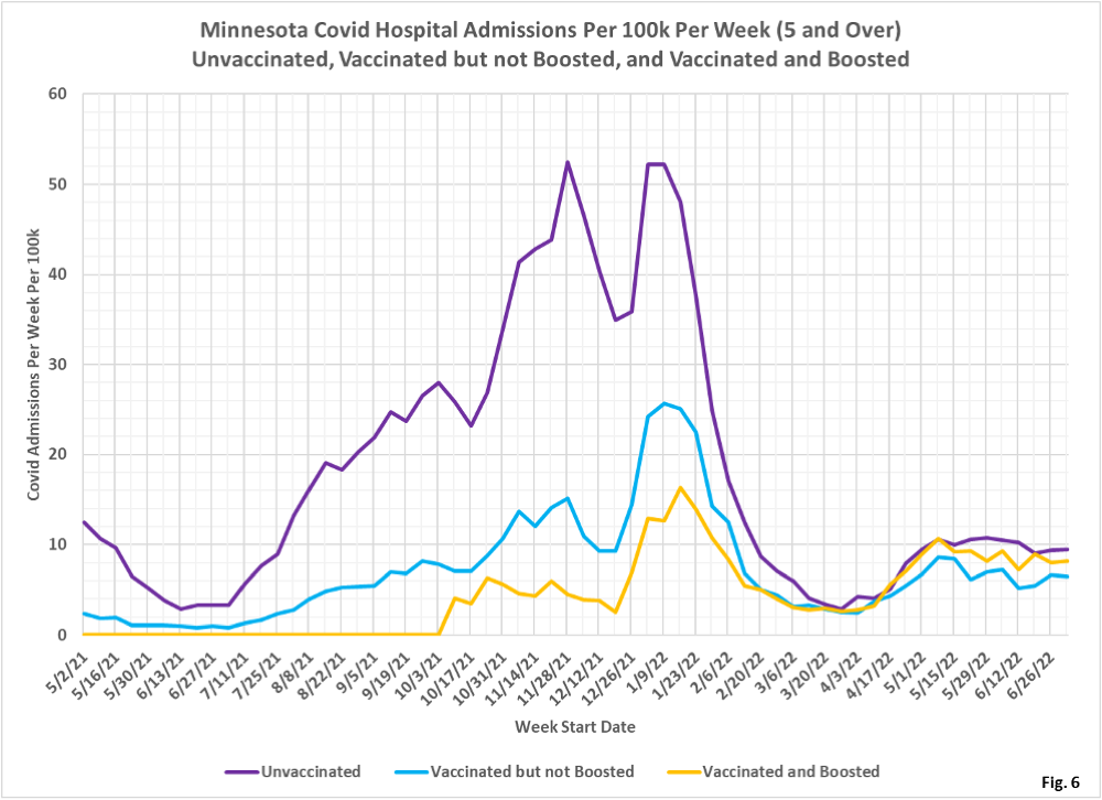
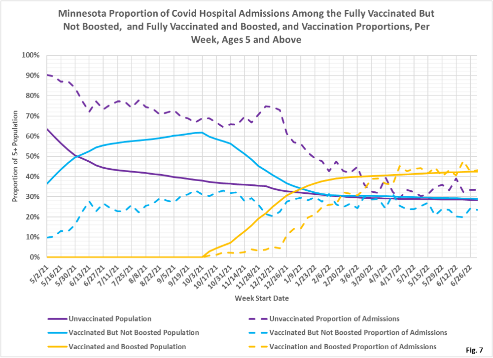
- Fig. 5-7: These charts display the hospital admissions, hospital admission rates per 100k, and hospital admissions proportions for the 5+ age group, in an identical format to the case charts in Fig. 2 through Fig. 4. Fig. 5 shows that the boosted as a group have the largest number of hospital admissions. Fig. 6 shows that the unvaccinated had the highest rate of hospital admission for the week of 7/03/22, while the vaccinated but not boosted had the lowest rate of admission. Fig. 6 shows that the vaccinated but not boosted are indeed under-represented (blue dashed curve lower than solid blue curve).
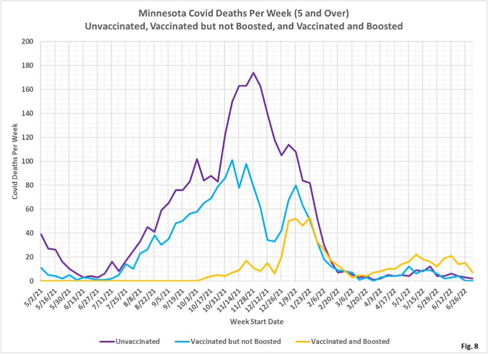
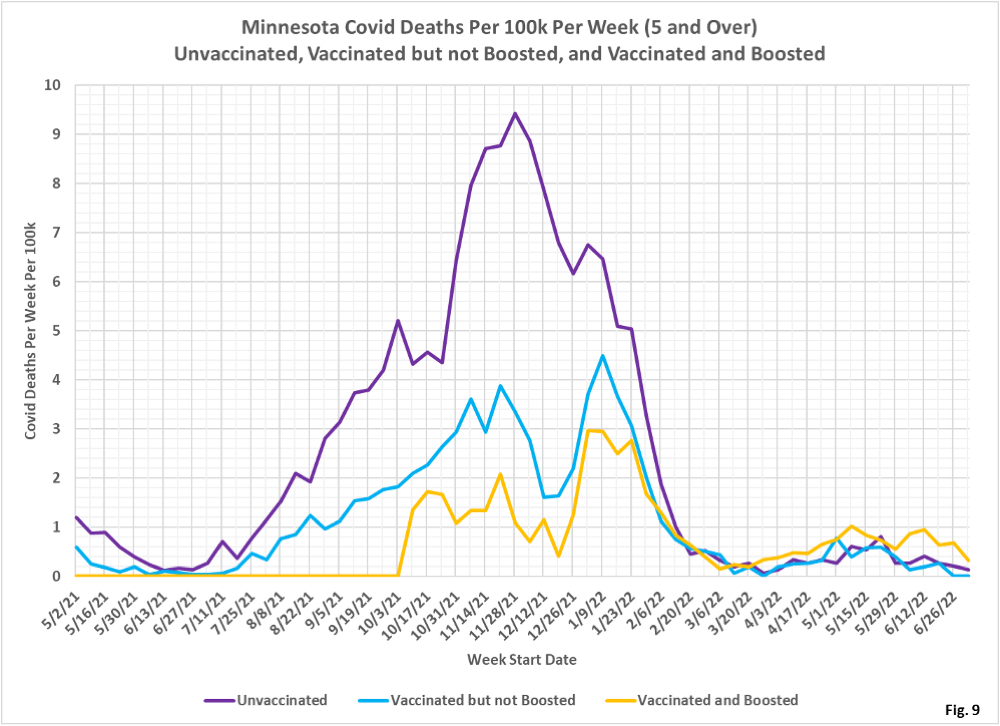
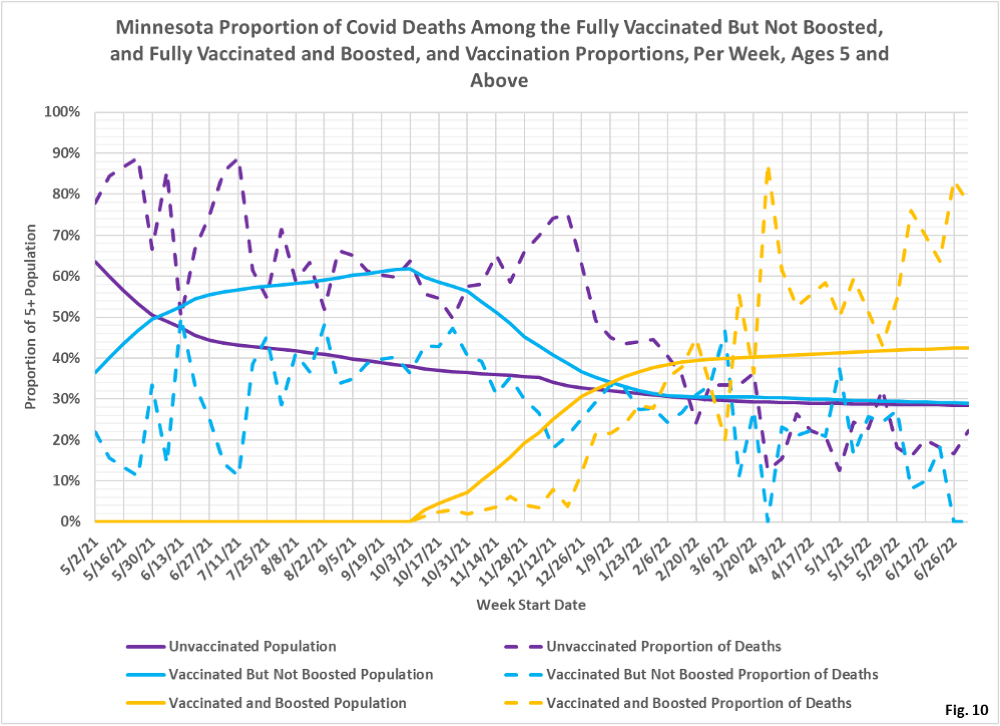
- Fig. 8-10: These charts display the deaths, deaths rates per 100k, and deaths proportions for the 5+ age group, in an identical format to the case charts in Fig. 2 through Fig. 4. The most significant trend is that the boosted account for the greatest number of deaths (Fig. 8) and have the highest rates of death (Fig. 9), although this is undoubtedly due to the higher rates of booster shots among the older, more at risk populations. For the week of 7/03/2022, the boosted make up 43% of the overall population but account for 78% of the weekly deaths (Fig. 10).
- MDH defines the fully vaccinated (what we have termed vaccinated but not boosted) as those who have not received a booster after completing their primary vaccination series, and had been vaccinated at least 14 days prior to testing positive.
- MDH defines the boosted as those who have received any additional vaccination shots after completing their primary vaccination series, and also received the booster at least 14 days prior to testing positive. In addition, booster doses were only counted after 8/13/2021, the date the CDC first began recommending booster shots.
