Another week dominated by breakthrough cases. Age group charts will be published every other week, but you get the general picture from Dave Dixon’s excellent work here.

 Dave’s notes:
- This is now our third post using the new breakthrough data that the Minnesota Department of Health (MDH) first published on 5/23/2022 and updated each Monday since. The breakthrough data is available here: https://www.health.state.mn.us/diseases/coronavirus/stats/vbt.html.
- We last published data tables and charts for the overall age group, what we call Breakthroughs Part 1, on 6/02/2022 here: https://healthy-skeptic.com/2022/06/02/breakthrough-events-may-31-part-1/ . The general breakthrough trends from that post continue, but at a lower overall rate of Covid activity as the last surge in cases wanes.
- The charts in Fig. 2 through 10 continue 3 charts for each type of event (cases, admissions, or deaths). The first chart for each type is the number of events each week. This chart helps illustrate the overall trend on the pandemic for the overall population, and what the impact is on society. The second chart is the rate of events per 100k each week. This chart displays the risk to an individual of the each category at different times during the pandemic. The third chart for each type of event is the proportions of event compared to the proportion of the population type (unvaccinated, vaccinated, or boosted). This chart helps show whether or not vaccination or boosting is effective in reducing the impact of the pandemic, by comparing the proportion of events to the proportion of the population.
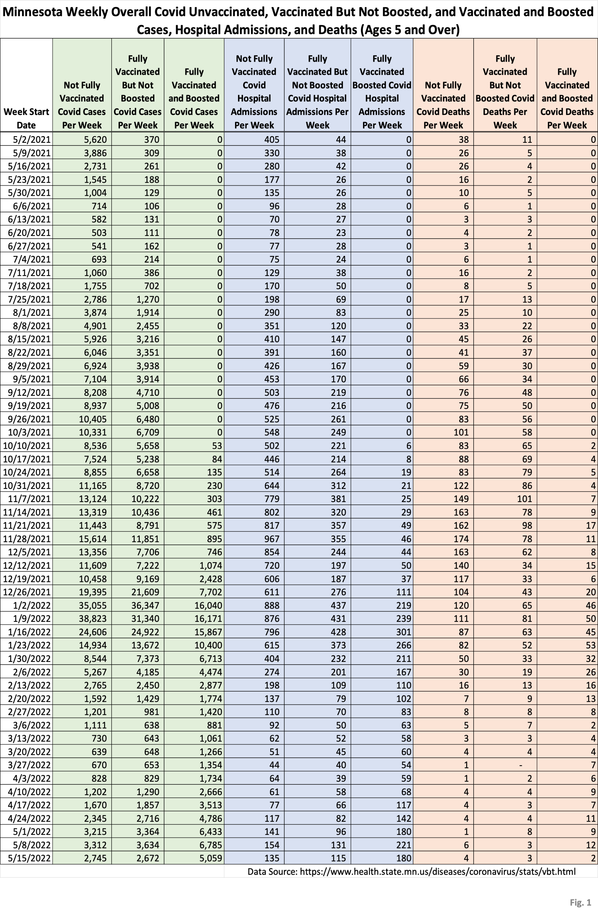
- Fig. 1: This table displays the total cases, hospital admissions, and deaths that occurred each week among the unvaccinated, vaccinated but not boosted, and vaccinated and boosted populations, with the latest week of 5/15/2022, one additional week compared to last week’s publication. This data is obtained from the data files vbtadultcirates.xlsx and vbtpedocirates.xlsx, available in the notes under the graphics on the MDH Vaccinate Breakthrough Weekly Update web page https://www.health.state.mn.us/diseases/coronavirus/stats/vbt.html. The week of 5/15/2022 was past the peak in cases in Minnesota, and the last row of data shows the first decline in several weeks in the numbers of cases and admissions for all of the population subgroups, while deaths remain generally low.
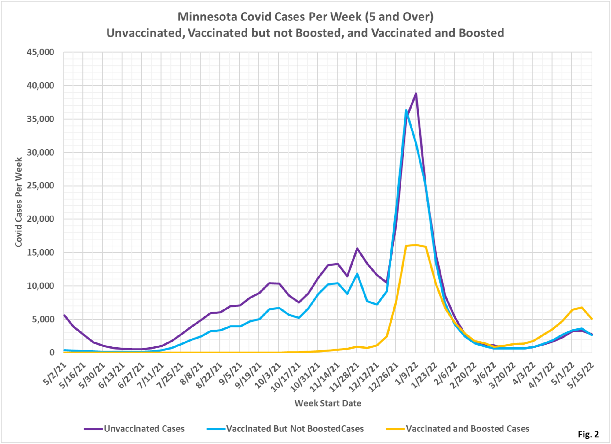
- Fig. 2: This chart simply plots the cases among the unvaccinated, vaccinated but not boosted, and vaccinated and boosted populations each week, as found in Fig. 1. Note that the greatest number of cases are among the boosted in the most recent weeks, in contrast to earlier in the pandemic when the unvaccinated and the unboosted had the largest number of cases.
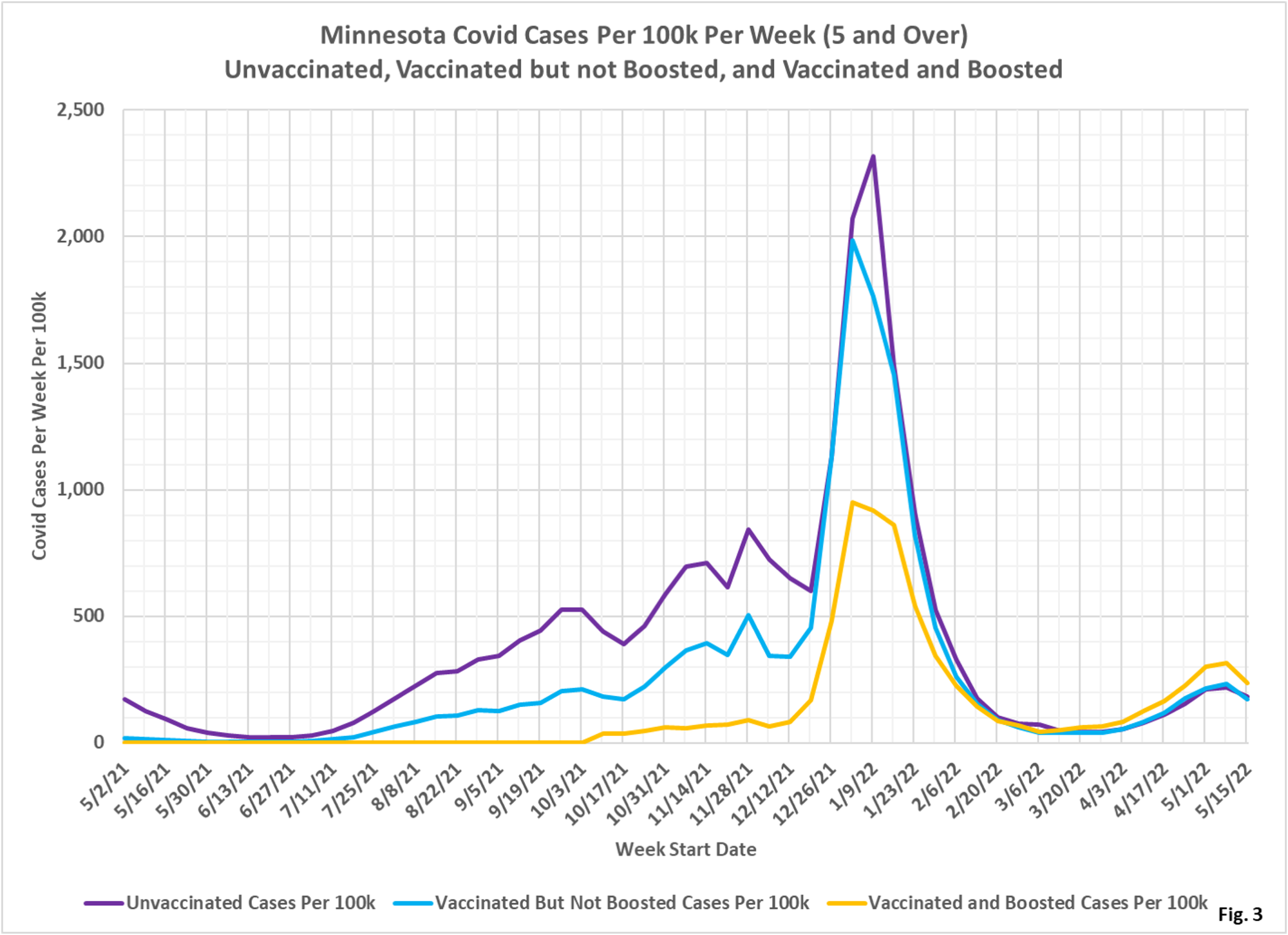
- Fig. 3: This chart displays the case rates per 100k for each group. Note that since March 2022 the highest case rates continue to be among the boosted.
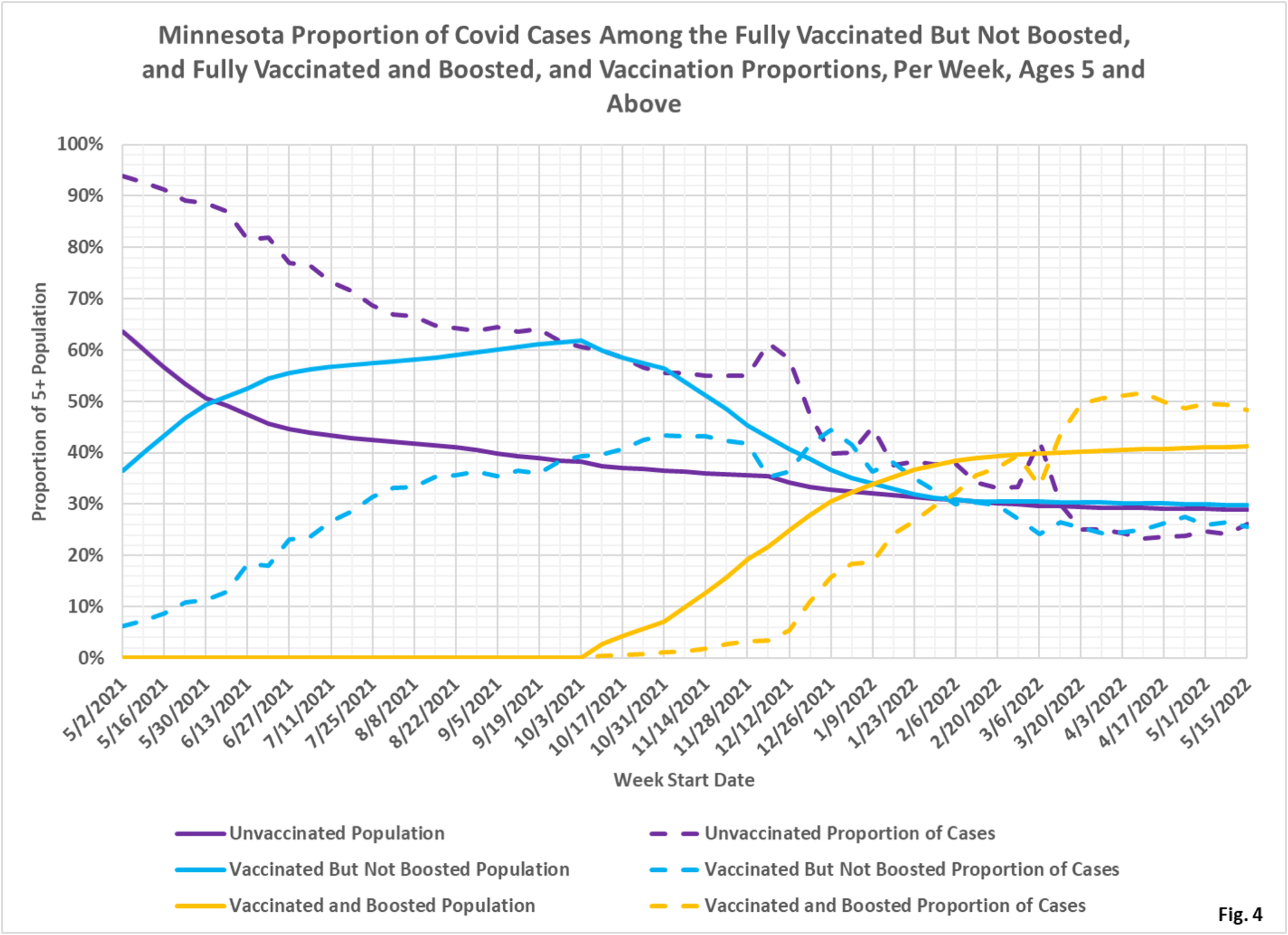
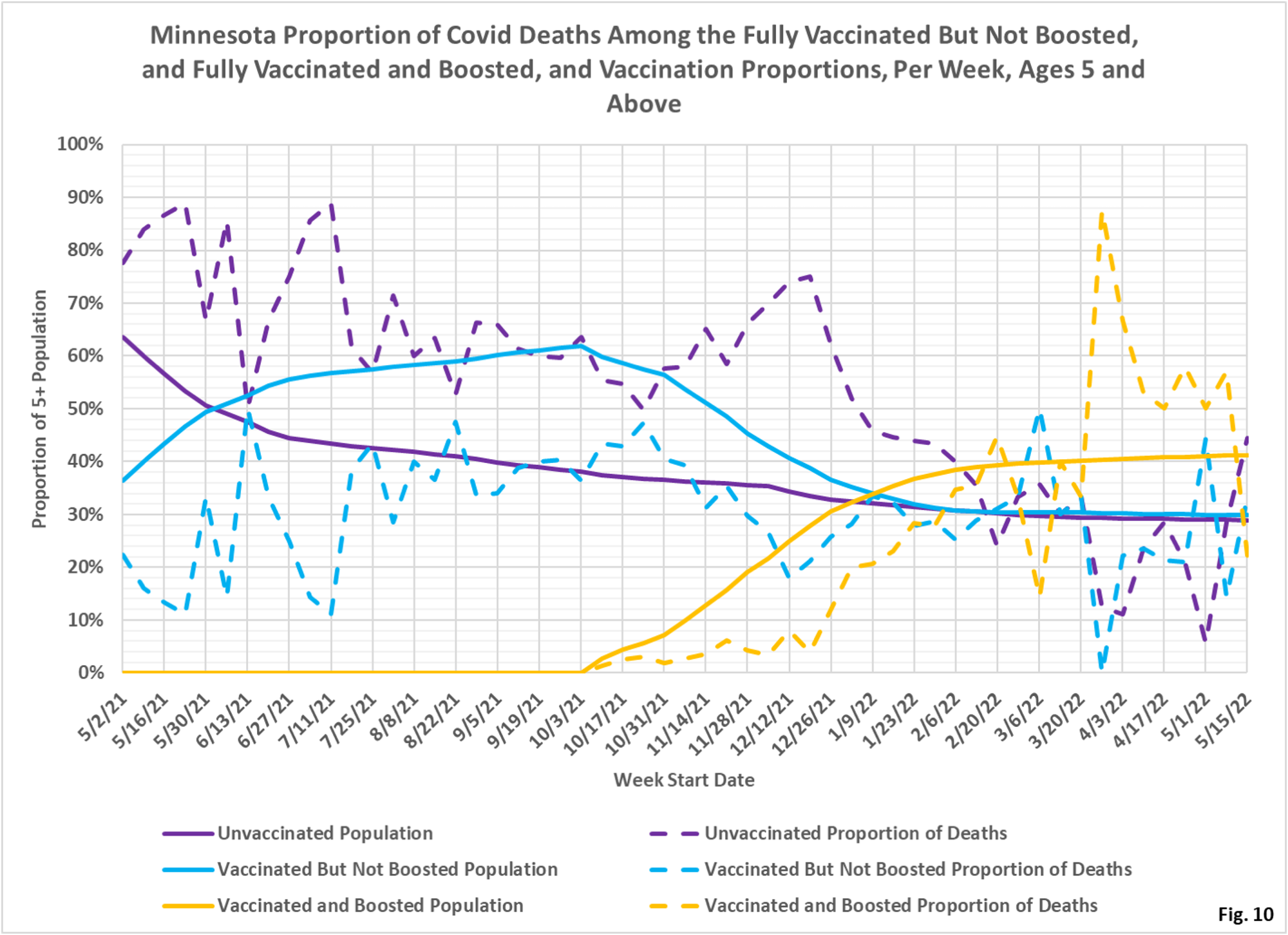
- Fig. 4: This chart displays the proportion of the 5 and over population who are unvaccinated (solid purple), vaccinated but not boosted (solid blue), and vaccinated and boosted (solid gold). For each population group we also display the proportion of cases each week (dashed lines of same color). The way to interpret this chart is to compare the proportion of breakthroughs to the proportion of vaccinations for each group. Whenever the dashed breakthrough proportion line is below the solid vaccination line of the same color, then that category is underrepresented for population, and when the dashed line is above the solid line of the same color then that category is overrepresented. For the week of 5/15/2022, for example, 41% of the population was vaccinated and boosted (solid gold line) while this group accounted for 49% of the cases (dashed gold line). We would interpret this to show that being boosted did not reduce an individual’s chances of testing positive for Covid for that week, when considering the overall population. On the other hand, on the left side of the chart showing older data, the dashed case proportions are significantly below the solid vaccination proportion lines, showing that vaccination and boosting did significantly reduce the chances of testing positive, while the unvaccinated proportion of cases (dashed purple line) is much higher than the unvaccinated population line (solid purple).
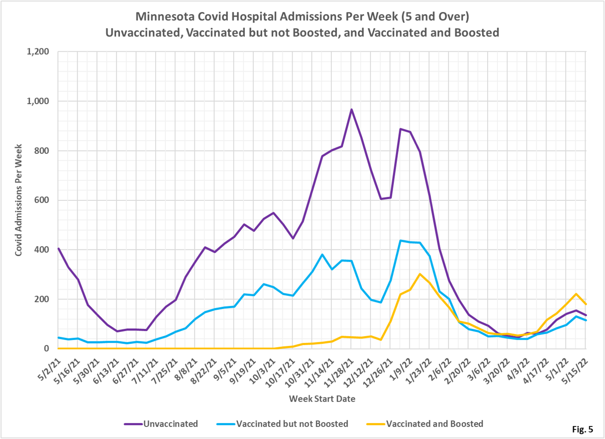
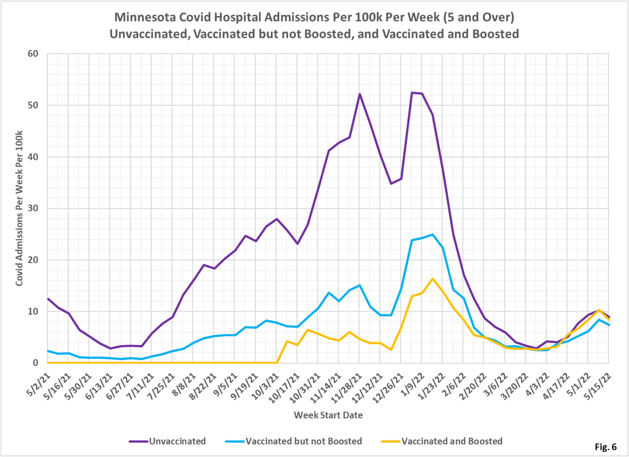
- Fig. 5-7: These charts display the hospital admissions, hospital admission rates per 100k, and hospital admissions proportions for the 5+ age group, in an identical format to the case charts in Fig. 2 through Fig. 4. Similar to cases, the boosted have a majority of the admissions (Fig. 5), however the admissions per 100k for the unvaccinated are close to equal the admissions of the boosted (Fig. 6). Fig. 7 shows that admissions among the unvaccinated have been disproportionately high throughout the pandemic until quite recently, where the proportion of admissions now are close to the same as the proportion of population for each group, meaning that for the overall population admissions are neutral as to vaccination status.
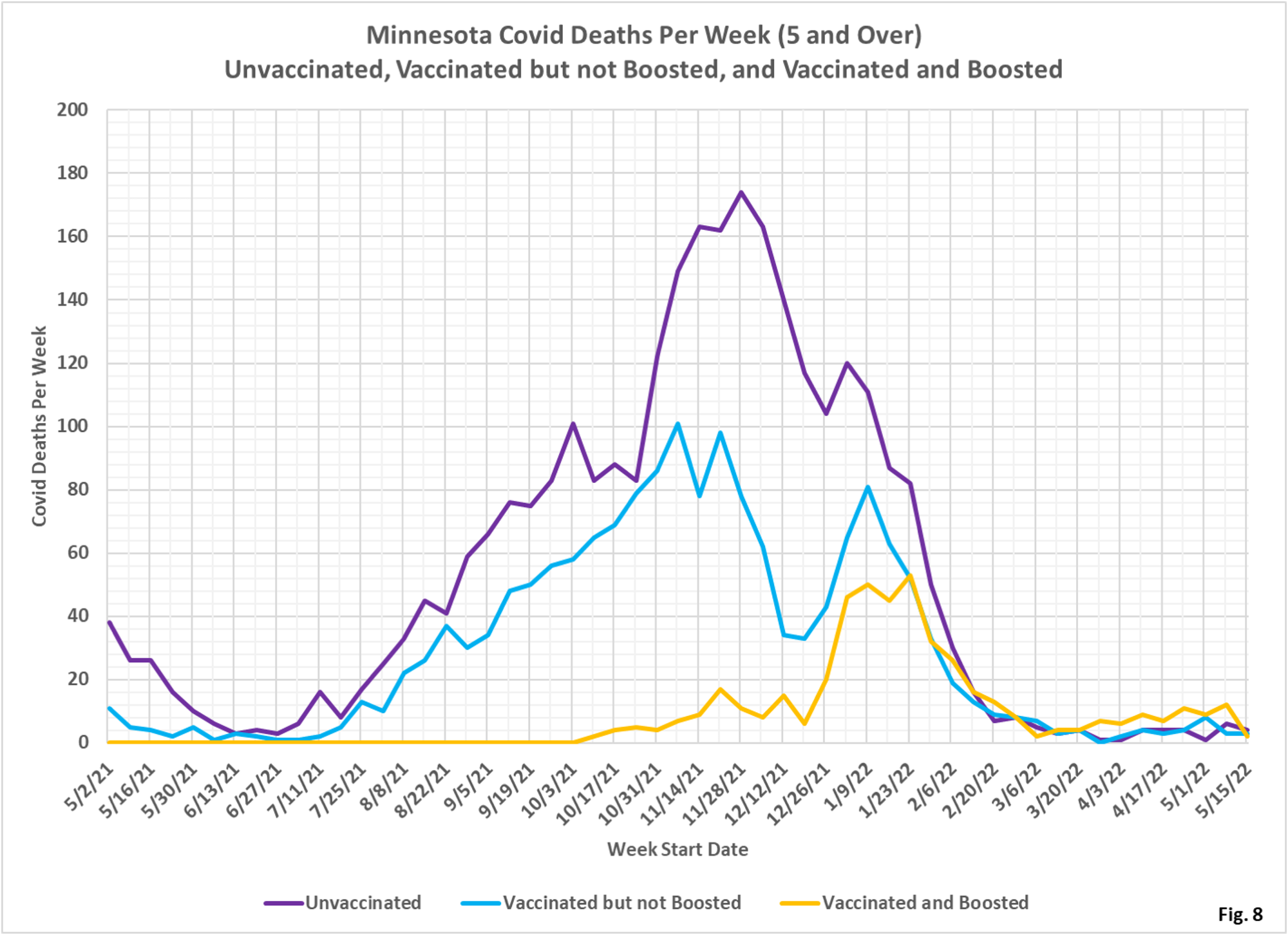
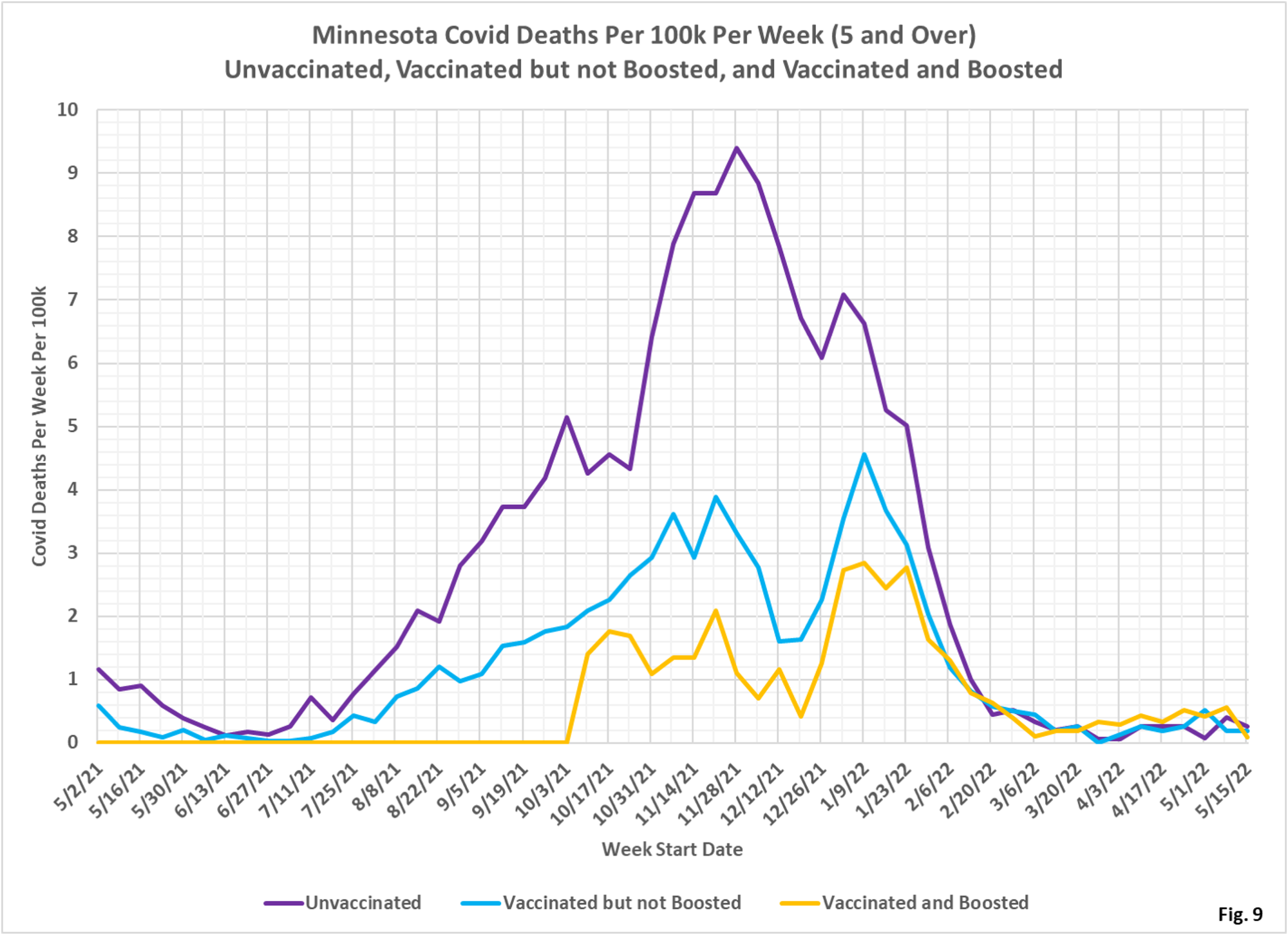
- Fig. 8-10: These charts display the deaths, deaths rates per 100k, and deaths proportions for the 5+ age group, in an identical format to the case charts in Fig. 2 through Fig. 4. Similar to cases, the boosted have had the greatest number of deaths each week in the past 2 months before falling to very low levels in the last couple weeks (Fig. 8), similar to the deaths per 100k (Fig. 9). Fig. 10 shows that deaths proportion are highly variable, especially in recent weeks when there are relatively few deaths.
- MDH defines the fully vaccinated (what we have termed vaccinated but not boosted) as those who have not received a booster after completing their primary vaccination series, and had been vaccinated at least 14 days prior to testing positive.
- MDH defines the boosted as those who have received any additional vaccination shots after completing their primary vaccination series, and also received the booster at least 14 days prior to testing positive. In addition, booster doses were only counted after 8/13/2021, the date the CDC first began recommending booster shots.

With all the data coming in on the limitations of the Covid shots, it is absolute insanity that many industries and institutions are still enforcing vaccine mandates. How can these illogical mandates still stand in the face of the overwhelming evidence?
I have never been a fan of mandates and lack of protection against transmission makes them even dumber
Interesting facts, there may be a bit of endogeneity here. People with frail health are more likely to get fully vaccinated and booster shots. That possibility is unlikely to explain the time pattern. Not trusting the cause of death reporting, I am more interested in the number of cases. Is there a way of scaling cases by number of tests? There are a lot of moving parts here. It would be interesting to determine what the tail looks like from how many people are getting tested and seeing if the vaccination rate predicts testing. Other questions like this.
The state stopped reporting number of tests some weeks ago. not sure why. So it is hard to know total number of tests–including home testing, or cases. Some people in very frail health cannot be vaxed. but many elderly in LTC aren’t really dying of CV anyway. The average life expectancy of an LTC resident is under a year. The totality of their health issues leads to their death and either CV-19 just happens to be the last straw or they had an incidental test sometime prior to death. Attributing it to CV in most cases is misleading