The state’s new way of presenting breakthrough events is clearly designed to try to convince people that there is still strong effectiveness against serious disease. I think they have given up on showing any real effectiveness against infection. The tables and charts below tell a little different story, with even effectiveness against hospitalization or death declining in a few months. I will say again, in case anyone at DOH is paying attention, it should add data on prior infections to these tables. That would be very enlightening in understanding true associations.
 Dave’s notes:
- In summary, it can be concluded from the following charts that being boosted no longer seems to reduce an individual’s chances of testing positive for Covid, being hospitalized for Covid, or dying from Covid. This conclusion is supported by the rates per 100k charts (the second of three charts for each event type) and the proportion charts (the third of three charts of each type). This is based on the overall blended population in Minnesota, but when we post the age group version of these charts we will see that boosting does appear to offer benefits for the 65+ age group.
- This is now our second post using the new breakthrough data that the Minnesota Department of Health (MDH) first published on 5/23/2022 and revised on 5/31/2022. The breakthrough data is available here: https://www.health.state.mn.us/diseases/coronavirus/stats/vbt.html.
- We last published data tables and charts for the overall age group, what we call Breakthroughs Part 1 (Breakthroughs Part 2 are for individual age groups), on 5/25/2022 here: https://healthy-skeptic.com/2022/05/25/breakthrough-events-may-23-part-1/. Compared to that post, the new post has been revised in several ways. First, we have changed the colors for the different categories to match those used on the MDH breakthrough web page. Second, we are now also showing the unvaccinated data on the proportion charts. Third, we have added charts for the rates per 100k for each of the types of chart.
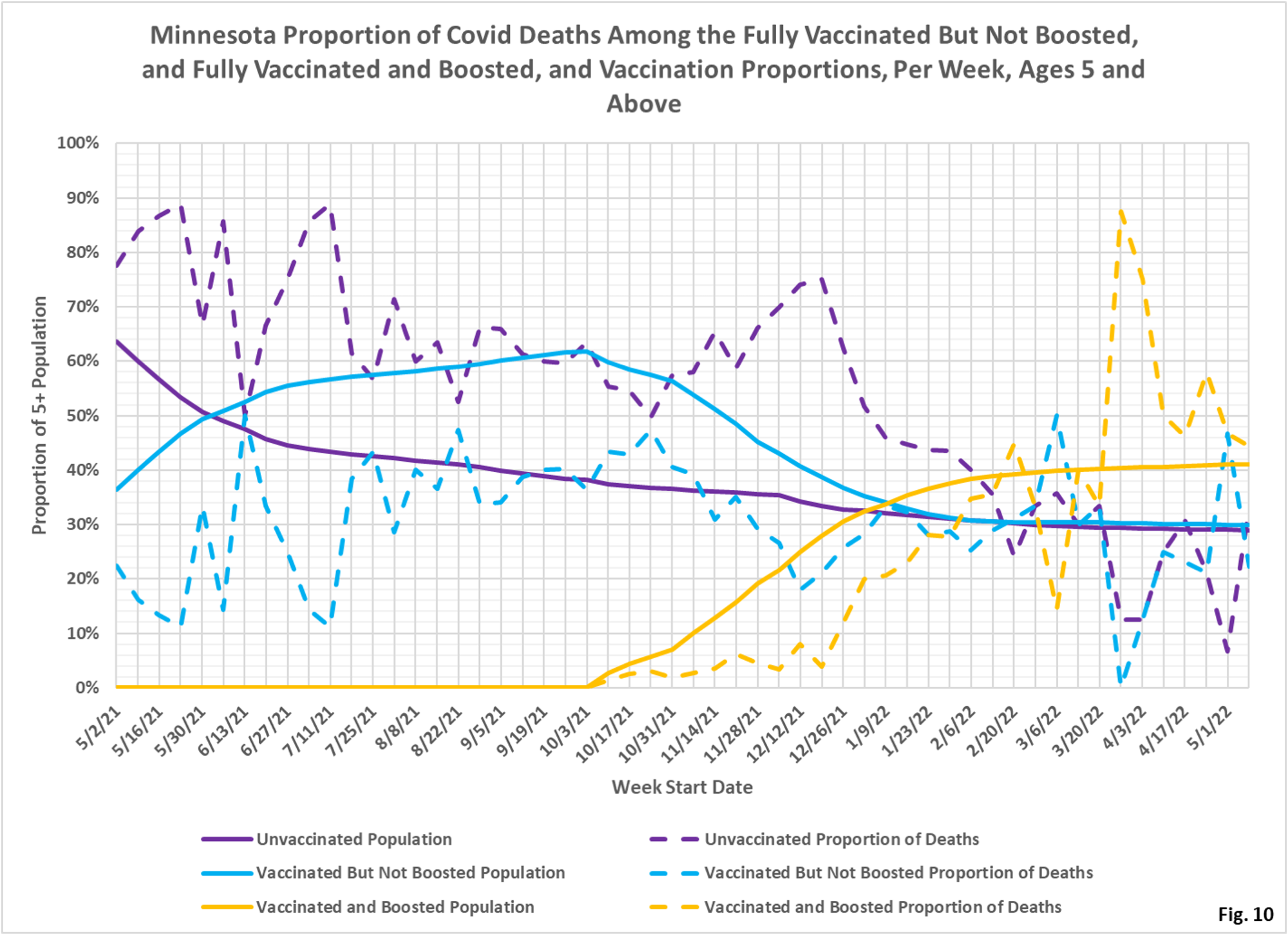
- There are several things to think about in interpreting these charts. For each type of event (cases, admissions, or deaths) there are three charts. The first chart for each type is the number of events each week. This chart helps illustrate the overall trend on the pandemic for the entire population, and what the impact is on society. The second chart is the rate of events per 100k each week. This chart displays the risk to an individual of the each category at different times during the pandemic. The third chart for each type of event is the proportions of event compared to the proportion of the population type (unvaccinated, vaccinated, or boosted). This chart helps show whether or not vaccination or boosting is effective in reducing the impact of the pandemic, by comparing the proportion of events to the proportion of the population.
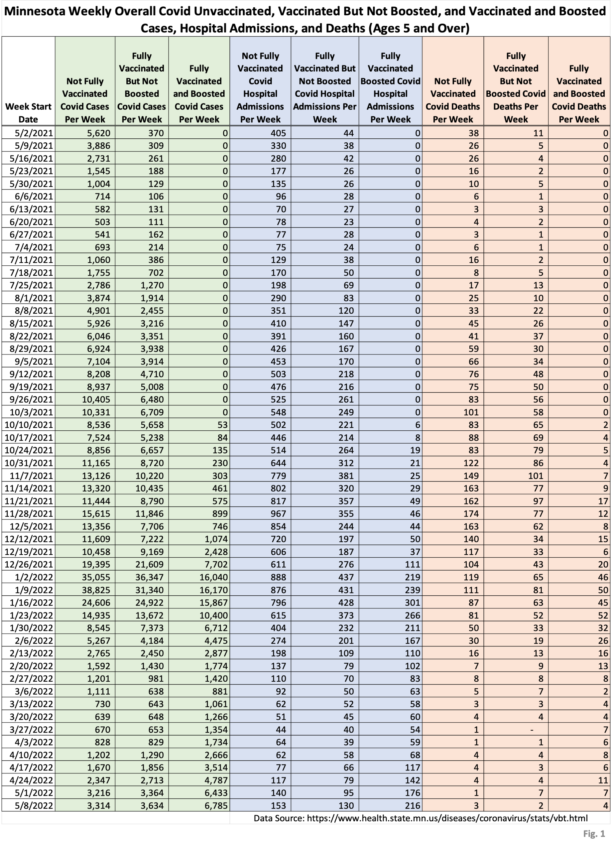
- Fig. 1: This table displays the total cases, hospital admissions, and deaths that occurred each week among the unvaccinated, vaccinated but not boosted, and vaccinated and boosted populations, with the latest week of 5/08/2022, one additional week compared to last week’s publication. This data is obtained from the data files vbtadultcirates.xlsx and vbtpedocirates.xlsx, available in the notes under the graphics on the MDH Vaccinate Breakthrough Weekly Update web page https://www.health.state.mn.us/diseases/coronavirus/stats/vbt.html. The week of 5/8/2022 was the week of the peak in cases in Minnesota, and the last row of data shows higher levels of cases and admissions for all of the population subgroups, while deaths remain generally low.
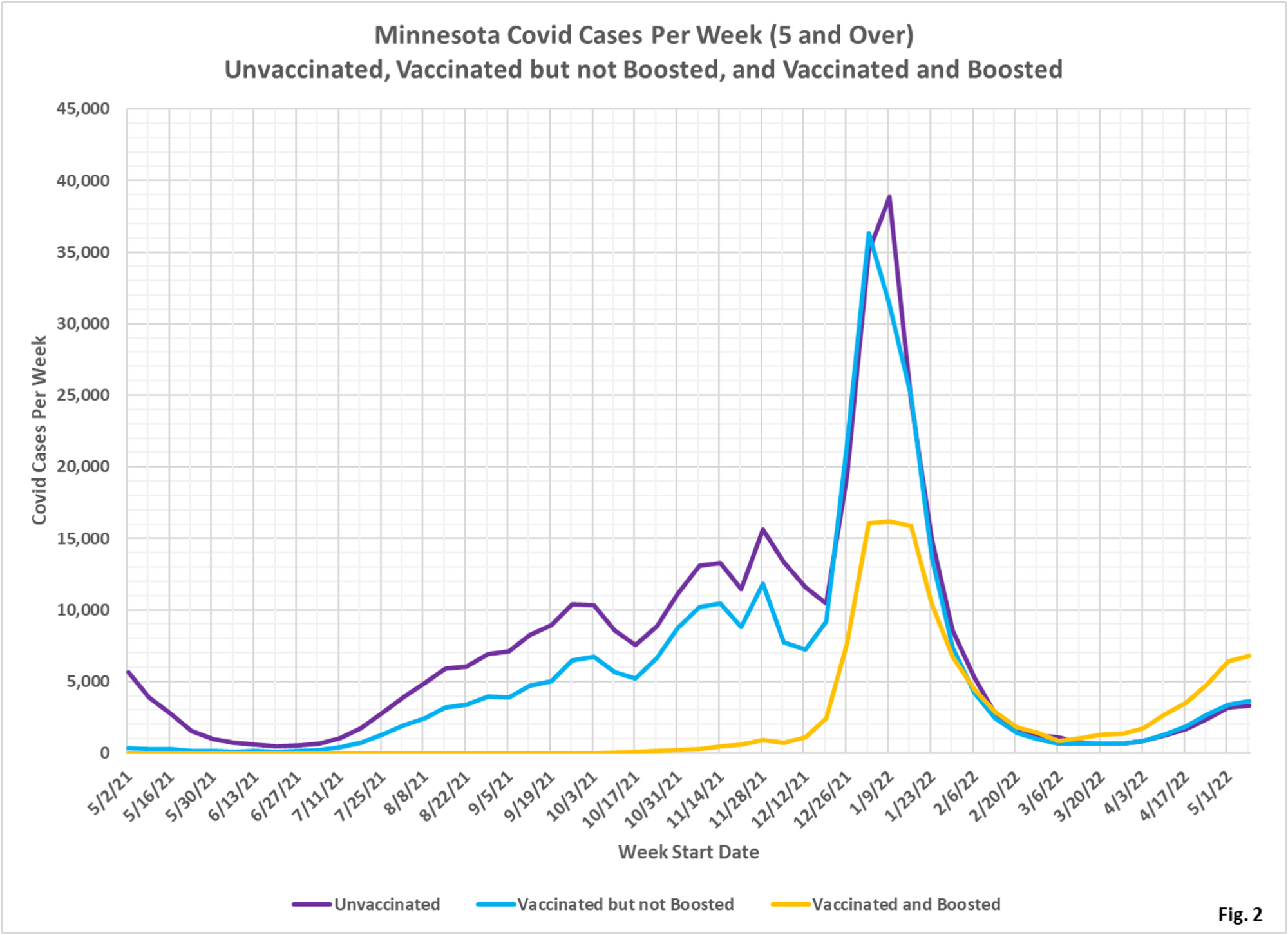
- Fig. 2: This chart simply plots the cases among the unvaccinated, vaccinated but not boosted, and vaccinated and boosted populations each week, as found in Fig. 1. Note that it appears that cases are peaking, as expected since we already know the peak in cases occurred on 5/11/2022. Note that the greatest number of cases are among the boosted in the most recent weeks, in contrast to earlier in the pandemic when the unvaccinated and the unboosted had the largest number of cases.
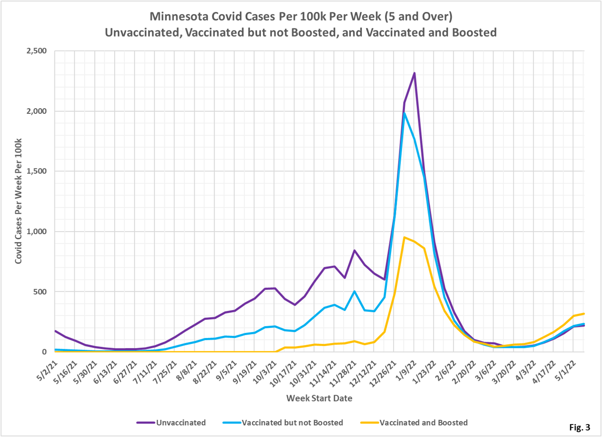
- Fig. 3: This chart displays the case rates per 100k for each group. Note that since March 2022 the highest case rates are among the boosted.
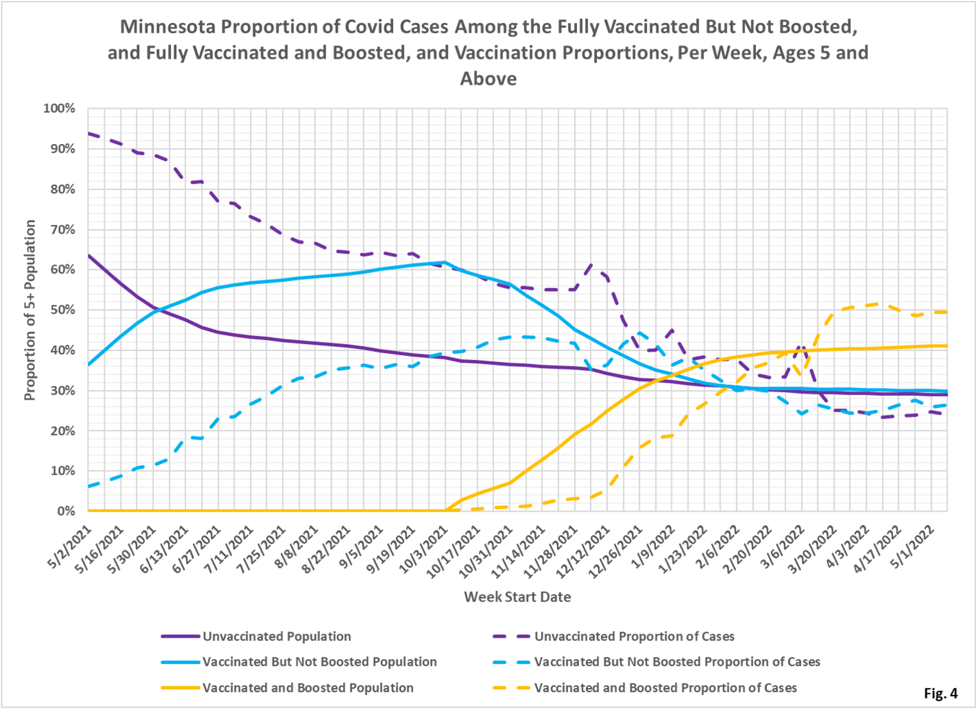
- Fig. 4: This chart is confusing, but it displays the proportion of the 5 and over population who are unvaccinated (solid purple), vaccinated but not boosted (solid blue), and vaccinated and boosted (solid gold). For each population group we also display the proportion of cases each week (dashed lines of same color). The way to interpret this chart is to compare the proportion of breakthroughs to the proportion of vaccinations for each group. Whenever the dashed breakthrough proportion line is below the solid vaccination line of the same color, then that category is underrepresented for the sub-population, and vaccination might be said to be beneficial (ignoring for now other confounding factors). For the week of 5/8/2022, for example, slightly over 40% of the population was vaccinated and boosted (solid gold line) while this group accounted for nearly 50% of the cases (dashed gold line). We would interpret this to show that being boosted did not reduce an individual’s chances of testing positive for Covid for that week. On the other hand, on the left side of the chart showing older data, the dashed case proportions are significantly below the solid vaccination proportion lines, showing that vaccination and boosting did significantly reduce the chances of testing positive, while the unvaccinated proportion of cases (dashed purple line) is much higher than the unvaccinated population line (solid purple).
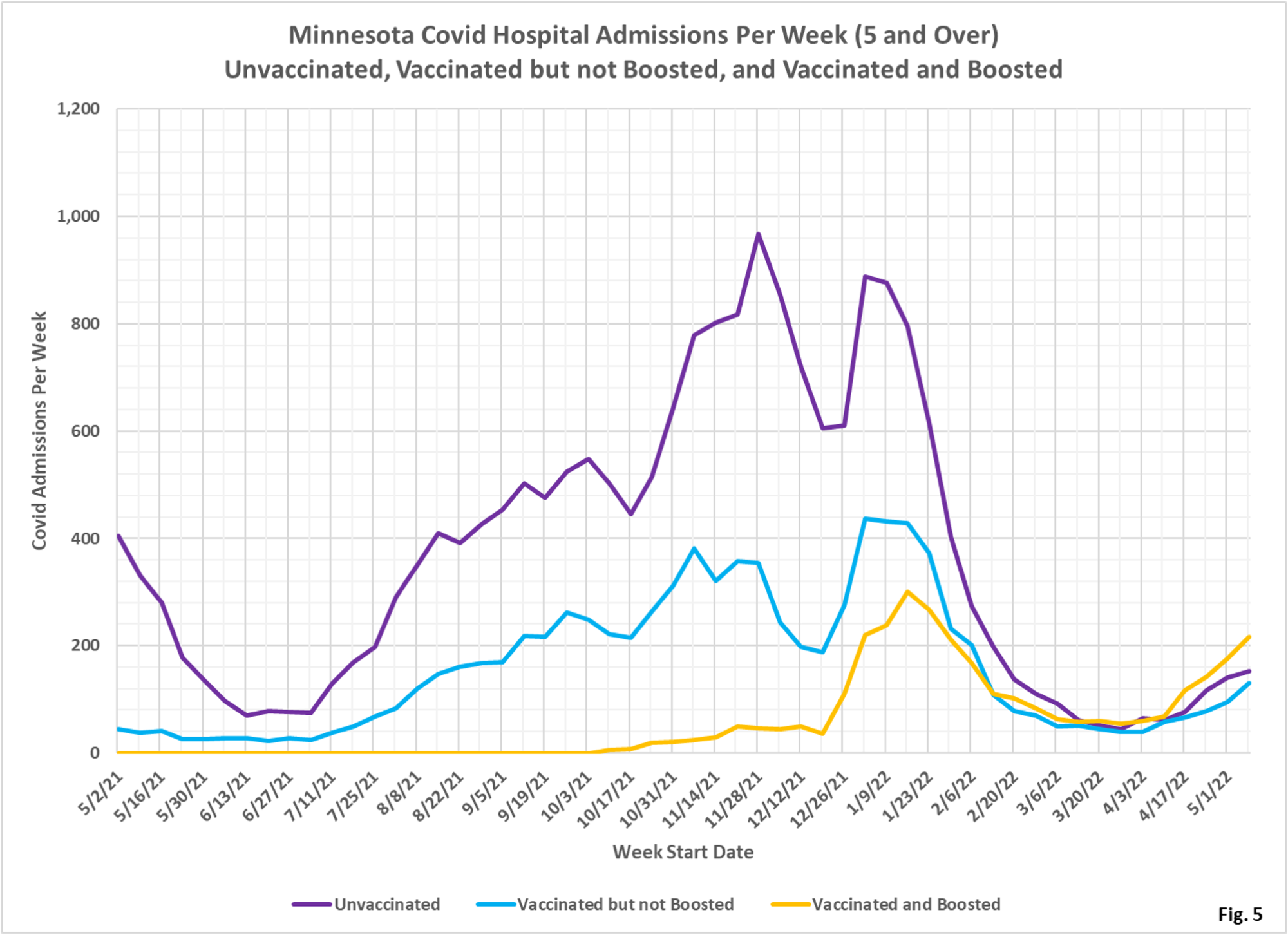
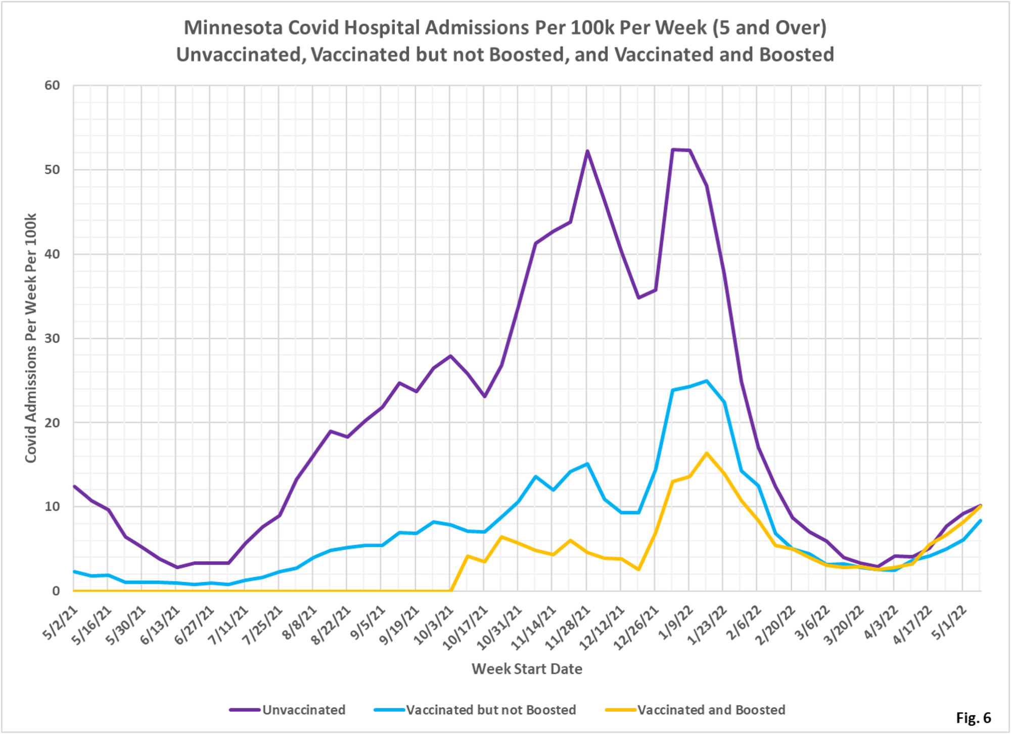
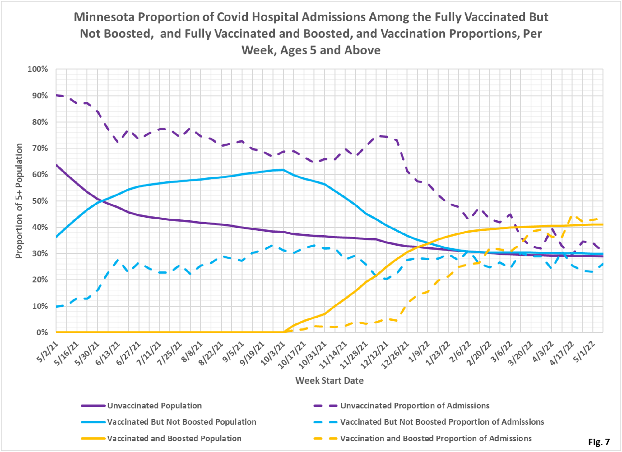
- Fig. 5-7: These charts display the hospital admissions, hospital admission rates per 100k, and hospital admissions proportions for the 5+ age group, in an identical format to the case charts in Fig. 2 through Fig. 4. Similar to cases, the boosted have a majority of the admissions (Fig. 5), however the admissions per 100k for the unvaccinated are close to equal the admissions of the boosted (Fig. 6). Fig. 7 shows that admissions among the unvaccinated have been disproportionately high throughout the pandemic until quite recently, where the proportion of admissions now are close to the same as the proportion of population for each group.
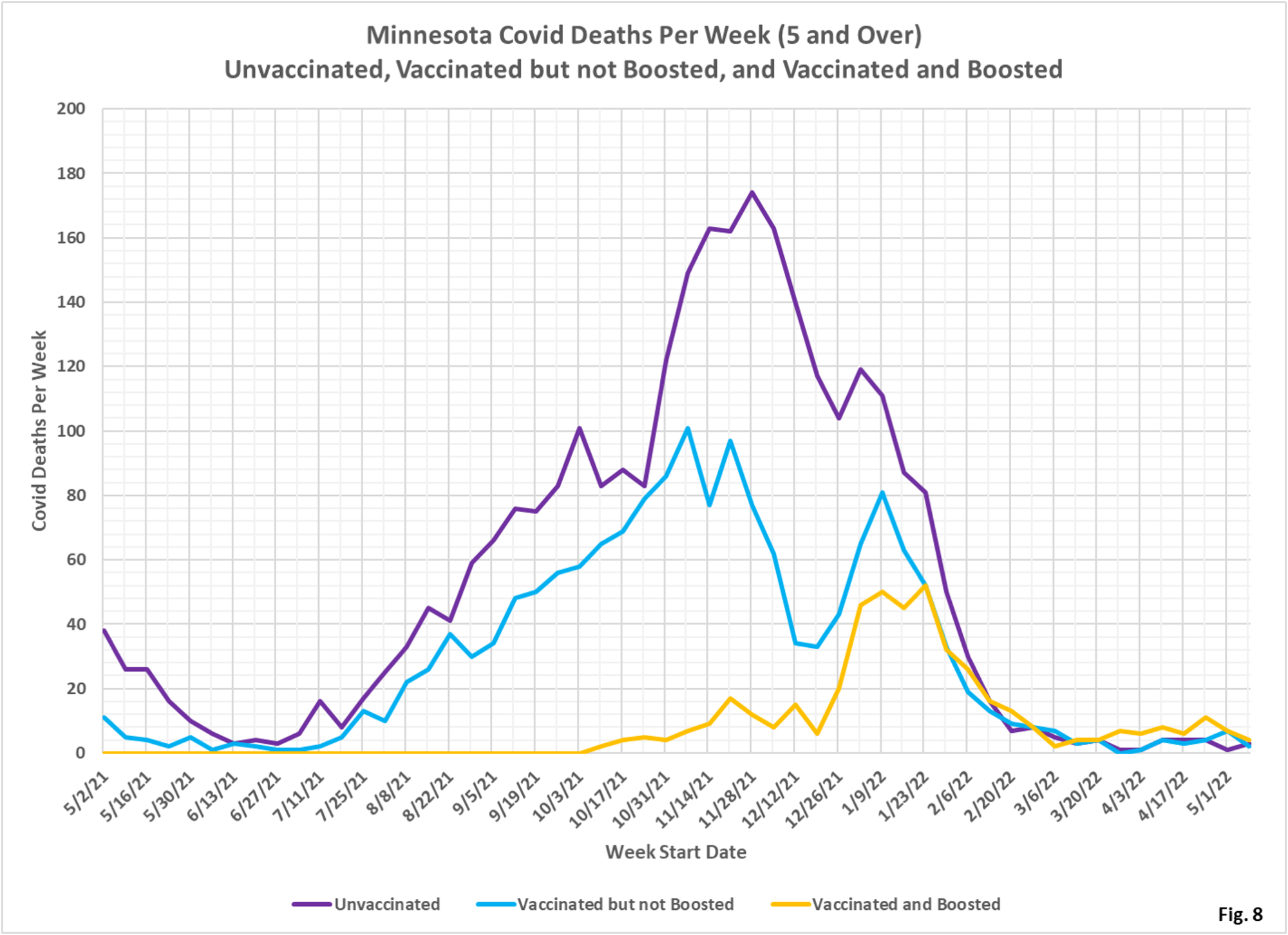
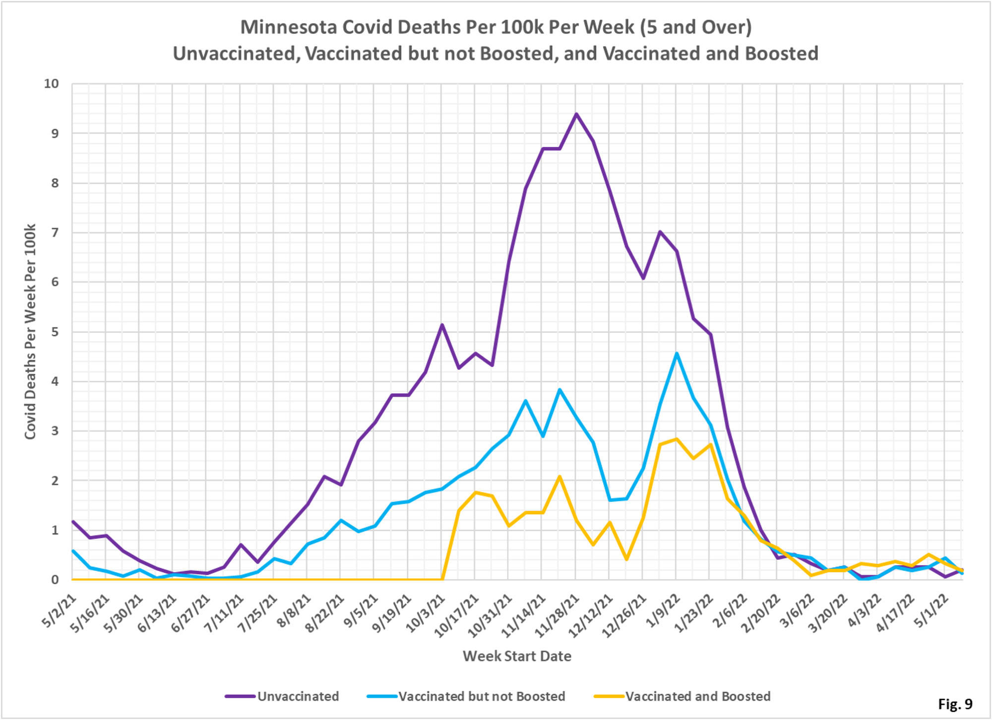
- Fig. 8-10: These charts display the deaths, deaths rates per 100k, and deaths proportions for the 5+ age group, in an identical format to the case charts in Fig. 2 through Fig. 4. Similar to cases, the boosted have had the greatest number of deaths each week in the past 2 months before falling to very low levels in the last couple weeks (Fig. 8), similar to the deaths per 100k (Fig. 9). Fig. 10 shows that deaths proportion are highly variable, especially in recent weeks when there are relatively few deaths.
- MDH defines the fully vaccinated (what we have termed vaccinated but not boosted) as those who have not received a booster after completing their primary vaccination series, and had been vaccinated at least 14 days prior to testing positive.
- MDH defines the boosted as those who have received any additional vaccination shots after completing their primary vaccination series, and also received the booster at least 14 days prior to testing positive. In addition, booster doses were only counted after 8/13/2021, the date the CDC first began recommending booster shots.
