This is complex and it is not easy to explain what the numbers mean, and lots of people have done similar work around the world. Dave Dixon and I have wondered if the various waves had a defined shape which could be determined by a formula and therefore predicted from the early days of the wave. We looked at the two most significant waves; the one from late 2020 to early 2021 and the recent Omicron one. The underlying question is why a pathogen moves as it does through a population. In the first big wave, there were a variety of mitigation measures in place which may have affected the shape of transmission. By the time of the Omicron wave, things like extensive population immunity from vax and prior infections clearly can affect transmission, as well as other lingering behavior changes. And testing regimens have a big impact on detected cases. But there appears to be a clear parabolic shape to cases during the most prominent waves in Minnesota.
The primary item the curves should be reflecting is how quickly currently infected people transmit to uninfected people. In both waves you see that this was quite steep initially but also flattened in a short time and came down basically in the same time frame and at the same rate it went up. Why? It isn’t because everyone in the population got infected, in both waves maybe a few hundred thousand people at most were infected. But people have a lot of variability in their likelihood of getting infected–due to contact profiles, immune system status, general health status and other factors. And they have a lot of variability in their likelihood of transmitting to others. I am inclined to the hypothesis that there are “superspreaders”–people who are both highly susceptible to infection and develop high viral loads and have lots of contacts. This pool of superspreaders is likely to get infected first and infect lots of people but as that pool is exhausted, the wave crests and recedes quickly.
We will keep working on this, with more to come shortly. If the parabolic shape is basically correct, once you know a portion of the arc, you should be able to predict the rest of the wave. Dave’s notes:
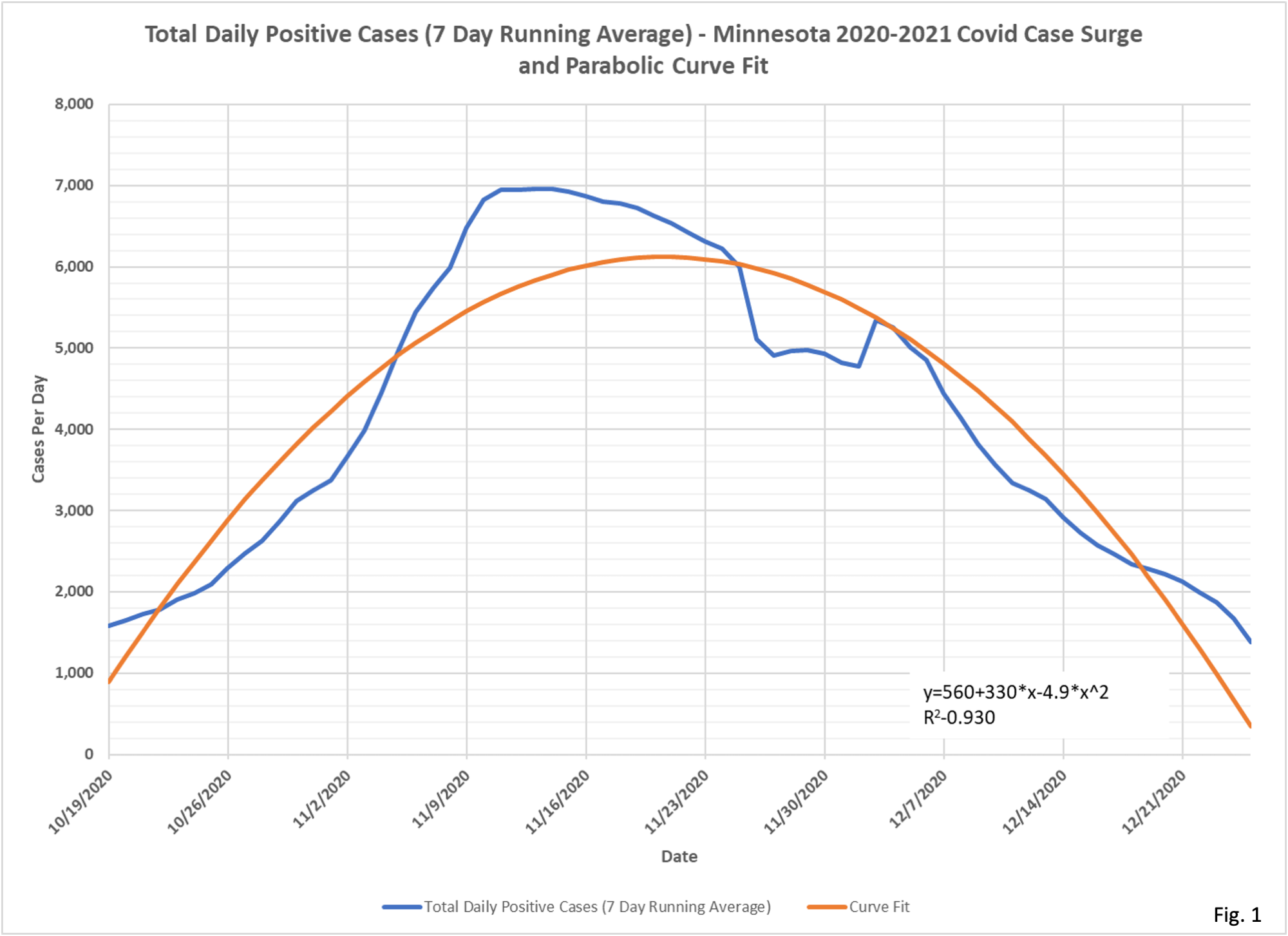
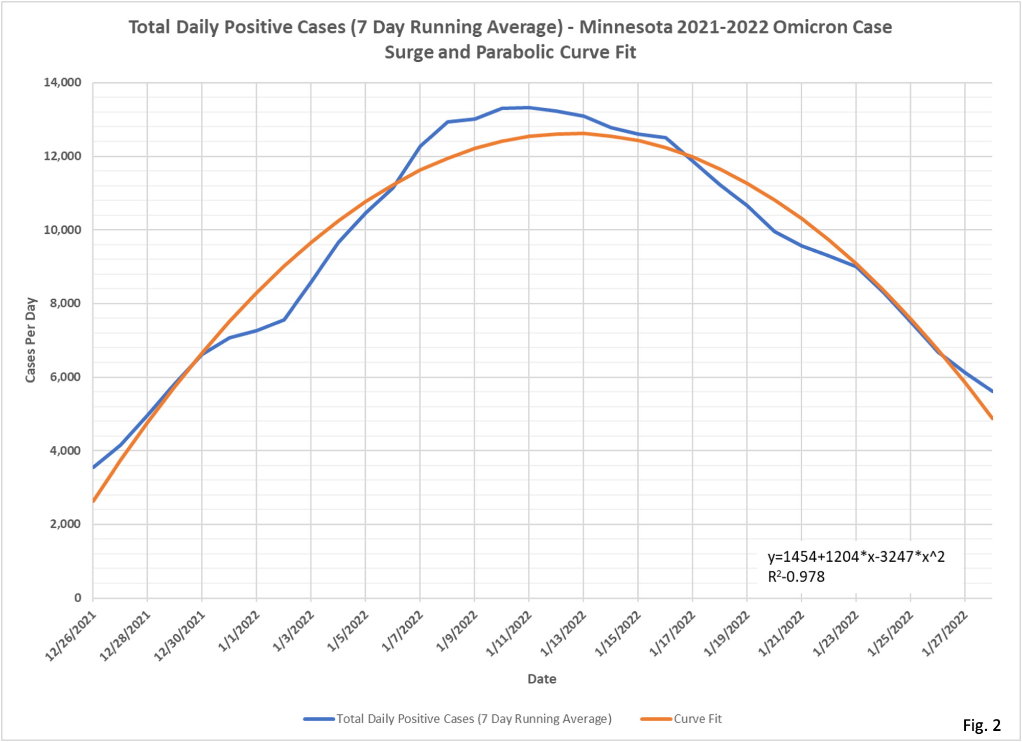
1. The very symmetrical rise and fall of the Omicron Covid wave in Minnesota made us wonder how close to a parabola the surge in cases was. A quick look of the literature reveals that many papers describe the Covid case surges as ‘normal’ distributions, or variations of bell curves. However, a parabola seems to model the rise and fall of the peak very well, perhaps just missing the early ramp up and later ramp down at either end off the surge in cases. While other more complicated mathematical models may slightly better fit the data, the parabola fits very well and describes the symmetrical rise and fall of cases very well also.
2. Fig. 1 and 2 show the two largest case surges in Minnesota, the winter 2020-2021 surge , and the winter 2021-2022 Omicron surge, downloaded from the Minnesota Situation Update for Covid-19 web page https://www.health.state.mn.
3. Fig. 1 displays the 7 day running average of cases in Minnesota in 2020-2021 (blue curve) and the parabolic (second order polynomial) curve fit in red. The R-squared coefficient for this curve fit is 0.930, meaning that the curve fit explains 93.0% of the variation in cases over time. We can see that this particular wave in cases appears a little asymmetrical, with the rise in cases being steeper than the fall in cases. We can see a very clear dip in cases caused by minimal testing on Thanksgiving, where the low testing day rolled out of the 7 days moving average 7 days later.
4. Fig. 2 displays the case curve and curve for the Omicron surge in cases that is just ending. The last 7 days of data are not displayed due to incomplete reporting of cases. This curve fit is even better than the 2020-2021 curve fit, with an R-squared value of 0.978. The case curve shows perhaps a minor dip around New Years Day, but is really very symmetrical.
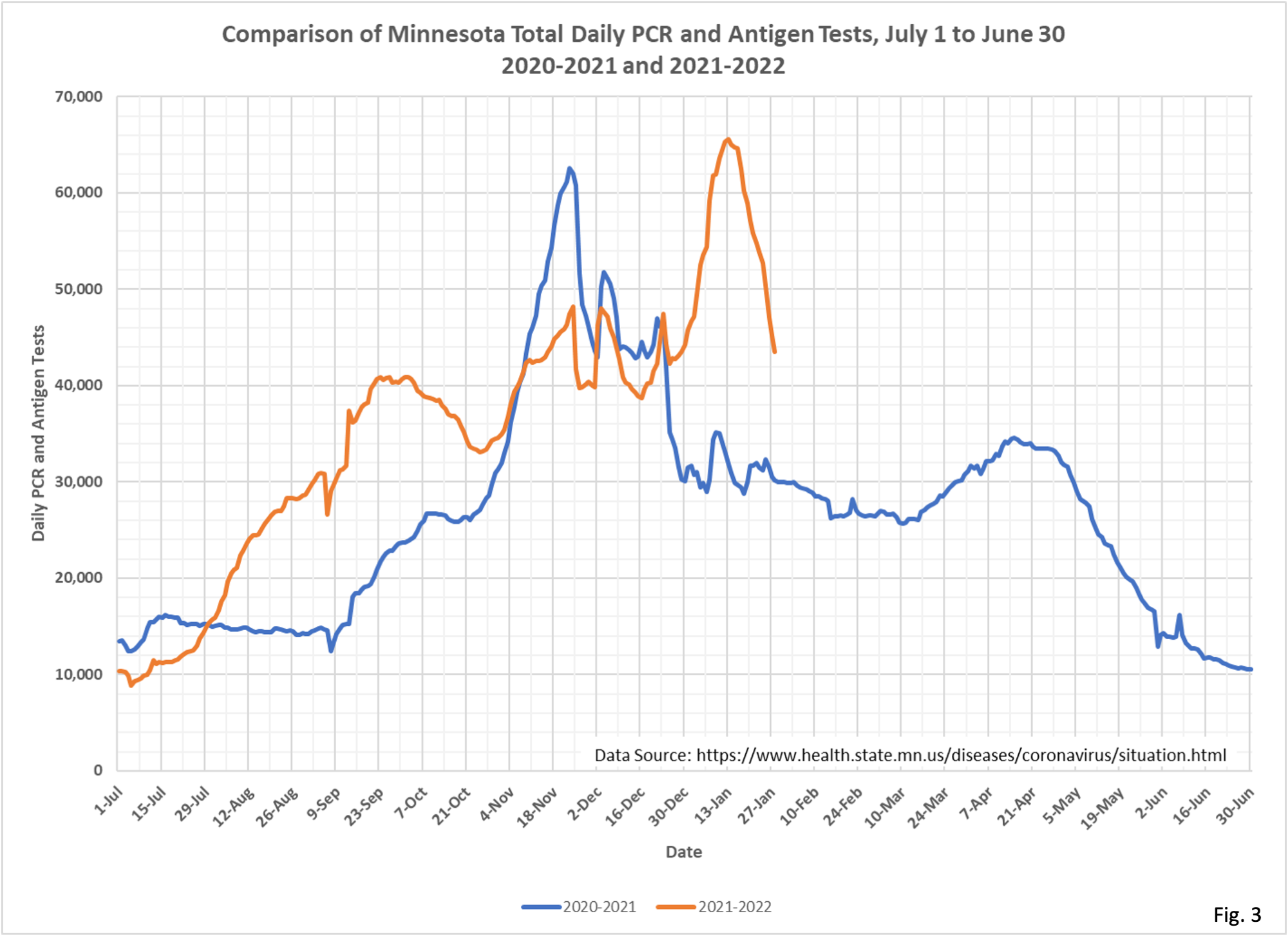
5. Fig. 3 displays the year over year testing curve, which we have published many times, most recently here https://healthy-skeptic.com/
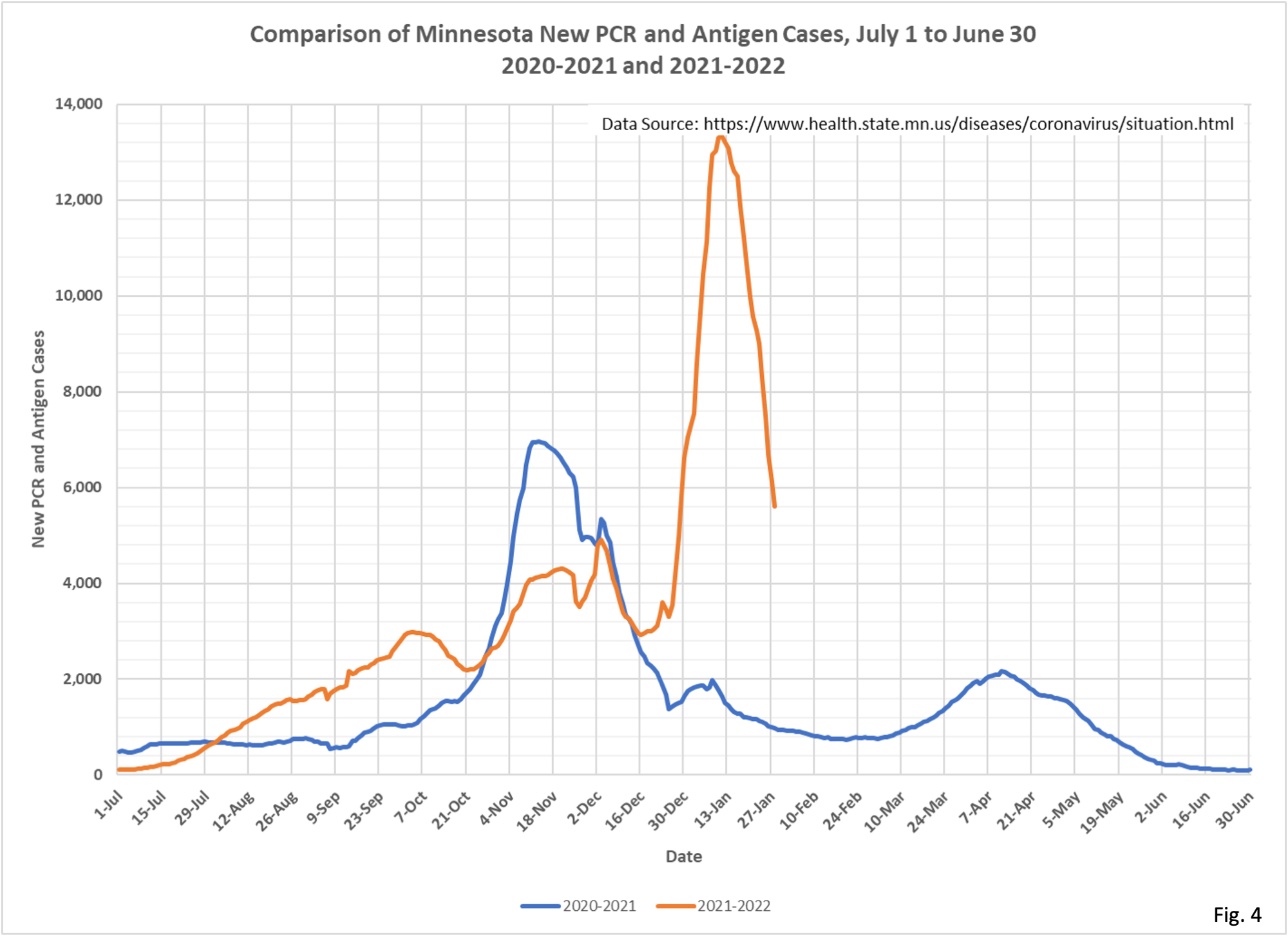
6. For completeness Fig. 4 shows the year over year case chart, allowing us to see both of surges we analyzed in the context of the majority of the pandemic.