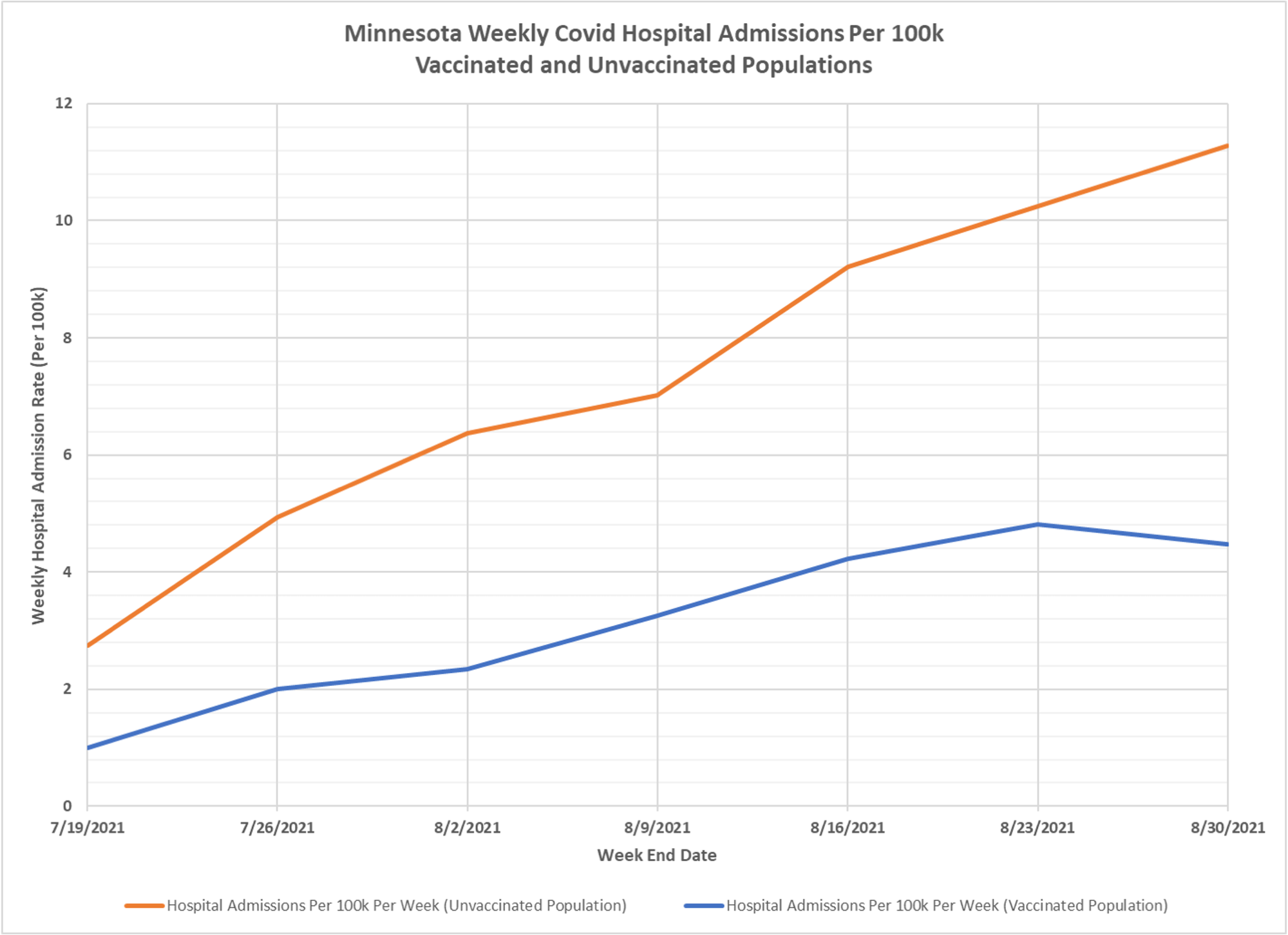
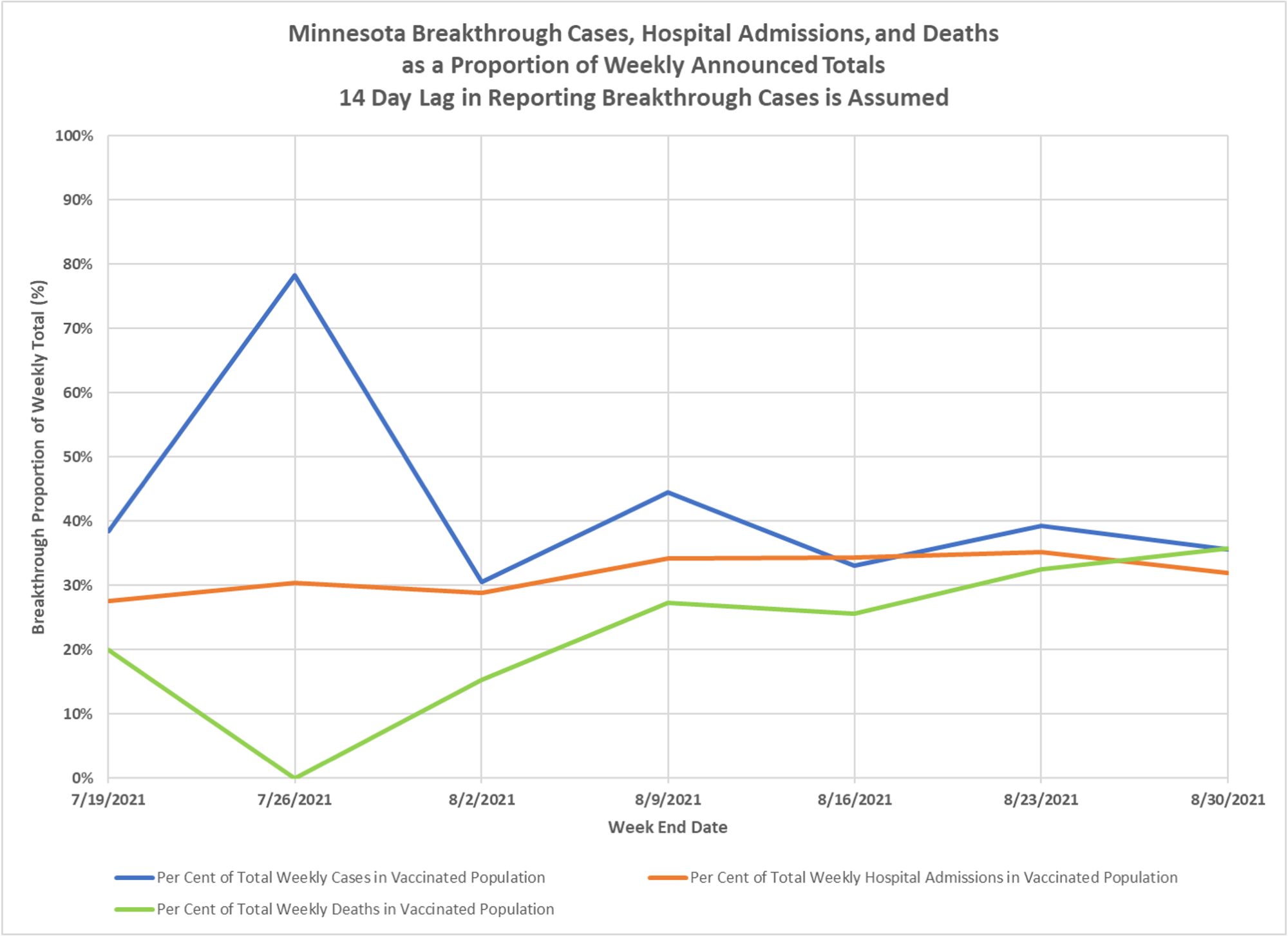
These charts attempt, based on Minnesota’s reported data for breakthroughs, which doesn’t tell you when they actually occurred, to estimate the relative per capita rates of cases and outcomes for breakthrough infections and those in the unvaxed population, keeping in mind again that the unvaxed group likely includes many with prior infections. You can see that the vaccines are pretty effective, with the strongest effect against hospitalization. If we could see the age structure, I strongly suspect that most of the adverse outcomes in breakthroughs are in the very old. Thanks to Dave Dixon for the graphs. 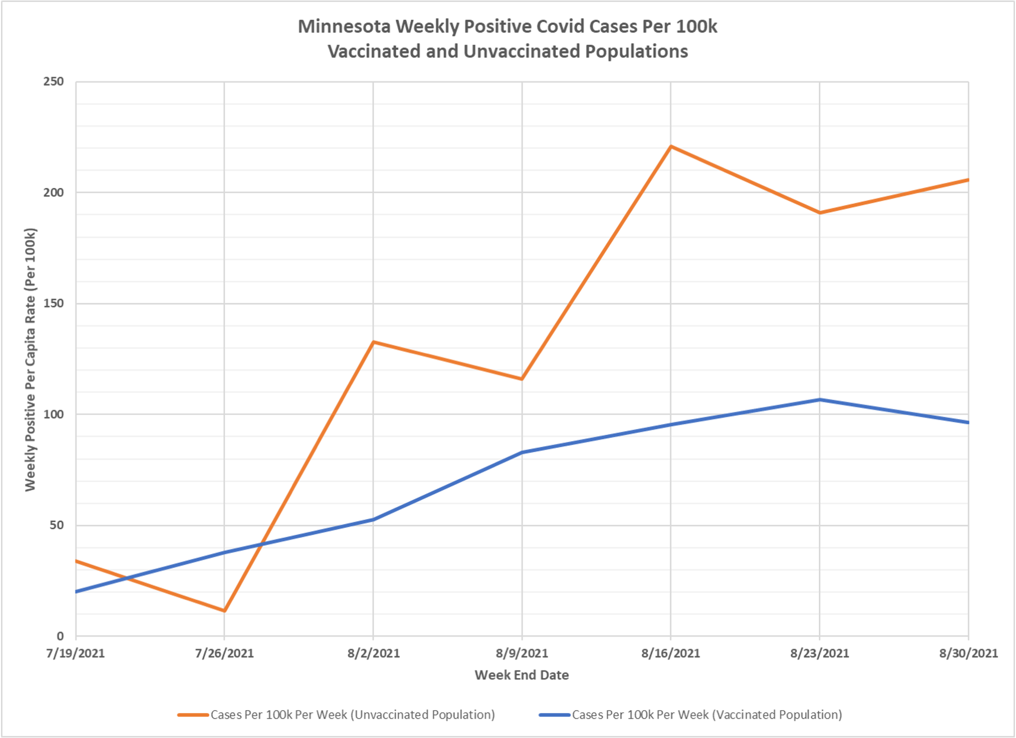
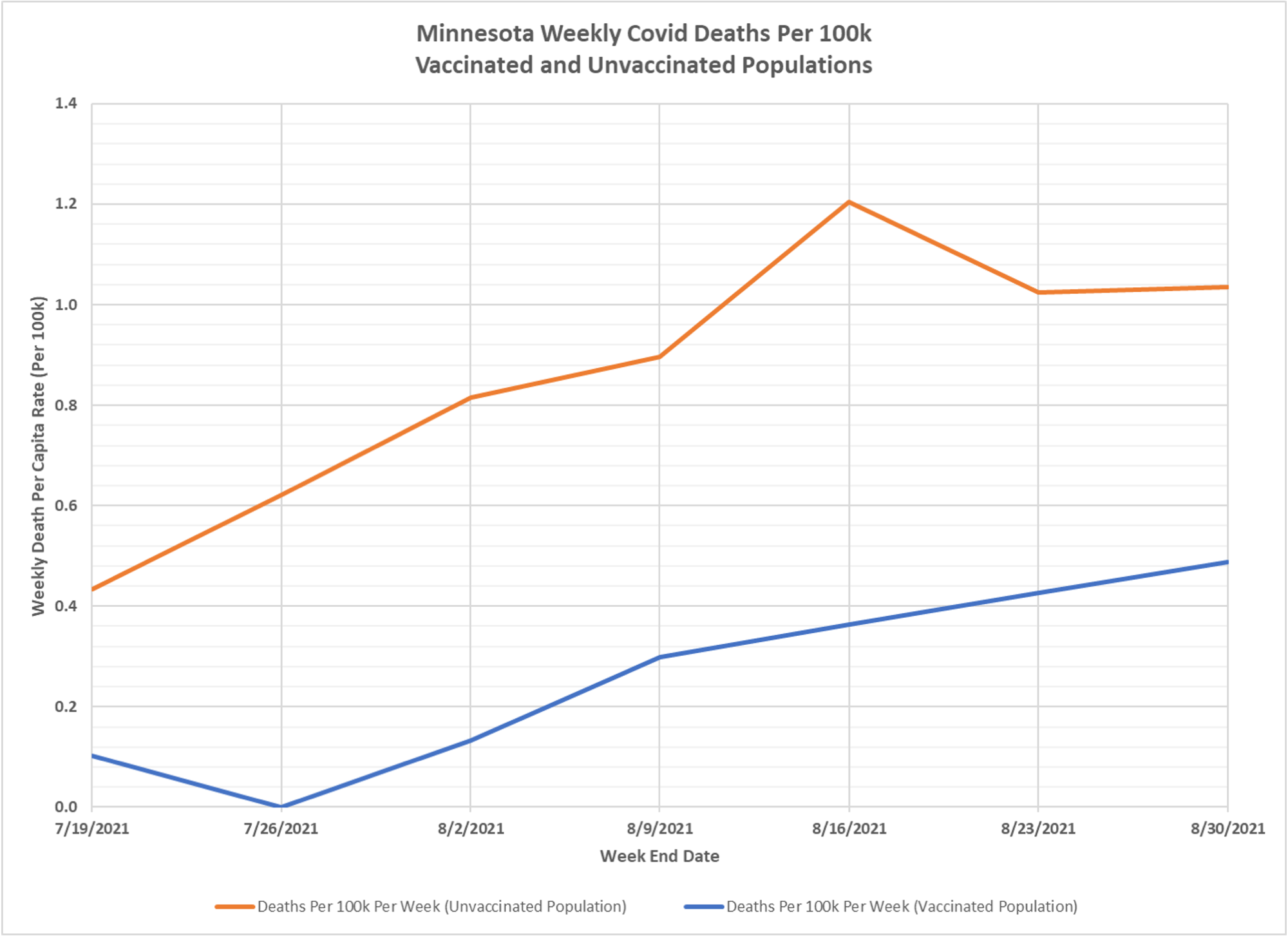

The deaths chart seems to tack pretty closely with my arithmetic from my comment in the earlier post.
So for “prevention of death by the coof” the vaccines are closer to 50% effective than 60% effective, so far.
It is time to admit the massive difference between the drug company and government claims and the truth.
Interesting data, but it must be kept in mind (as Kevin alluded to) that the two populations “vaccinated” and “unvaccinated” doubtless have other differentia than simply vaccine status. Age, race, sex, health condition other than Covid, previous Covid infection, etc. would all limit how confidently we can draw conclusions about vaccine effectiveness from this raw data.
sj2001, I’m tired of hearing that caveat, especially as it seems to be a one-way caveat.
Good enough data are available that we can draw rough conclusions.
If someone draws a rough conclusion and it is wrong, let’s hear why. If the why involves unknowns, let’s make an estimate of the magnitude of the unknowns and make an error band.
But this idea that we can’t look at data that suggest the vaccines were either wildly oversold or outright suck is frustrating me, because in these quarters those considerations haven’t prevented the opposite, namely talking up the vaccines when there wasn’t enough positive data (e.g. time lapsed) to draw those conclusions.
I say these charts look bad for the vaccines, what am I missing?
The number of possibilities for a given set of variables (n) with 2 outcomes (sick/not sick) is 2^n. I think we can agree that there are at least a dozen such human variables, therefore we can have over 4,000 possible outcomes. However, the simple math doesn’t account for the numbers of lies, medical malpractice, miss-classifications of data, fraudulent test results, government’s policies, plus an entire additional set of variables within the experimental [vaccines] themselves.
Let’s just admit we’re completely lost ! And worst of all, it’s be design.
This blog’s banter is for mental health purposes only, getting what’s bouncing around in all of our frustrated heads out so we can hopefully go home to our families and work without having it poison everything we do. I think it’s a good time to buy the lake front cabin in Arkansas 🙂