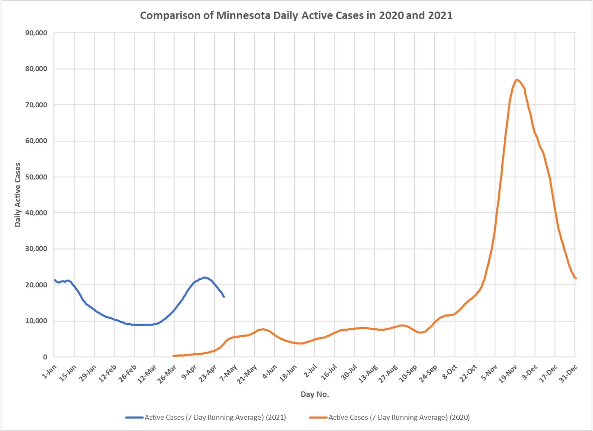
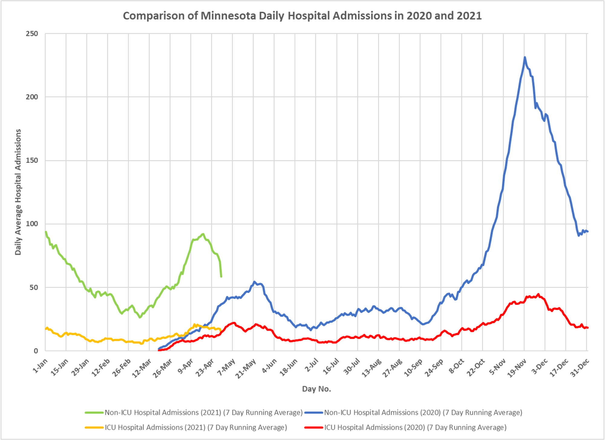
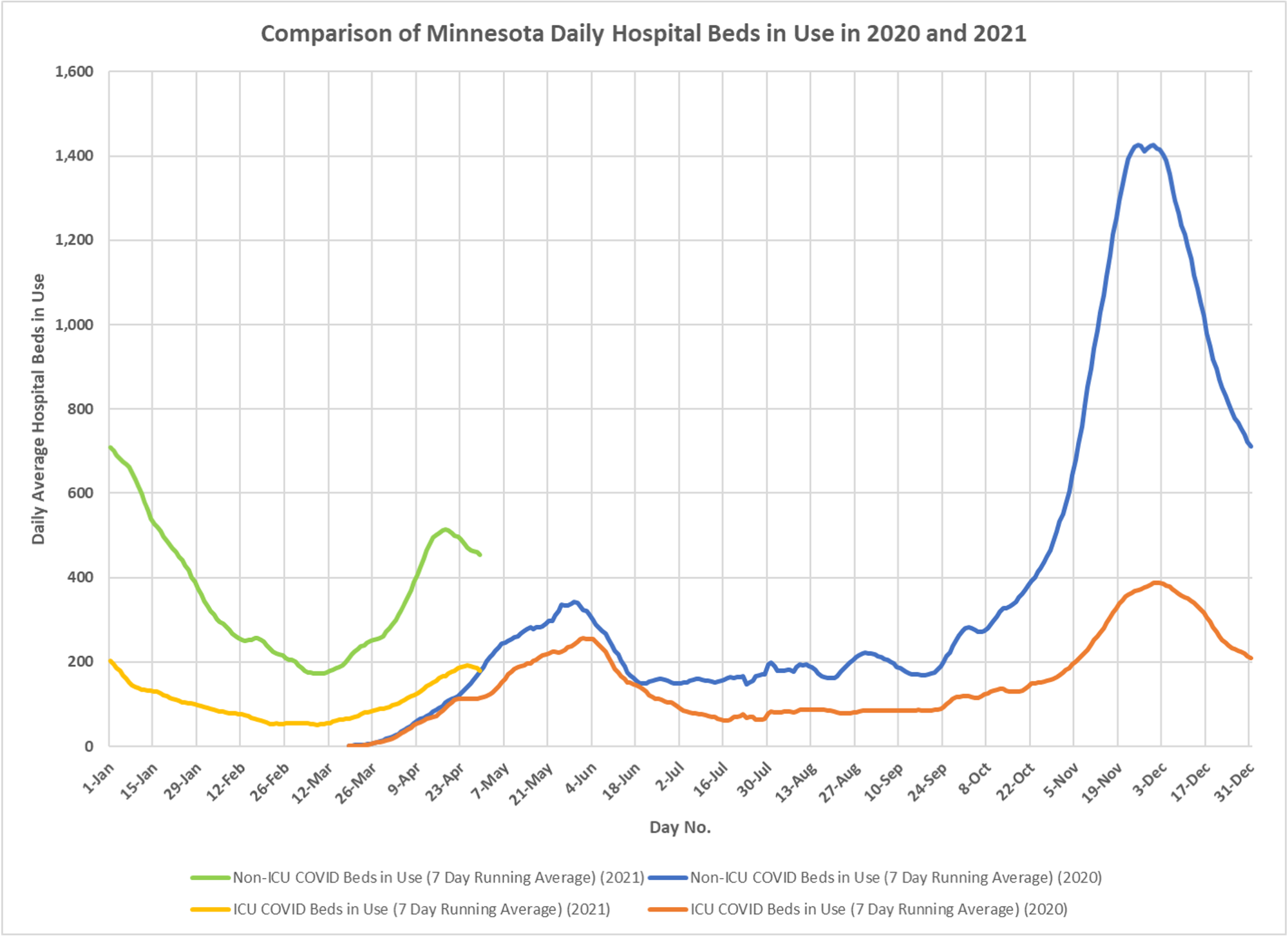
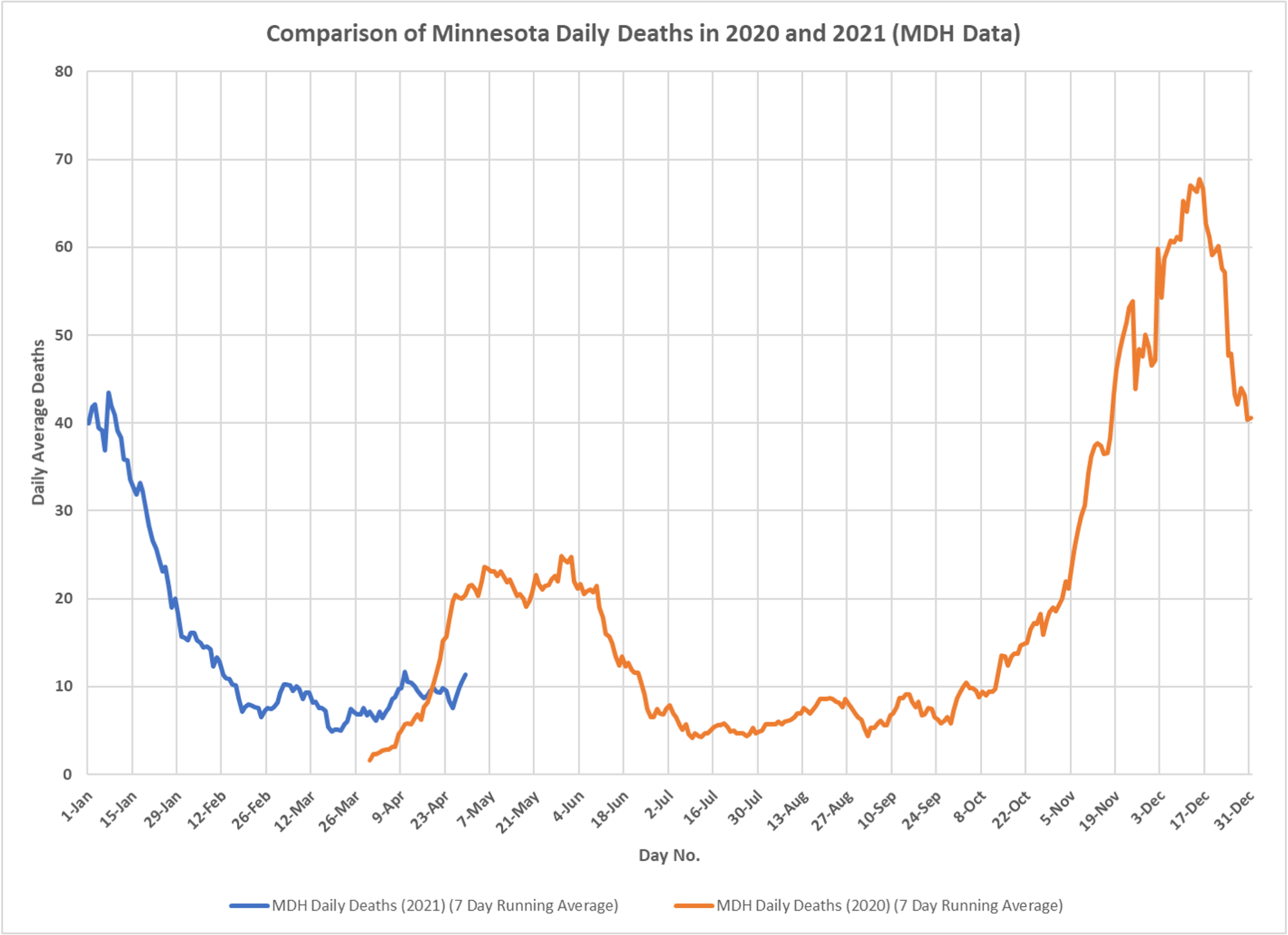
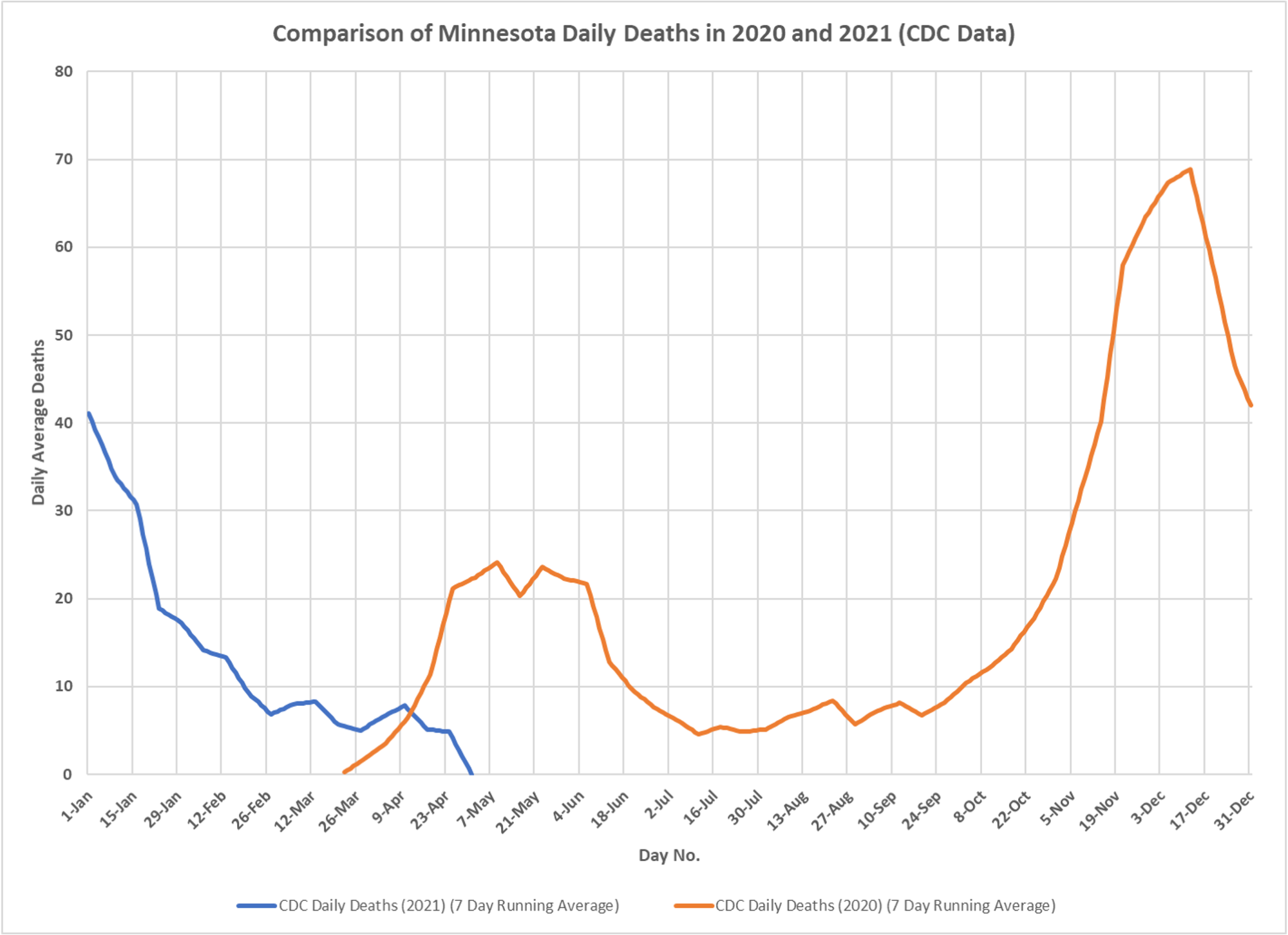
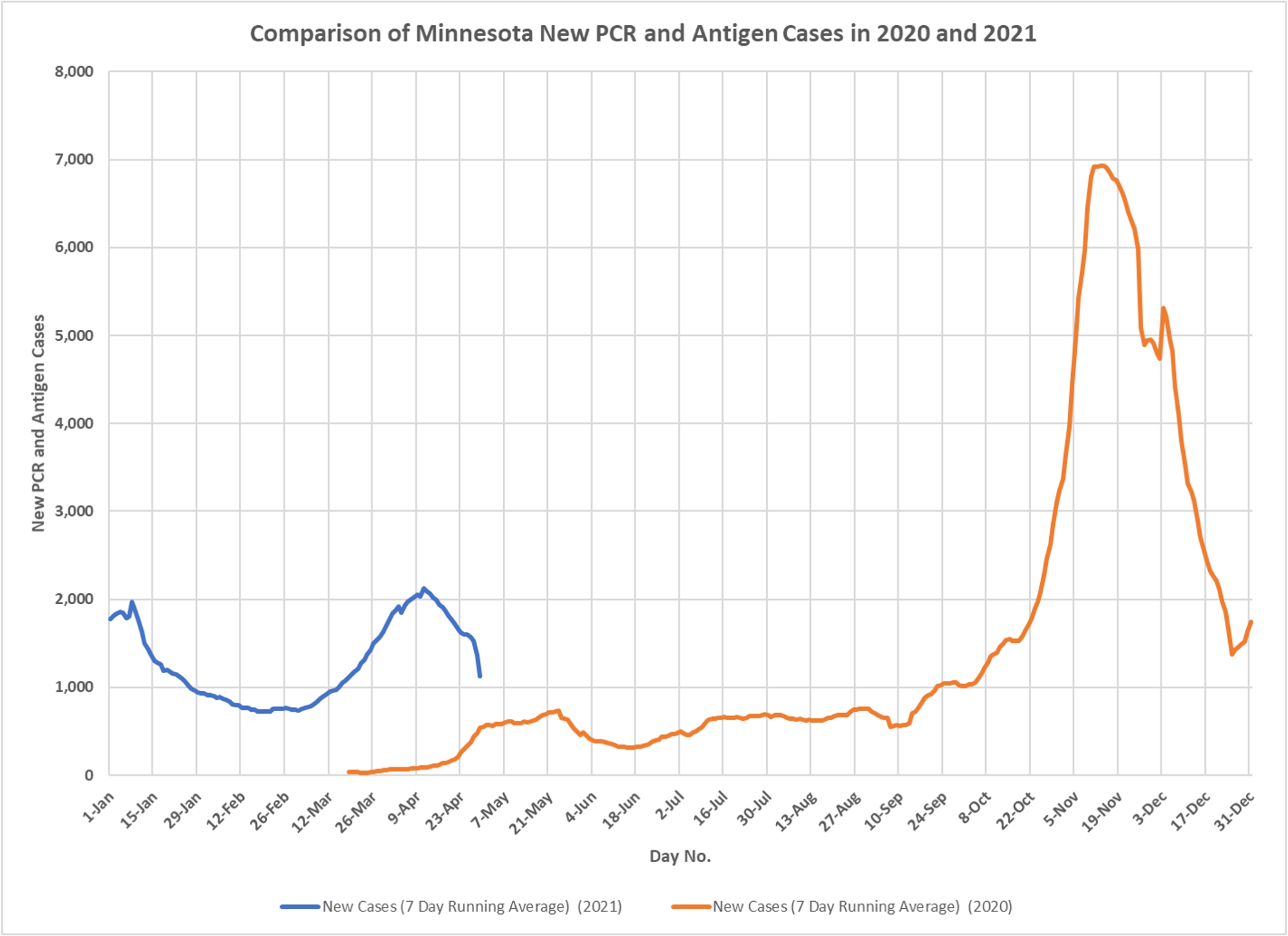
As the epidemic works into its second year, some charts showing the year-over-year look, courtesy as usual of DD. Interesting to see the offset of the spring wave in terms of cases and outcomes. Likely due to late introduction last year and different weather in the spring. Also interesting to see the number of non-ICU hospitalizations, the cohort analysis indicates no higher case rate this year, and since undetected infections were likely much higher last spring, given no testing, the rate is actually probably lower. And ICU hospitalizations are down, indicating lower severity, but that may due to excessive use of mechanical ventilation last spring. Deaths down significantly.
✅ Subscribe via Email
About this Blog
Healthy Skeptic Podcast
Research
MedPAC 2019 Report to Congress
June 18, 2019
Headlines
Tags
Access
ACO
Care Management
Chronic Disease
Comparative Effectiveness
Consumer Directed Health
Consumers
Devices
Disease Management
Drugs
EHRs
Elder Care
End-of-Life Care
FDA
Financings
Genomics
Government
Health Care Costs
Health Care Quality
Health Care Reform
Health Insurance
Health Insurance Exchange
HIT
HomeCare
Hospital
Hospital Readmissions
Legislation
M&A
Malpractice
Meaningful Use
Medicaid
Medical Care
Medicare
Medicare Advantage
Mobile
Pay For Performance
Pharmaceutical
Physicians
Providers
Regulation
Repealing Reform
Telehealth
Telemedicine
Wellness and Prevention
Workplace
Related Posts
Commentary
January 28, 2023
Coronamonomania Lives Forever, Part 189
Another vax heavy set of research summaries, still not super-effective and definitely not causing lots…
Commentary
January 26, 2023
The Cost of Illegal Immigration
Immigration is likely beneficial, illegal immigration not so much and it costs far more than…
Commentary
January 25, 2023
Relative Rates of Breakthroughs and Reinfections
Based on more recent information Dave received from DOH, updated rates of breakthrough and reinfection…
One view that might be interesting and worth analyzing is comparing some of these charts with the chart found on page 3 of the MDH Weekly Influenza Statistics Summary: 2010 – 2011. The chart in question is titled, “Hospitalized Influenza Cases Influenza Surveillance Network (FluSurv-Net) Minnesota, October 1, 2008 – May 21, 2011”. The pattern in that chart seems to have a remarkable resemblance.
https://www.health.state.mn.us/diseases/flu/stats/2010summary.pdf