You will notice a couple of things different here and in future posts on the overall Breakthrough Events posts. One is that there will only be the single table enumerating the events. Following the initial change in DOH methods a couple of months ago there have only been relatively few changes for each week in a current table from the preceding tables. So a separate table showing how each week’s events changed doesn’t tell you much. Second, the usual charts are not included.
The reason for dropping the charts is complex and involves Dave Dixon’s usual exemplary sleuthing on data issues. Our charts tended to show different population rates than did DOH’s and he wondered why. I mentioned in a tweet that DOH appeared to be doing some unusual “age adjustment” whose value was unclear. As Dave communicated with DOH and probed further, it appears that on the overall numbers–those not broken down by age groups–DOH perceived that it would be misleading if there weren’t some age adjustment by vax status, since older people are both more likely to vaxed and/or vaxed and boosted and to have serious illnesses. There may be some merit to that position by DOH, but what would make more sense is just to give everything by age group breakdowns, preferably the five year age groups that DOH was using during most of the epidemic.
On the overall charts, doing the age adjustment makes the vax and boosting look more effective than the raw population rates would suggest. Again, let’s assume that is appropriate. But when you break it into age groups, you are automatically doing an age adjustment and any further change would be very misleading and inappropriate. DOH tends to emphasize the overall rates, which they age adjust, for the obvious reason that it makes the vax and boosters look better than they are performing for almost every age group. It hides actual negative performance in many age groups, which may itself be due to confounders, like relative prevalence of prior infections, minority status, health status, etc.
In any event, from now on, the only charts you will see that relate to vax effectiveness will be by age group and will have no age adjustment. There are some issues in the DOH data, but Dave will do his best to present it straight.
 Dave’s notes:
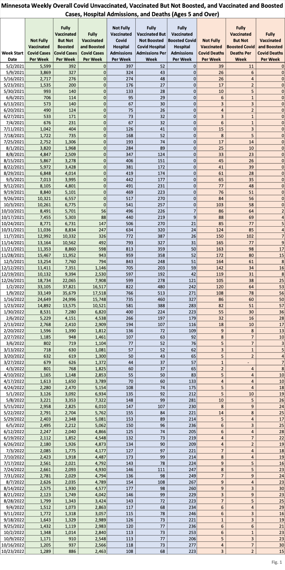
- This post is an update to the Covid vaccination breakthrough data table for the overall Minnesota population published on 11/07/2022 here: https://healthy-skeptic.com/
2022/11/07/breakthrough- events-november-3/. This week’s update adds data through the week ending 10/23/2022, published by the Minnesota Department of Health (MDH) on 11/17/2022. Note that we have discontinued the three data tables showing the changes in past data each week, which were Fig. 2 through Fig. 4 in the old post. Since MDH changed their data matching algorithm on 10/06/2022 we have been checking and reporting on changes to past data, but now the data has settled down and there are very few changes to old data, at least not enough to be of much interest. We have also discontinued publication of the overall average charts, which were Fig. 5 through Fig. 13 in the old post. We have been publishing these charts as the simple overall averages for the entire population, while MDH publishes age-adjusted versions of the same overall population charts. We have been having a conversation with MDH this week about the need for this age adjustment, and the appropriate way to do it. MDH’s rationale for the age adjustment, which seems reasonable, is that the age distribution of the boosted will skew older than the vaccinated and unvaccinated. Since older people are more susceptible to bad outcomes, the simple overall average will then make boosting appear ineffective. However, we dispute that an age-adjusted overall population chart is proper since it implies that the entire population will benefit from vaccination or boosting, but as shown by the breakthrough age group charts we have published every couple weeks for quite some time the vax and boosting have different effectiveness in different age groups. Until this issue is resolved we will choose not to publish overall population averages. - The breakthrough data files are available from MDH here, https://www.health.state.mn.
us/diseases/coronavirus/stats/ vbt.html , in the notes under the graphic images. - Fig. 1: This table displays the total cases, hospital admissions, and deaths that occurred each week among the unvaccinated, vaccinated but not boosted, and vaccinated and boosted populations. Data through the week of 10/23/2022 has been added this week. The very gradual reduction in cases, hospital admissions, and deaths that we have seen for several months continues, interrupted only by a slight uptick in unvaccinated cases. All other data types continue their gradual decline.
- MDH defines the fully vaccinated (what we have termed vaccinated but not boosted) as those who have not received a booster after completing their primary vaccination series, and had been vaccinated at least 14 days prior to testing positive.
- MDH defines the boosted as those who have received any additional vaccination shots after completing their primary vaccination series, and also received the booster at least 14 days prior to testing positive. In addition, booster doses were only counted after 8/13/2021, the date the CDC first began recommending booster shots.

What is missing is critical. What are the rates of vaccination? What is relevant are the RELATIVE risks of the outcome for the vaccinated, or (# Outcome=yes in the vaccinated/ # vaccinated) / (# Outcome=Yes/ unvaccinated). If the Relative Risk is < 1, then the vaccine reduces the risk.
Why is this important? Say 60% of events occur in the vaccinated population, but 80% of the population is vaccinated. The relative risk is then (0.6/0.8)/(0.4/0.2) = 0.75/2 = 0.375. In the example, the raw NUMBER of events is 50% higher in the vaccinated population – but the actual risk of the event in the vaccinated population is less than 40% that of the unvaccinated population. The raw numbers make it look like you are more likely to experience an event if vaccinated, but that is ONLY because there are four times as many vaccinated in the hypothetical population, and therefore a smaller risk can generate more cases simply due to population SIZE disparities.
This is kind of very introductory epidemiology, and shows why raw counts tell you nothing about actual levels.
What the raw numbers show, however, is that Dr. Jha is lying through his teeth with the claims that 100% vaccination rates with the current vaccine will eliminate all risk from COVID. His exaggerated claims – much like the claims from folks trying to portray every cardiac death as a result of the mRNA vaccines – are misleading and, as they originate with a prominent public health official, undercut the legitimacy and hence authority of the public health community. Unfortunately, too many government health officials have squandered long term legitimacy for short-term power grabs during this epidemic.