Really not much happening here. Overall, vax appear to offer no to very limited protection against infection, maybe some protection against hospitalization and death.


Dave’s notes:
- We noted a peculiar spike in unvaccinated cases and hospital admissions in the data released several weeks ago on 9/01/2022. This was accompanied by a decrease in vaccinated, and boosted, hospital admissions. In the new data released since then the cases and hospital admissions have generally returned to the prior trends. We note also that a similar, but slightly smaller, discontinuity in cases for the week of 6/12/2022, and this discontinuity has not been revised in the intervening weeks. However, the spike in unvaccinated cases and hospital admissions has not been revised in the slightest in the subsequent releases of new data that has been released by the Minnesota Department of Health (MDH).
- Jeremy Olson in the StarTribune recently quoted a hospital administrator stating that between 50% and 75% of Covid hospitalizations are for people who were admitted from something else. This will undoubtedly skew the data on hospitalizations greatly, since older people tend to hospitalized, and also tend to be vaccinated and/or boosted, which will mean that population will also be susceptible to incidental Covid positive tests upon admissions. Article here: https://www.startribune.com/
covid-19-levels-stubbornly- stagnant-in-minnesota/ 600201117/. - This post is an update to the breakthrough data table and charts for the overall Minnesota population published on 9/23/22 here: https://healthy-skeptic.com/
2022/09/23/breakthrough- events-september-22/. This week’s update adds data for the week ending 9/04/2022, newly published by MDH on 9/29/2022. As is usual, there are very minor updates to prior weeks as well. - The breakthrough data files are available from MDH here, https://www.health.state.mn.
us/diseases/coronavirus/stats/ vbt.html , in the notes under the graphic images. - The charts in Fig. 2 through 10 contain 3 charts for each type of event (cases, admissions, or deaths). The first chart for each type is the number of events each week, illustrating in raw numbers the overall trend on the pandemic for the overall population, and the impact is on society of each sub-group. The second chart is the rate of events per 100k each week, displaying the risk to an individual of the each category at different times during the pandemic. The third chart for each type of event is the proportions of event compared to the proportion of the population type (unvaccinated, vaccinated, or boosted). This chart helps show whether or not vaccination or boosting is effective in reducing the impact of the pandemic, by comparing the proportion of events to the proportion of the population.
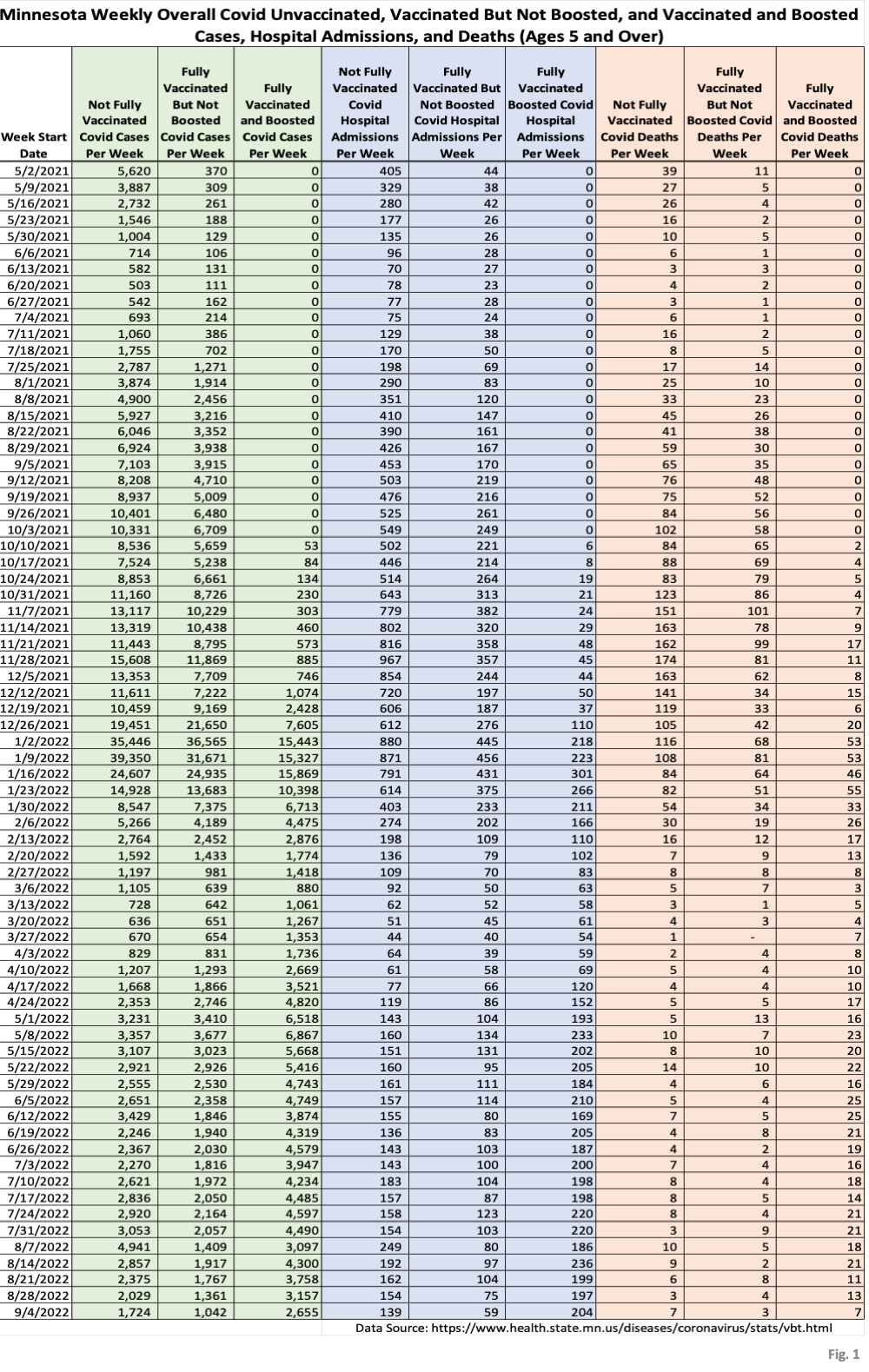
- Fig. 1: This table displays the total cases, hospital admissions, and deaths that occurred each week among the unvaccinated, vaccinated but not boosted, and vaccinated and boosted populations. The week of 9/04/2022 has been added this week. In the four new weeks of data since the anomalous spike in unvaccinated cases 8/7/2022 there has been a declining trend in cases in all three subgroups.
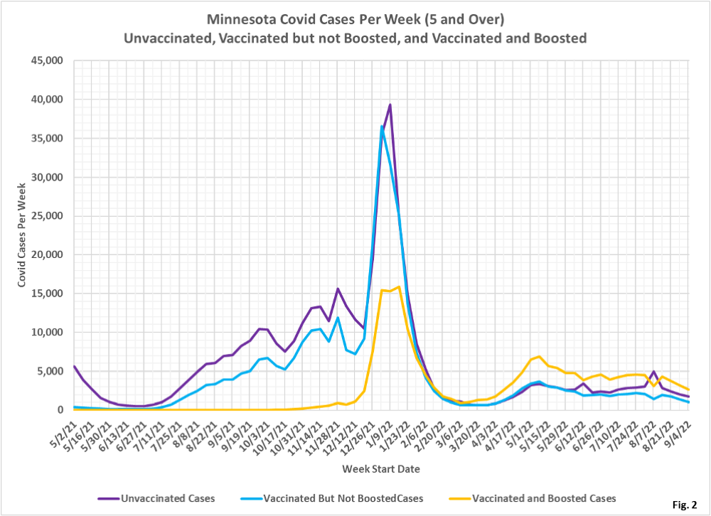
- Fig. 2: This chart simply plots the cases among the unvaccinated, vaccinated but not boosted, and vaccinated and boosted populations each week, as found in Fig. 1. Note that cases are falling in all three subgroups.
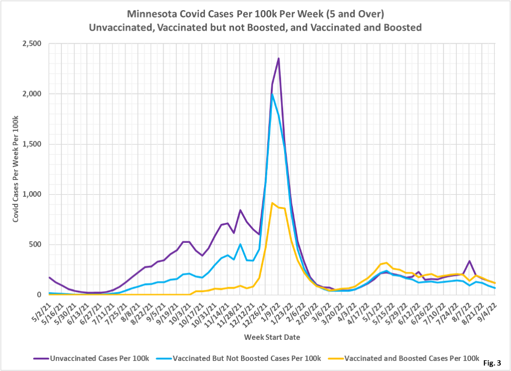
- Fig. 3: This chart displays the case rates per 100k for each group. We can see a sharp increase in the unvaccinated case rate for the week of 8/07/2022, and now the reversal in the following weeks. Note also a similar spike which has not been corrected for the week of 6/12/2022. The prevailing trend since early July has been for the boosted and unvaccinated case rate to be almost identical, and for the vaccinated but not boosted case rate to be somewhat lower.
- Fig. 4: This chart displays the proportion of the 5 and over population who are unvaccinated (solid purple), vaccinated but not boosted (solid blue), and vaccinated and boosted (solid gold). For each population group we also display the proportion of cases each week (dashed lines of same color). The way to interpret this chart is to compare the proportion of breakthroughs to the proportion of vaccinations for each group. Whenever the dashed breakthrough proportion line is below the solid vaccination line of the same color, then that category is underrepresented for population, and when the dashed line is above the solid line of the same color then that category is overrepresented. For the week of 9/04/22 the boosted made up 43% of the overall population but accounted for 49% of the cases, while the vaccinated but not boosted made up 29% of the population but only accounted for 19% of the cases. The unvaccinated accounted for 29% of the population and accounted for 32% of the cases.
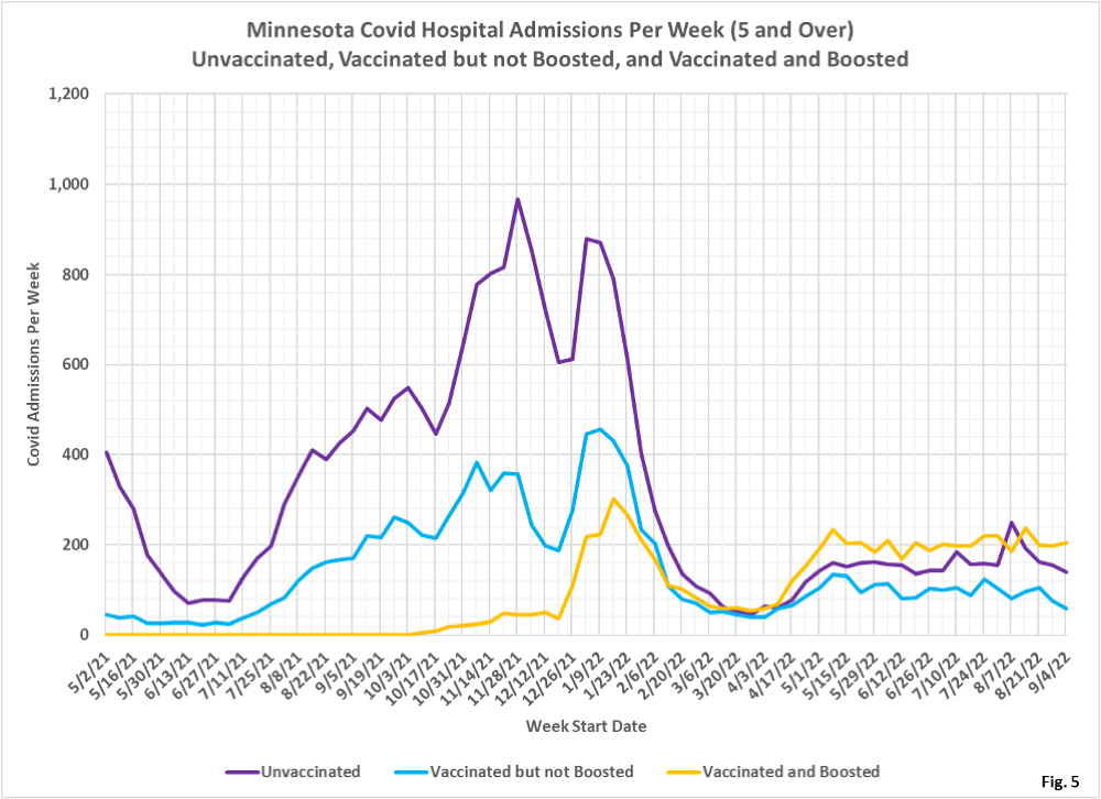
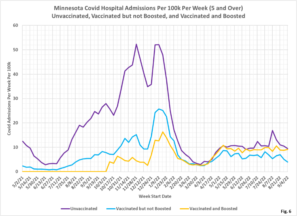
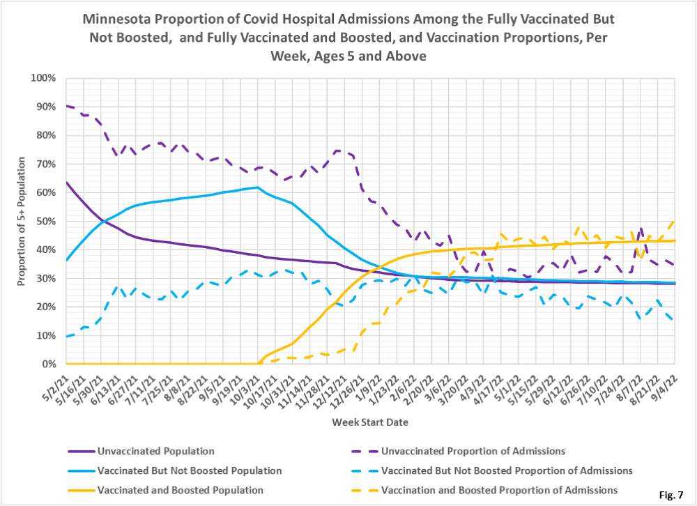
- Fig. 5-7: These charts display the hospital admissions, hospital admission rates per 100k, and hospital admissions proportions for the 5+ age group, in an identical format to the case charts in Fig. 2 through Fig. 4. Fig. 5 shows less of a decline in admissions than is shown for cases in Fig. 2, ignoring the spike in unvaccinated admissions on 8/7/2022 which we believe is a data anomaly. For several months the boosted have made up the largest portion of admissions, and therefore have created the most burden on hospitals. Fig. 6 shows the unvaccinated and boosted have almost identical rates of hospitalization rate for the week of 9/04/2022, while the vaccinated but not boosted having the lowest hospitalization rate and are declining rapidly. Fig. 7 shows that the unvaccinated made up 29% of the population the week of 0428/2022 but account for 35% of the admissions, while the vaccinated but not boosted made up for 29% of the population but only accounted for 15% of the admissions.
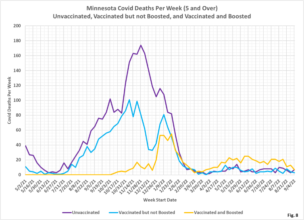
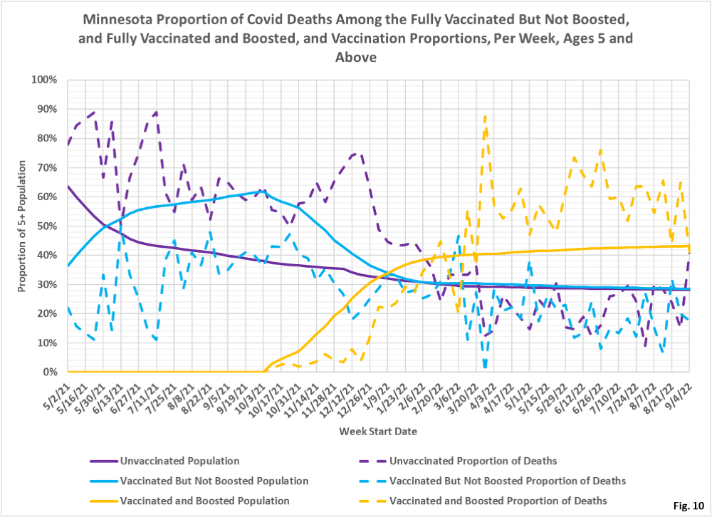
- Fig. 8-10: These charts display the deaths, deaths rates per 100k, and deaths proportions for the 5+ age group, in an identical format to the case charts in Fig. 2 through Fig. 4. There have been more deaths every week among the boosted for several months, and finally leading up to 9/04/2022 the number of deaths among boosted is falling (Fig. 8). The death rates per 100k are all very low for the week of 9/04/2022, but the boosted continue to have a higher death rate, skewed by higher booster rates in the elderly (Fig. 9). For the week of 9/04/2022, the boosted make up 43% of the overall population but account for 41% of the weekly deaths, while the unvaccinated make up 29% of the population but account for 41% of the deaths (Fig. 10).
- MDH defines the fully vaccinated (what we have termed vaccinated but not boosted) as those who have not received a booster after completing their primary vaccination series, and had been vaccinated at least 14 days prior to testing positive.
- MDH defines the boosted as those who have received any additional vaccination shots after completing their primary vaccination series, and also received the booster at least 14 days prior to testing positive. In addition, booster doses were only counted after 8/13/2021, the date the CDC first began recommending booster shots.
