As Dave notes, once more DOH has some screwed up data processing, particularly in identifying those who are vaxed. You will recall that DOH initially would treat every case as though it occurred in an unvaxed person and then supposedly matches the case records with the vaccination records to shift people into the correct bucket. DOH cannot identify every vaxed person, they really only get those who were vaxed in Minnesota. And Dave and I strongly suspect their matching process, which they refuse to fully describe, has serious inaccuracies. So every now and then we get a week like this one where the anomalies are obvious and the data has to be treated as incomplete and just wrong. You can see that if you add the drop in cases in the vaxed and the vaxed and boosted groups you basically get the increase in the vaxed group, all compared to the prior week. And despite Dave’s best efforts, DOH never fixes the problem.
Dave’s notes:
- We note that there are peculiarities in the most recent breakthrough data released on 9/01/2022. There is a sharp spike in the reported number of Covid cases in the unvaccinated in all age groups for the week ending 8/07/2022, accompanied by a drop in the number of cases in the vaccinated and boosted. There is a similar increase in the number of Covid hospital admissions among the unvaccinated for the week of 8/02/2022 as well, also accompanied by drops in the number of admissions among the vaccinated and boosted. Deaths, however, do not show a similar spike among the unvaccinated.
- This post is an update to the breakthrough data table and charts published on 8/30/22 here: https://healthy-skeptic.com/
2022/08/30/breakthrough- events-august-25/. This week’s update adds data for the week ending 8/07/2022, newly published by the Minnesota Department of Health (MDH) on 9/01/2022. In addition, there are relatively minor updates to prior weeks as well. - The breakthrough data files are available here, https://www.health.state.mn.
us/diseases/coronavirus/stats/ vbt.html , in the notes under the graphic images. - The charts in Fig. 2 through 10 contain 3 charts for each type of event (cases, admissions, or deaths). The first chart for each type is the number of events each week, illustrating in raw numbers the overall trend on the pandemic for the overall population, and the impact is on society of each sub-group. The second chart is the rate of events per 100k each week, displaying the risk to an individual of the each category at different times during the pandemic. The third chart for each type of event is the proportions of event compared to the proportion of the population type (unvaccinated, vaccinated, or boosted). This chart helps show whether or not vaccination or boosting is effective in reducing the impact of the pandemic, by comparing the proportion of events to the proportion of the population.
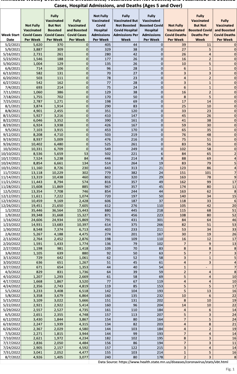
- Fig. 1: This table displays the total cases, hospital admissions, and deaths that occurred each week among the unvaccinated, vaccinated but not boosted, and vaccinated and boosted populations. The week of 8/07/2022 has been added this week. We can see that the cases among the unvaccinated grew by roughly 50% from the prior week, while cases among the unvaccinated and boosted fell by roughly 30%. We can see similar changes for the week of 8/07/2022 for admissions.
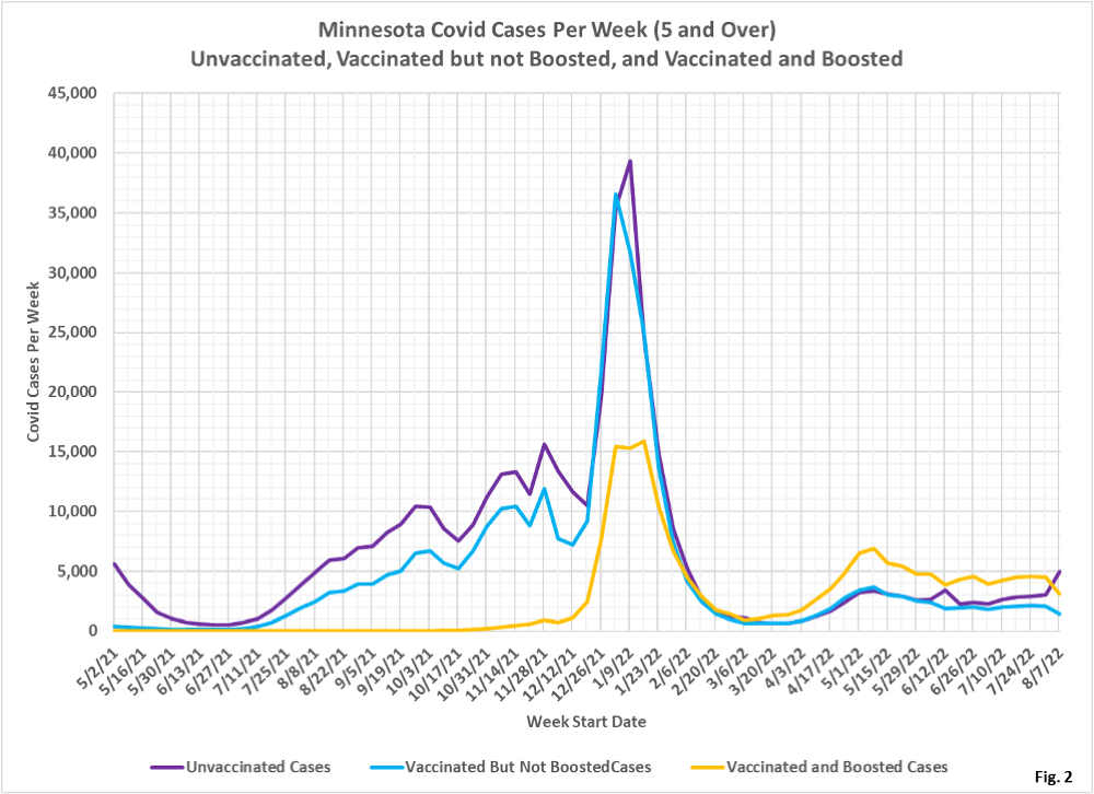
- Fig. 2: This chart simply plots the cases among the unvaccinated, vaccinated but not boosted, and vaccinated and boosted populations each week, as found in Fig. 1. As noted, there is a sharp spike in unvaccinated cases for the most recent data point. It seems likely that this is a data anomaly, and not an actual increase in cases among the unvaccinated. There was a similar, but smaller, spike in unvaccinated cases for the week of 6/12/2022 which then reversed back to trend the following week. However, the 6/12/2022 anomaly has not been updated in the weeks since it was first reported by MDH.
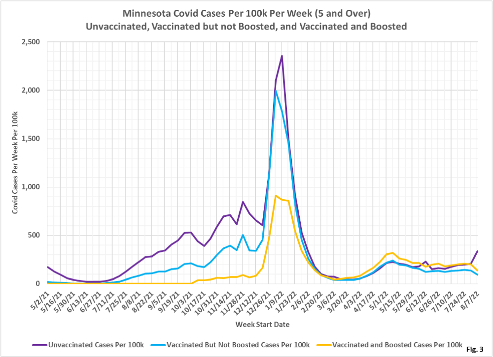
- Fig. 3: This chart displays the case rates per 100k for each group. We can see a sharp increase in the unvaccinated case rate for the week of 8/07/2022.
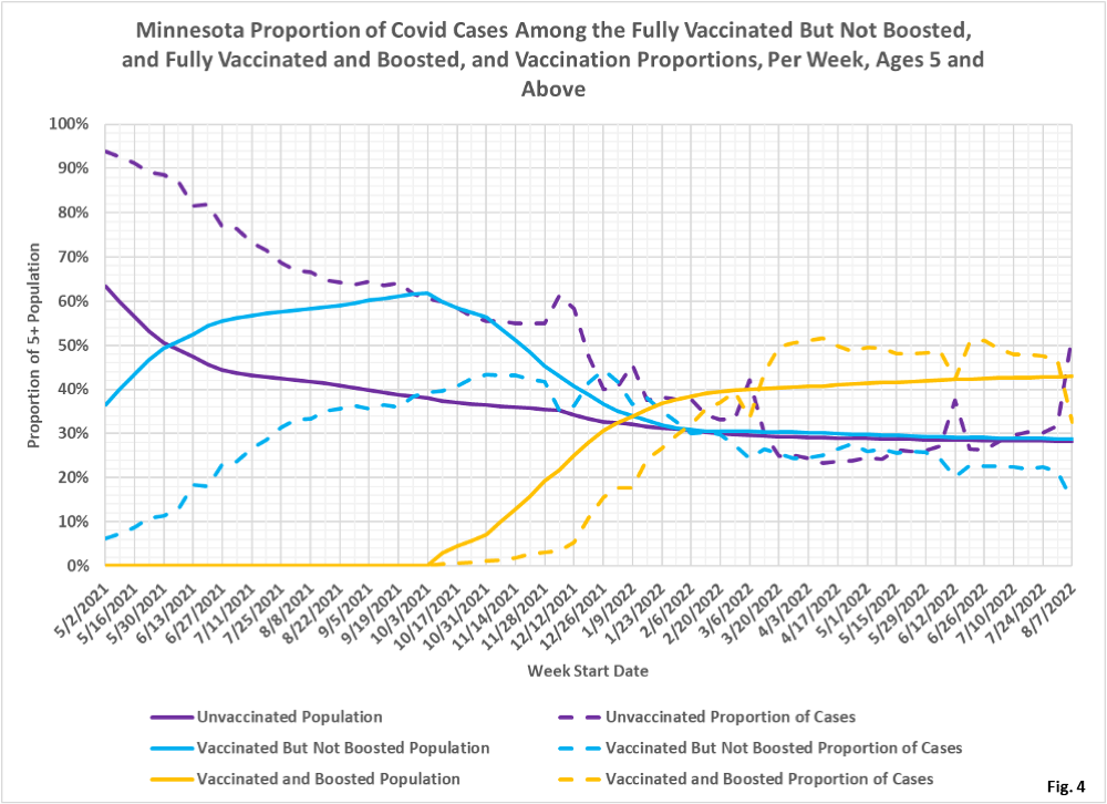
- Fig. 4: This chart displays the proportion of the 5 and over population who are unvaccinated (solid purple), vaccinated but not boosted (solid blue), and vaccinated and boosted (solid gold). For each population group we also display the proportion of cases each week (dashed lines of same color). The way to interpret this chart is to compare the proportion of breakthroughs to the proportion of vaccinations for each group. Whenever the dashed breakthrough proportion line is below the solid vaccination line of the same color, then that category is underrepresented for population, and when the dashed line is above the solid line of the same color then that category is overrepresented. For the week of 8/07/22 the unvaccinated made up 29% of the overall 5+ population but accounted for 52% of the overall cases.
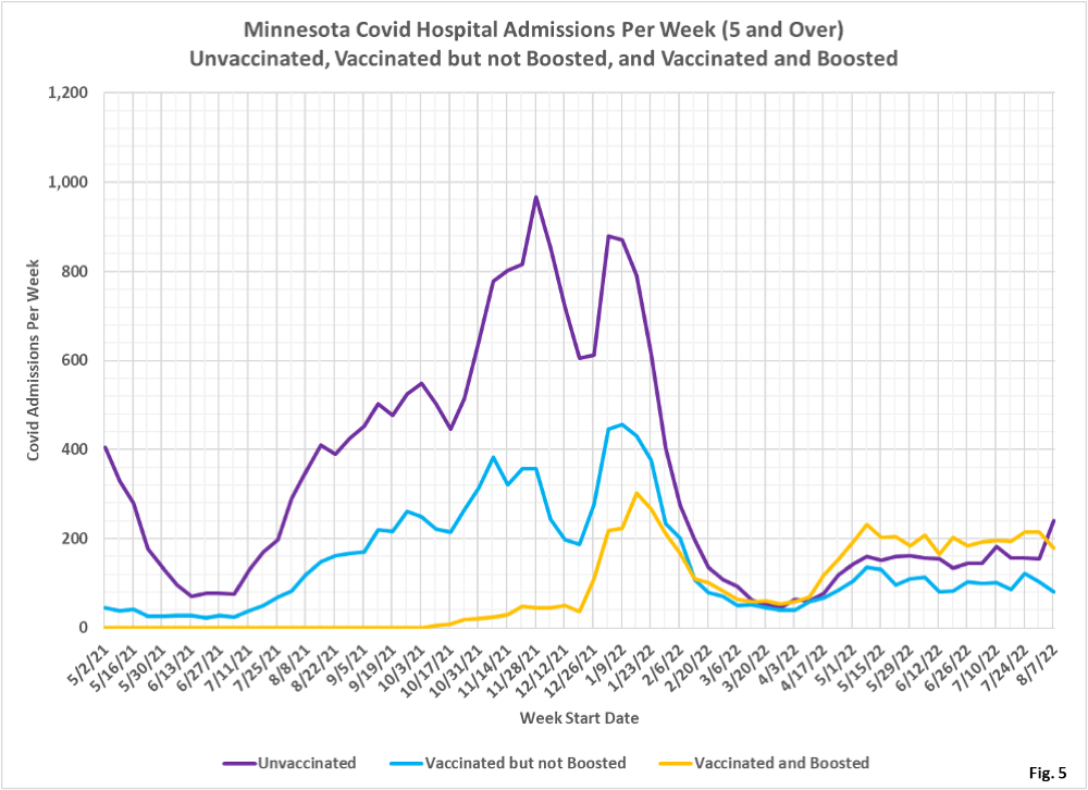
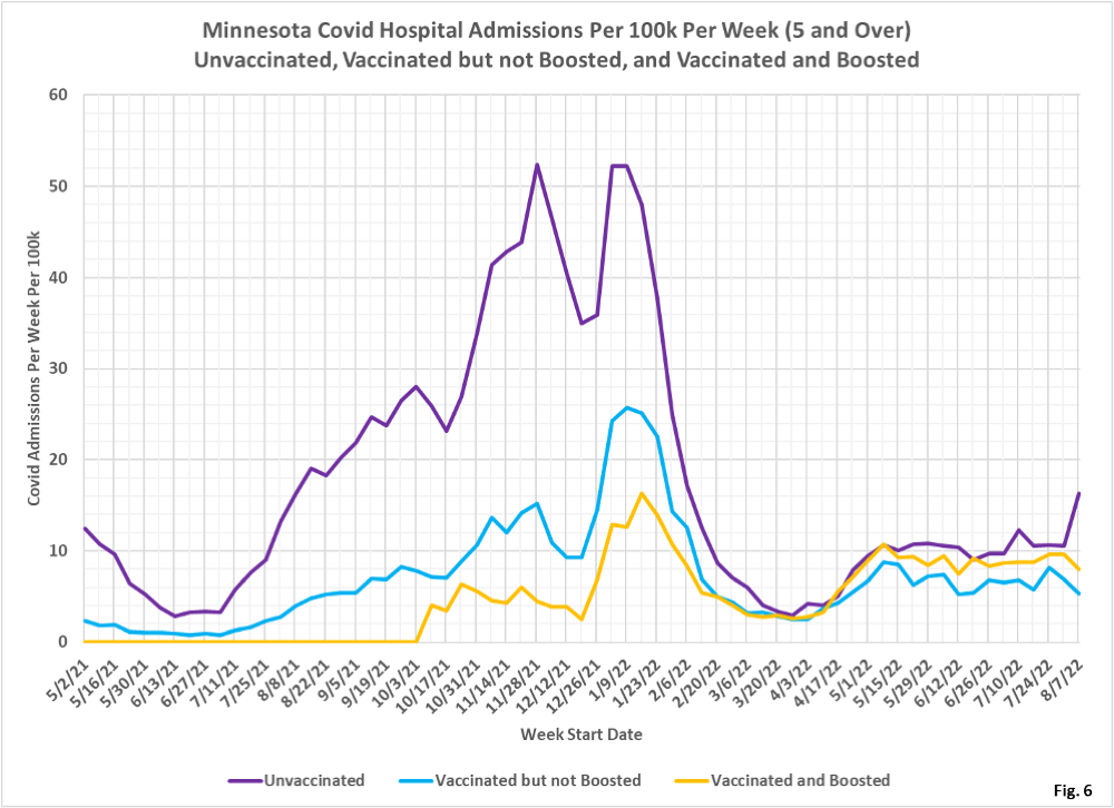
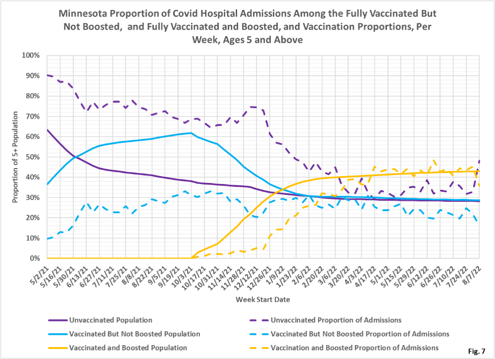
- Fig. 5-7: These charts display the hospital admissions, hospital admission rates per 100k, and hospital admissions proportions for the 5+ age group, in an identical format to the case charts in Fig. 2 through Fig. 4. Fig. 5 shows a sharp spike in the number of hospital admissions among the unvaccinated, with sharp decreases in admissions for the vaccinated and boosted. Fig. 6 shows similar changes in trend among the different groups. Fig. 7 shows that the unvaccinated were over-represented the week of 8/07/2022 (purple dashed curve higher than the solid purple curve), while the vaccinated and boosted are under-represented.
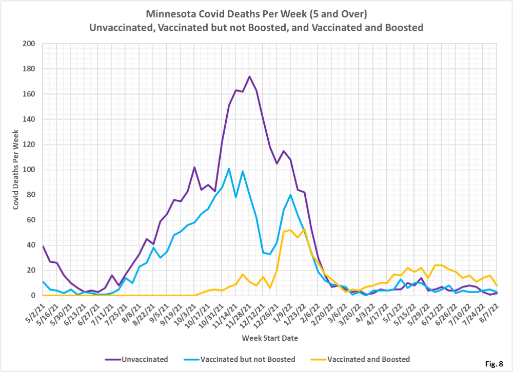
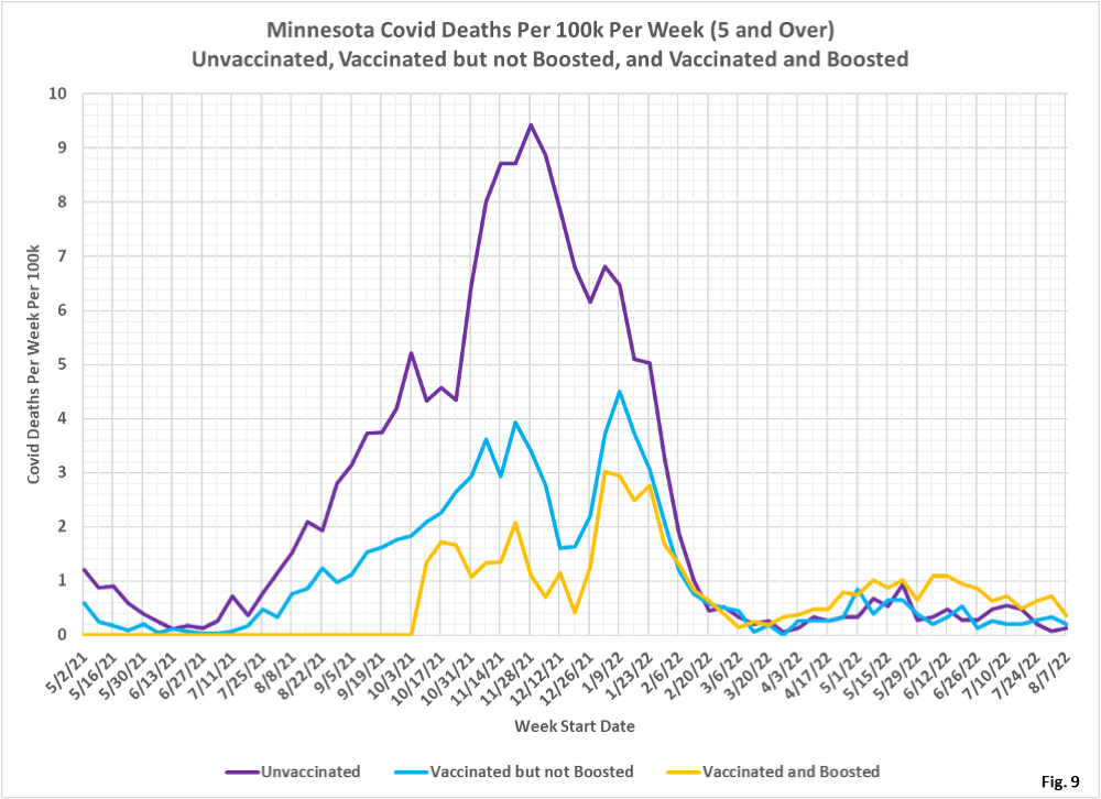
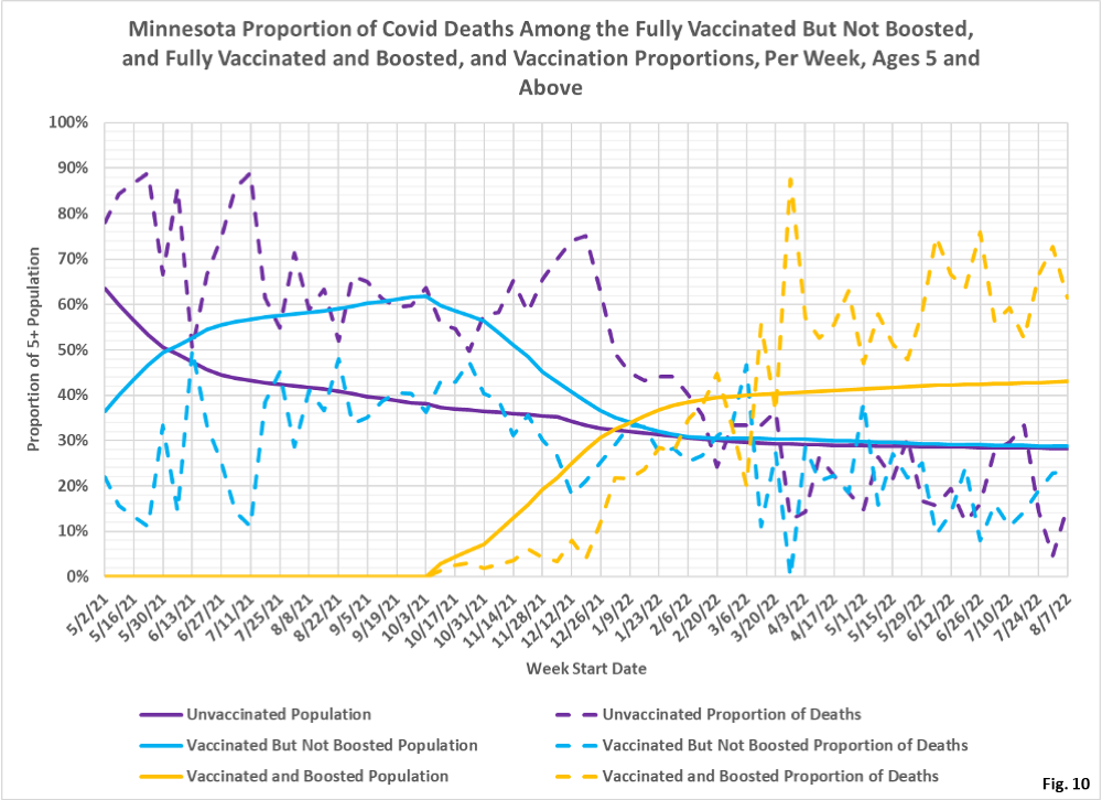
- Fig. 8-10: These charts display the deaths, deaths rates per 100k, and deaths proportions for the 5+ age group, in an identical format to the case charts in Fig. 2 through Fig. 4. Deaths among the boosted have been declining for several weeks (gold curve), while deaths among the unvaccinated and vaccinated are even lower (Fig. 8). The death rates per 100k are all very low, however the vaccinated and boosted have the highest death rate, likely due to incidental positive cases among the elderly boosted population (Fig. 9). For the week of 8/07/2022, the boosted make up 43% of the overall population but account for 62% of the weekly deaths, while the unvaccinated make up 29% of the population but account for only 15% of the deaths (Fig. 10). The breakthrough data is updated retroactively, so it is likely that these rates will change over time.
- MDH defines the fully vaccinated (what we have termed vaccinated but not boosted) as those who have not received a booster after completing their primary vaccination series, and had been vaccinated at least 14 days prior to testing positive.
- MDH defines the boosted as those who have received any additional vaccination shots after completing their primary vaccination series, and also received the booster at least 14 days prior to testing positive. In addition, booster doses were only counted after 8/13/2021, the date the CDC first began recommending booster shots.
