The most notable thing over the last few weeks is how being vaxed and boosted underperforms just being vaxed, but I believe this is exclusively an age effect, with only the oldest groups being heavily boosted.


Dave’s notes:
- This post is an update to the breakthrough data table and charts published on 8/06/22 here: https://healthy-skeptic.com/
2022/08/06/breakthrough- events-august-4/. This week’s update adds data for the week ending 7/17/2022, newly published by the Minnesota Department of Health (MDH) on 8/11/2022. In addition, there are relatively minor updates to prior weeks as well. - The breakthrough data files are available here, https://www.health.state.mn.
us/diseases/coronavirus/stats/ vbt.html , in the notes under the graphic images. - The charts in Fig. 2 through 10 contain 3 charts for each type of event (cases, admissions, or deaths). The first chart for each type is the number of events each week, illustrating in raw numbers the trend in the pandemic for the overall population, and the impact on society of each sub-group. The second chart is the rate of events per 100k each week, displaying the risk to an individual of the each category at different times during the pandemic. The third chart for each type of event is the proportions of event compared to the proportion of the population type (unvaccinated, vaccinated, or boosted). This chart helps show whether or not vaccination or boosting is effective in reducing the impact of the pandemic, by comparing the proportion of events to the proportion of the population.
- Fig. 1: This table displays the total cases, hospital admissions, and deaths that occurred each week among the unvaccinated, vaccinated but not boosted, and vaccinated and boosted populations. The week of 7/17/2022 has been added this week. Breakthrough cases for both vaccination categories have risen for the 3rd week in a row. There is a large decrease in boosted deaths the week of 7/17/2022, but this may be due to reporting lags.
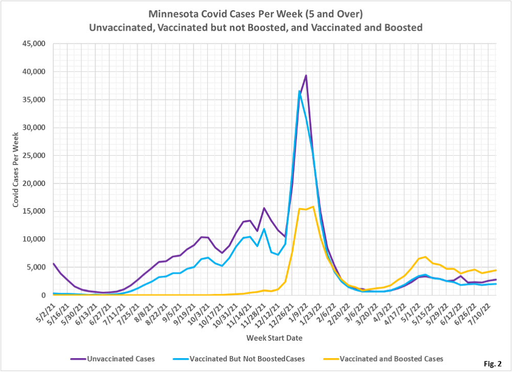
- Fig. 2: This chart simply plots the cases among the unvaccinated, vaccinated but not boosted, and vaccinated and boosted populations each week, as found in Fig. 1. Slight upward trend in cases, led by boosted cases.
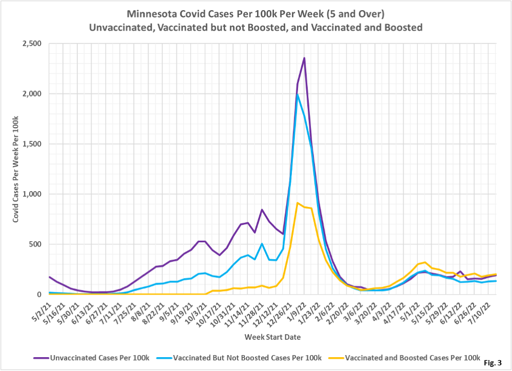
- Fig. 3: This chart displays the case rates per 100k for each group. The gap between case rates for the boosted and the unvaccinated has narrowed greatly the last several weeks. The vaccinated but not boosted continue to have the lowest rate of testing positive. Note that this data does not include home Covid tests, which may skew the among the vaccination categories.
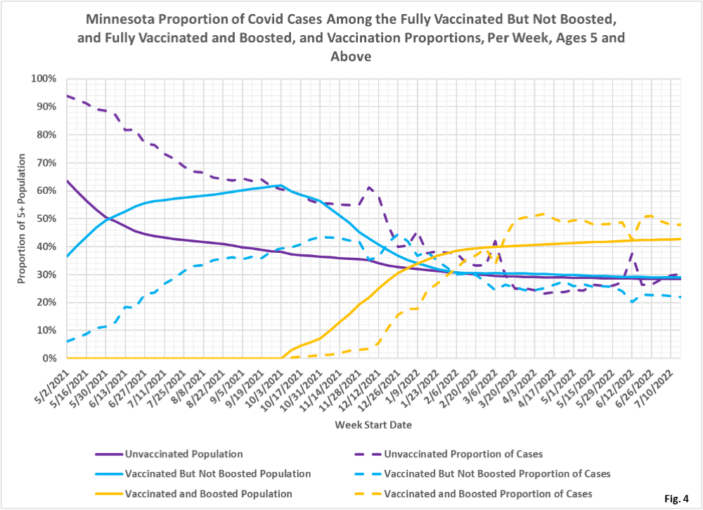
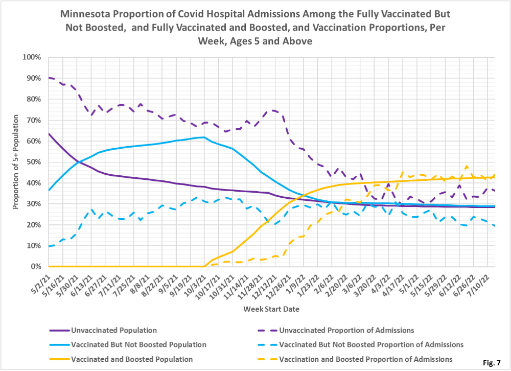
- Fig. 4: This chart displays the proportion of the 5 and over population who are unvaccinated (solid purple), vaccinated but not boosted (solid blue), and vaccinated and boosted (solid gold). For each population group we also display the proportion of cases each week (dashed lines of same color). The way to interpret this chart is to compare the proportion of breakthroughs to the proportion of vaccinations for each group. Whenever the dashed breakthrough proportion line is below the solid vaccination line of the same color, then that category is underrepresented for population, and when the dashed line is above the solid line of the same color then that category is overrepresented. For the week of 7/17/22 the vaccinated and boosted made up 43% of the overall 5+ population but accounted for 48% of the overall cases for the second week in a row. The proportion of boosted cases (gold dashed curve) have been over-represented since 3/13/2022, compared to the proportion of boosted population (solid gold curve).
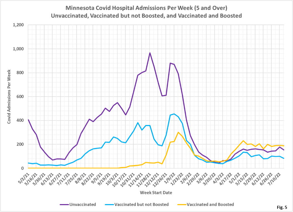
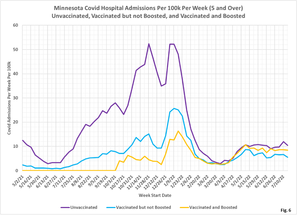
- Fig. 5-7: These charts display the hospital admissions, hospital admission rates per 100k, and hospital admissions proportions for the 5+ age group, in an identical format to the case charts in Fig. 2 through Fig. 4. Fig. 5 shows that the boosted as a group have the largest number of hospital admissions, with admissions for the unvaccinated dropping down after a large increase last week. Fig. 6 shows that the unvaccinated had the highest rate of hospital admission for the week of 7/17/22, while the vaccinated but not boosted had the lowest rate of admission. Fig. 6 shows that the vaccinated but not boosted are indeed under-represented (blue dashed curve lower than solid blue curve), while the unvaccinated are over-represented dashed purple line higher than solid purple line).
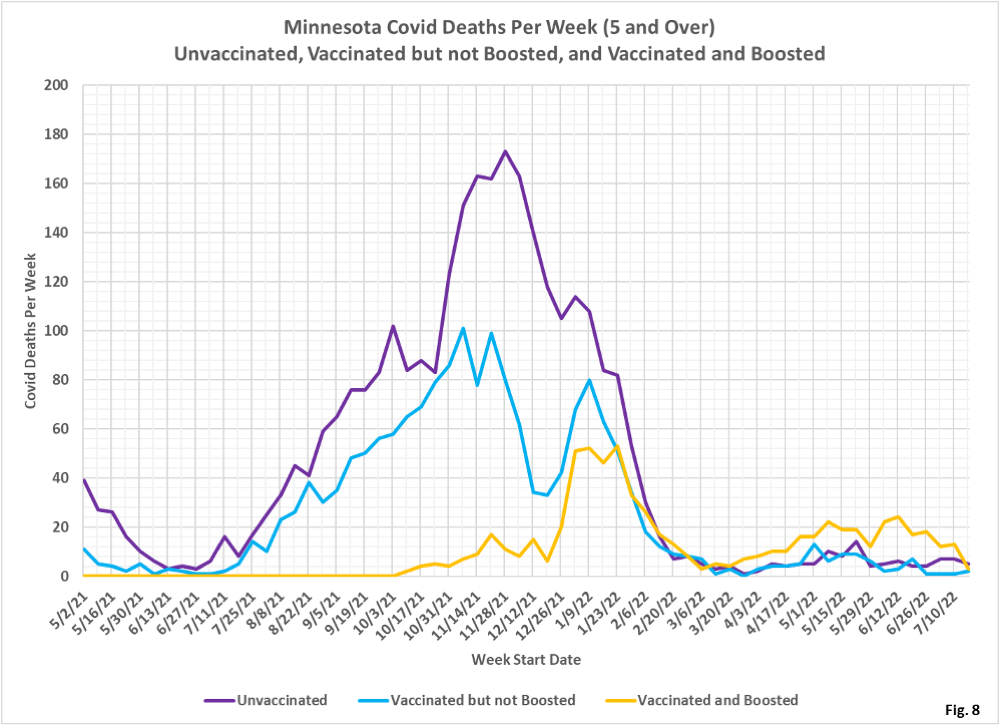
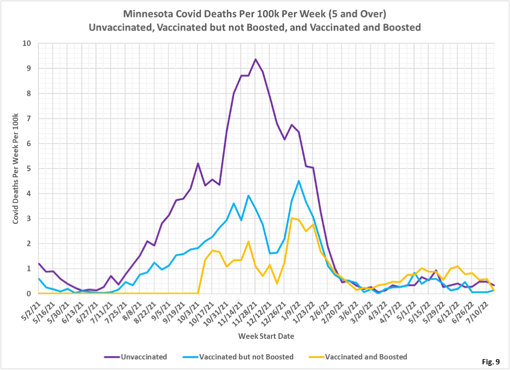
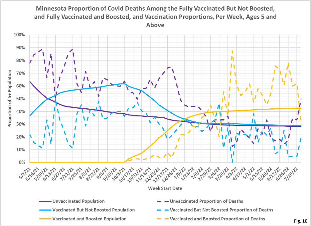
- Fig. 8-10: These charts display the deaths, deaths rates per 100k, and deaths proportions for the 5+ age group, in an identical format to the case charts in Fig. 2 through Fig. 4. Deaths among the boosted have dropped by a large amount for the week of 7/17/22 (Fig. 8). The unvaccinated for 7/17/2022 have the highest rate of death for the first time since the spike in unvaccinated deaths the week of 5/22/22 (Fig. 9). For the week of 7/17/2022, the boosted make up 43% of the overall population but only account for 30% of the weekly deaths (Fig. 10). The breakthrough data is updated retroactively, so it is possible that the large drop in boosted deaths may be revised in the future.
- MDH defines the fully vaccinated (what we have termed vaccinated but not boosted) as those who have not received a booster after completing their primary vaccination series, and had been vaccinated at least 14 days prior to testing positive.
- MDH defines the boosted as those who have received any additional vaccination shots after completing their primary vaccination series, and also received the booster at least 14 days prior to testing positive. In addition, booster doses were only counted after 8/13/2021, the date the CDC first began recommending booster shots.
