 Dave’s notes:
- The following charts illustrate, for the 18-49 year old age group, that being vaccinated and boosted appears to offer protection for being hospitalized with Covid in the most recent weeks’ data available, but the boosted and the unvaccinated have almost identical rates of testing positive in the most recent data. There are too few deaths in this age group to draw any conclusions.
- This post is an update to the 18-49 age group breakthrough charts most recently published on 7/25/2022 here: https://healthy-skeptic.com/2022/07/25/breakthrough-events-july-21-ages-18-to-49/.
- There are 9 charts in this set, 3 charts each for cases, hospital admissions, and deaths. Each set of 3 charts consists of the actual events per week (cases, admissions, or deaths); the rate per 100k each week, and the proportion of events compared to the proportion of the vaccinated population.
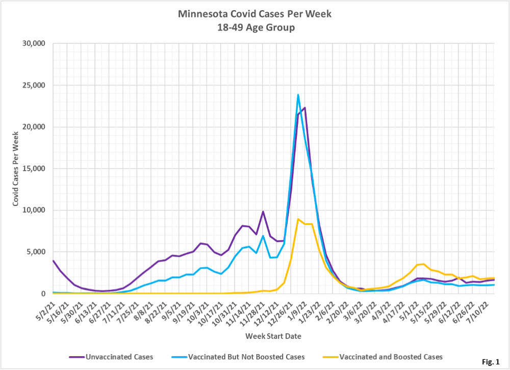
- Fig. 1: This chart plots the cases in the 18-49 age group per week among the unvaccinated, vaccinated but not boosted, and vaccinated and boosted populations each week. Since the week of 3/13/2022 (except for the anomalously high number of unvaccinated cases the week of 6/12/2022) there have been more cases each week among the boosted, rather than among the vaccinated but not boosted, or unvaccinated.
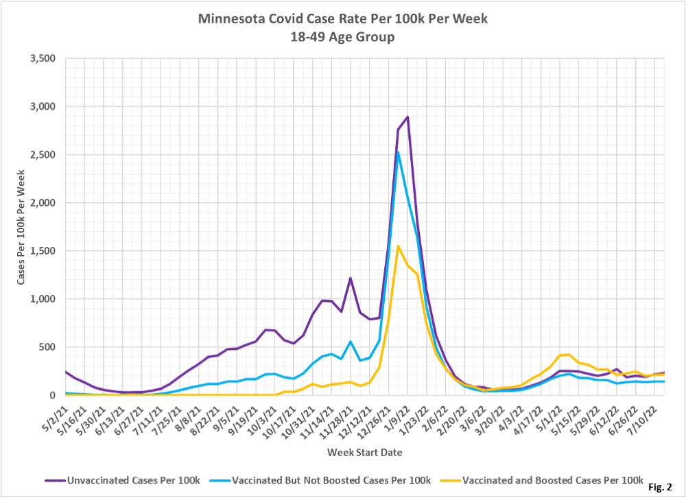
- Fig. 2: This chart displays the case rates per 100k for each subgroup in the 18-49 age group. The boosted continue to have almost identical rates of cases per 100k, and the vaccinated but not boosted have the lowest rate of cases per 100k. Earlier in the pandemic being vaccinated or boosted did substantially lower the case rate compared to the unvaccinated.
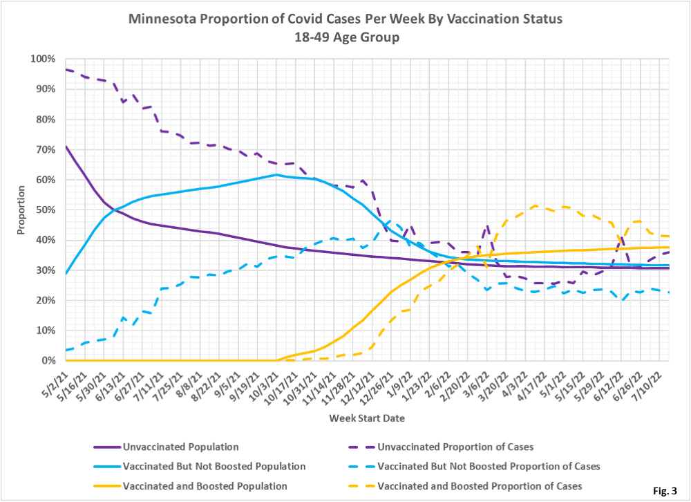
- Fig. 3: This chart displays the proportion of the 18-49 population who are unvaccinated (solid purple), vaccinated but not boosted (solid blue), and vaccinated and boosted (solid gold). For each population group we also display the proportion of cases each week (dashed lines of same color). Note that as people are boosted they are moved from the vaccinated subgroup to the boosted subgroup. The way to interpret this chart is to compare the proportion of breakthroughs to the proportion of vaccinations for each group. Whenever the dashed breakthrough proportion line is below the solid vaccination line of the same color, then that category is underrepresented for population, and that vaccination status might be said to be beneficial (ignoring for now other confounding factors). For the week of 7/17/2022, the most recent data we have, 38% of this age group was vaccinated and boosted (solid gold line) while this group accounted for 41% of the cases (dashed gold line). We would interpret this to show that being boosted did not reduce an individual’s chances of testing positive for Covid for that week. Also for the week of 7/17/2022, the vaccinated but not boosted (solid blue line) made up 32% of the population of this age group, but accounted for only 23% of the cases for that age group.
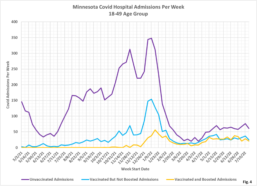
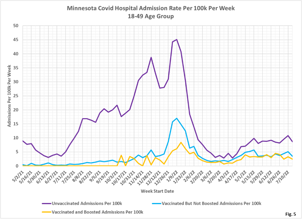
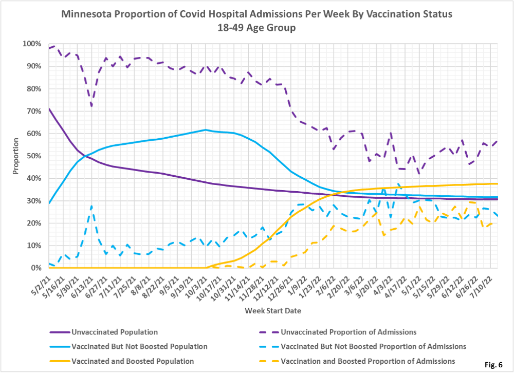
- Fig. 4-6: These charts display the hospital admissions, hospital admission rates per 100k, and hospital admissions proportions for the 18-49 age group, in an identical format to the case charts in Fig. 1 through Fig. 3. The unvaccinated had the highest number of admissions throughout the pandemic (Fig. 4). The admissions per 100k for the unvaccinated are highest throughout the pandemic, with the admissions rates per 100k for the boosted very similar to the vaccinated but not boosted for the past several weeks (Fig. 5). Fig. 6 shows that admissions among the unvaccinated have been disproportionately high throughout the pandemic. For the week of 7/17/2022 the unvaccinated made up 31% of the age group but accounted for 54% of the admissions. The boosted made up 38% of the age group but only accounted for 20% of the admissions.
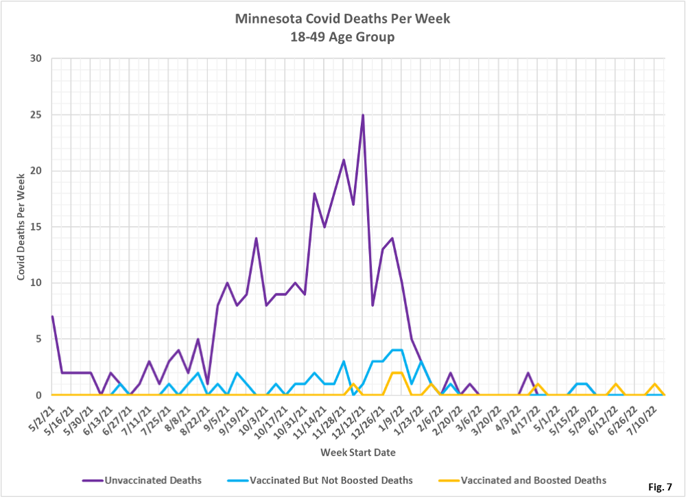
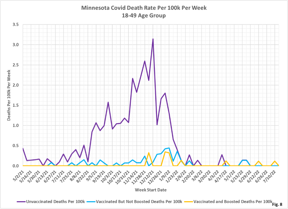
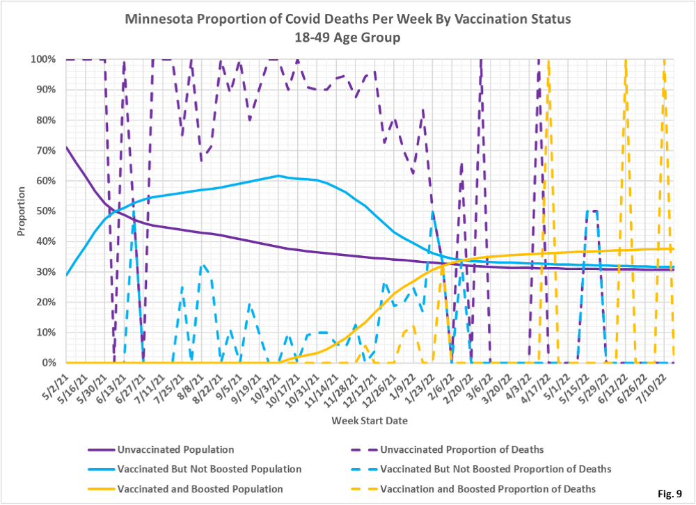
- Fig. 7-9: These charts display the deaths, deaths rates per 100k, and deaths proportions for the 18-49 age group, in an identical format to the case charts in Fig. 1 through Fig. 3. The unvaccinated had the greatest number of deaths by far during the Omicron wave in late 2021/early 2022, but in recent weeks there are very few deaths in any of the subgroups (Fig. 7). Fig. 8 shows that the rates of death per 100k for each subgroup is very low in the most recent months of data, matching Fig. 7. Fig. 9 shows that deaths proportions are highly variable, and that deaths among the unvaccinated are over-represented through much of the pandemic.
- All data is obtained from the Minnesota Department of Health (MDH) Vaccine Breakthrough Weekly Update web site https://www.health.state.mn.us/diseases/coronavirus/stats/vbt.html. A data file on this site, vbtadultcirates.xlsx, contains all of the age group data.
- MDH defines the fully vaccinated (what we have termed vaccinated but not boosted) as those who have not received a booster after completing their primary vaccination series, and had been vaccinated at least 14 days prior to testing positive.
- MDH defines the boosted as those who have received any additional vaccination shots after completing their primary vaccination series, and also received the booster at least 14 days prior to testing positive. In addition, booster doses were only counted after 8/13/2021, the date the CDC first began recommending booster shots.
