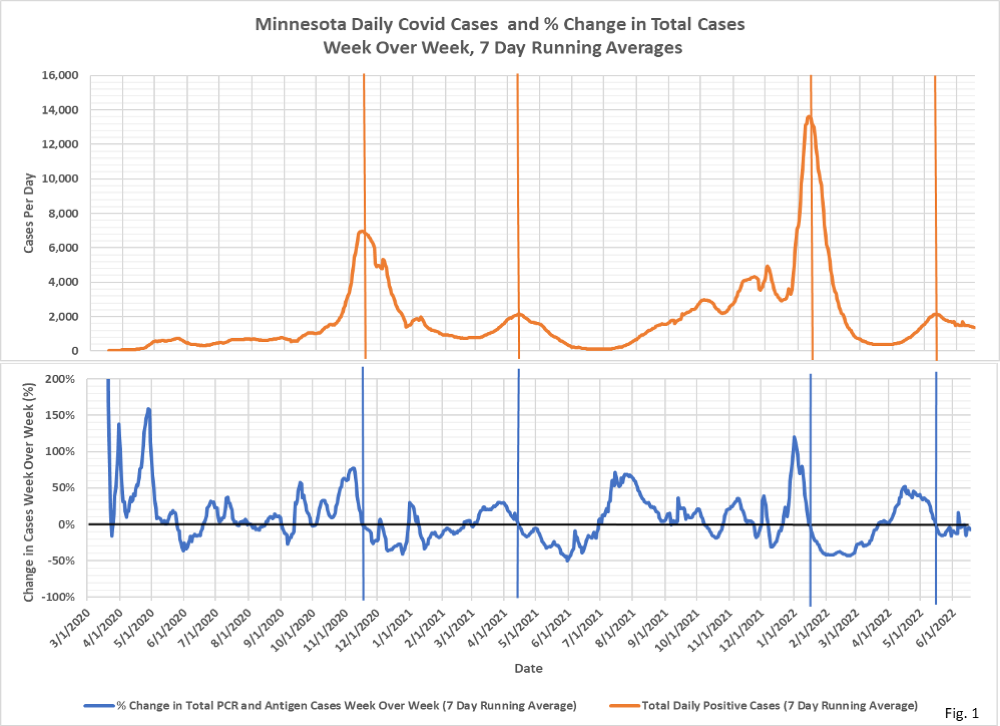
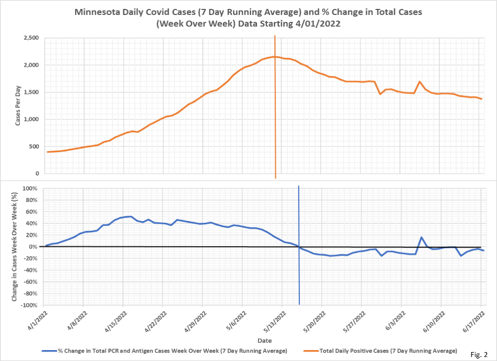
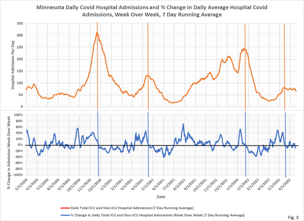
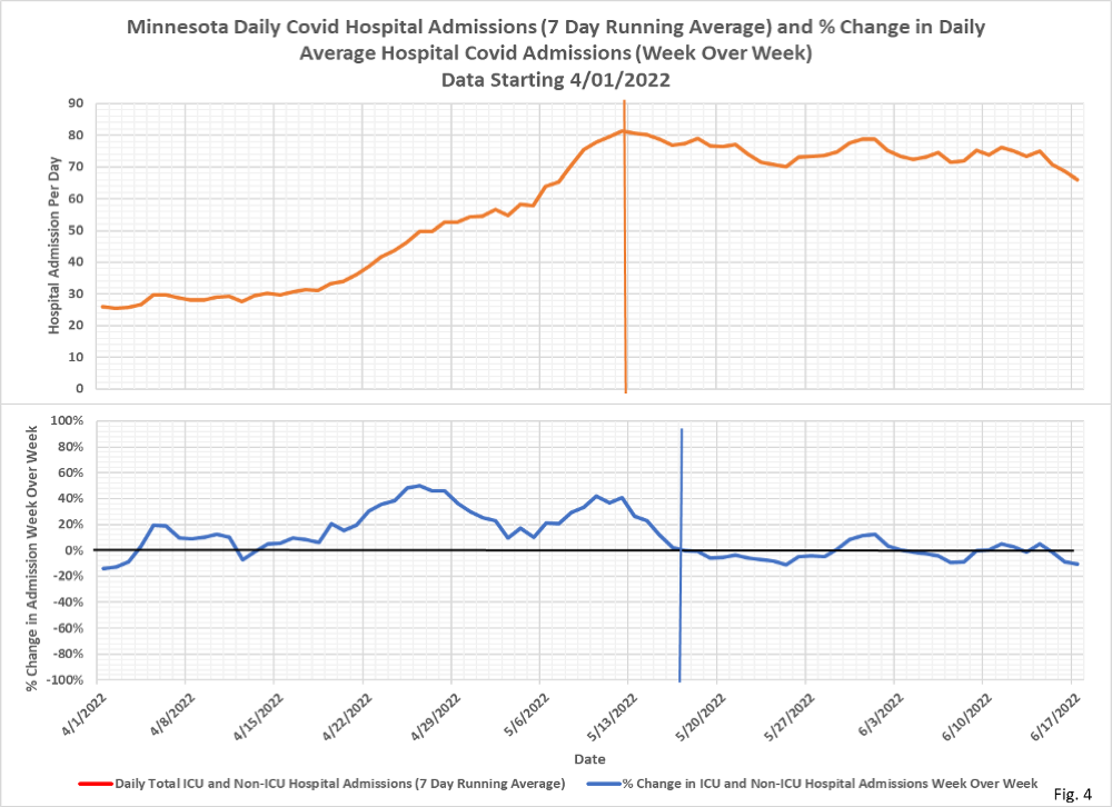
These charts help identify the trend in the trend, and you can see it is pretty flat. Odd pattern, probably quite distorted by home testing, which doesn’t show up, and incidental hospitalizations. The methodology is the same as with the other week-over-week charts.
✅ Subscribe via Email
About this Blog
Healthy Skeptic Podcast
Research
MedPAC 2019 Report to Congress
June 18, 2019
Headlines
Tags
Access
ACO
Care Management
Chronic Disease
Comparative Effectiveness
Consumer Directed Health
Consumers
Devices
Disease Management
Drugs
EHRs
Elder Care
End-of-Life Care
FDA
Financings
Genomics
Government
Health Care Costs
Health Care Quality
Health Care Reform
Health Insurance
Health Insurance Exchange
HIT
HomeCare
Hospital
Hospital Readmissions
Legislation
M&A
Malpractice
Meaningful Use
Medicaid
Medical Care
Medicare
Medicare Advantage
Mobile
Pay For Performance
Pharmaceutical
Physicians
Providers
Regulation
Repealing Reform
Telehealth
Telemedicine
Wellness and Prevention
Workplace
Related Posts
Commentary
A Good Longer-term Debt Auction
March 19, 2025
A Good Longer-term Debt Auction
A strong 20 year US debt auction.
Commentary
Mixed Economic News
March 18, 2025
Mixed Economic News
Various economic reports and indicators reflect uncertainty.
Commentary
Debunking Climate Hysteria, March 17, 2025
March 17, 2025
Debunking Climate Hysteria, March 17, 2025
Offshore wind farms are a particularly stupid source of unreliable, expensive power.