Another update on the troubled wastewater series, which is interesting to watch but doesn’t seem capable of helping us with the undetected cases issue.
 Dave’s notes:
- We last looked at correlations between wastewater and Covid case levels in Minnesota on June 1 here: https://healthy-skeptic.com/
2022/06/06/wastewater-cv-19- levels-june-1/ . We had noted in that post that every data point had been undated, which we found disappointing since it would prevent use of wastewater data as an early predictor of cases if the data was frequently and significantly revised. In today’s review of the data we found that none of the old data points were revised. Visually the correlations between wastewater virus levels and cases per 10k look fairly good, so if the wastewater could be analyzed quickly and reliably then perhaps it may be a useful predictor of Covid activity. The other issue is that we do not know what percent of Covid cases are detected by MDH, and whether that proportion changes over time. - The University of Minnesota publishes summary data of Covid sampling of wastewater in Minnesota here: https://experience.arcgis.com/
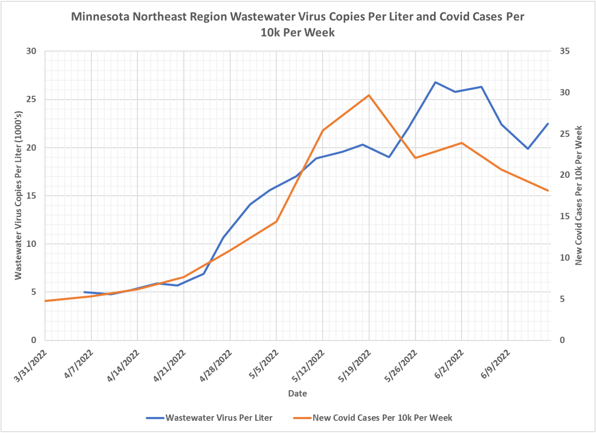
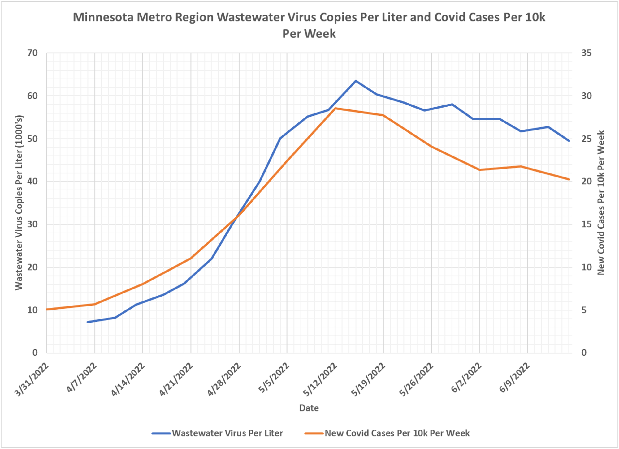
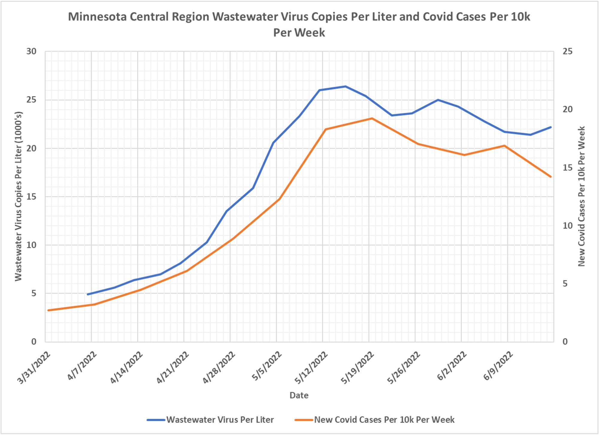
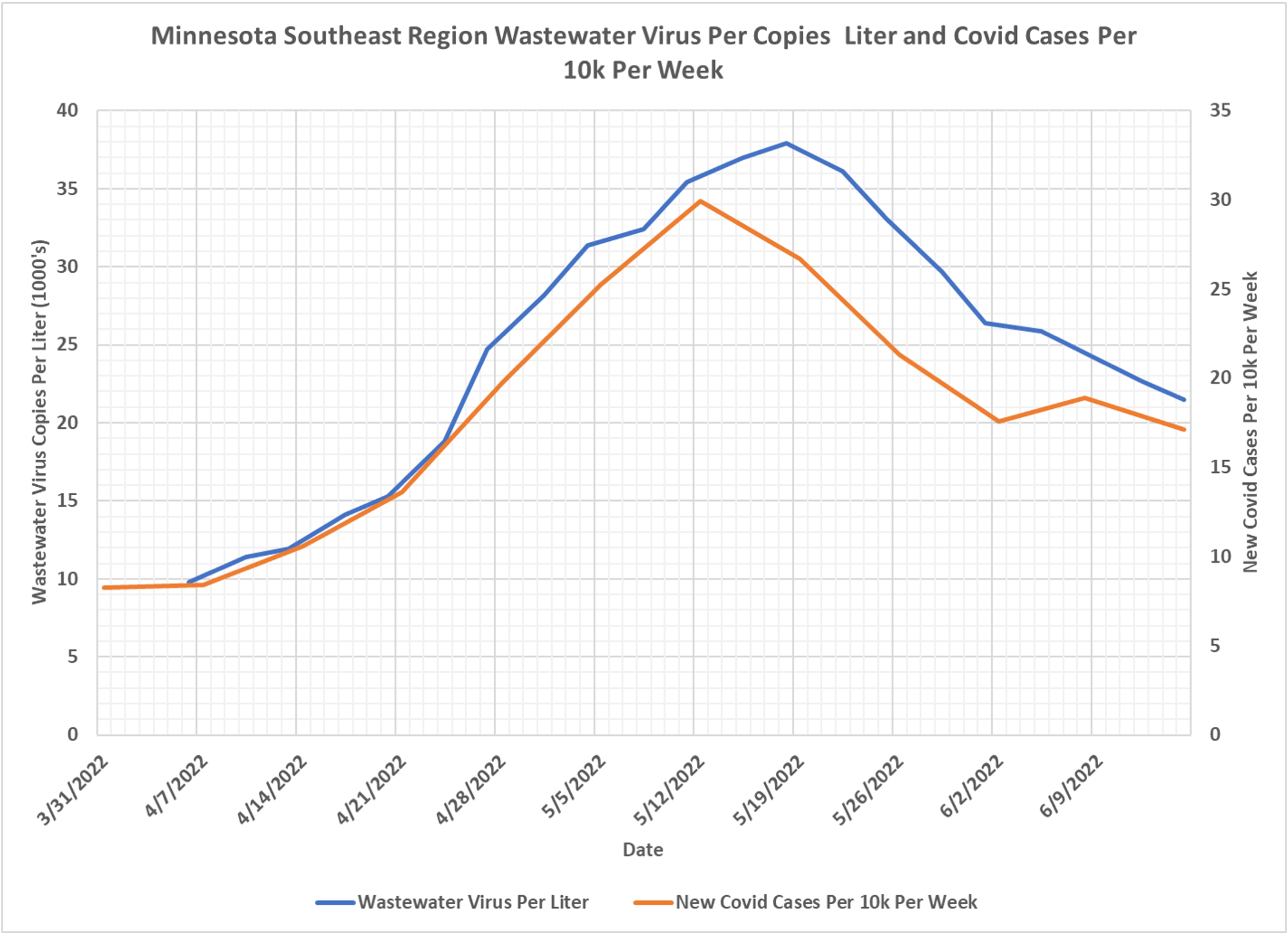
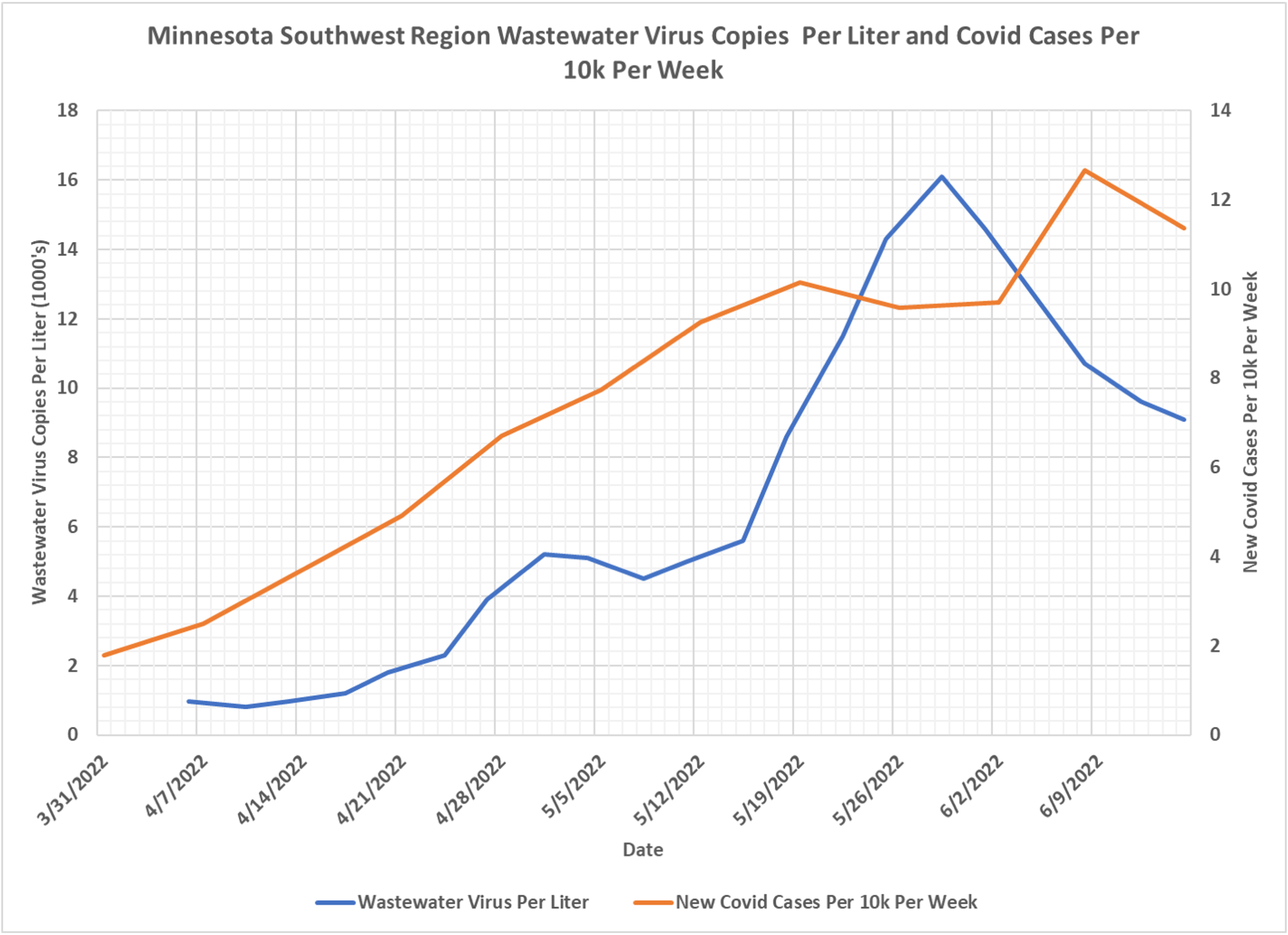
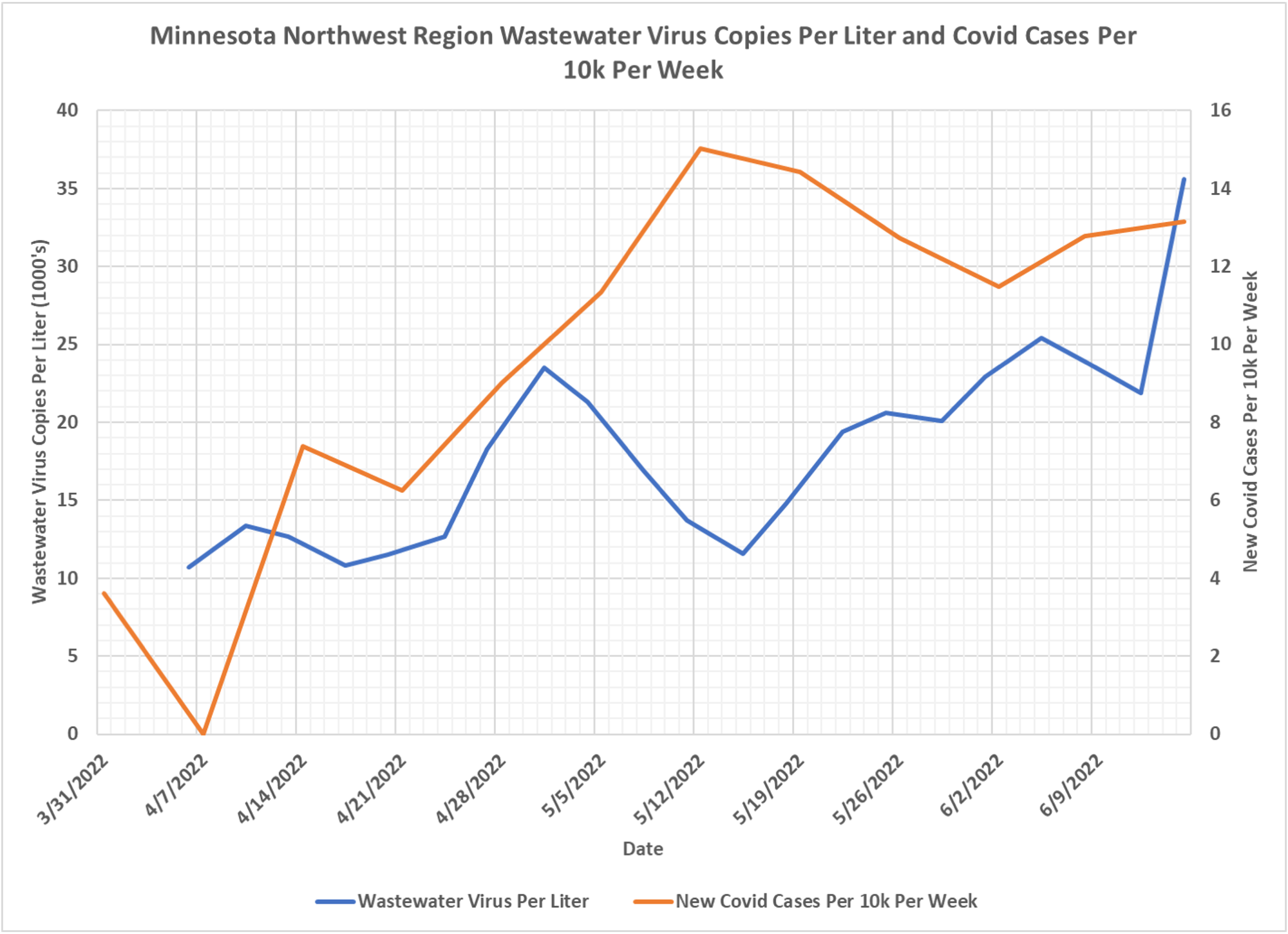
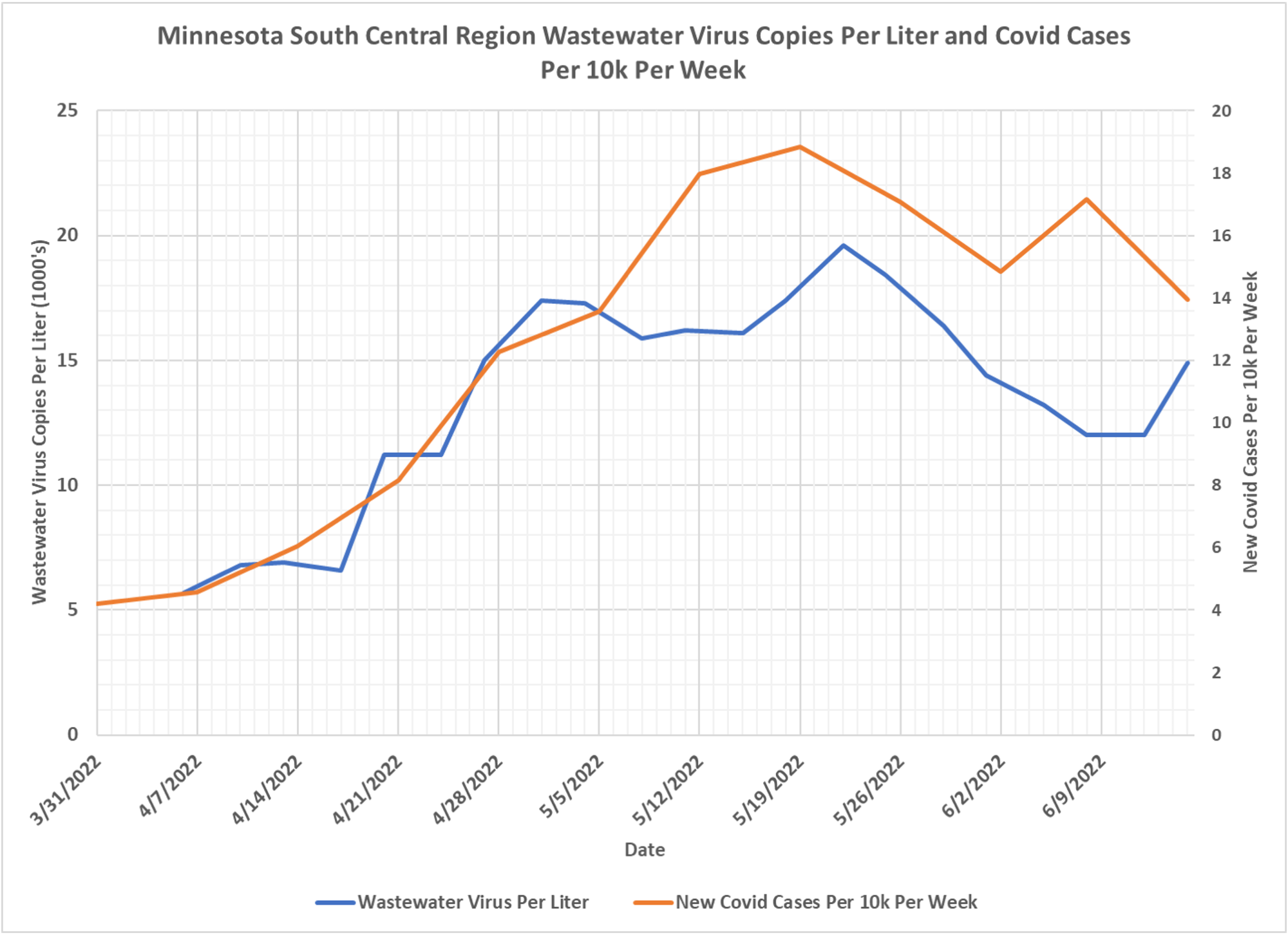
experience/ a8d269bd670a421e9fd45f967f23f1 3c?data_id=dataSource_1- 17ed5c83cca-layer-5%3A2 The U of M is monitoring wastewater plants for the presence of Covid indicators. They state that the amount of Covid detected in wastewater is predictive of clinical cases of Covid 1 to 2 weeks later. They also state that they are studying whether their metrics correlate to hospitalizations. - In the following charts we are plotting the U of M metric “Mean Weighted Average (N and O genes)” of virus copies per liter (blue curves) along with the newly reported covid cases per 10,000 residents in each region (red curves). We have yet to find any documentation describing exactly what the mean weighted average represents. For the purposes of this post it is assumed that the weighting process accounts for the differing populations in each region. For this reason we have chosen to plot Covid cases as the cases per 10k residents, rather than simply number of Covid cases per region.
- It is important to note that the U of M states that they changed their methodology on 3/15/2022. This means that the older data they published, from 1/1/2021 to 3/15/2022, is not directly equivalent with the post-3/15/2022 data. We are only publishing the newer data in these charts. Also, the mean weighted metric we are displaying only starts on 4/6/2022. Some of the 4/3/2022 data points available last time have been deleted by the U of M, so they have been removed from the charts as well.
- The cases per 10,000 plotted in the charts are not the cases publishes by the U of M. Rather, we are taking cases per week per county from the Minnesota Department of Health Weekly Report archive, https://www.health.state.mn.
us/diseases/coronavirus/stats/ index.html, which includes cumulative cases per county each week. From this data we calculate cases per week, and then cases per week per region per 10,000 population.

I gotta say that wastewater-driven policy scares me and I am glad it doesn’t seem to be predictive because a pandemic could be declared with no persona involved.