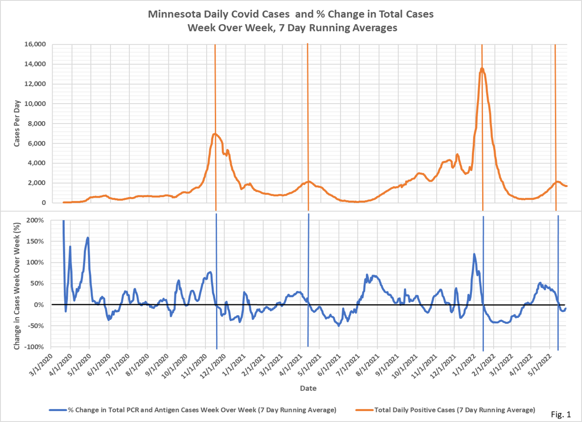
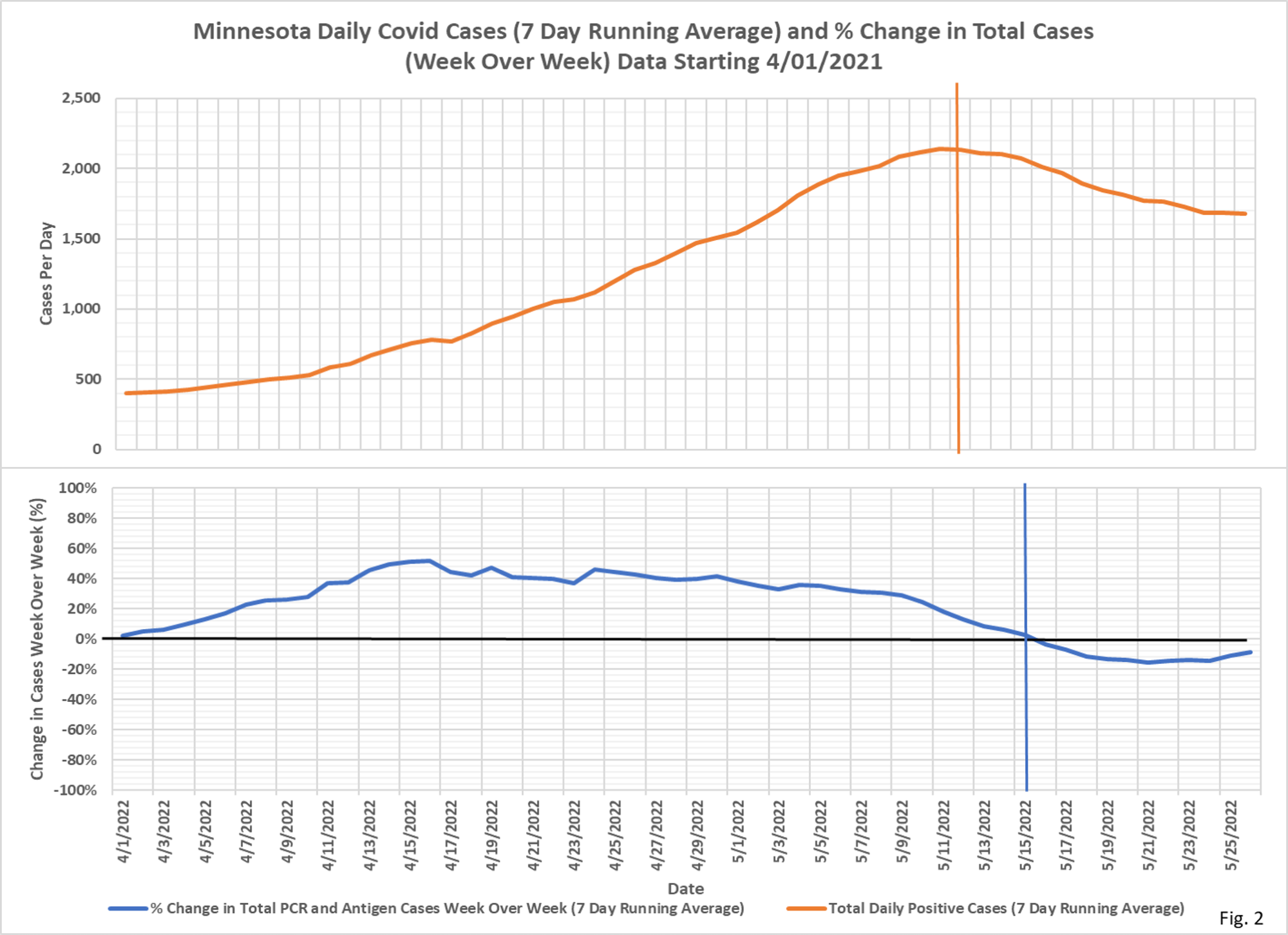
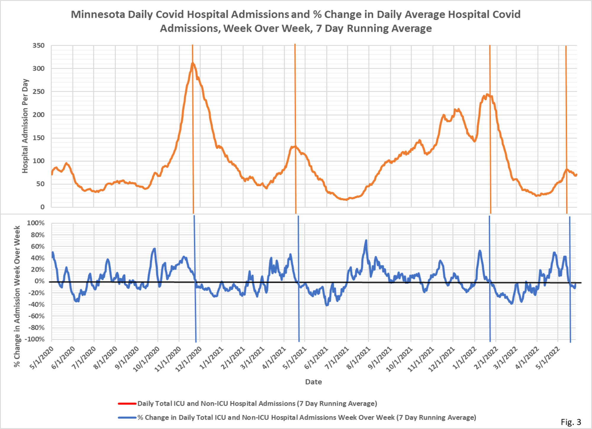
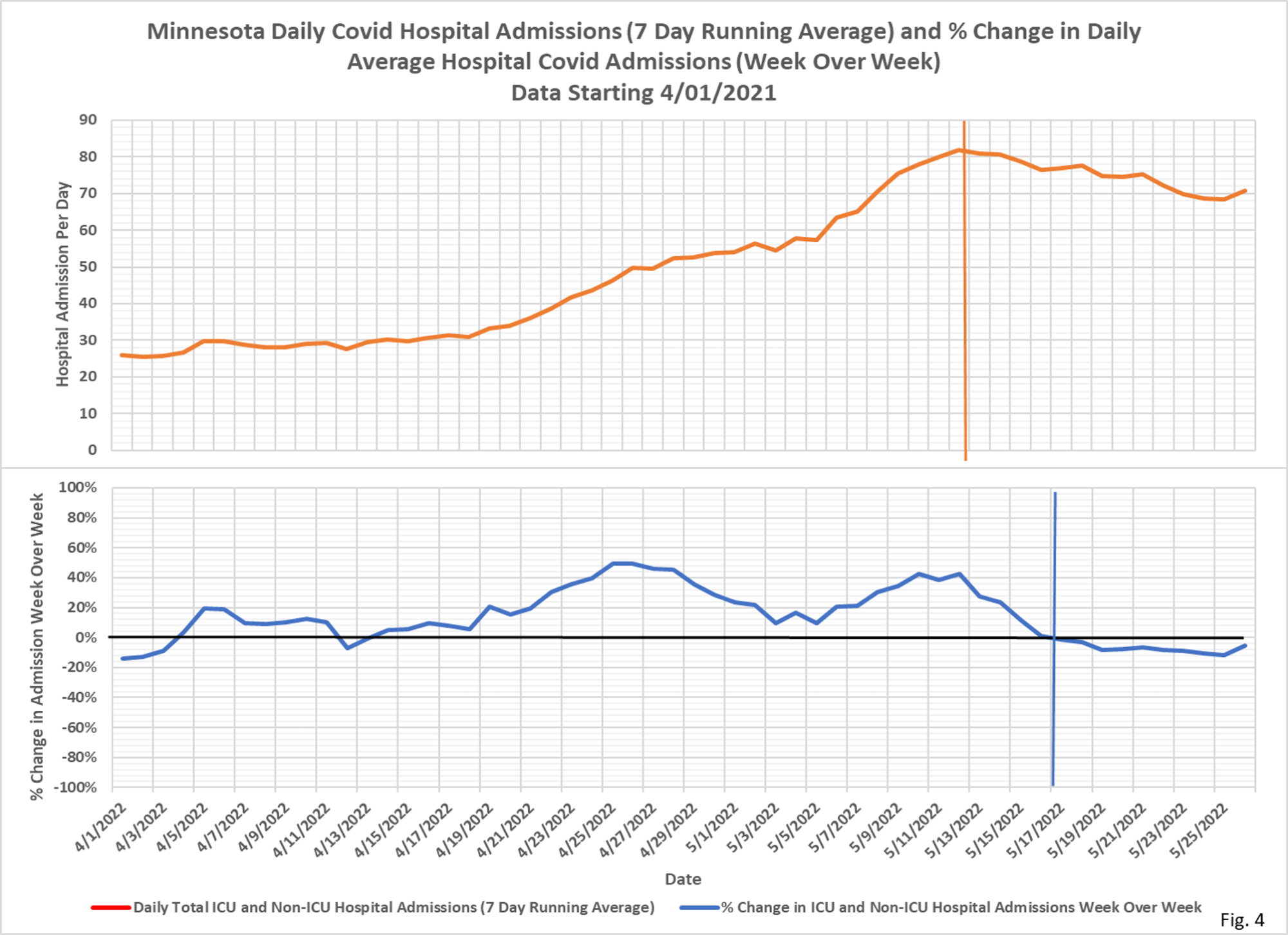
I have come to rely on this method for picking out near term trends. Dave Dixon puts these charts together, but as I mentioned before you can use the tables of events by date to just eyeball the trend. What we see right now is a very slow change line that declined a bit and is now turning up a bit. Home testing undoubtedly has changed the ratio of reported to total cases since the start of the year. But reported cases seem to be following the same trend as hospitalizations.