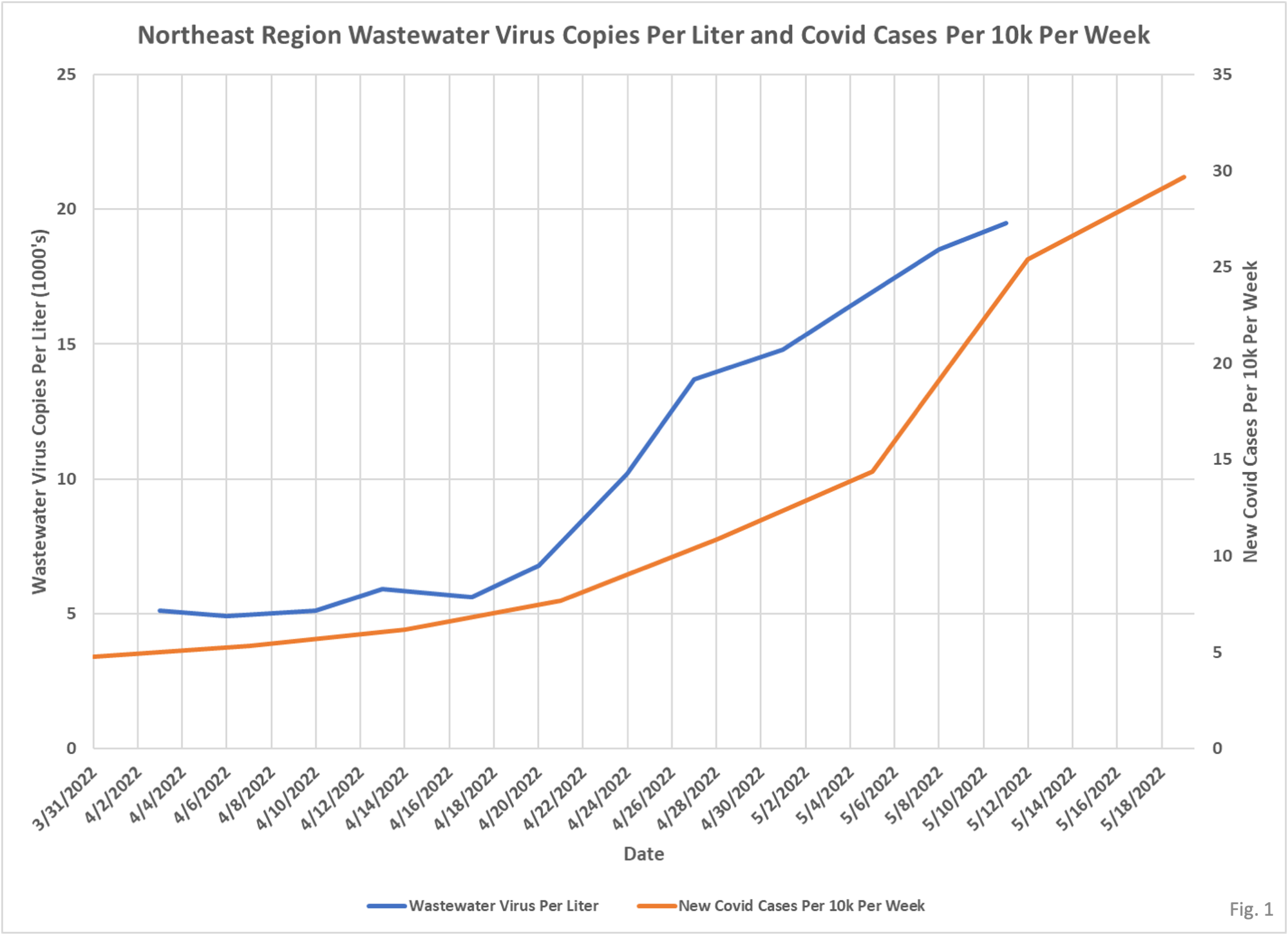
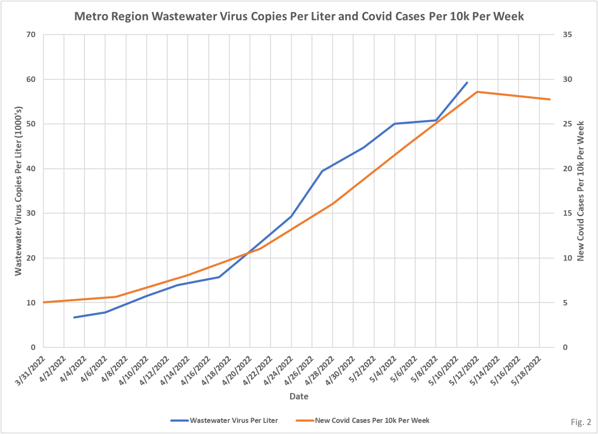
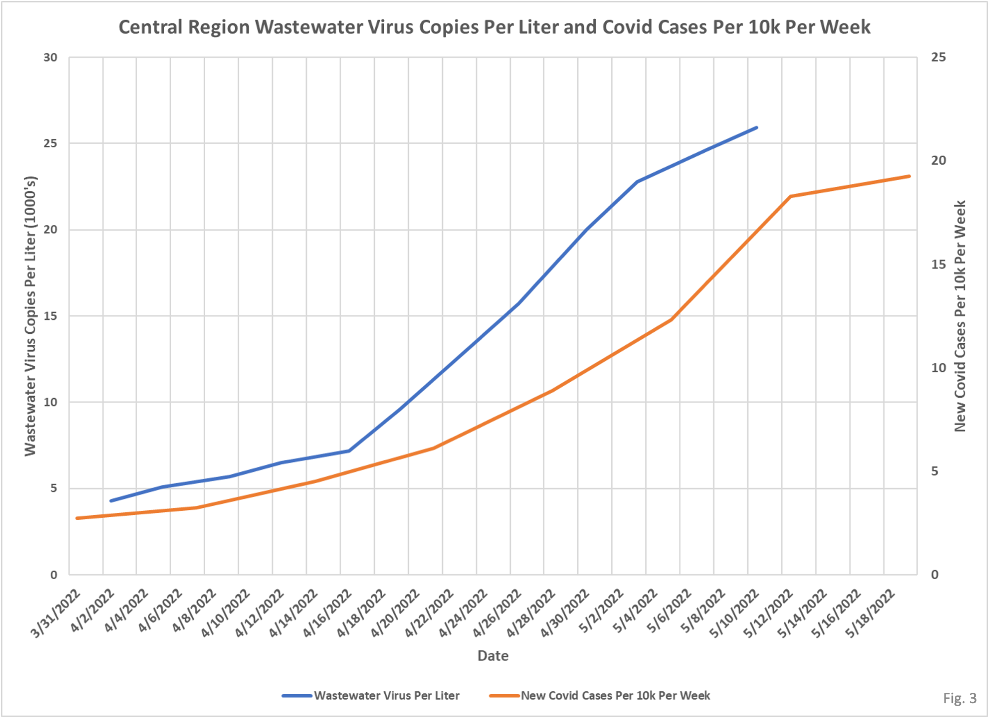
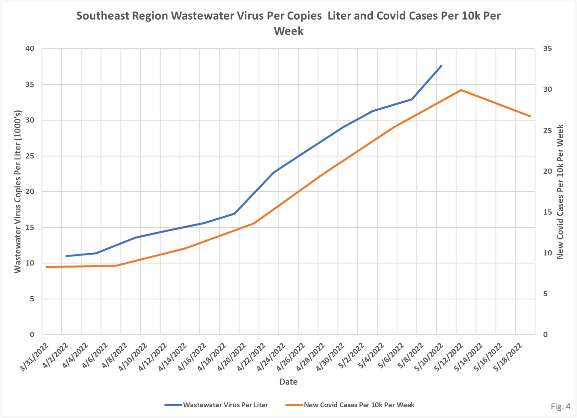
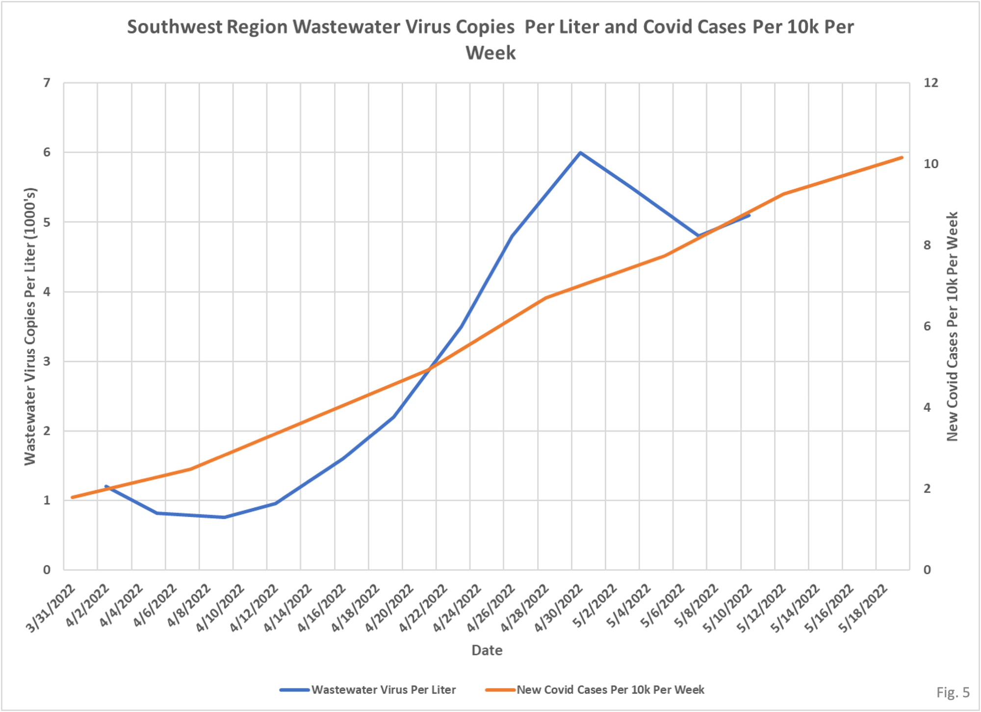
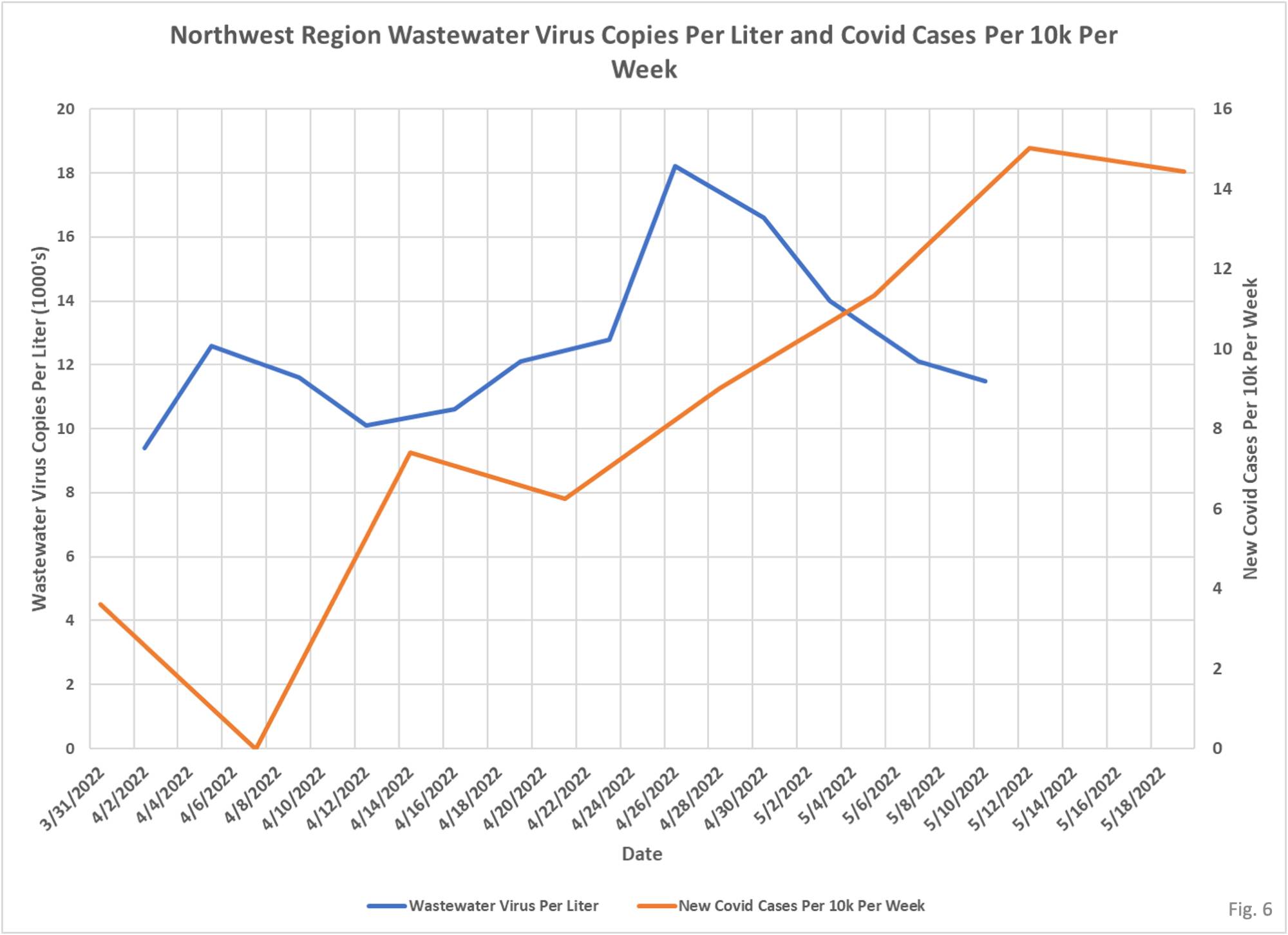
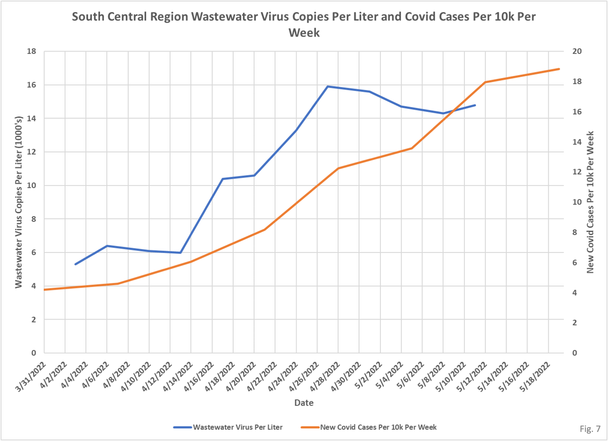
Here is an updated set of wastewater charts. On some you can see that the wastewater was suggesting higher levels of cases than were being reported. There is a lot of inconsistency and other issues in these measures so they are a little disappointing to me as I thought they might be more helpful in identifying undetected case levels.
 Dave’s notes:
- We last looked at correlations between wastewater and Covid case levels in Minnesota on May 13 here: https://healthy-skeptic.com/
2022/05/13/using-wastewater- data-to-track-case-levels/. We noticed that the U of M updated the data points for 5/08/2022 and 5/11/2022 when posting the data points for 5/15/2022 and 5/18 2022. In the following charts the 5/15 and 5/18 data points are not displayed in anticipation that they will be updated in the coming week. Covid cases were updated through 5/29/2022. - It is hard to judge how good the correlation really is between wastewater measurements and published Covid cases. The Covid cases on the county level for Minnesota are published on a reported basis, not on the actual date of the positive case. Given the normal reporting lags we would assume that there is at least one week of reporting lag in the county Covid case data. Perhaps when the current Covid wave in cases has run its course in Minnesota it will be possible to more definitively judge the effectiveness of this wastewater data.
- The University of Minnesota publishes summary data of Covid sampling of wastewater in Minnesota here: https://experience.arcgis.com/
experience/ a8d269bd670a421e9fd45f967f23f1 3c?data_id=dataSource_1- 17ed5c83cca-layer-5%3A2 The U of M is monitoring wastewater plants for the presence of Covid indicators. They state that the amount of Covid detected in wastewater is predictive of clinical cases of Covid 1 to 2 weeks later. They also state that they are studying whether their metrics also correlate to hospitalizations. - In the following charts we are plotting the U of M metric “Mean Weighted Average (N and O genes)” of virus copies per liter (blue curves) along with the newly reported covid cases per 10,000 residents in each region (red curves). We have yet to find any documentation describing exactly what the mean weighted average represents. For the purposes of this post it is assumed that the weighting process accounts for the differing populations in each region. For this reason we have chosen to plot Covid cases as the cases per 10k residents, rather than simply number of Covid cases per region.
- It is important to note that the U of M states that they changed their methodology on 3/15/2022. This means that the older data they publish, from 1/1/2021 to 3/15/2022, is not directly equivalent with the post-3/15/2022 data. We are only publishing the newer data in these charts. Also, the mean weighted metric we are displaying only starts on 4/3/2022. We will likely plot and publish the pre-3/15/2022 data separately in the future.
- The cases per 10,000 plotted in the charts are not the cases publishes by the U of M. Rather, we are taking cases per week per county from the Minnesota Department of Health Weekly Report archive, https://www.health.state.mn.
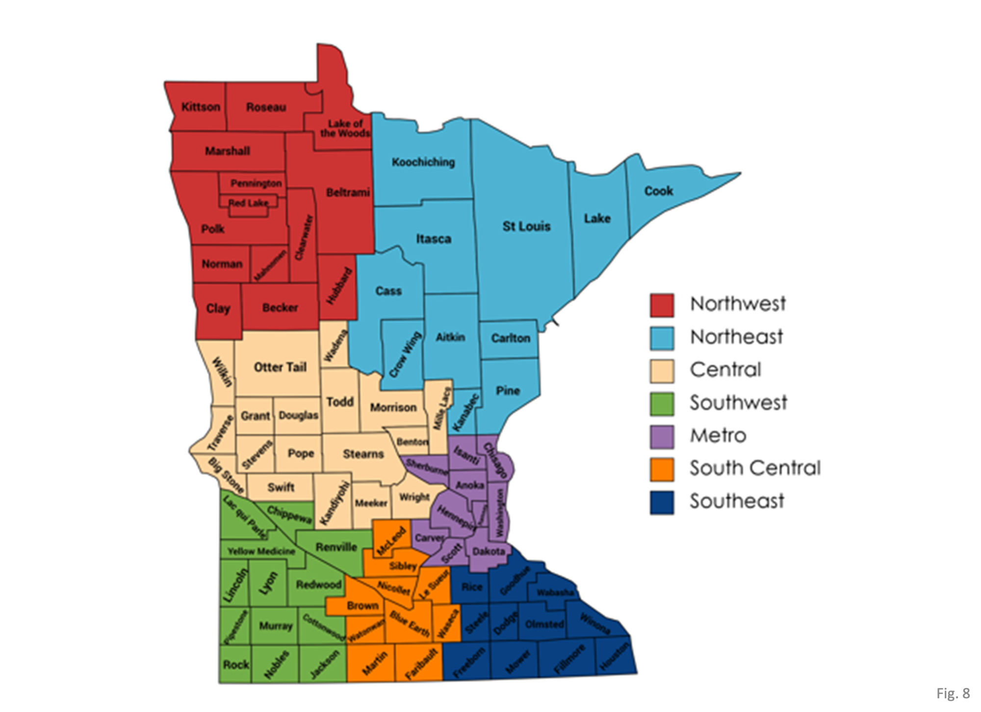
us/diseases/coronavirus/stats/ index.html, which includes cumulative cases per county each week. From this data we calculate cases per week, and then cases per week per region per 10,000 population. - The regions are defined by the graphic on the U of M wastewater surveillance web page, which we have reproduced in Fig. 8.
