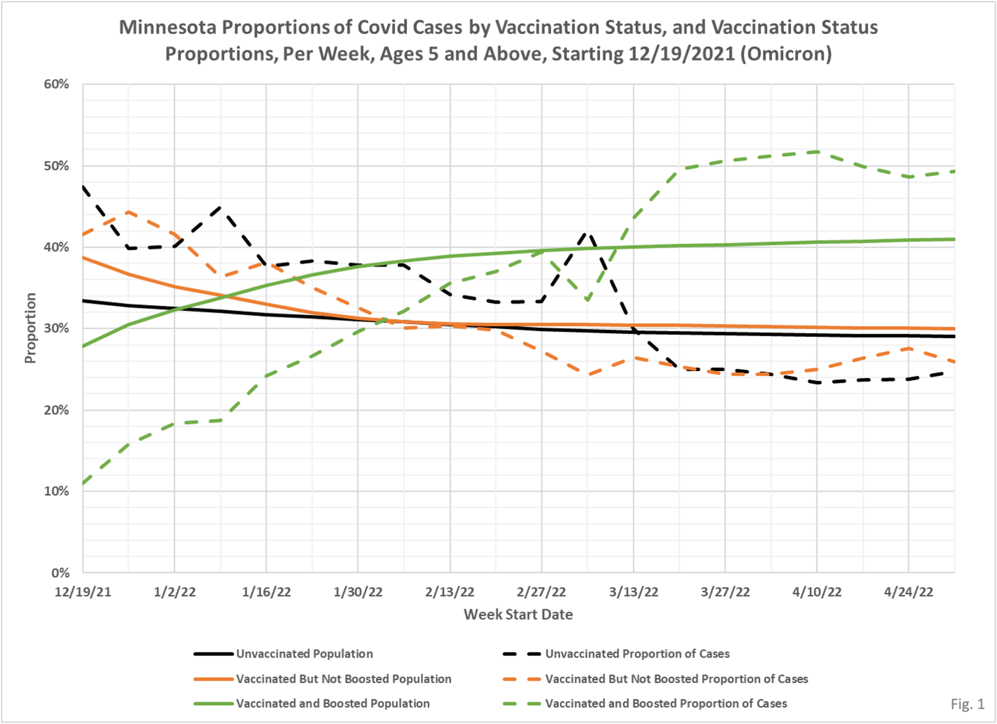
This version of the chart basically covers the time since the start of Omicron and allows you to explicitly see the proportions in regard to the unvaccinated. A little easier to notice the decline in vax effectiveness. One way to put this in business terms is that the boosted group is stealing market share from the vaxed two dose and unvaxed groups. You can literally see when looking at the green (boosted) lines that at first there is a meaningful gap indicating effectiveness but that after several weeks that begins to disappear and now is completely gone.
 Dave’s notes:
- On Monday, 5/23/2022, the Minnesota Department of Health (MDH) made some fairly significant changes to their vaccine breakthrough reporting, available here: https://www.health.state.mn.us/diseases/coronavirus/stats/vbt.html. The biggest change was the addition of booster information to the breakthrough data. They now report cases, hospital admissions, and deaths for those vaccinated but not boosted, and for those who have received at least one booster shot. Also new is the data for the 5-11 age group. Finally, the underlying data files were comprehensively changed, for the positive with the addition of the vaccinated populations, and by providing actual breakthrough cases, admissions, and deaths each week in addition to the rates per 100k. While we believe the changes were mainly driven by MDH’s desire to present booster shots in a positive light, the published underlying data is an improvement on what was available before.
- Fig. 1: This chart displays the proportion of the 5 and over population of Minnesota who are unvaccinated (solid black), vaccinated but not boosted (solid orange), vaccinated and boosted (solid green), and the proportion of cases among these 3 groups each week (dashed lines of same color). The way to interpret this chart is to compare the proportion of breakthroughs to the proportion of vaccinations. Whenever the dashed breakthrough proportion line is below the solid vaccination line of the same color, then that category is underrepresented in the population, and when the dashed breakthrough proportion line is above the solid vaccination line of the same color then that category is over-represented. For the week of 5/1/2022, for example, slightly over 40% of the population was vaccinated and boosted (solid green line) while this group accounted for nearly 50% of the cases (dashed green line). We would interpret this to show that being boosted did not reduce an individuals chances of testing positive for Covid for that week. For another example, for the first week on the left side of the chart, 12/19/21, the dashed green line for the boosted proportion of cases line is at approximately 11%, while the solid green line for the boosted proportion of the population is approximately 28%. This means for the week of 12/19/21 that being boosted is associated with a proportion of cases lower than the proportion of population that is boosted. For the week of 12/19/21 we can see that the lower proportion of boosted cases show up primarily in the unvaccinated, where the unvaccinated proportion of the population is roughly 34%, but they accounted for about 47% of that week’s cases. In general, it appears that the boosted population is over-represented in Covid cases each week since 3/13/22.
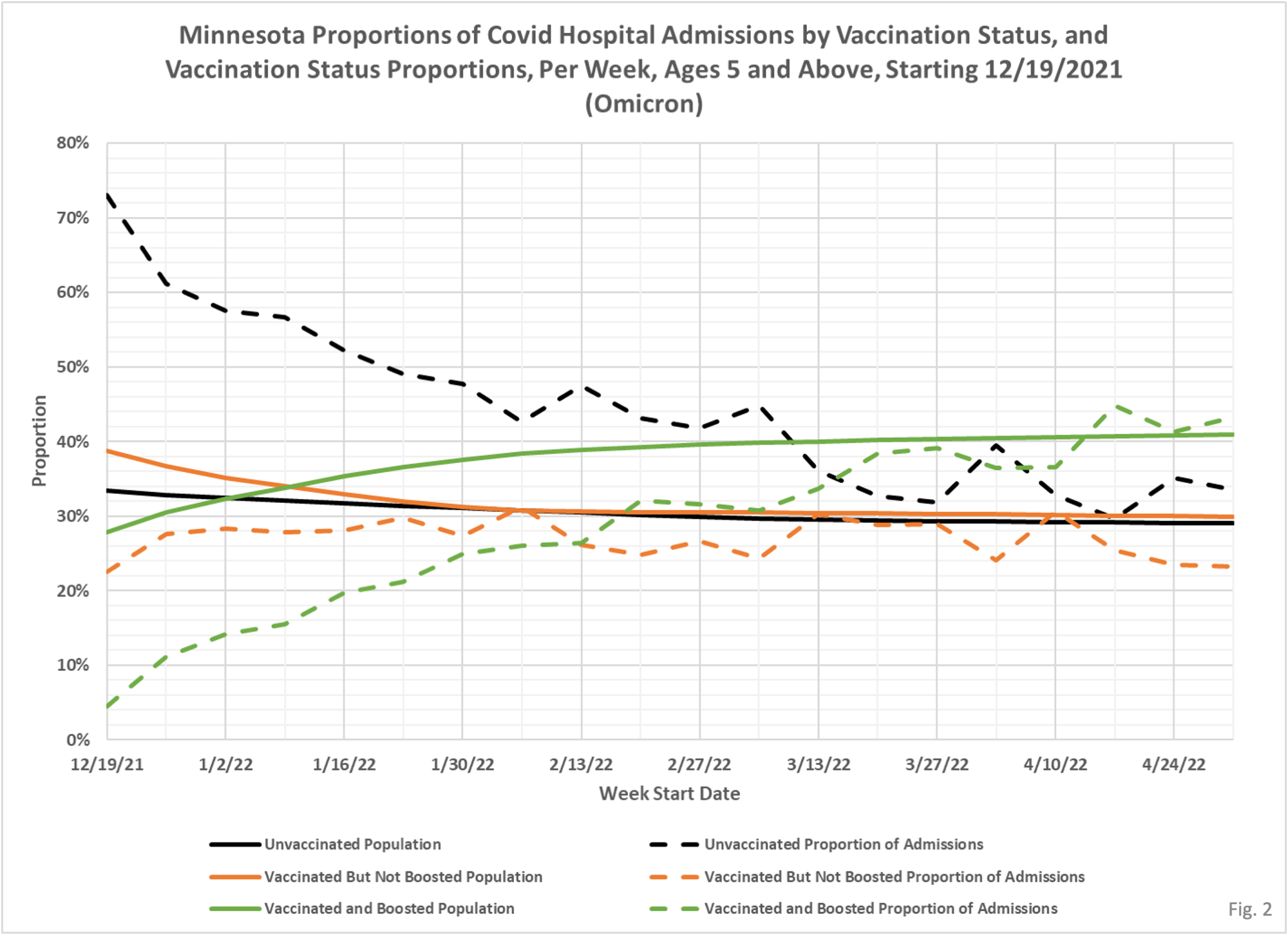
- Fig. 2: Similar to the case proportion chart in Fig. 1, this chart shows the proportion of hospital admissions among the unvaccinated (dashed black line), the vaccinated but not boosted (dashed orange line) and vaccinated and boosted (dashed green line) compared to the corresponding proportions of the population (solid lines). We can see that since roughly 3/20/2022 being boosted has had little effect on the odds of an individual being hospitalized, since the proportion of admissions (dashed green line) is roughly similar to the proportion boosted (solid green line). Being vaccinated but not boosted has been negligibly helpful since roughly 1/23/2022, comparing the dashed to solid orange lines.
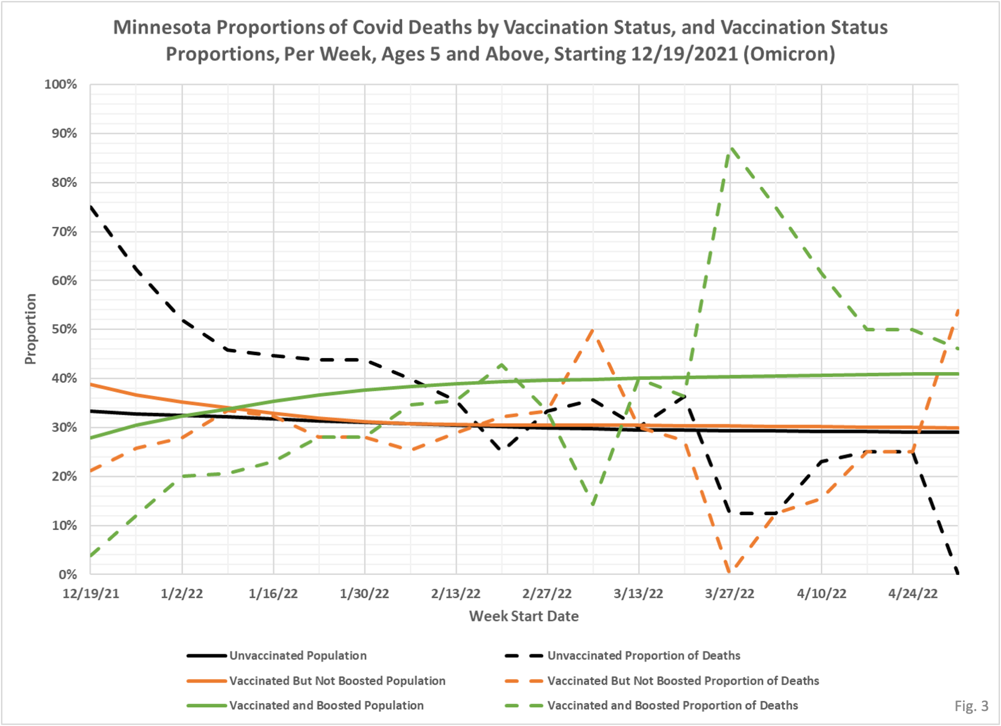
- Fig. 3: Finally this chart displays the proportion of weekly deaths and to the corresponding proportion of the population. As with cases and hospital admissions, whenever the dashed line is higher than the corresponding solid line then that category is over-represented. We can see, for example, that the proportion of deaths among the vaccinated and boosted peaked at roughly 85% on 3/27/2022, while the boosted made up only 40% of the population. It is likely that data reporting inconsistencies accounts for some of the choppiness of the data, as well as the fact that there are relatively few Covid deaths each week, so a few deaths can swing the proportions to extremes more easily. In the most recent week, 5/1/22 on the far right side of the chart, both the boosted (green lines, 6 deaths, 45% of weekly total but only 41% of the population, and the vaccinated but not boosted (orange lines, 7 deaths, 55% of the weekly total but only 30% of the total population) are over-represented, and the unvaccinated are under-represented as there have been no unvaccinated deaths reported for that week so far.
- MDH defines the fully vaccinated (what we have termed vaccinated but not boosted) as those who have not received a booster after completing their primary vaccination series, and had been vaccinated at least 14 days prior to testing positive.
- MDH defines the boosted as those who have received any additional vaccination shots after completing their primary vaccination series, and also received the booster at least 14 days prior to testing positive.
