You may recall, this is a formal visual presentation of my favorite eyeball method for detecting epidemic trends. Go back a week, then take the seven days before that day and compare, keep doing that going back a day at a time, get a sense of the absolute number of events change as well as the rate of change in the change. I don’t think we have quite yet seen a clear rollover, but we may be getting there, or it may continue in a rough plateau. Thanks again to Dave Dixon.
 Dave’s notes:
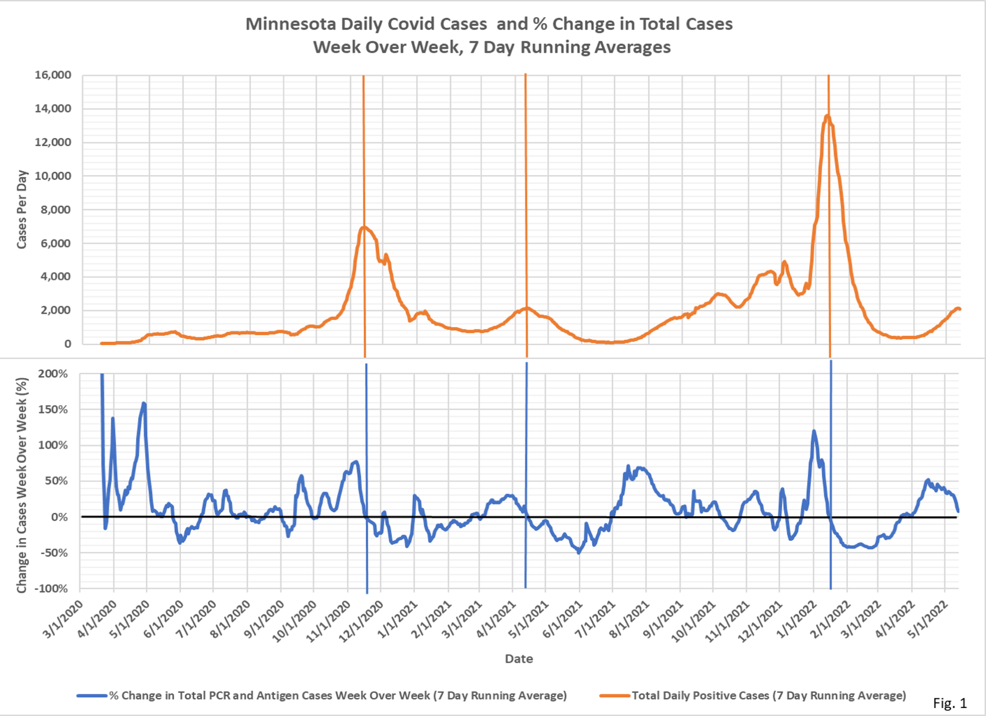
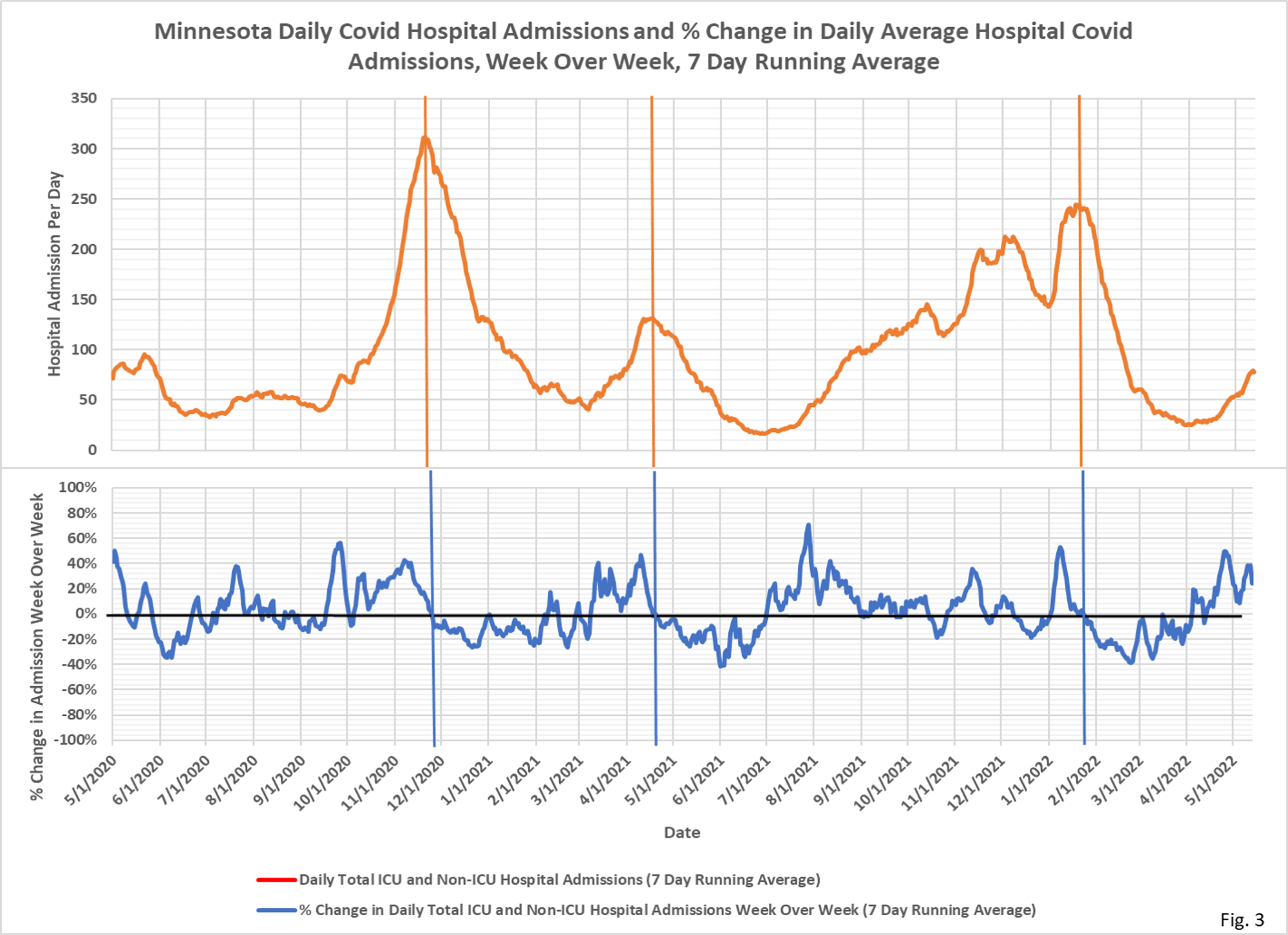
- These charts display the total daily new cases and daily hospital admissions (red curves) along with the percent change in the cases and admissions from 7 days earlier (blue curves).
- Fig. 1 displays the 7 day running average cases and weekly % change over the entire pandemic. The vertical lines mark the peak cases. Note that % change in week over week cases turns negative slightly after the peak in cases, because the percent change curve reaches zero the first time cases past peak equal cases before the peak, one week earlier.
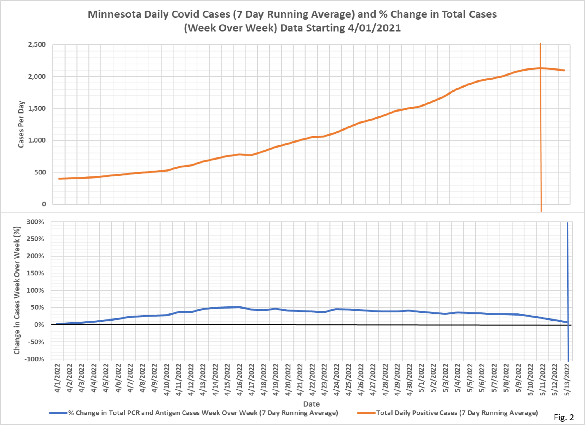
- Fig. 2 displays the case data since 4/1/2022 (new for this week), showing the increase in cases in recent weeks. Cases appear to have peaked on 5/11/2022, although it is possible that additional reported cases may shift the peak a little. The most recent % change week over week is about 8%, and is nearing 0%.
- Fig. 3 displays the 7 days running average daily Covid hospital admissions and percent change over the entire pandemic. As with cases, the vertical lines mark the peak in admissions, which occur approximately where the % change in admissions week over week turns negative. Also as with cases, the % change week over week peaks earlier than the peak in admissions.
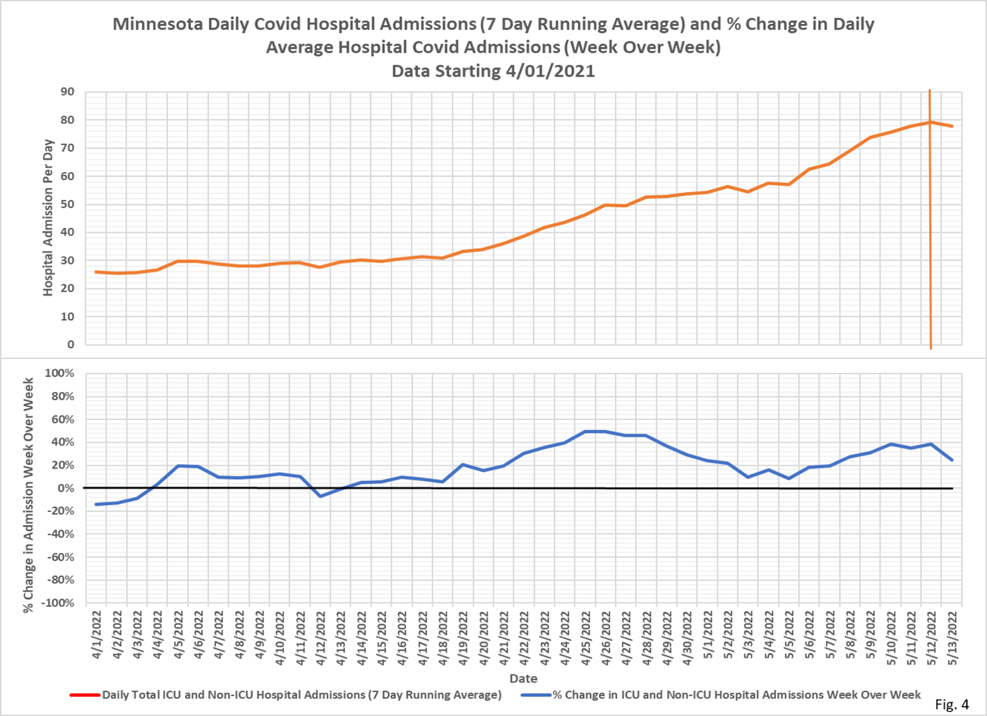
- Fig. 4 displays the daily Covid hospital admissions and percent change since 4/1/2021. Hospital admissions may have peaked on 5/12/2022, although it is too early to declare a peak.
- There are multiple issues with need to be considered when thinking about the relationships between cases and hospital admissions: 1). Positive cases are heavily dependent on testing rates, with high testing rates potentially generating lots of false or asymptomatic cases. 2). A large fraction of hospital admissions are for non-Covid afflictions, with an incidental positive test then causing the patient to be classified as Covid. MDH has not released data on incidental positive admissions despite a Data Practice Act request.
- Daily case data is downloaded from the Minnesota Department of Health (MDH) Situation Update for COVID-19 web page https://www.health.state.mn.
us/diseases/coronavirus/ situation.html. The daily PCR and antigen case data is added together and then a 7 day running average is computed. The last 7 days of data is excluded from the chart to avoid plotting incomplete data. The percent change week over week is computed as the percent change in the 7 day running average from 7 days earlier. - Daily hospital admissions data is also downloaded from the Situation Update web page. The daily ICU and Non-ICU admission data is added together and then a 7 day running average is computed. The last 7 days of data is excluded from the chart to avoid plotting incomplete data. The percent change week over week is computed as the percent change in the 7 day running average from 7 days earlier.
