One of the primary methods we have used to attempt to ascertain changes in case level trends is a week-over-week analysis. Dave Dixon’s most recent update of this method is below. As we have mentioned several times, Minnesota has experienced a case wave but it is largely of unreported cases due to home testing and management. It appears on this analysis that based on the percent change method we are at or very near the likely peak of this wave and heading down, but given the dominance of home testing, it is hard to know for sure. The ratio of detected to undetected cases in official reports may be more variable now. And while week-over-week hospitalizations should be more reliable, the issue of incidental hospitalizations may confuse that analysis. In any event, this remains a useful leading indicator of trend.
 Dave’s notes:
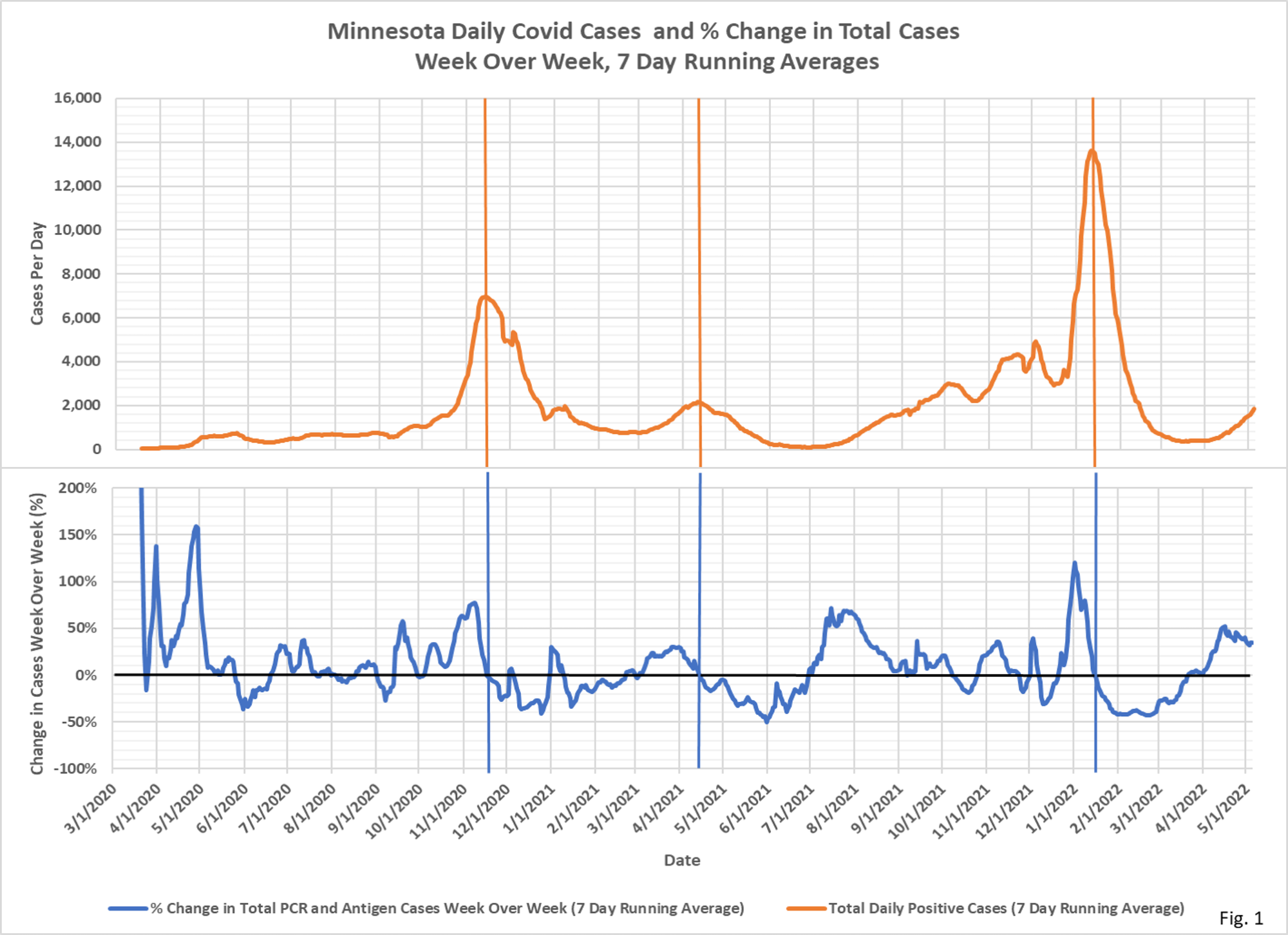
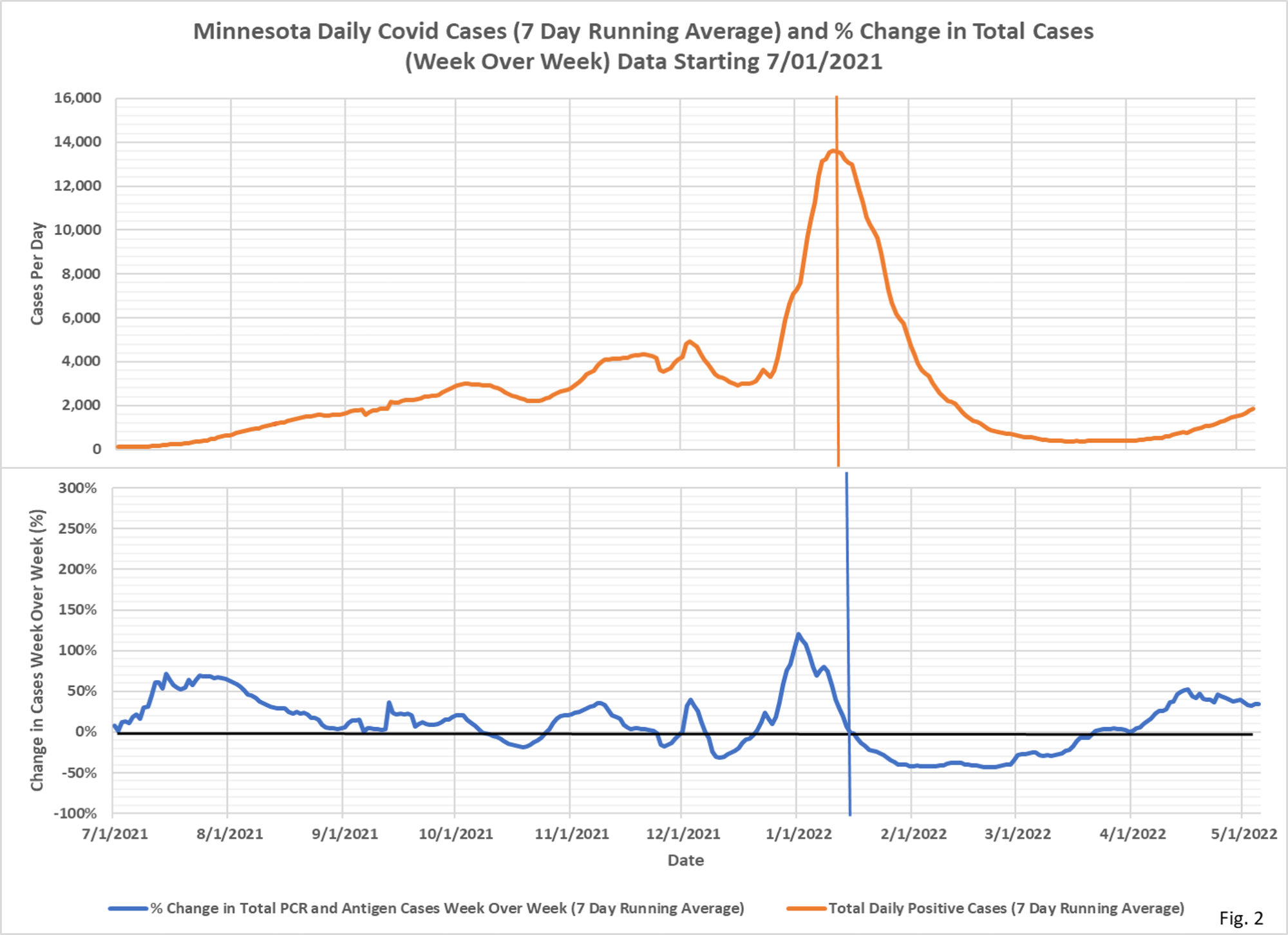
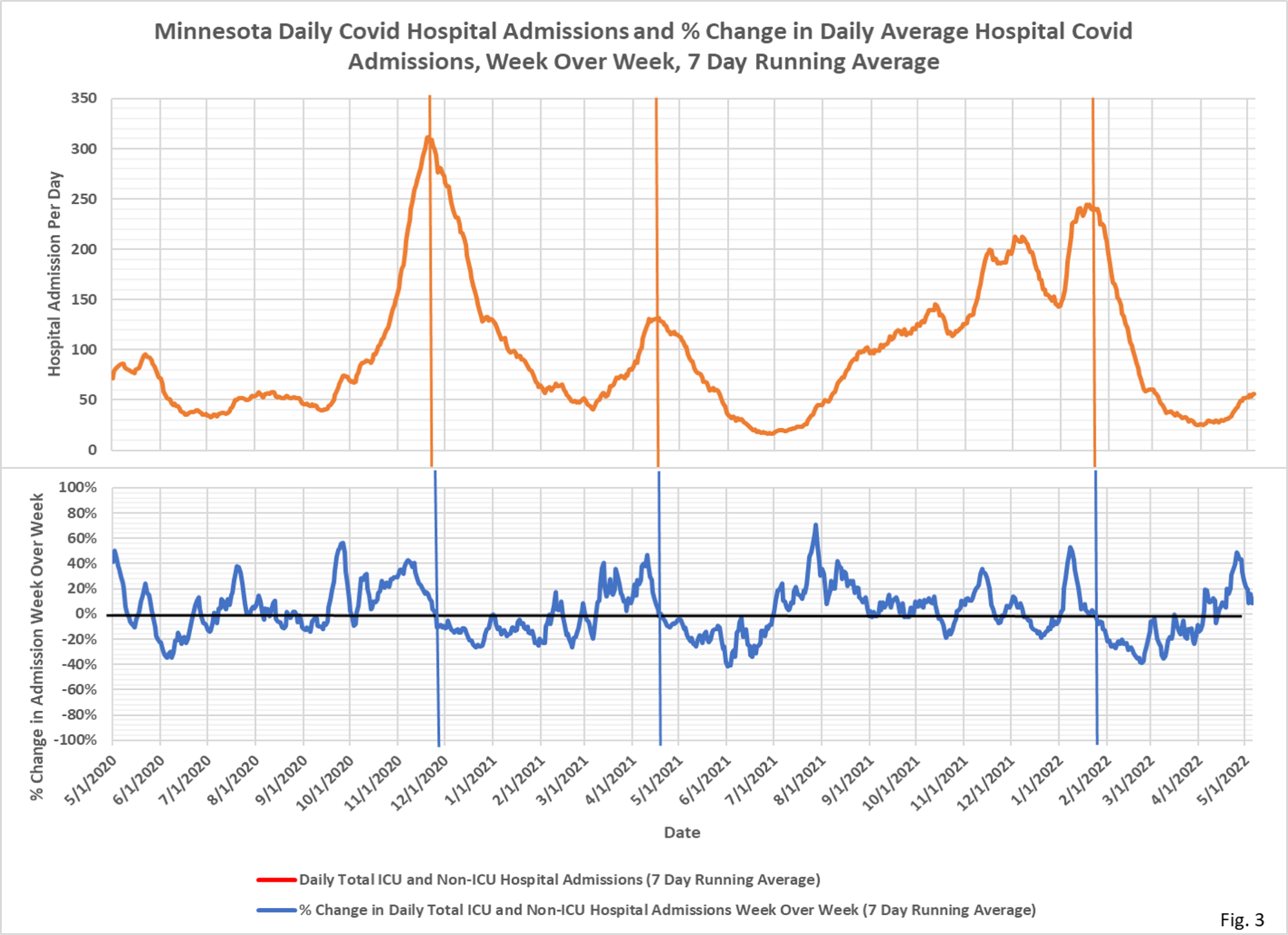
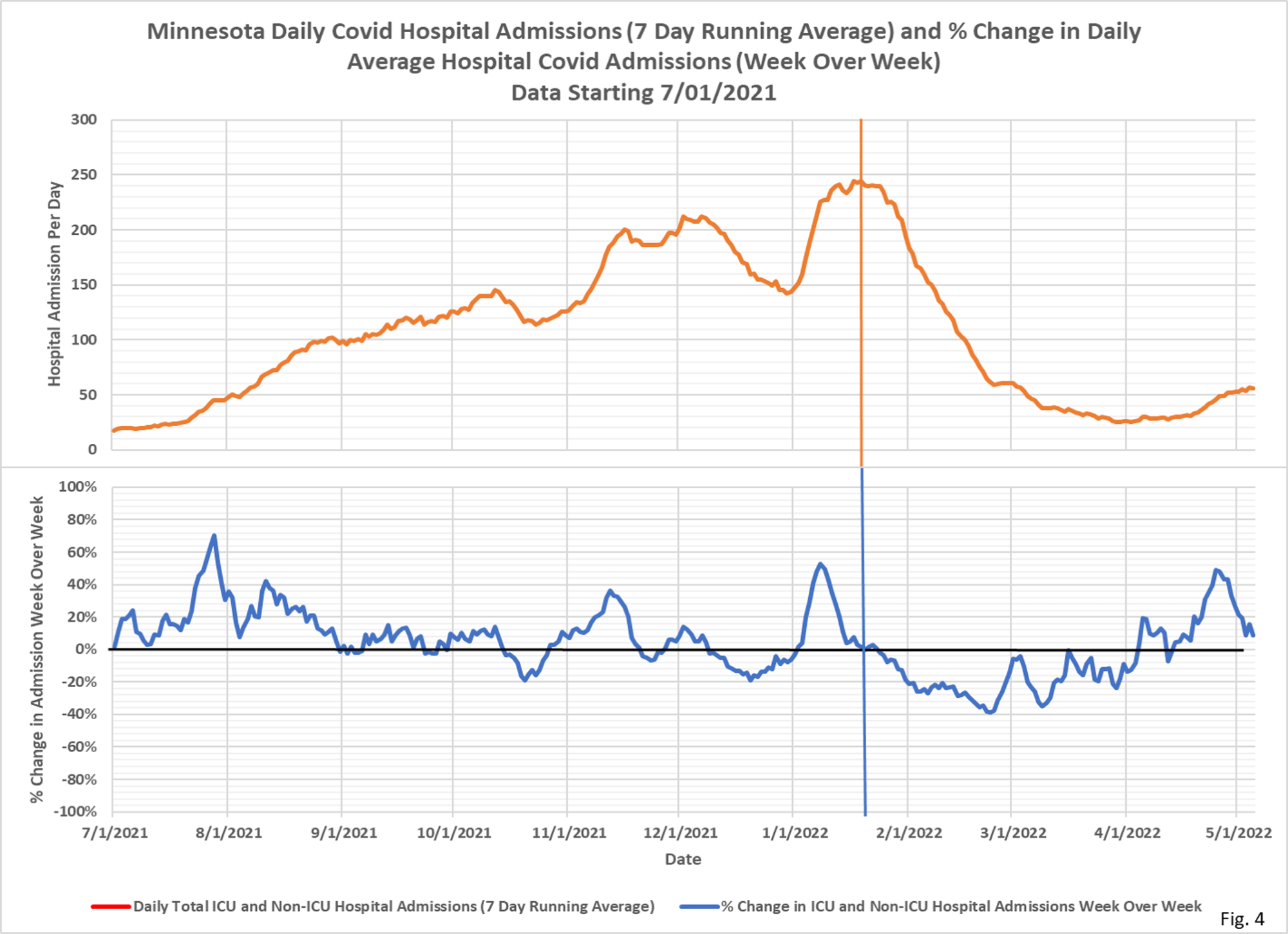
- These charts display the total daily new cases and daily hospital admissions (red curves) along with the percent change in the cases and admissions from 7 days earlier (blue curves).
- Fig. 1 displays the 7 day running average cases and weekly % change over the entire pandemic. The vertical lines mark the peak cases. Note that % change in week over week cases turns negative slightly after the peak in cases, because the percent change curve reaches zero the first time cases past peak equal cases before the peak, one week earlier.
- Fig. 2 displays the case data since 7/1/2021, showing the increase in cases in recent weeks. The most recent % change week over week is about 35%, and although the % change is decreasing it still has a ways to go before reaching zero on the current trend. This indicates that we will likely not reach the peak in new daily cases for perhaps 2 weeks.
- Fig. 3 displays the 7 days running average daily Covid hospital admissions and percent change over the entire pandemic. As with cases, the vertical lines mark the peak in admissions, which occur approximately where the % change in admissions week over week turns negative. Also as with cases, the % change week over week peaks earlier than the peak in admissions.
- Fig. 4 displays the daily Covid hospital admissions and percent change since 7/1/2021. In contrast to cases, the percent change in hospital admissions has declined much closer to zero in recent days. This indicates that we may be close to the peak in new daily Covid hospital admissions.
- There are multiple issues with need to be considered when thinking about the relationships between cases and hospital admissions: 1). Positive cases are heavily dependent on testing rates, with high testing rates potentially generating lots of false or asymptomatic cases. 2). A large fraction of hospital admissions are for non-Covid afflictions, with an incidental positive test then causing the patient to be classified as Covid. MDH has not released data on incidental positive admissions despite a Data Practice Act request.
- Daily case data is downloaded from the Minnesota Department of Health (MDH) Situation Update for COVID-19 web page https://www.health.state.mn.
us/diseases/coronavirus/ situation.html. The daily PCR and antigen case data is added together and then a 7 day running average is computed. The last 7 days of data is excluded from the chart to avoid plotting incomplete data. The percent change week over week is computed as the percent change in the 7 day running average from 7 days earlier. - Daily hospital admissions data is also downloaded from the Situation Update web page. The daily ICU and Non-ICU admission data is added together and then a 7 day running average is computed. The last 7 days of data is excluded from the chart to avoid plotting incomplete data. The percent change week over week is computed as the percent change in the 7 day running average from 7 days earlier.
