We haven’t run these in a while but since some people want to get worked up over a supposed impending wave, we thought it might be worth showing. When you start from a very low level, any significant change looks like a huge percent move. We will see if it sustains. While I think a lot of cases are being missed now because of home testing, I also think it doesn’t matter because they are colds we never would have tested for in the past. And shouldn’t be testing for now, at home or elsewhere. Can we please just move on?
 Dave’s notes:
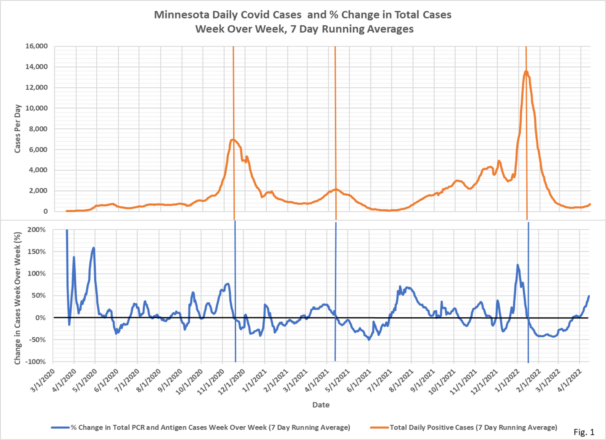
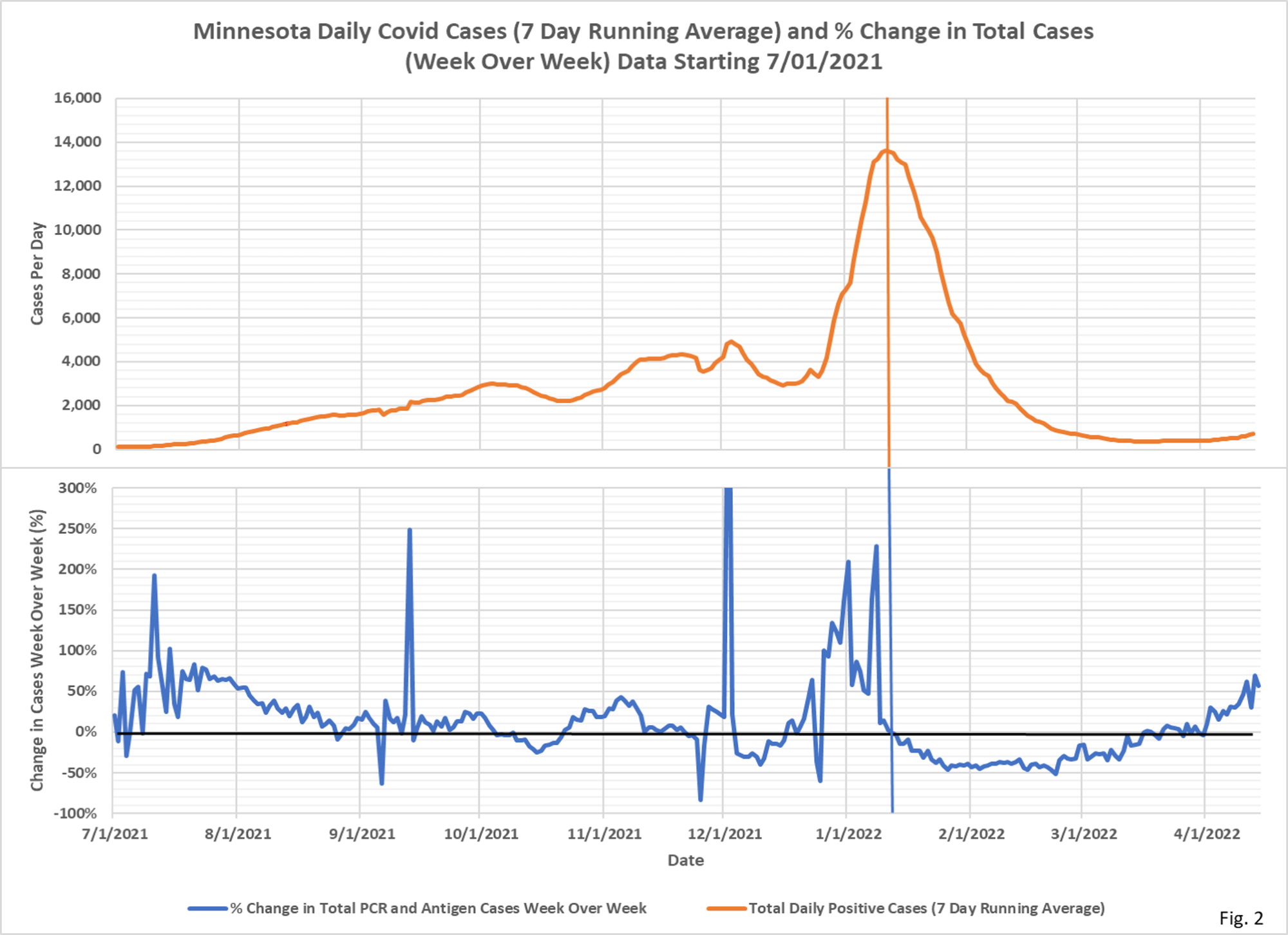
- These charts display the total daily new cases and daily hospital admissions (red curves) along with the percent change in the cases and admissions from 7 days earlier (blue curves).
- Daily case data is downloaded from the Minnesota Department of Health (MDH) Situation Update for COVID-19 web page https://www.health.state.mn.us/diseases/coronavirus/situation.html. The daily PCR and antigen case data is added together and then a 7 day running average is computed. The last 7 days of data is excluded from the chart to avoid plotting incomplete data. The percent change week over week is computed as the percent change in the 7 day running average from 7 days earlier.
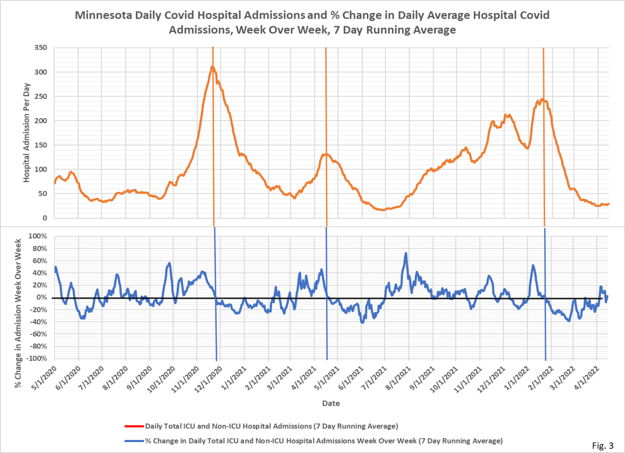
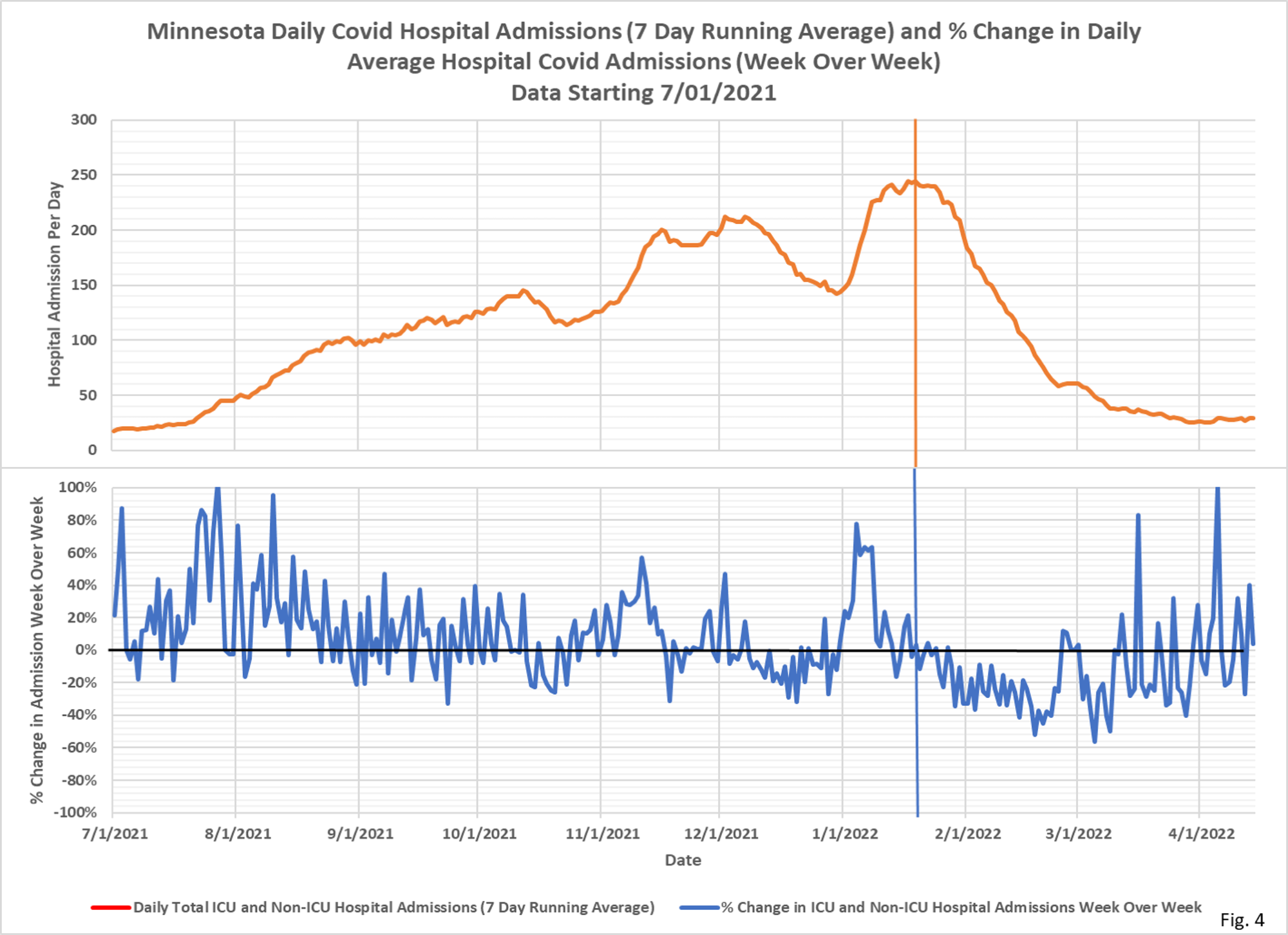
- Daily hospital admissions data is also downloaded from the Situation Update web page. The daily ICU and Non-ICU admission data is added together and then a 7 day running average is computed. The last 7 days of data is excluded from the chart to avoid plotting incomplete data. The percent change week over week is computed as the percent change in the 7 day running average from 7 days earlier.
- Fig. 1 displays the 7 day running average cases and weekly % change over the entire pandemic, and Fig. 2 displays data since 7/1/2021. The vertical lines mark the peak cases. Note that the peak cases approximately correspond with the change in cases week over week turning negative. Of note the peak in % change in cases week over week is earlier than the peak in cases, as the rate of change in cases reduces toward zero as the peak is reached. Fig. 2 shows how an increase in cases from a low baseline can easily generate a fairly large percentage change, as shown by the increase in cases the past several weeks.
- Fig. 3 displays the 7 days running average daily Covid hospital admissions and percent change over the entire pandemic, and Fig. 4 displays data since 7/1/2021. As with cases, the vertical lines mark the peak in admissions, which occur approximately where the % change in admissions week over week turns negative. Also as with cases, the % change week over week peaks earlier than the peak in admissions.
- There are multiple issues with need to be considered when thinking about the relationships between cases and hospital admissions: 1). Positive cases are heavily dependent on testing rates, with high testing rates potentially generating lots of false or asymptomatic cases. 2). A large fraction of hospital admissions are for non-Covid afflictions, with an incidental positive test then causing the patient to be classified as Covid. MDH has not released data on incidental positive admissions despite a Data Practice Act request.
