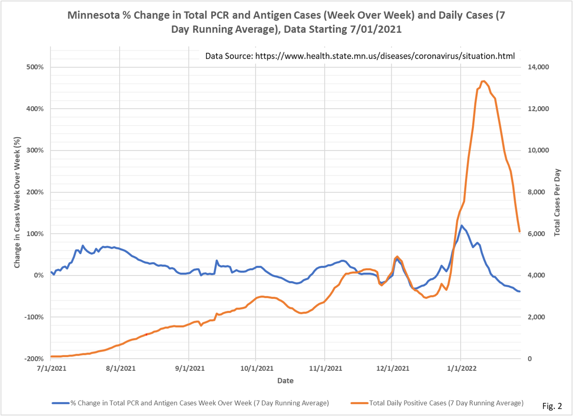
It’s over, for now, as shown in the week-over-week charts. Cases are plummeting as fast as they rose.
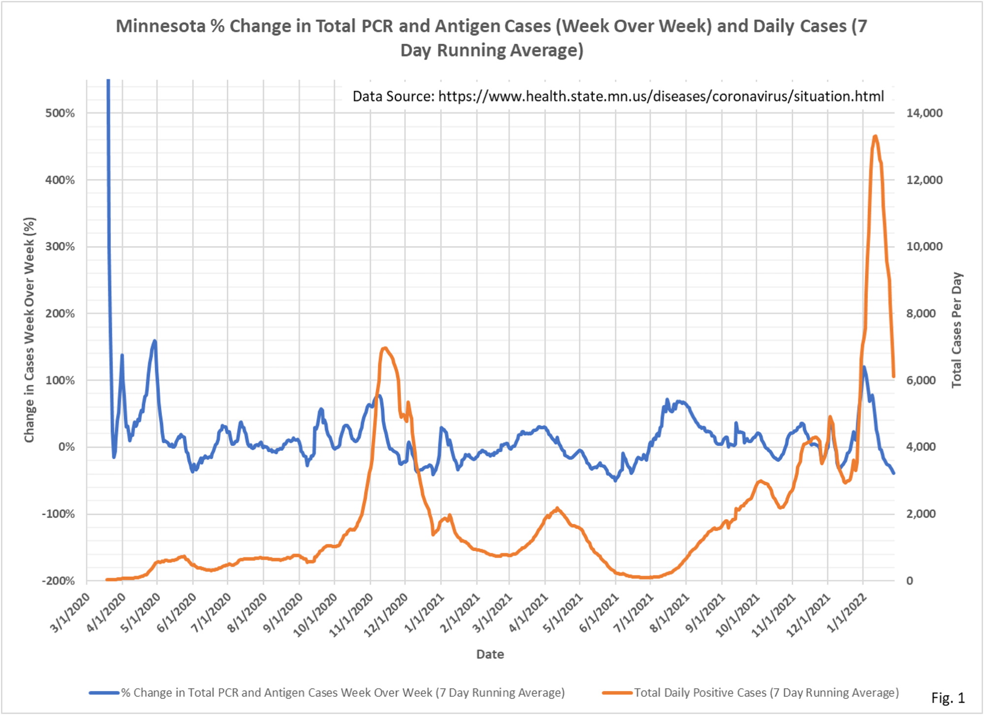
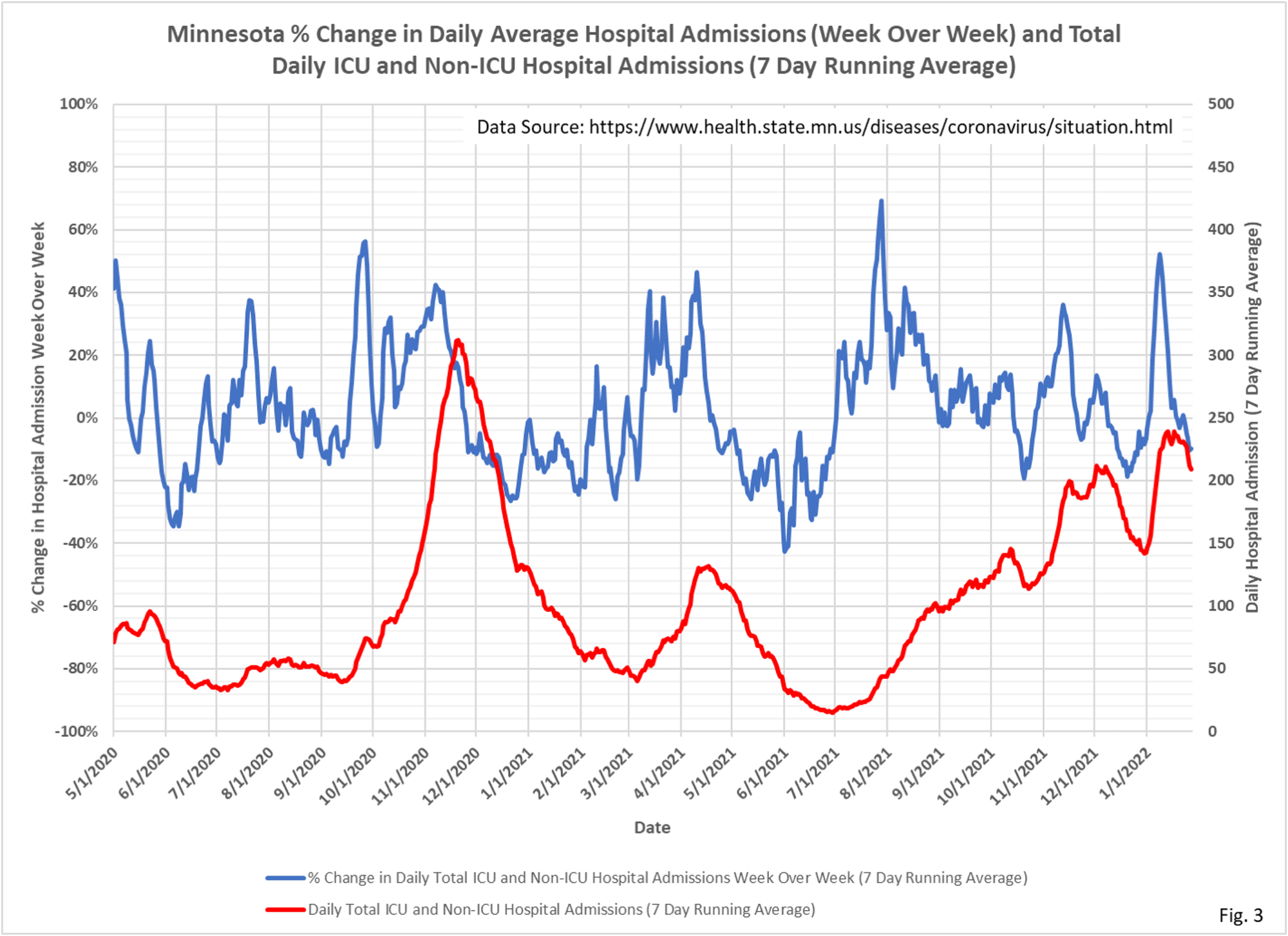
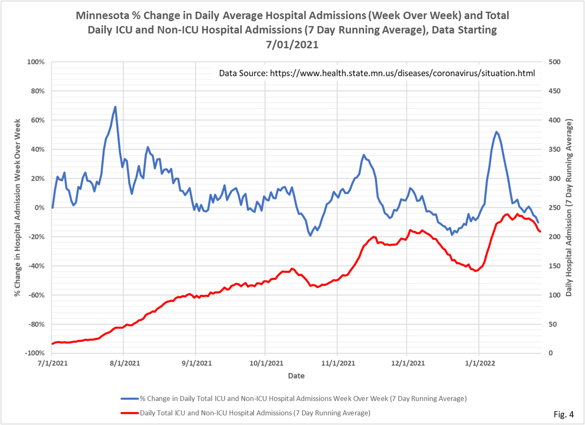
- These charts display the total daily new cases and daily hospital admissions (red curves and right vertical axis) along with the percent change in the cases and admissions from 7 days earlier (blue curves and left vertical axis).
- Daily case data is downloaded from the Minnesota Department of Health (MDH) Situation Update for COVID-19 web page https://www.health.state.mn.us/diseases/coronavirus/situation.html. The daily PCR and antigen case data is added together and then a 7 day running average is computed. The last 7 days of data is excluded from the chart to avoid plotting incomplete data. The percent change week over week is computed as the percent change in the 7 day running average from 7 days earlier.
- Daily hospital admissions data is also downloaded from the Situation Update web page. The daily ICU and Non-ICU admission data is added together and then a 7 day running average is computed. The last 7 days of data is excluded from the chart to avoid plotting incomplete data. The percent change week over week is computed as the percent change in the 7 day running average from 7 days earlier.
- Fig. 1 displays the 7 day running average cases and weekly % change over the entire pandemic, and Fig. 2 displays data since 7/1/2021. The Omicron wave is obviously very striking, with the fall in cases appearing as steep as the rise. The original surge of cases in late 2020 is fairly symmetrical as well, with a less rapid rise in cases leading to a lower peak. The spring wave in early 2021 is also symmetrical, but also with an even more gradual rise in cases and the lowest peak of any of the Covid surges. The shapes and relationships of these curves to cases is an area of future exploration.
- Fig. 3 displays the 7 days running average daily ICU and Non-ICU admissions and percent change over the entire pandemic, and Fig. 4 displays data since 7/1/2021. Comparing Fig. 1 and Fig. 3, we can see that in late 2020 we had a rise in hospital admissions at the same time as the surge in cases, and that rise appears equally parabolic. However, hospital admissions have not had a spike in admissions during the Omicron surge in late 2021. Rather the hospital admissions curve continues on a gently rising path it was on before Omicron, almost as if hospital admissions were continuing on the path of the earlier Delta surge in cases.
- There are multiple issues with need to be considered when thinking about the relationships between cases and hospital admissions: 1). Positive cases are heavily dependent on testing rates, with high testing rates potentially generating lots of false or asymptomatic cases. 2). A large fraction of hospital admissions are for non-Covid afflictions, with an incidental positive test then causing the patient to be classified as Covid. MDH has not released data on incidental positive admissions despite a Data Practice Act request.