Up fast, down fast. Why? Because you deplete the pool of possible infectees quickly and the total number of infectious people disappears rapidly, leaving both possible infectors and infectees in a diminishing subset. You can see here that we are headed rapidly down even with the backlog processing going on. If the infectious period really is only five days after case detection, you can see that the curve looks similar, but has a much lower peak. If the state’s numbers underlying these calculations are accurate, we had a lot of infected people at one point in Minnesota and we know from other data that the majority were vaxed. Those vaxed people had to also be doing a lot of the transmission. Dave’s notes:
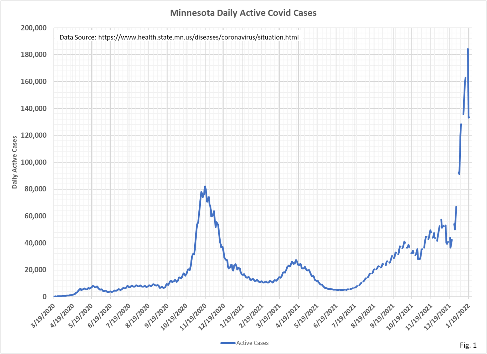
- Active cases are a theoretical measure of how many infectious people there may be in Minnesota at any one time. Active cases are calculated as the cumulative number of positive cases minus the cumulative number of people No Longer Needing Isolation (NLNI) minus cumulative deaths. All of this data is available on the Minnesota Situation Update for COVID-19 web page https://www.health.state.mn.us/diseases/coronavirus/situation.html. All of this data is reported by date of event, so there should not be any issues with reporting lags, or mismatched dates.
- Minnesota Department of Health (MDH) defines No Longer Needing Isolation this way on the Situation Update web page: “Cases no longer needing isolation represents individuals with confirmed or probable COVID-19 who no longer need to self-isolate”. MDH defines PCR test results as “Confirmed” and antigen test results as “Probable”.
- On 11/17/2020 we asked MDH how they determined the number of people No Longer Needing Isolation. They informed us on 11/30/2020 that people are No Longer Needing Isolation when 1). It is 10 days past the onset of illness, 2). They have been fever free for 24 hours, and 3). Their respiratory symptoms are improving. Since this reply was received we have not inquired further.
- Fig. 1, Active Cases: Active cases peaked at 184,239 on 1/18/2022, the next day dropping to 133,187. Gaps in the curve are because MDH stopped reporting data on weekends and holidays starting on 7/1/2021.
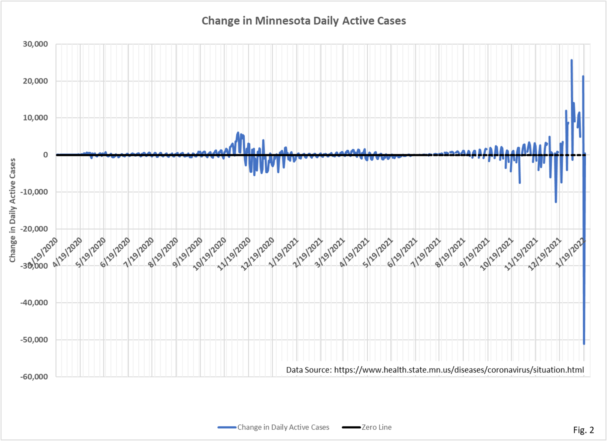
- Fig. 2, Change in Daily Active Cases: The change in Active Cases can be seen to be dominated by the drop of 51,502 cases on 1/19/2022. This is caused by the Non Longer Needing Isolation statistic declining from 1,073,545 on 1/18/2022 to 1,135,053 on 1/19/2022. This one day jump of 61,508 for NLNI is unprecedented. On the next two days, NLNI increase by 7291 on 1/20/2022 and by 6172 on 1/21/2022. For this reason we would tend to view the 1/19/2022 NLNI increase as a catch-up for past recovered people.
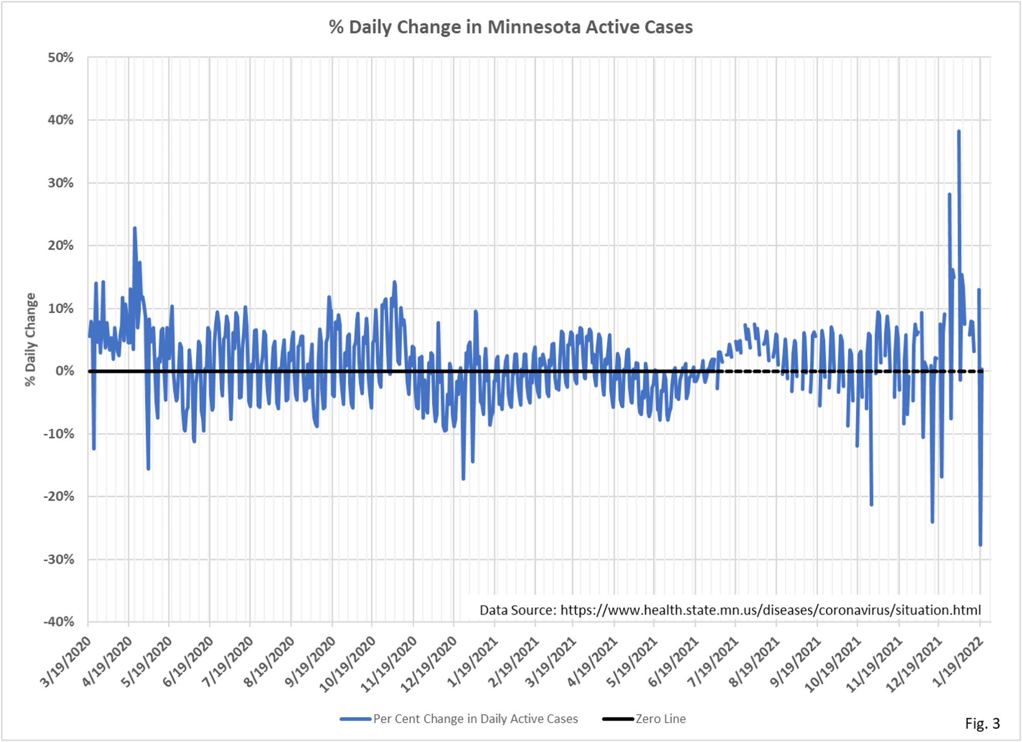
- Fig. 3, Per Cent Change in Daily Active Cases: The per cent change in daily active cases is simply the change in active cases divided by the previous days active cases. The per cent change on 1/19/2022 is looks more proportional when it is considered as a per cent change, and looks less out of place on this chart.
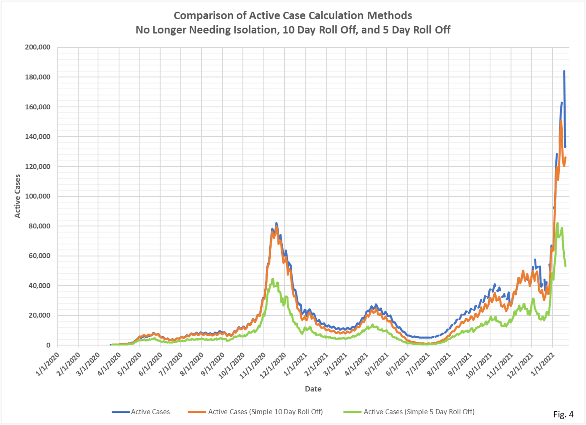
- Fig. 4, Comparison of Active Case Calculation Methods: The active case curve in blue is the same curve shown in Fig. 1, calculating active cases using the NLNI statistic. We stated above the MDH claims to use a 10 day criteria in determining active cases. The orange curve simply calculates active cases as the number of people on any given date have been positive for 10 days or less. We can see that since 1/1/2021 the 10 day roll off curve is lower than the active case curve. It is evident that MDH does not calculate the NLNI statistic using a 10 day criteria, or they adjust it in some way. The CDC, on 12/27/2021 (https://www.cdc.gov/media/releases/2021/s1227-isolation-quarantine-guidance.html) changed the quarantine period to 5 days for asymptomatic people. The green curve on Fig. 4 is the number of people who have been positive for 5 days or less. Not surprisingly, it is roughly half the magnitude of the 10 day roll off on any given date.

A few days ago I came across fascinating graphs about covid from the Metropolitan Council looking at the virus in Twin Cities wastewater, including what strains were prevalent, and abundance, which is probably a good measure of total infection. The dramatic rise and fall in numbers for the Omicron variant is notable. According to the Covid-19 Variants graph, Omicron showed up in the wastewater on November 21, 2021, and the Covid-19 Load graph indicates that the outbreak is over. https://metrotransitmn.shinyapps.io/metc-wastewater-covid-monitor/