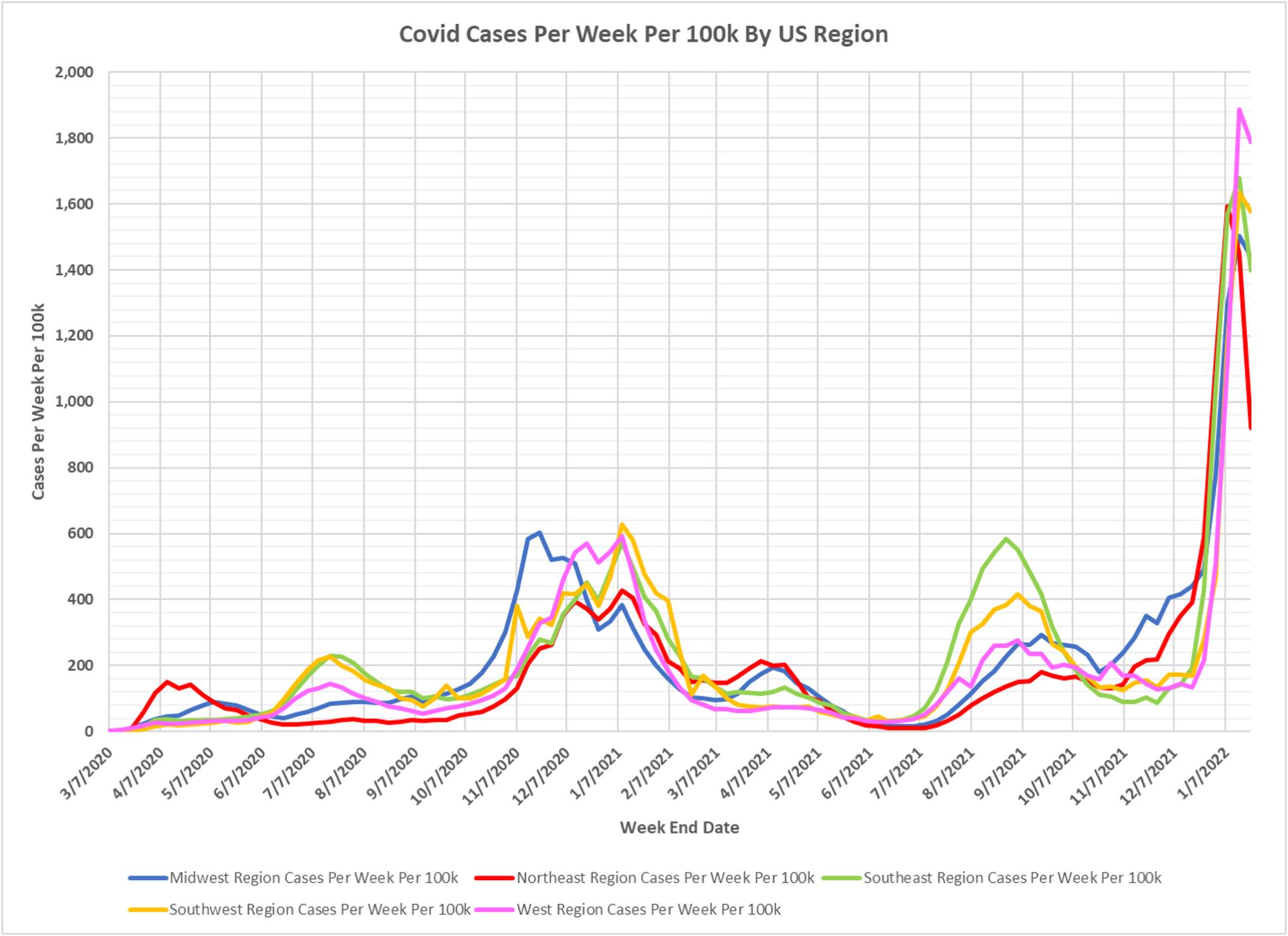
Just to keep you updated on the national picture, Dave’s latest version of the regional charts and national animation. The wave has clearly crested. Dave’s notes:
- The chart of US regional cases displays the entire pandemic. The animation of cases per week per 100k starts the week ending 7/03/2021.
- US case data by state is taken from a CDC database: https://data.cdc.gov/Case-Surveillance/United-States-COVID-19-Cases-and-Deaths-by-State-o/9mfq-cb36 , This database appears to be corrupted, especially for California, in early 2021. Therefore, all data for all states prior to 8/1/2021 is the version published by the CDC on 10/24/2021. All data starting 8/1/2021 is the most current available data, published by the CDC on 1/27/2022, plotted to 1/22/2022.
- State population estimates used to calculate rates per 100k are taken from the CDC data file nst-est2019-01.xlsx, available here: https://www.census.gov/newsroom/press-kits/2019/national-state-estimates.html
- Cases per 100k have peaked are and declining week over week, with the Northeast region declining the most. The Northeast was also the first region to start to decline last week, while the other regions were still increasing.
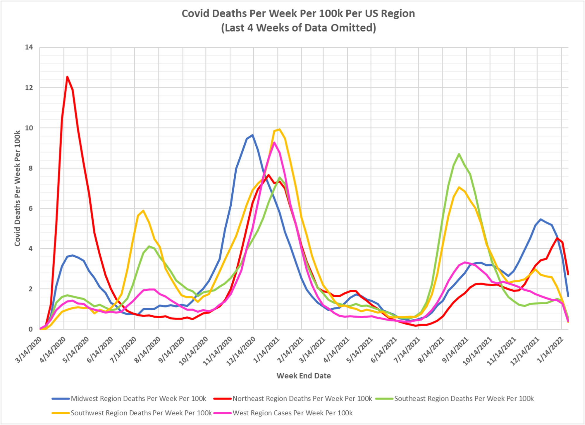
- Despite the surge in cases the regional reported deaths are not increasing dramatically. It is hard to know for sure since we do not know how long the reporting lag is for CDC deaths data.
- In the animation, it is interesting that in the Fall of 2021 we can see the prior seasonal effect at work, with the Midwest having higher case levels in November and December. As Omicron became dominant there were none of the previous geographical or seasonal trends visible so far, just a nationwide rise in cases.