Dave’s updated national charts and animation–is Omicron peaked and losing steam? What is next? Dave’s notes:
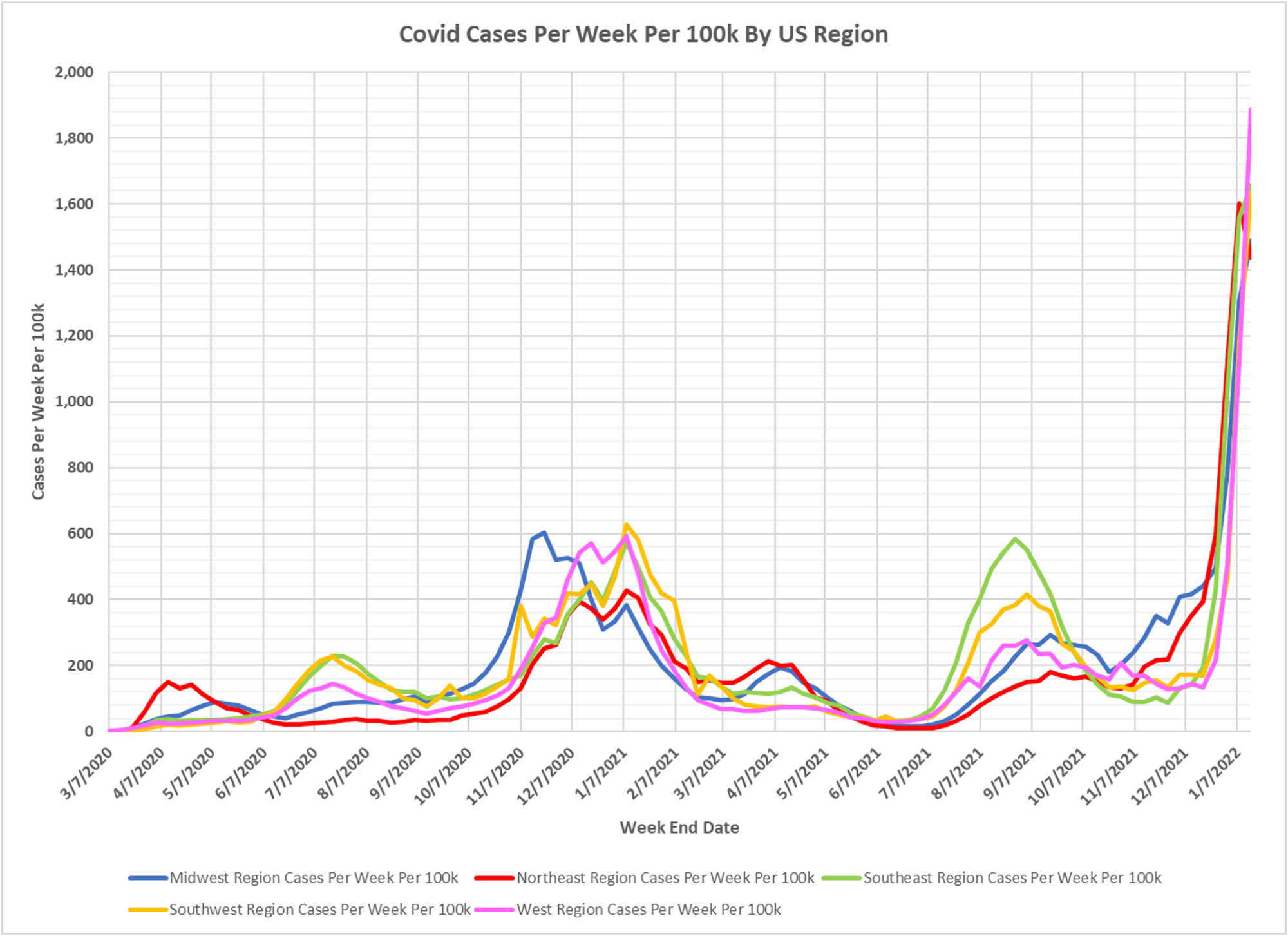
1. The chart of US regional cases displays the entire pandemic. The animation of cases per week per 100k starts the week ending 7/03/2021.
2. US case data by state is taken from a CDC data base: https://data.cdc.gov/Case-
3. State population estimates used to calculate rates per 100k are taken from the CDC data file nst-est2019-01.xlsx, available here: https://www.census.gov/
4. Cases per 100k in all regions continue to spike higher except the Northeast region, which has dropped slightly this week. The reporting lag for cases by the CDC is unknown.
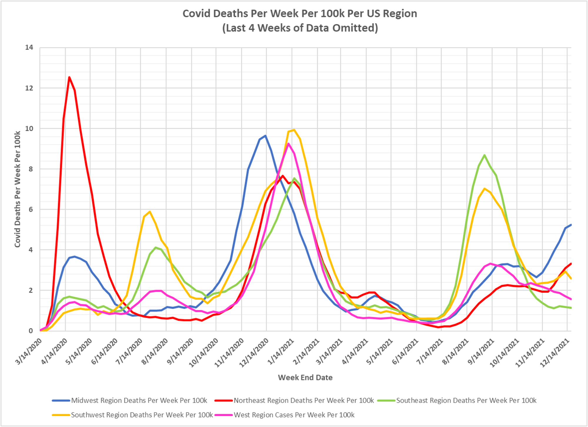
5. Despite the surge in cases the regional reported deaths are not increasing dramatically. It is hard to know for sure since we do not know how long the reporting lag is for CDC deaths data.
6. The maximum scale on the animation has been raised to 4000 cases per 100k per week, because all regions have gone higher than the old maximum scale of 3000 cases per 100k per week used in the previous animation.
7. In the animation, it is interesting that in the Fall of 2021 we can see the prior seasonal effect at work, with the Midwest having higher case levels in November and December. As presumably Omicron became dominant there were none of the previous geographical or seasonal trends visible so far, just a nationwide rise in cases.