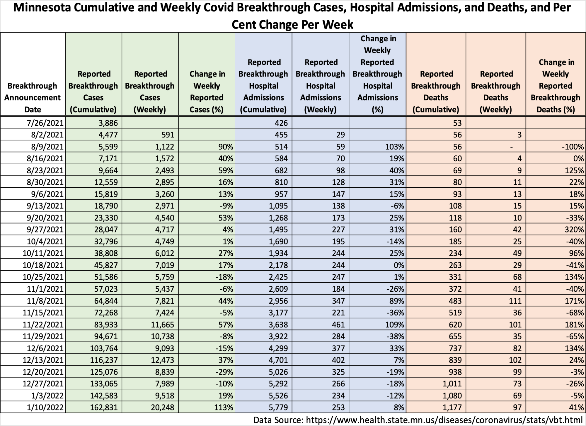
Dave and I have been mulling over other, maybe faster ways to figure out presenting breakthru data. The table and charts Dave has been putting together are based on the spreadsheet underlying the DOH’s per capita table on the breakthrough page. I am highly suspicious of that spreadsheet because they refuse to explain the denominators and we know they miss lots of vaxed people, so they are putting events in wrong buckets. But at least it gives you a shot at doing case rates, which is important, and you can track proportions of events by week, which contrary to what some say, is important because 1) you can see who proportionately is using health resources and 2) you can see how having lots of vaxed people doesn’t stop there from being enough events to feed the terrorists.
The weekly data dump which occurs on Monday and just lists the number of vaccinated, the number of events and the percent of fully vaxed people affected, is not date of event, but has some rough potential utility. So Dave put together the table below which just gives those weekly events reported. Of course the state just gives you cumulative numbers so you have to do a little subtraction and then you can see the percent change week-over-week, which is kind of a potential trend indicator, except in this case what it indicates is how extremely variable the data processing is. If you compare this table to the usual breakthrough event table, which is date of event, note the difference in trends. (On the usual table, you have to do this by comparing the proportion of events from week-to-week, on this table you can just look at the percent change from the prior week.)
You can see, however, that the most recent report, from this past Monday, shows a huge jump in number of cases reported, in absolute number and by percent. And that is largely reflecting events in earlier and mid-December. So these kinds of numbers are why I say that if we saw what was happening in real time, we are having a ton of vaxed cases. I am somewhat suspicious of hospitalization numbers and would really like to see a chart review or audit of how vax status was determined. I think the hospitals are probably under pressure to report as much as possible as unvaxed to support the state’s desired messaging.
Anyway, Dave and I thought you might like this different look.

I believe if the data was accurate they would have a third bucket, unknown. I think they use logic something like if vaccinated then Y else N. But should be if vaccinated then Y is unvaccinated then N else unknown. So unknowns go into unvaccinated.