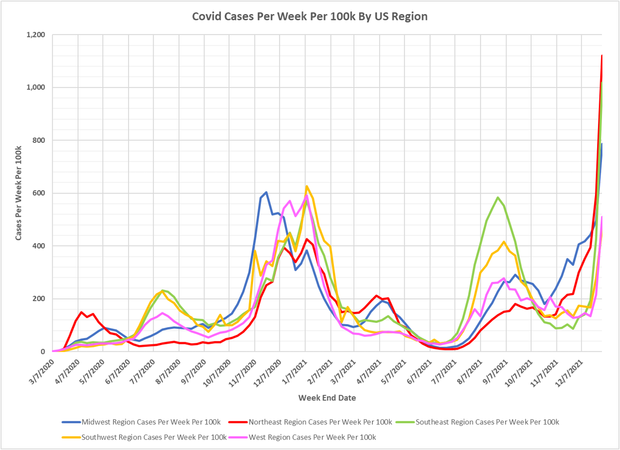
Coronaviruses are one of the sources of the common cold. We are being overwhelmed by colds, ladies and gentlemen. Dave’s latest regional case chart and national case animation. Dave’s notes:
1. The chart of US regional cases displays the entire pandemic. The animation of cases per week per 100k starts the week ending 7/03/2021.
2. US case data by state is taken from a CDC data base: https://data.cdc.gov/Case-Surveillance/United-States-COVID-19-Cases-and-Deaths-by-State-o/9mfq-cb36 , This data base appears to be corrupted, especially for California, in early 2021. Therefore, all data for all states prior to 8/1/2021 is the version published by the CDC on 10/24/2021. All data starting 8/1/2021 is the most current available data, published by the CDC on 1/06/2022, plotted to 1/01/2022.
3. State population estimates used to calculate rates per 100k are taken from the CDC data file nst-est2019-01.xlsx, available here: https://www.census.gov/newsroom/press-kits/2019/national-state-estimates.html
Cases per 100k in all regions are spiking higher. The Northeast, Midwest, and Southeast regions are all at record high reported case levels.
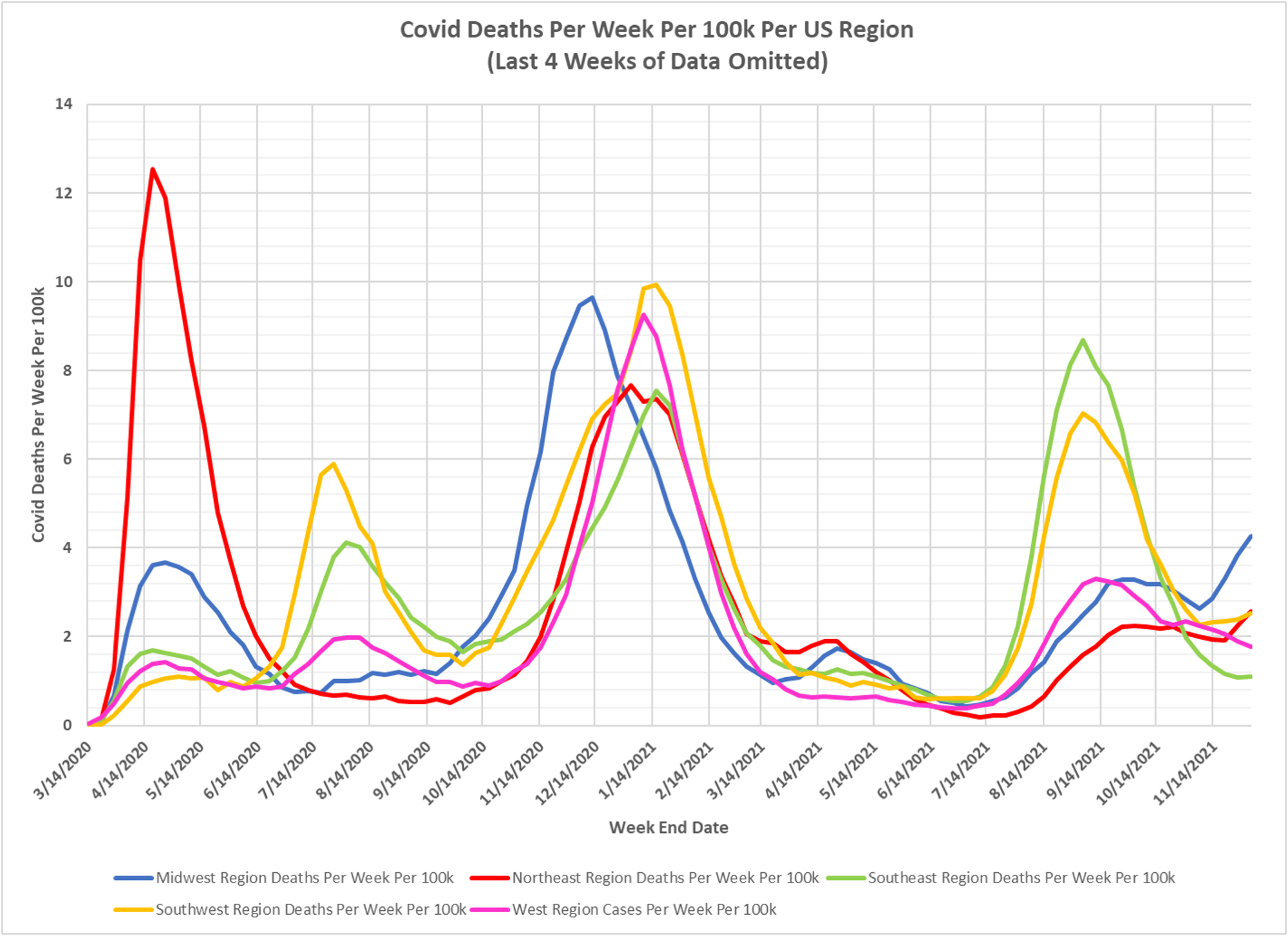
4. Despite the surge in cases the regional reported deaths are not increasing dramatically.
The maximum scale on the animation is 1245.4 cases per 100k per week. This rate occurred the week ending 11/14/2020 in North Dakota, before the start of the this animation.

Dont get tested. You play into their foolishness. Stay home and do down time. Keep up your Vita C, Zinc and D3 and rest. Use over the counter meds for the symptoms you have. Use common sense or maybe there is none of that around anymore, just fear.
Thanks for the animation. Even I can understand it!