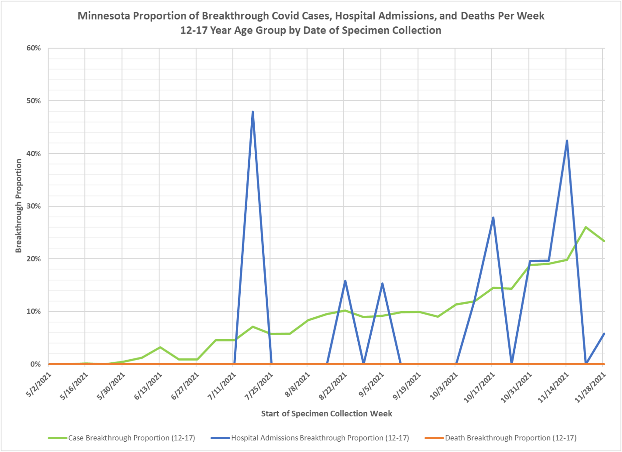
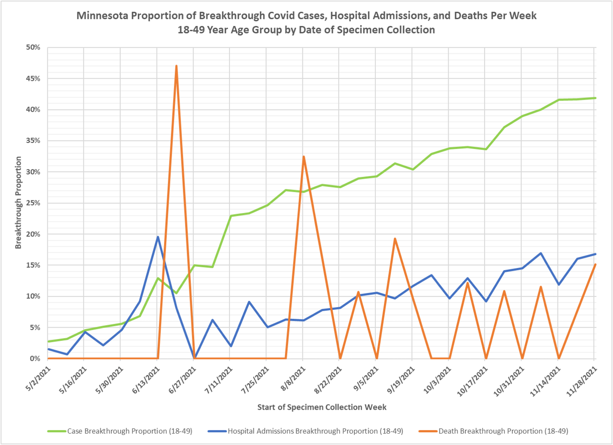
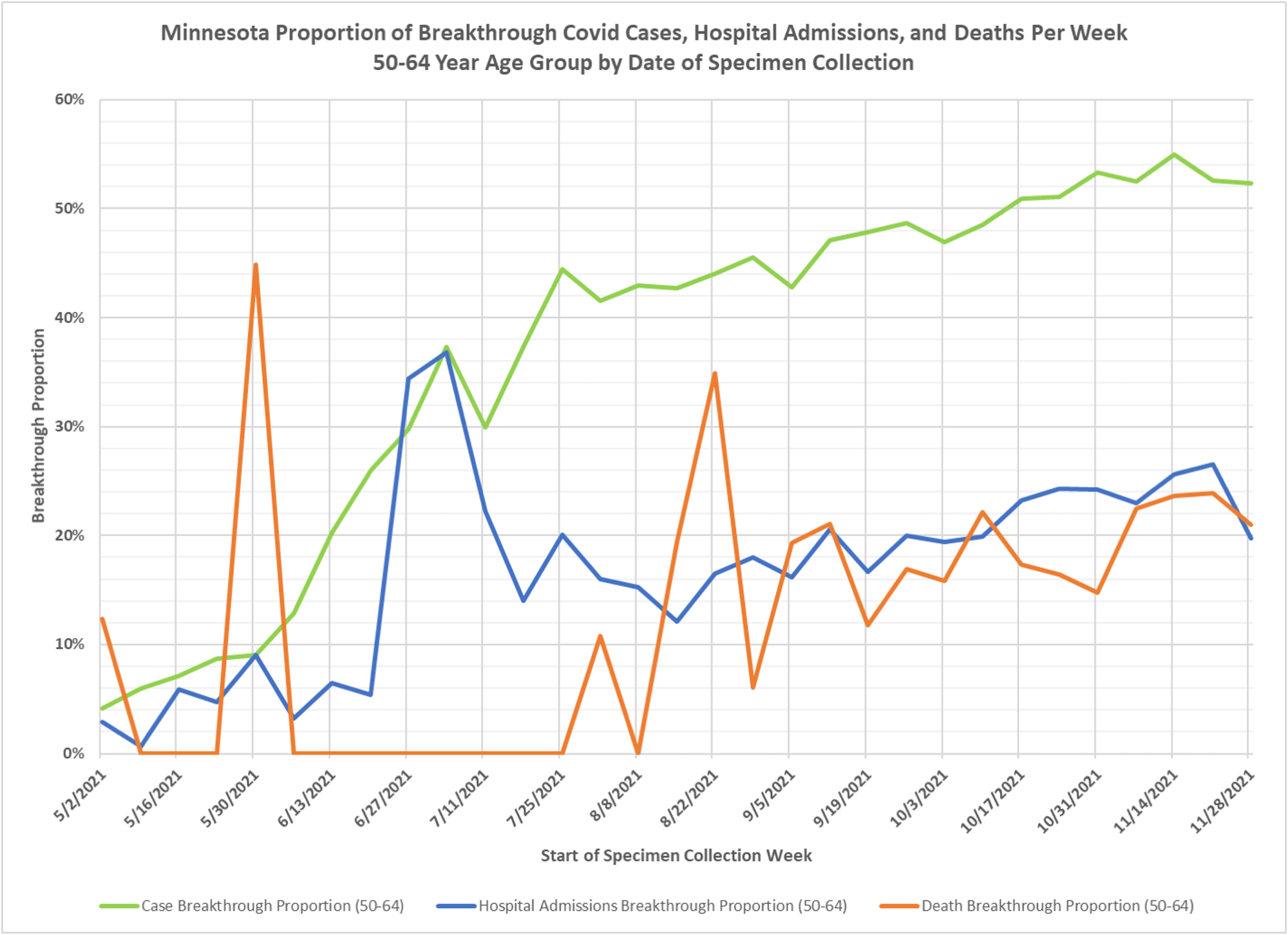
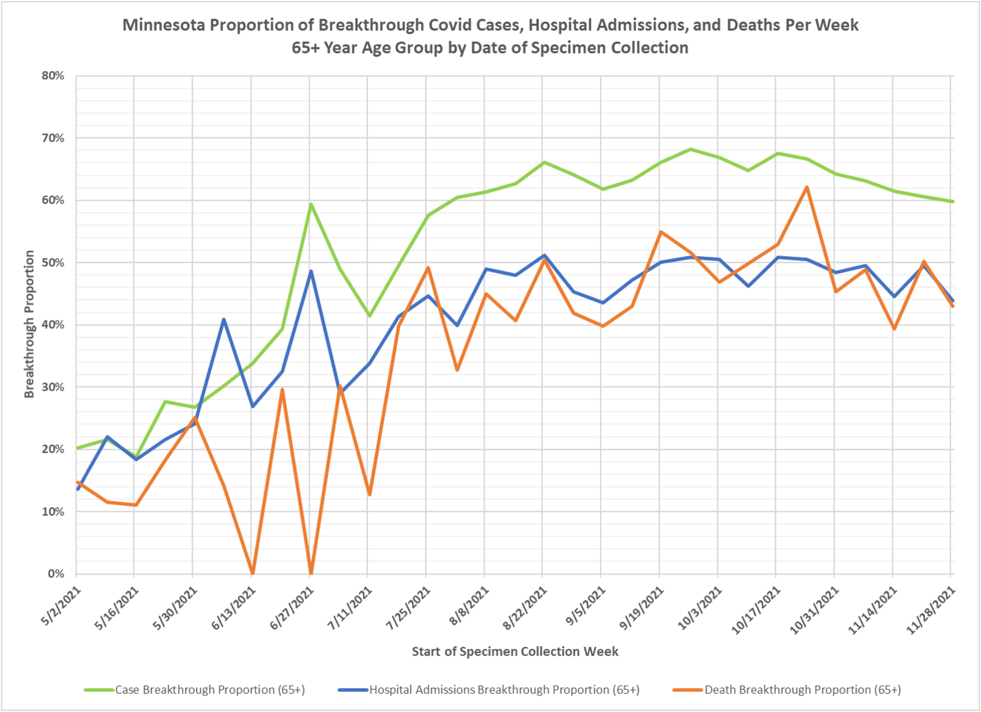
Is there a difference in breakthrough proportions of all events by age group? Yes there is and here is Dave Dixon’s updated chart on the topic. Notes below:
1. These charts display the proportion of weekly cases, hospital admissions, and deaths which are breakthrough events. Breakthrough cases are considered to be Covid positive cases, admissions, or deaths which occur in a person who completed their vaccination series at least 14 days before the positive test.
The underlying data for these charts is the data file vbtcirates.xlsx, found on the Minnesota Department of Health (MDH) web page: https://www.health.state.mn.us/diseases/coronavirus/stats/vbtcirates.xlsx . This data file gives the rates per 100k of cases, hospitalizations, and deaths in full vaccinated and not fully vaccinated people, broken out by age group.
2. The rates per 100k in vbtcirates.xlsx are converted into cases, hospitalizations, and deaths by multiplying by the appropriate population. The number of vaccinated people by age group can found on the Vaccine Data page, https://mn.gov/covid19/vaccine/data/index.jsp , in the data file People Vaccinated by Age. The unvaccinated population is found by taking the US Census American Community Survey 5-Year Estimate (Data Table S0101, https://data.census.gov/cedsci/table) and subtracting the vaccinated population. The breakthrough proportion is then found by dividing the breakthrough events by the total of the breakthrough and non-breakthrough weekly events.
3. One difference between these charts and other breakthrough charts we have published is that all of the dates are based on the specimen collection date for the original positive case. Hospital admissions are not based on the date of admission, but on the date the person who was admitted had a specimen collected which tested positive. The death dates are also by specimen collection date. This creates a sort of instant cohort analysis.
4. For the 12-17 age group chart the breakthrough admissions (blue curve) looks a bit peculiar because there are so few admissions, breakthrough or otherwise, there were no recorded deaths at all. Breakthrough cases (green curve) rise steadily before falling to 23.3% for the most recent data point.
5. The 18-49 chart shows breakthrough cases (green curve) to end at 41.9%. The blue breakthrough hospital admission curve is spikey in the early weeks due to a very low level of admissions, as is the red breakthrough death curve.
6. The 50-64 age group chart shows that breakthrough cases have been above 50% since 10/17/2021, while hospital admissions and deaths have been between 15% and 25% during the same time period. Note that if 50% of breakthrough cases account for roughly 20% of deaths, that means that the other 50% of non-breakthrough cases account for roughly 80% of the deaths.
7. The 65+ age group chart shows that breakthrough cases have been above 60% since 8/1/2021, which makes some sense since this age group was most highly vaccinated earliest. Breakthrough hospital admissions and deaths have been hovering close to or above 40% since around 8/28/2021.
8. My takeaway from breakthrough charts and analysis like this is that vaccinations are unable to stop spread of the virus through the overall population, although vaccination may be beneficial for the outcome of a specific individual who tests positive.

raw numbers please … % are used to hide raw numbers when those raw numbers are small and not as scary as %’s in my experience …