Some things are different as the years of this never-ending epidemic wear on, like testing levels, and some things stay the same, like calling hosps and deaths CV-19 ones when they really have nothing to do with it. The truncation of peaks in hosps and deaths this year compared to last is due to vaccines and depletion of the pool of susceptible persons, I believe. Beds in use, I believe if we were given full data, would be due to incidental positives, not treatment for CV-19. We appear headed down, but this has been a fall and winter of head fakes so far and given the Moronic insanity, who knows where we are going. Thanks again to Dave Dixon, whose notes are below.
1. For all charts the last 7 days of data is excluded to avoid charting incomplete data. Death reporting, however, is still likely to be incomplete.
2. All data is taken from the Minnesota Department of Health Situation Update for OCVID-19 web page https://www.health.state.mn.us/diseases/coronavirus/situation.html and from the Response and Preparation web page https://mn.gov/covid19/data/response-prep/response-capacity.jsp.
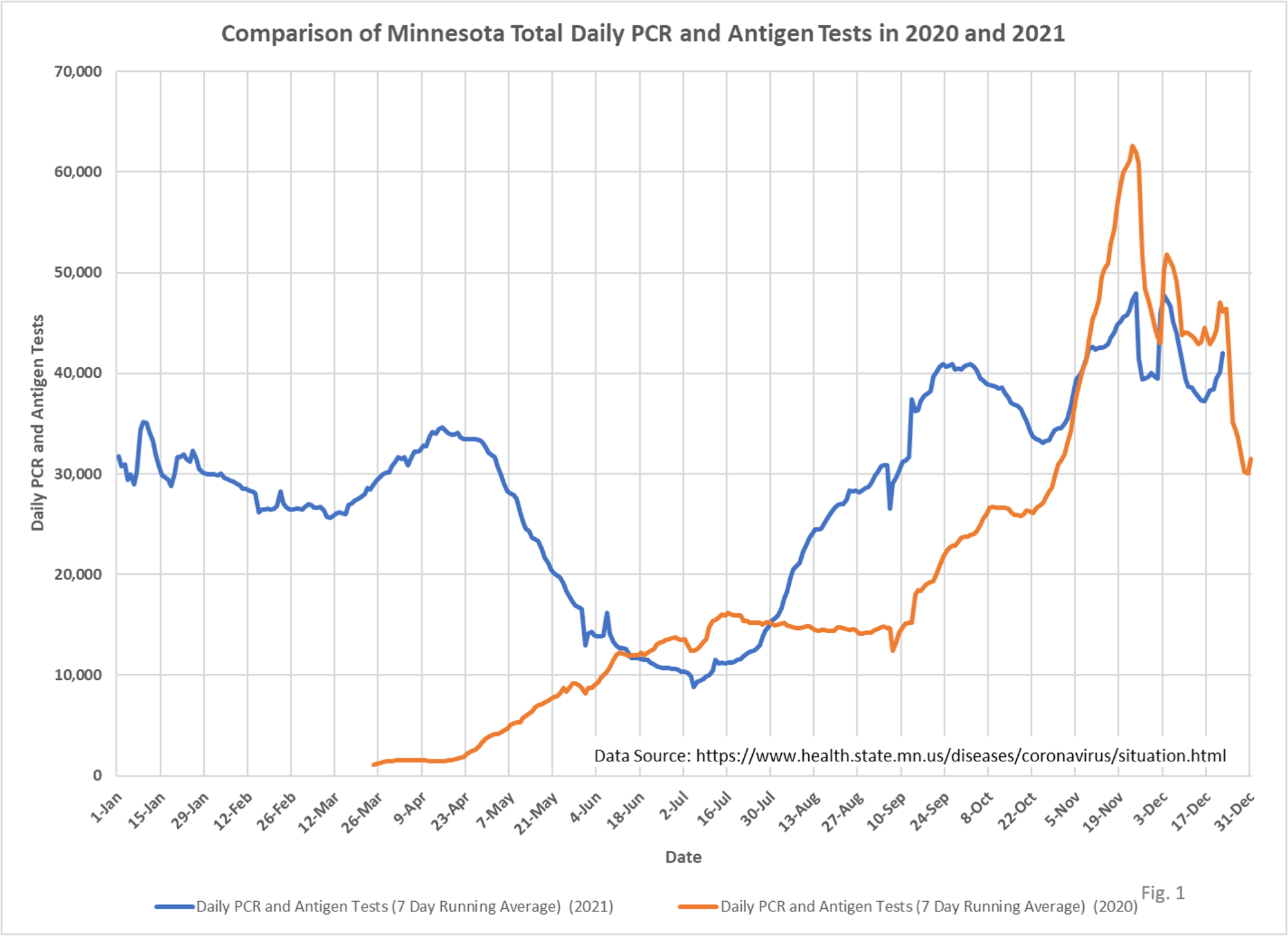
3. Tests per day, after declining slightly in the middle of December, increased again through Dec. 22, the last day plotted. Testing on Christmas Day and the next day appear low, although reporting may be incomplete.
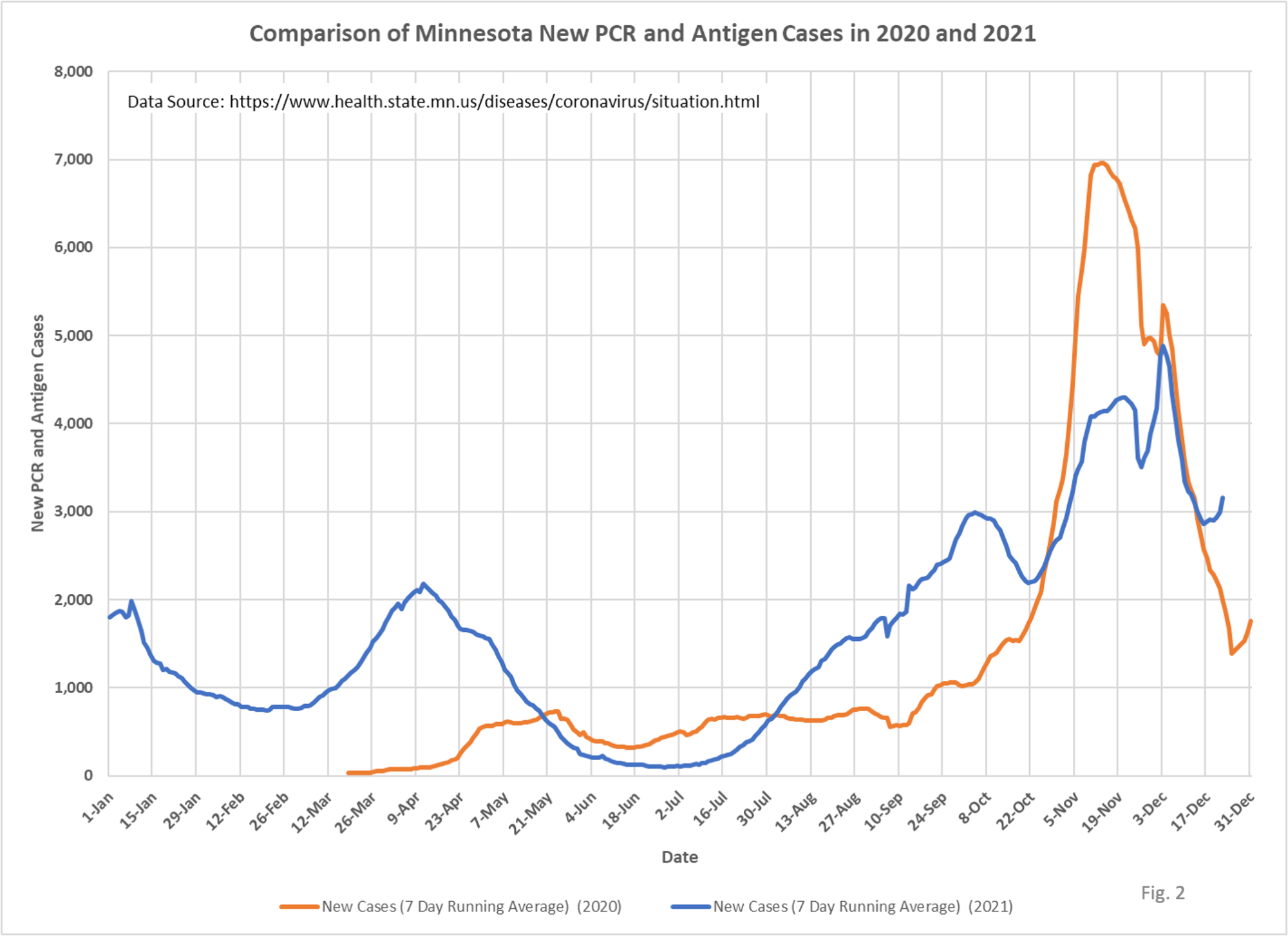
4. New daily cases, after peaking on 12/03/2021 at 4,885 cases per day, and then falling to 2,856 cases per day on 12/16/2021, have now started rising again. Is this caused by the Omicron variant, or by increased testing, both, or something else?
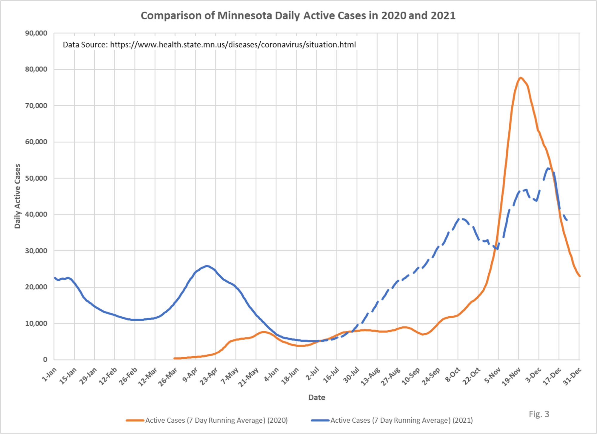
5. Active cases largely mirror the new daily cases curve, with a lag for the period in which a person is considered infectious.
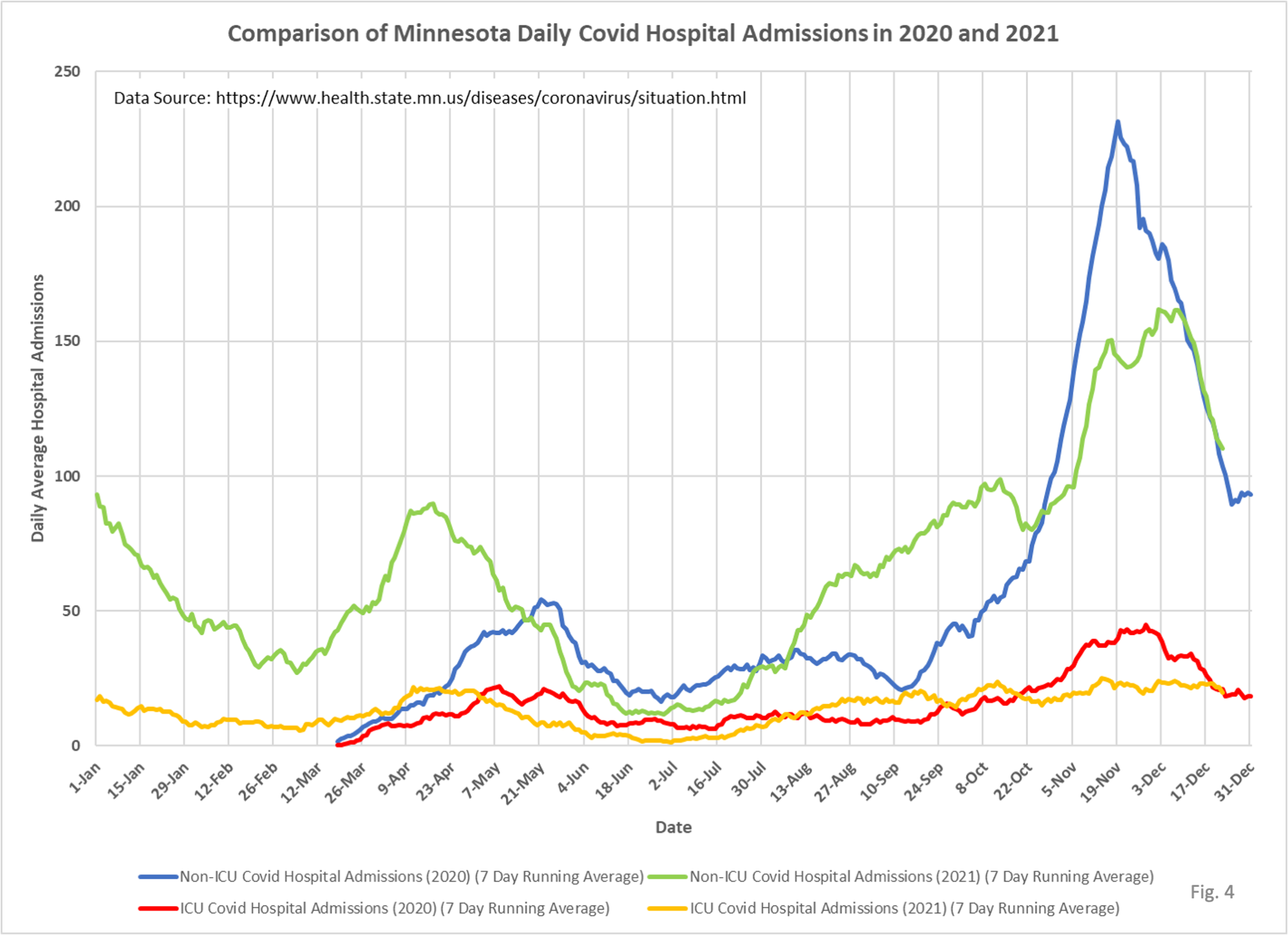
6. Non-ICU admissions per day are declining sharply, almost identical to last year. ICU admissions per day are also now exactly matching last year’s ICU admissions per day at this time.
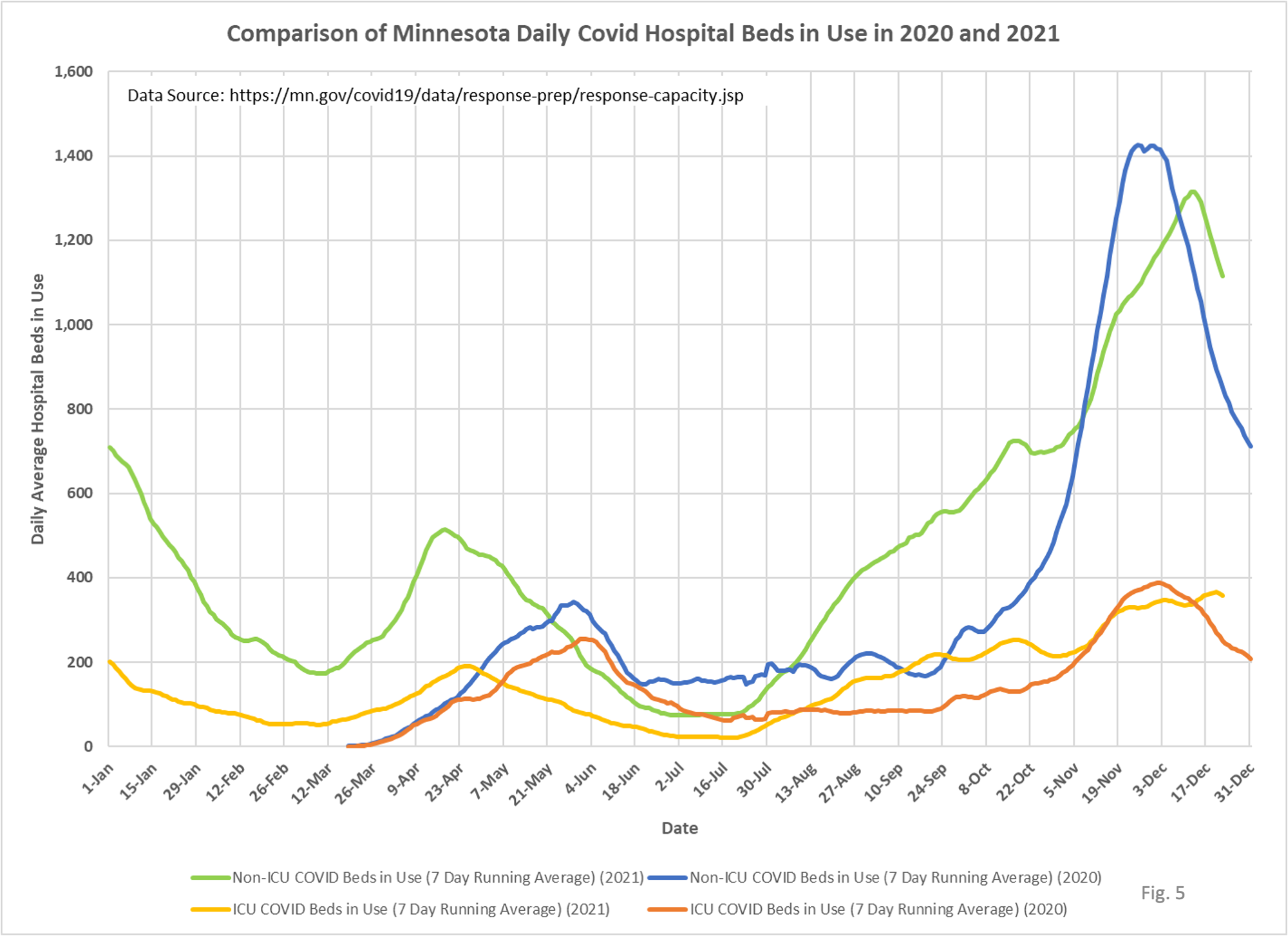
7.Non-ICU Covid hospital beds in use continues to drop sharply. The rate of change this year matches last year’s almost exactly, but 9 days later. It is interesting that although the decline in cases from the peak matches last year (Fig. 2), and daily admissions this year matches last year exactly (Fig. 4), the decline in Non-ICU Covid hospital beds in use is occurring 9 days later. One possible explanation is the hospital length of stay is longer, but we have been unable to prove this conclusively with the data available to use. We have filed a Data Practice Act request for length of stay data.
8. ICU Covid beds in use may have peaked on Dec. 20, although we will need to wait a few days to confirm this.
An ongoing question is why the peak in beds in use this year is much closer to last year’s peak, while daily admissions peaked at a lower level compared to last year. Non-ICU daily admissions in 2021 peaked at 69.7% of the 2020 peak, while Non-ICU beds in use in 2021 peaked at 91.8% of the 2020 peak. Similarly, ICU daily admissions in 2021 peaked at 59.5% of the 2020 peak, while ICU beds in use in 2021 peaked at 94.7% of the 2020 peak, assuming that 12/20/2021 turns out to be the peak in 2021 ICU beds in use. The peak in beds in use this year compared to daily admissions remains puzzling, and longer hospital length of stay is the only explanation I can come up with. It may partly be a capacity issue due to vaccine mandates.
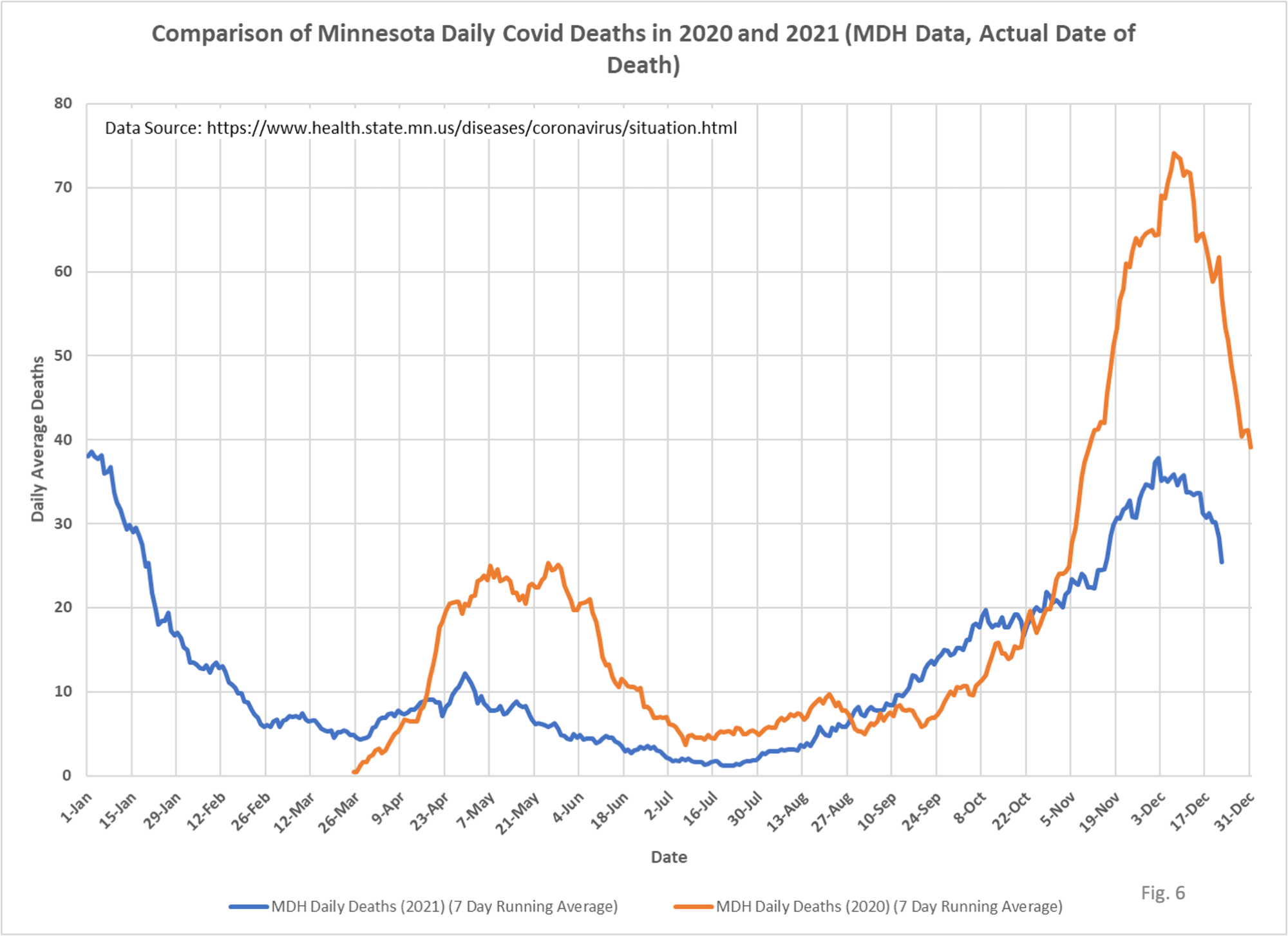
9. Deaths per day attributed to Covid peaked at 37.9 deaths on 12/02/2021, one day earlier than the peak in new cases on 12/03/2021. This seems strange since it is conventional wisdom that there is a roughly a 14 day lag from positive test to death on average. This means we would normally expect the peak in deaths to occur sometime around 12/17/2021. I have no explanation for why deaths appear to have peaked so early relative to new daily cases. Could be an unusual delay in death reporting.

Isn’t it time for the Minnesota DOH to rename itself to The Homer Simpson “DOH!” ?