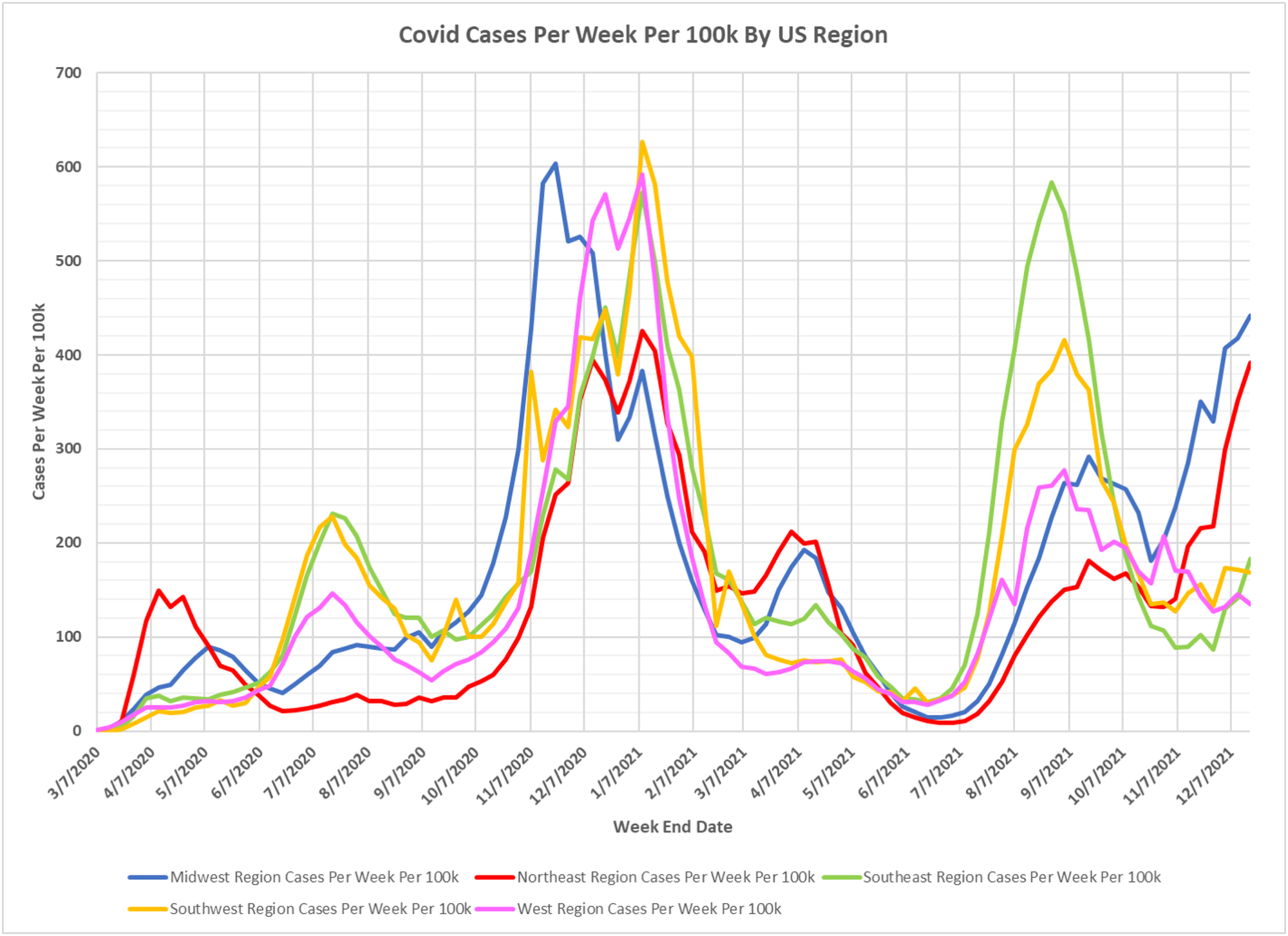
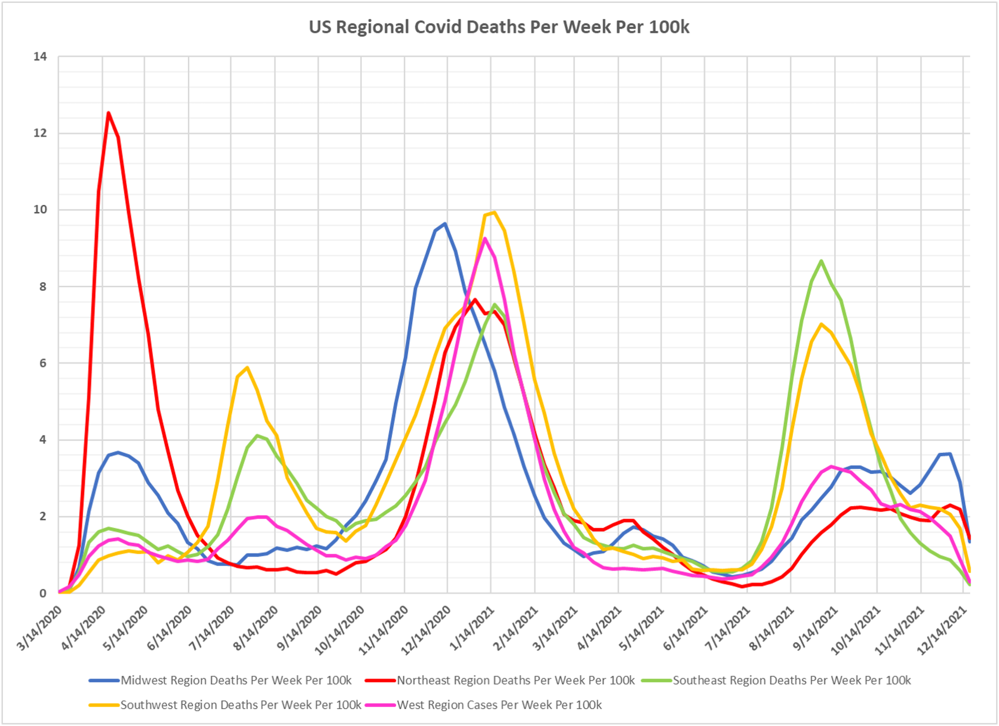
Thanks to Dave Dixon here is another update on regional cases in the US, as we await the Moronic blizzard, and there are some signs of a good uptick, and we haven’t done this for a while, but an animation of case rates across the country since July of this year. Interesting to see the ebb and flow across regions. Dave’s notes:
1. The chart of US regional cases displays the entire pandemic. The animation of cases per week per 100k starts the week ending 7/03/2021.
2. US case data by state is taken from a CDC data base: https://data.cdc.gov/Case-Surveillance/United-States-COVID-19-Cases-and-Deaths-by-State-o/9mfq-cb36 , This data base appears to be corrupted, especially for California, in early 2021. Therefore, all data for all states prior to 8/1/2021 is the version published by the CDC on 10/24/2021. All data starting 8/1/2021 is the most current available data, published by the CDC on 12/22/2021.
State population estimates used to calculate rates per 100k are taken from the CDC data file nst-est2019-01.xlsx, available here: https://www.census.gov/newsroom/press-kits/2019/national-state-estimates.html
3. The Midwest region currently has the highest case rate per 100k in the US, with the Northeast region experiencing a rapid rise in cases as well.
4. It is striking that there are geographical waves of cases still evident, despite a variety of vaccination rates and government mitigation measures.
5. The maximum scale on the animation is 1245.4 cases per 100k per week. This rate occurred the week ending 11/14/2020 in North Dakota, before the start of the this animation.