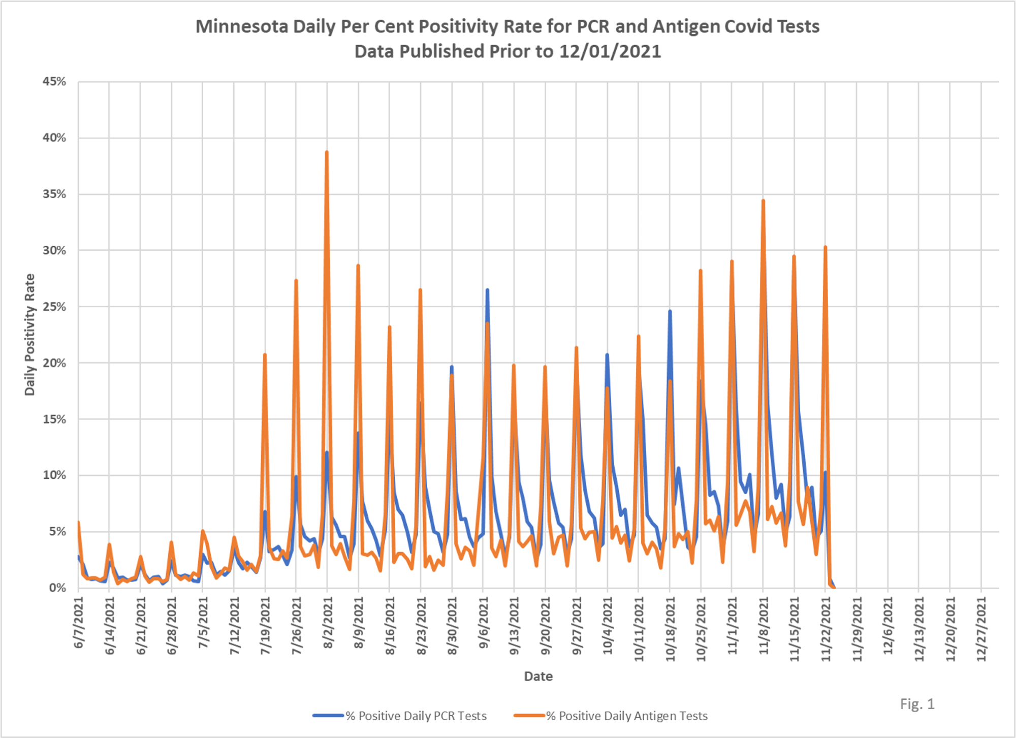
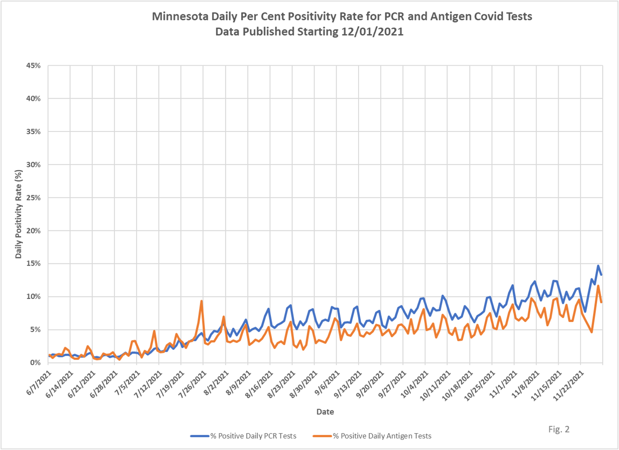
DOH has had trouble figuring out exactly how to report data in a consistent way, and I am not sure they want to. They have frequently changed reporting methods or even what is reported, and they never seem to use the simplest option. Sometimes their approach to data revelation is clearly designed to support some message, but often times it just looks incompetent. The most recent example is testing, which just looks all over the place on the data they have been reporting, with a strange weekly pattern. Now they have changed the data to be date of event, and the pattern looks a little more consistent. Dave Dixon put these charts together and here are his notes on his work to understand the changes and what they mean. The second chart, based on the new date of testing data, looks more regular than the prior one with the huge spikes that were an artefact. But you can still see one of the most notable features of the virus; it has the uncanny ability to know what day of the week it is and to infect people more during the week, as opposed to the weekend. I guess viruses need some time off too.
Dave’s notes:
1. On Dec. 1, 2021 Minnesota Department of Health changed the way they report Covid tests. Prior to 12/1/21 MDH gave the numbers of PCR and antigen tests performed in terms of when the test was reported to MDH. Starting 12/1/21 the tests are now reported in terms of the date on which the specimen was collected from a patient.
While this change in reporting is fairly minor it does perhaps clarify the daily positivity rates, because positive tests have been reported by date of specimen collection for quite some time.
2. Prior to 12/1/2021, because the date the test was reported differed from the date the specimen was collected, calculating a daily positivity rate gave a very pronounced weekly pattern, as seen in Fig. 1 below. The positivity rate spikes high for data reported on the MDH Situation Update web site (https://www.health.state.mn.us/diseases/coronavirus/situation.html) every Tuesday, representing data as received by MDH every Monday.
3. With the change on 12/1/2021 of reporting tests by the date of specimen collection, the same manner as cases are reported, the weekly pattern is largely smoothed out, as seen in Fig .2 below. The apparent weekly variation pattern is now only several per cent, rather than 15% to 35% as seen before.
4. We have been puzzled for quite some time by the weekly pattern in the testing data prior to 12/1/2021. It appears that what was happening was there was some amount of lag in the reporting of tests to MDH. This caused the positivity rate to spike on a weekly basis because the positive tests, by date of specimen collection, were not aligned with the actual number of tests performed on a given day, which then skewed the positivity rate. Testing typically is lower on weekends, and when the low weekend test amounts were compared to the high number of positive cases on Mondays, this then caused the apparent high positivity rate.
5. We can see in Fig. 2 that the antigen tests since August, 2021 have a consistently lower positivity rate by several per cent. We do not have enough information to determine if this is caused by difference in populations (ages, school vs hospital settings, etc.) or if it is inherent in the sensitivity of the PCR test compared to the antigen test. Antigen tests tend to report fewer false positives, but perhaps more false negatives, although PCR tests report lots of infections that aren’t. PCR tests find lots of non-viable virus. We can also see in Fig. 2 that there is still a consistent weekly pattern. It is unknown for sure if this an artifact of inconsistent reporting, or because on weekends less routine testing is occurring, which in turn causes tests of actual sick people to raise the positivity rate.

It would be interesting now that we have 2 seasons of data to compare the 2020 and 2021 ‘maps’ of spread and see if the same seasonal / geographic patterns immerge. I though DD had a ‘live’ .ppt of the month over month state data last year?
Also, very glad to know that sitting down in a restaurant, on the weekend, is the safest place to be 🙂 If they find out that having alcohol in your blood stream is also a preventive measure, I’m all set !!
Thanks for the continued effort to stay on top of the bouncing ball, inflated with hot air from all of the IB’s.
Judging by the second chart, the switch was made because it presents more reason to panic.
It also shows the complete failure of public health bureaucrats to actually improve the numbers they claimed their methods were going to improve. Naturally this is the fault of everyone except the bureaucrats (sarcasm). They use their failure as the reason they should be given more money and power, and people fall for it.