Dave Dixon is modifying charts with each release or provision by the state of new files. These constant revisions by DOH give you no confidence in the completeness or accuracy of the data released. In any event, below is an updated table, and an updated chart, and Dave’s notes on how they were produced. We are working on case and per capita rates, but the data isn’t very good for that yet.
I am trying to juggle two things here. One is a reaction I have against demonizing the unvaxed. That reaction is partly based on the fact that in terms of perceptions of absolute numbers and proportions of events, this really is not an epidemic solely of the unvaxed. And since the state initially provided only shitty data, all we could do is try to point out as well as we could that there are a lot of cases, hospitalizations and deaths in the vaxed. And for the 100th time, which I said even before the vaccines were approved, nothing surprising here. Anyone familiar with the history of respiratory virus vaccines would have said: “hey folks, going to be continuing infections, and some hospitalizations and deaths, especially among older people”.
The second thing I am trying to do is keep people from saying “well that means the vaccines don’t work”. No, it absolutely does not. To understand vaccine effectiveness, comparative case rates of hospitalizations and deaths are far more useful and should be done on an age-adjusted basis. And per capita rates for each population are also important. The state is still not giving out data that allows the accurate calculation of those rates. We are going to publish soon some cumulative case rates that at least give you a flavor. And we will keep pushing and pushing til we get the right data to do the right analysis.
And, as Dave points out in his notes, if part of what the state is doing is worrying about use of health resources, the fully vaxed are using a lot of health resources right now. For example, if around 1200 hospital beds are being used for CV-19 patients, and a third are fully vaxed patients, which is the minimum proportion, that is 400 beds that would be available if the vax was 100% effective.
The absolute best analysis in my perspective, as I have again explained several times, would divide people by totally uninfected and unvaxed, infected but not vaxed, partly or fully vaxed but not ever infected, and partly or fully vaxed but infected at some point, and would have the dates of each event and allow a days of exposure analysis, in which the days after vaccine or after infection could be compared to assess risk.
Even with the somewhat better data files the state has provided us, it is hard to do this analysis right. It needs to be age adjusted at a minimum. And I can give you a long list of things that should be considered, that could make the comparative rates higher or lower. So read these tables and charts with those caveats in mind. We will keep working at getting better data and an accurate analysis. Please note that for this table and chart, we used the state’s data as provided.
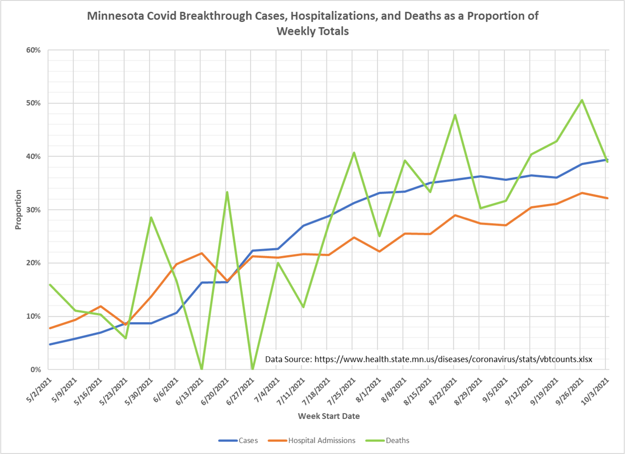
Note that the proportion hops around because of the state’s variable processes to identify breakthroughs. I suspect breakthroughs will still be added to some of these weeks and the proportion may rise. Non-breakthroughs are likely complete at this point.
Dave’s notes:
Notes, Sources, and Methods:
1. This table and chart show the breakthrough cases, hospital admissions, and deaths as a proportion of total weekly cases, hospital admissions, and deaths.
2. Note that although in the most recent week of available data breakthrough cases and deaths make up nearly 40% of the totals cases and deaths, and breakthrough hospital admissions make up roughly 32% of the total admissions, it is still true that the risk infection, hospitalization, and death appears to be higher for an unvaccinated individual than for a vaccinated individual. At this point we don’t have good respective population data to have an adquate level of confidence in the denominators for case and per capita analyses.
3. The data used to generate this table and chart comes from a new data file names vbtcounts.xlsx published by the Minnesota Department of Health for the first time on 11/12/2021. This file can be found on the Vaccine Breakthrough Report here: https://www.health.state.mn.us/diseases/coronavirus/stats/vbtcounts.xlsx
Vntcounts.xlsx contains the weekly cases, hospital admissions, and deaths for the Fully Vaccinated and Not Fully Vaccinated populations in Minnesota for each week from the week starting 5/2/2021 to the week starting 10/3/2021.
4. In order to generate the table and chart we simply divided the Fully Vaccinated amounts by the sum of the Fully Vaccinated and Not Fully Vaccinated amounts for each data type for each week.
5. Although the risk of hospitalization of an unvaccinated individual may be higher than for a vaccinated individual, it is reasonable to state that the burden on the health care system overall by vaccinated people is roughly equal to the proportion of vaccinated hospital admissions, just under 40% for the week starting 10/3/2021.