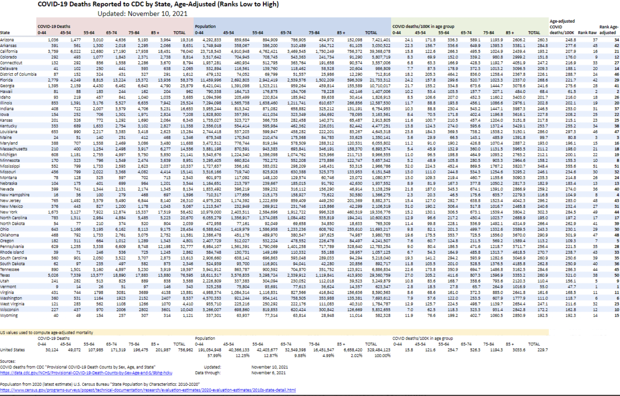
 Thanks to Phil Kerpen on Twitter for regularly doing these, I think they are useful in showing the effect, or lack thereof, of different policy regimes in different states. Minnesota, and Wisconsin, have done pretty well by this metric.
Thanks to Phil Kerpen on Twitter for regularly doing these, I think they are useful in showing the effect, or lack thereof, of different policy regimes in different states. Minnesota, and Wisconsin, have done pretty well by this metric.

© 2026 Healthy Skeptic.
Interesting. I was disappointed to see that Florida, whom you recently lauded for its approach and outcomes with Covid, fared worse than MN, HI, MA and a couple of others.
Is there a way to download the file
The print is too small to read
thanks
https://www.theburningplatform.com/2021/11/02/uh-thats-not-a-conspiracy-theory/
I had questioned before the concept of a QC problem with the vaccine manufacturing vs. the personal immune system responses to this technology (mRNA) as the driver for the seemingly random medial issues associated with the vaccines. This article seems to suggest that it’s in the manufacturing platform. It drills down into the death counts by lot numbers and finds correlations.
Since it’s (presumably) from the VAERS database directly, it’s hard to put this in the “Tinfoil Hat” category. With the rush to approve, manufacture and distribute, I don’t know why we wouldn’t expect this outcome. I believe these are temperature dependent products which could potentially also explain a supply chain SNAFU on certain lots which might have caused them to be more deadly than others.
It would have been great to see the temporal relationships to better understand if the bad batch/results were dropping over time, meaning that the manufacturing and distribution processes were improving as the roll out took place. Maybe I missed this?