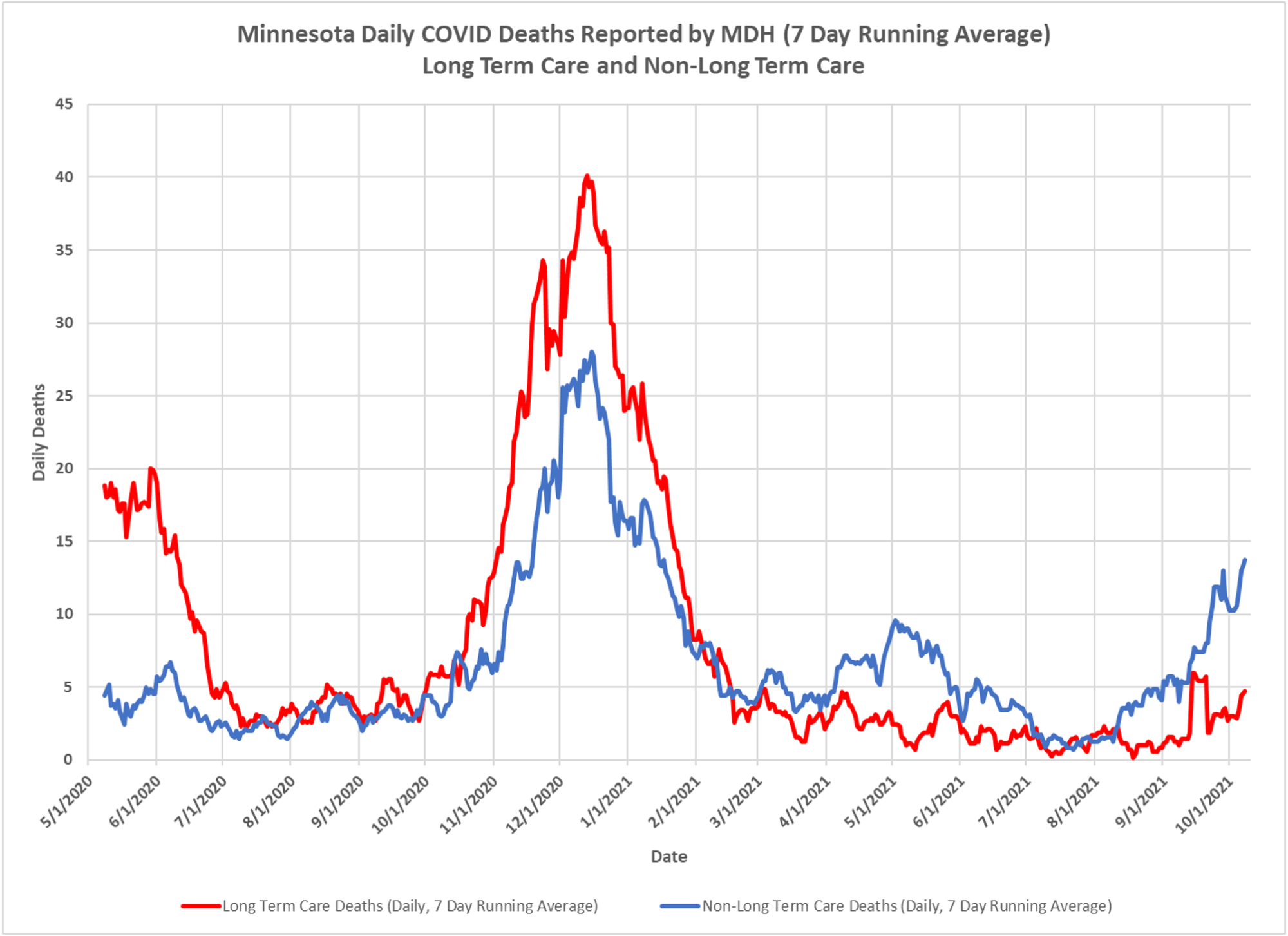
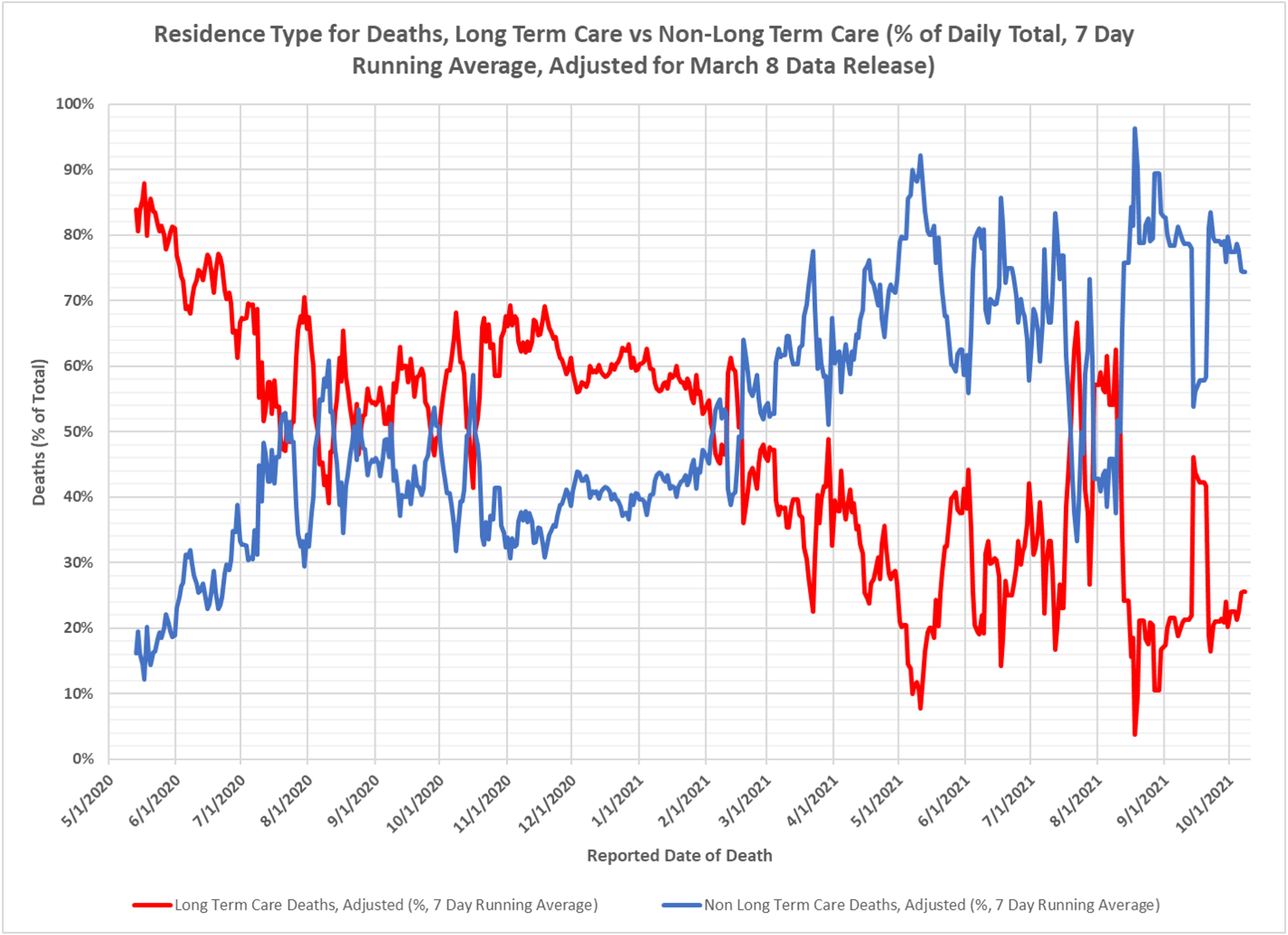
Been a while since we updated this chart, but Dave Dixon did it today based on the strong uptick in deaths, which are in the old and probably vaxed. But LTC residents don’t appear to be a big part of the problem, relatively speaking. While deaths are up in this group, the relative proportion hasn’t changed a lot since the vaccination program caused a reversal of relative contribution from each population. Here are Dave’s comments on the data.
- The LTC deaths in July are elevated abnormally because DOH was reporting many older deaths from February and March.
- There was a data dump on 9/15, where 41 deaths were reported, many of them from February 2021 and older. Some of these were LTC deaths, which elevated the LTC death ratio for one week until this sike rolled out of the 7 day average.
- Deaths are at levels not seen since the end of the November, 2020 spike, and appear to be still trending higher.


The CDC just (stealthily) updated their death data, 6% were from Covid only. All others had multiple serious comorbidity diagnosis with a positive PCR test. If DD is using DOH hospital data, there’s a good chance it’s over 90% inflated. Until the DOH data is based on audited death certs, this type of information is just adding to the fear mongering that you’ve been so critical about.
Covid is the gust of wind that pushes very unhealthy and near death people over the edge in the overwhelming majority of the situations.