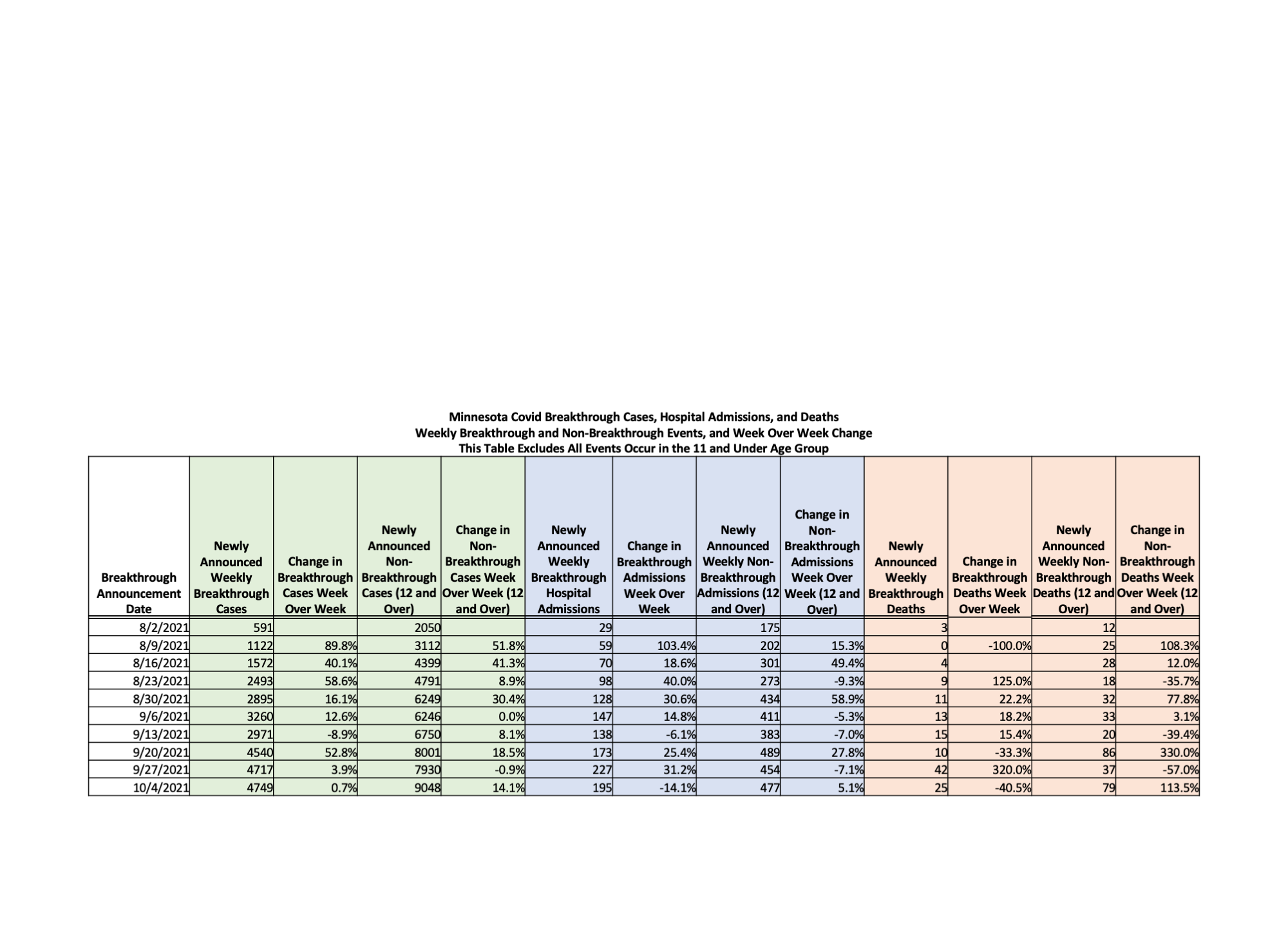
This one gives you the percent change of each of breakthrough and non-breakthrough events from week to week for the last few weeks since the state has been giving us data on breakthroughs. What is noticeable is how much it hops around, which is due to either the difficulty the state has identifying who was vaxed or intentional slowness. One thing that does stand out is that the vaxed hospitalizations appears to be growing faster than unvaxed ones.
Now here is what you really have to understand about this chart. Within a couple of weeks after a specific day, the total events for that day are pretty much fully reported. So the total isn’t going to change a lot. But it takes the state a lot longer to match up events to vaxed people, so the relative buckets are going to shift, and shift a lot. You see those 42 vaxed deaths for the week of 9/27, and the 37 unvaxed? On a reported basis more vaxed deaths were reported that week. But those vaxed deaths were largely for prior weeks, and they are deaths that were already reported in an earlier week, and they shift those prior weeks deaths from the unvaxed to vaxed. The state doesn’t give us dates of death for the vaxed, on purpose I am sure, so that we can’t draw exactly the inference that I am drawing. Right now, a huge percent of deaths for a day are the vaxed, and they can delay the reporting and hide important facts about those deaths, but sooner or later that information is going to come out. Thanks to Dave Dixon.


https://notrickszone.com/2021/10/11/counterintuitive-more-vaccinations-leads-to-more-infections-hospitalizations-deaths/
It’s time to STOP this vaccine [program] and let nature take its course. It’s driving social, political and medical wedges into our society. All of the intervention attempts have done nothing but multiply the normal deaths from a respiratory virus into countless other aspects of life, reeking havoc, leaving ruin in their wake. And all for what purpose? To advance the agenda of the human scum at the WEF and their affiliated non-profits and foundations. Several new billionaires have been created by this vaccine campaign at Moderna.
It’s hard to look at the data they way Kevin summarized it and not infer that *something* is going on. There are multiple possible explanations, fair enough.
But what if we look at the data from outside Minnesota, especially the fairly transparent stuff from the UK? Does it add support to one of the possible explanations?