It is good every now and then to remind everyone how bifurcated the outcomes from this epidemic are. These charts from Dave Dixon show the cumulative spread of tests, cases, hospitalizations and deaths across age groups. You will see how concentrated testing and cases are in younger groups, driven partly by truly dumb school testing policies. But in terms of serious disease, especially deaths, it is all about the elderly. There hasn’t been much change in this chart over time (another post coming on this). So if you looked at these charts, what would it tell you about the appropriate public health reponse?
✅ Subscribe via Email
About this Blog
Healthy Skeptic Podcast
Research
MedPAC 2019 Report to Congress
June 18, 2019
Headlines
Tags
Access
ACO
Care Management
Chronic Disease
Comparative Effectiveness
Consumer Directed Health
Consumers
Devices
Disease Management
Drugs
EHRs
Elder Care
End-of-Life Care
FDA
Financings
Genomics
Government
Health Care Costs
Health Care Quality
Health Care Reform
Health Insurance
Health Insurance Exchange
HIT
HomeCare
Hospital
Hospital Readmissions
Legislation
M&A
Malpractice
Meaningful Use
Medicaid
Medical Care
Medicare
Medicare Advantage
Mobile
Pay For Performance
Pharmaceutical
Physicians
Providers
Regulation
Repealing Reform
Telehealth
Telemedicine
Wellness and Prevention
Workplace
Related Posts
Commentary
February 4, 2023
Coronamonomania Lives Forever, Part 190
Still doing my best to keep you up on the research relevant to the epidemic,…
Commentary
February 3, 2023
Minnesota Dems Go Full-on Crazy
Minnesota has gone full on lunatic in policy.
Commentary
February 3, 2023
(Biggest Sigh Yet) Can We Finally Acknowledge Masks Are Pointless
The most prestigious source for evidence-based medicine and a large study once more demonstrate the…
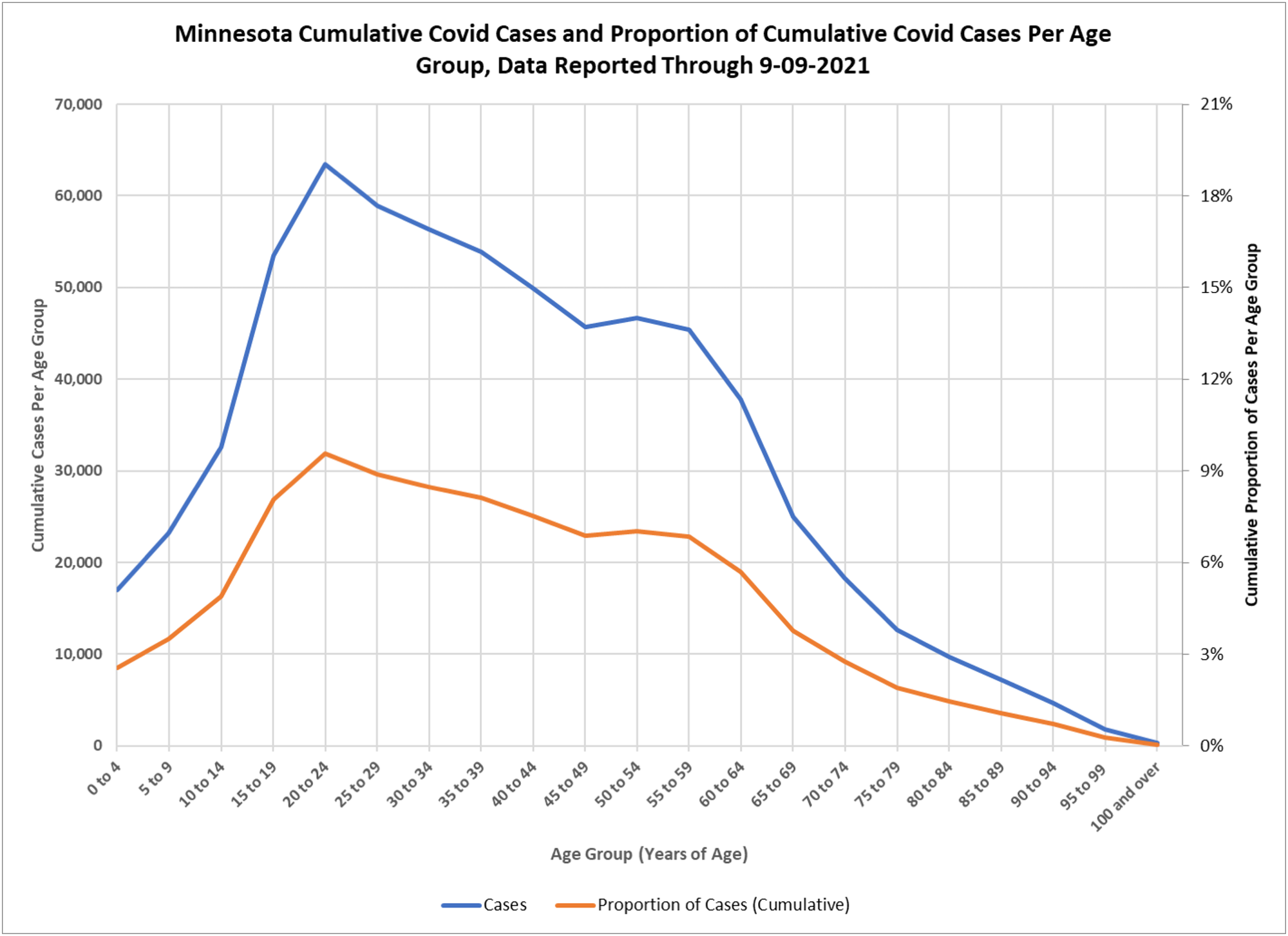
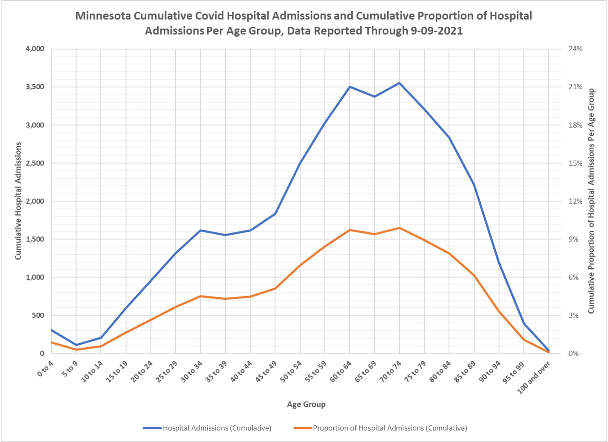
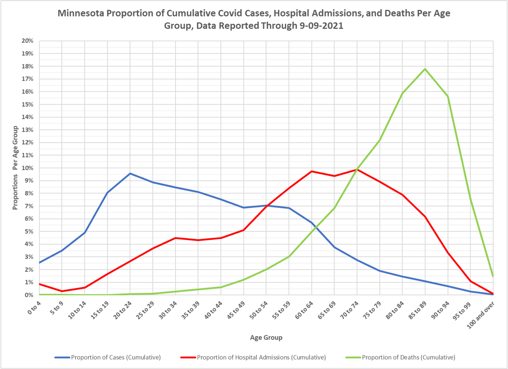
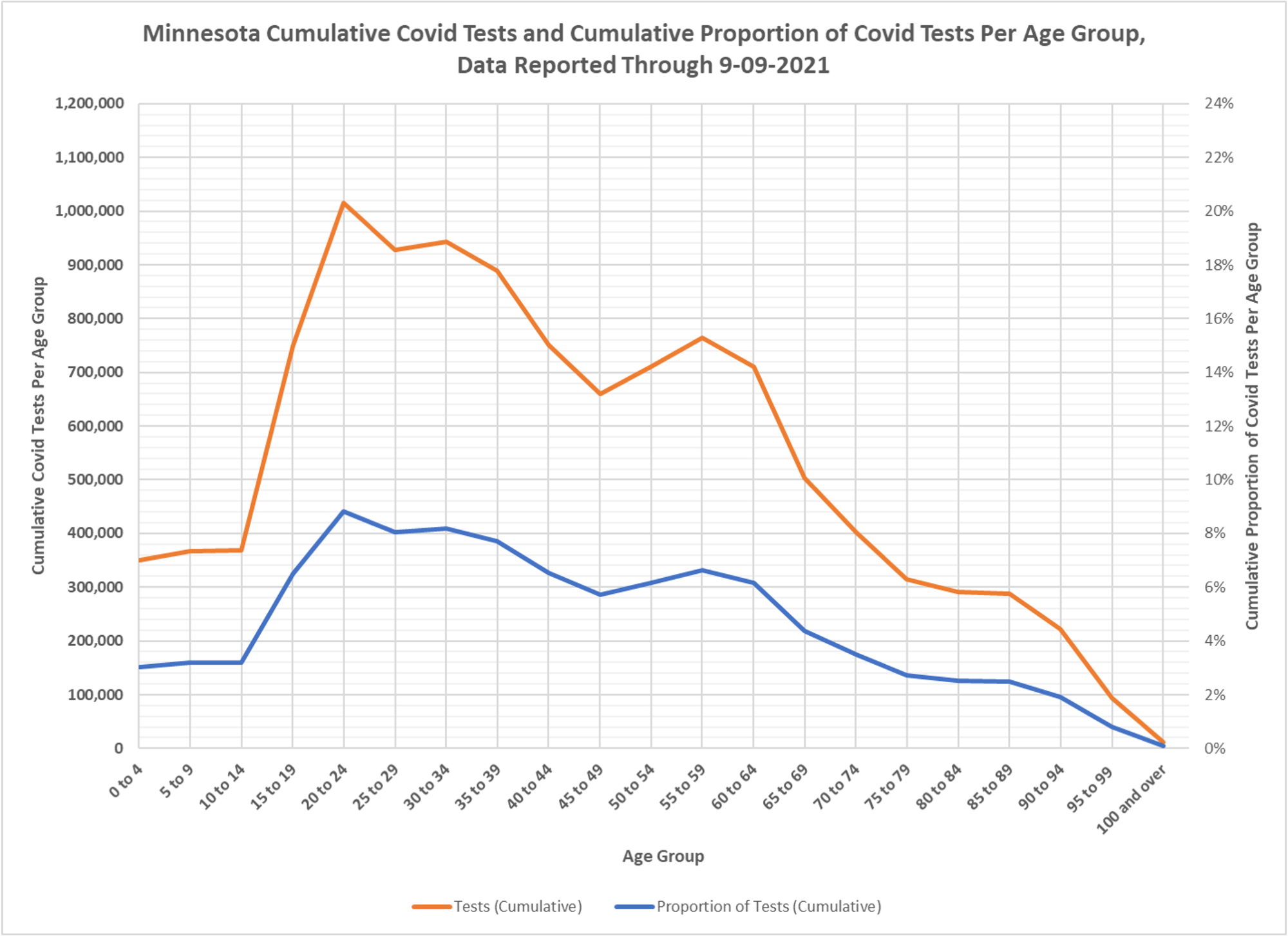
I’ve been looking at this same info graphed in the DoH summary every week since they started reporting it on May 14, 2020, and I completely agree with your question: what would it tell you about the appropriate public health response?
I think these stats are pretty amazing and ought to be front and center in the public’s eye for making decisions about where we ought to focus our attention.
Go to page 22 (typically) in the weekly summary reports linked at https://www.health.state.mn.us/diseases/coronavirus/stats/index.html