The epidemic in one chart. Note that deaths are staying pretty low, although the last week or so they have increased. The effects of vaccination are seen most clearly in deaths. Still waiting to see if we rollover or plateau.
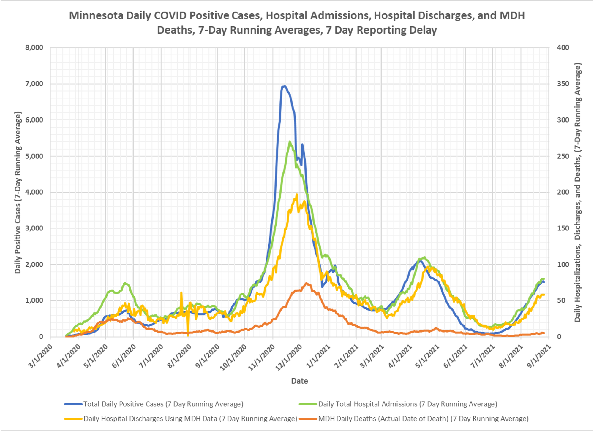
The epidemic in one chart. Note that deaths are staying pretty low, although the last week or so they have increased. The effects of vaccination are seen most clearly in deaths. Still waiting to see if we rollover or plateau.

© 2026 Healthy Skeptic.
We should be looking at acceleration measures here. It’s hard to see but it looks like a peak in the most recent period.
Thanks Tom, our rate of change, first and second order, measures are primarily in the active cases and week-over-week charts and that is what I primarily look at to ascertain likely trend change points. For the last few weeks those have actually not signaled a huge change. New active case and WOW charts coming tonight or tomorrow. The WOW looks like we are definitely on a downswing, but I am just being cautious because of meteorological factors, uncertainty about vaccine effectiveness against “infection” and over-sensitive PCR testing. The active cases similarly shows a reversal in the percent change in active cases, but for the same reasons, I am just being cautious about saying the current wave in Minnesota is over.
Hi, Kevin! I thank you again for your continuing reporting of research and statistics for the Chi-Com Flu (yes, we’re supposed to call it COVID, but the CCP is almost certainly responsible for this pandemic).
Anyway, this is a really good chart, but would it work better to use a log-scale for the y-axis, instead of two different linear scales? I know a lot of people don’t relate to log-scale charts, but they do sometimes help when co-related data differs by orders of magnitude.
yeah, we have tried to figure out how to make things more visible, I believe my charting expert, Mr. Dixon can look at that.
Mr. Roche – I’m in Florida, and while there is a lot of data on cases, hospitializations and deaths by age group, race, ethnicity, the one measure I have been looking for is a breakdown of cases, hospitalizations and deaths according to whether the person was/or was not vaccinated. Seems that would be a critical data item….or is it out there and I have just missed it?
I don’t know. If you go to the state information page, maybe it has a heading there for breakthrough infections. I don’t think the CDC gives its breakthrough infection data by state, just for the country. You can go to twitter and tweet @kylelamb and ask him, he works for Florida and does a lot of CV data analysis. If I have a chance I will take a look as well. Thank you for reading.
Hospital admission vs. death indicates that either the vax is helping or doctors are finally deciding on useful treatments or a combination of both.
Or cynically, the frailest had their deaths pushed forward.