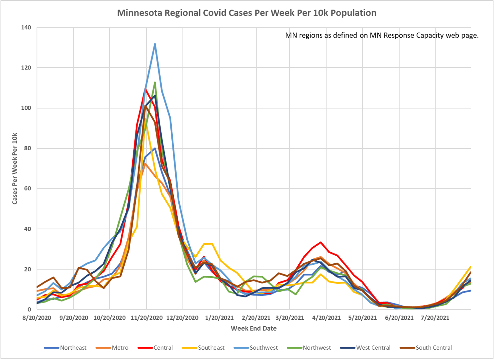
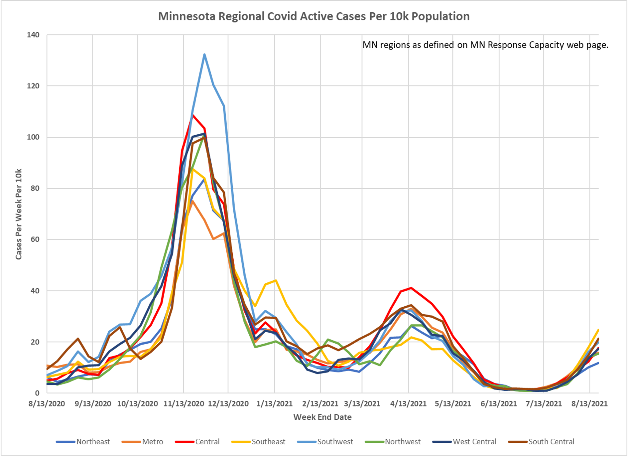
The implication in Minnesota is often made that all the unvaccinated in the outstate are the source of our cases. The latest from Dave Dixon suggests that isn’t necessarily so. Here are case and active case charts for the hospital regions used by the state. You can make your own judgment.


Can you provide the actual web page link to the regions supposedly described on the “MN Response Capacity” web page on the graphs provided? Couldn’t find the descriptions described on the graphs, so it is not possible for me to make the comparisons suggested in the brief text accompanying the graphs.
Thanks,
I believe you can find them on the weekly reports, and on the data sheets which underlie them, which are linked on the dashboard.