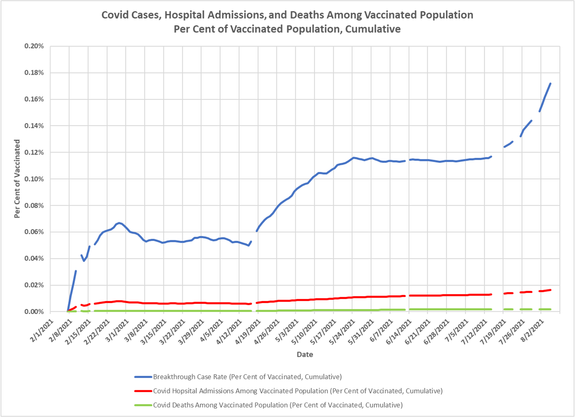
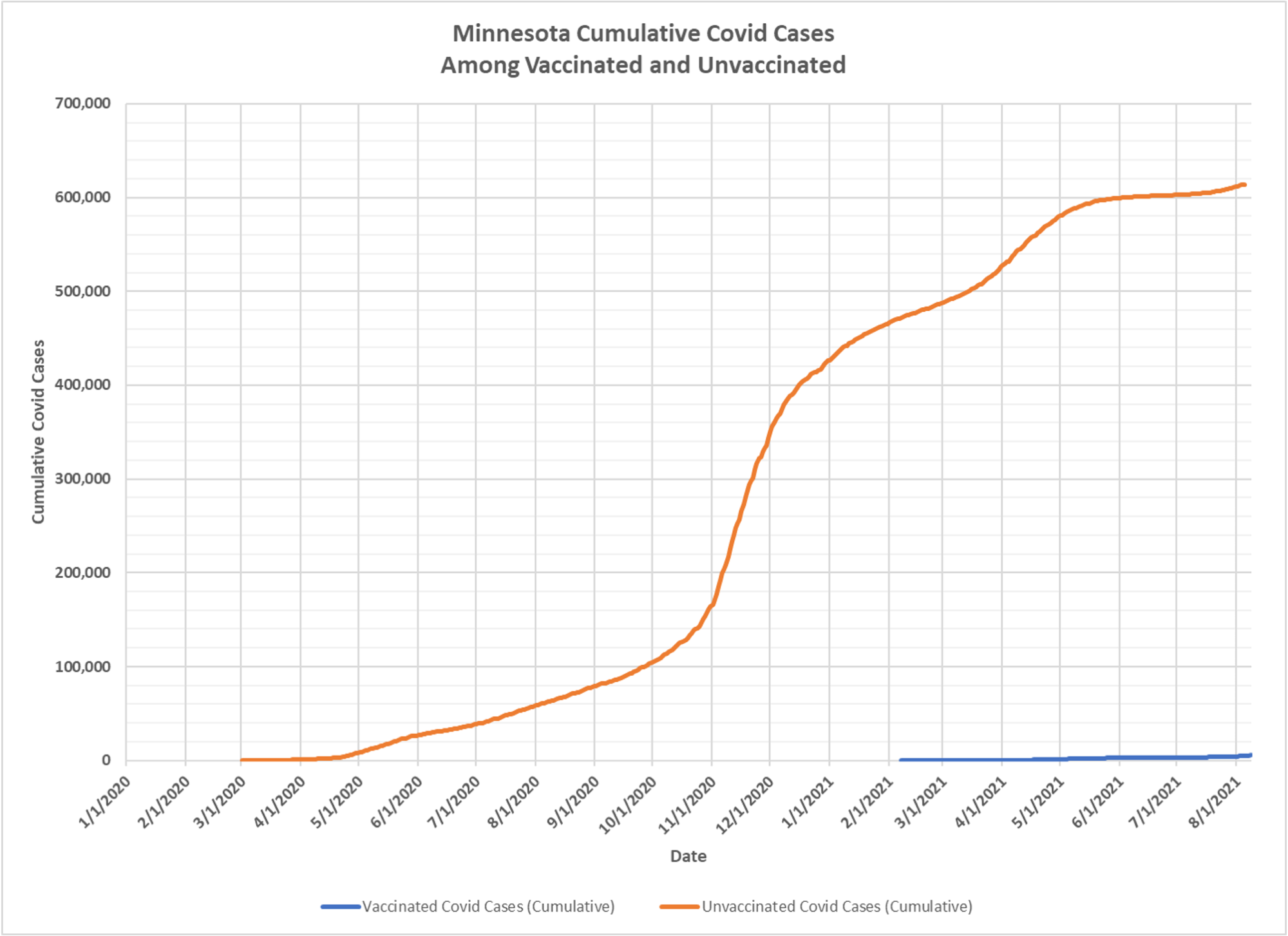
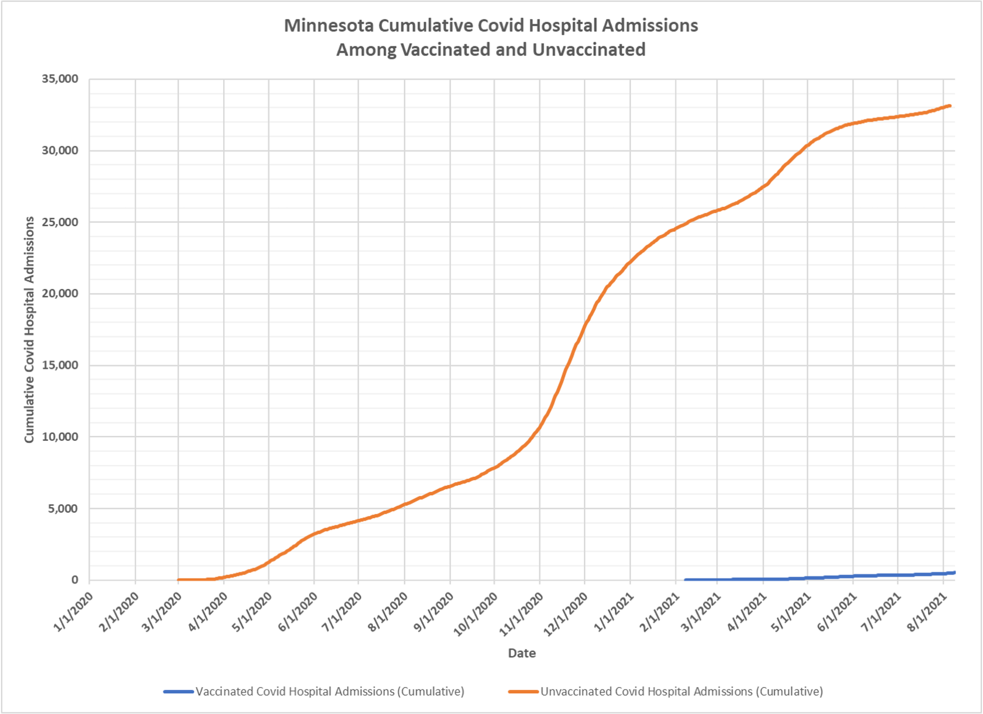
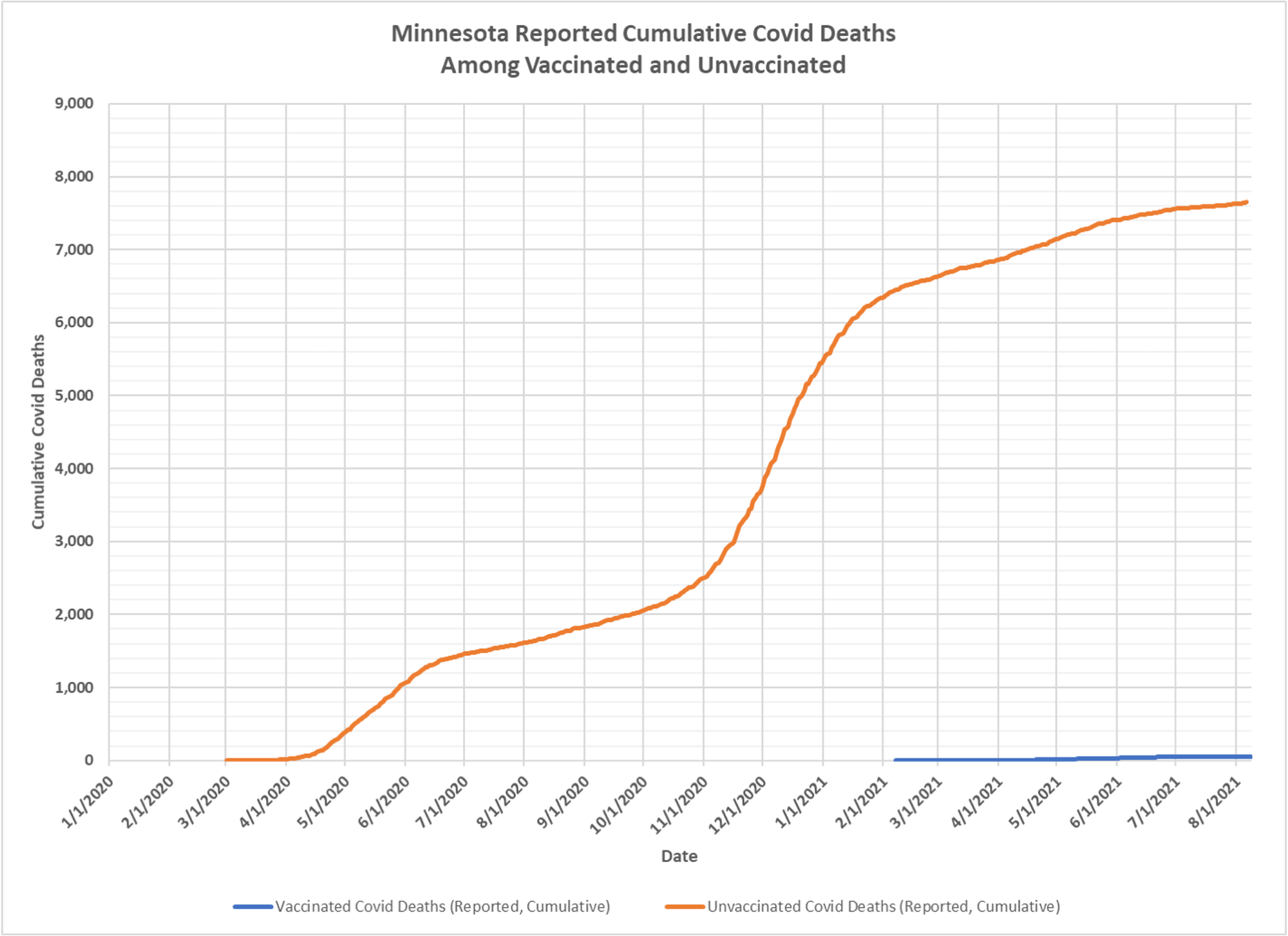
Dave Dixon’s latest chart showing what breakthrough infections look like in Minnesota. As you can see, the per capita rate of breakthrough infections obviously can only go up, but is at a low level. You have two moving pieces, both the number in the vaxed population and the number of breakthrough infections are increasing. At some point the vaxed will stabilize and the per capita rate will just move up, probably slowly. But you can also see that even in recent weeks, the great bulk of growth in total cases, hospitalizations and deaths in among the unvaxed population. That too will shift as the unvaxed group shrinks in size.
The state of Minnesota is saying it will routinely provide data on breakthrough infections going forward, so we will see what we get.


I assume these visualizations are the work of DD, and using what data the state provides, it’s great work. I am still bugged by other people’s misuse of terms. Covid is a disease, hence the D at the end. Cases are positive test for the presence of a virus (sar-cov-2 and numerous others). Totally different data points. Therefore, cases is NOT equal to disease, so calls for hospitalization is slightly better indicator. i say slightly because a hospitalization for a vehicle accident may be called a covid case, even postmortem, by those wishing to propagate the hysteria.
Also, if counting cases is their thing, people need to consider that a person with one positive test can be so taken up in the hysteria, they followup with more tests, soon after. My wife is a triage nurse and sees this exact thing. Even tho most insurance will not pay for tests taken within a time frame, these people find free tests all around their community. One can argue this would hardly move the needle, but i feel it should be called out in reporting.
Again i praise DD’s work, but we know, if the data is bad, a conclusion is of little value
“An unsophisticated forecaster uses statistics as a drunken man uses lamp-posts – for support rather than for illumination.” – Andrew Lang