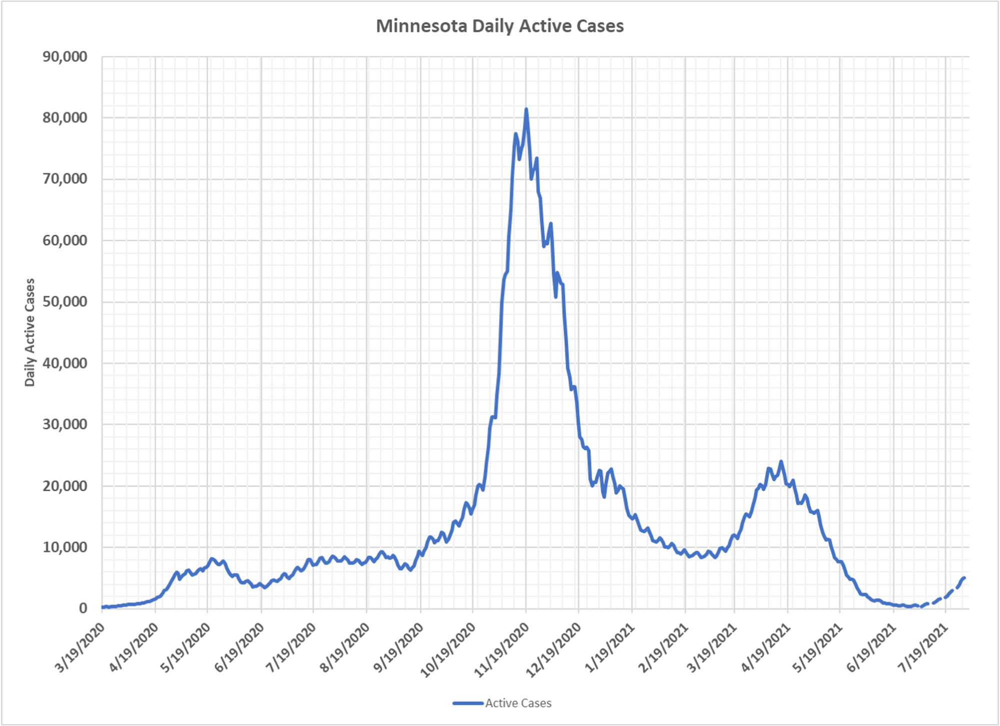
You can see the uptick in Minnesota, but from a very small level. When you look at this long-term chart, you see pretty classic epidemic curves, masking and all the other crap makes no difference. And you can actually see that last year we were beginning to see slightly higher case numbers around the same time. Testing is about the same in both periods. All these charts are courtesy Dave Dixon, who has recently unmasked, so to speak, himself as DD. Dave, as were several people before him, has been an enormous contributor by creating all these charts and making many great observations on the data.