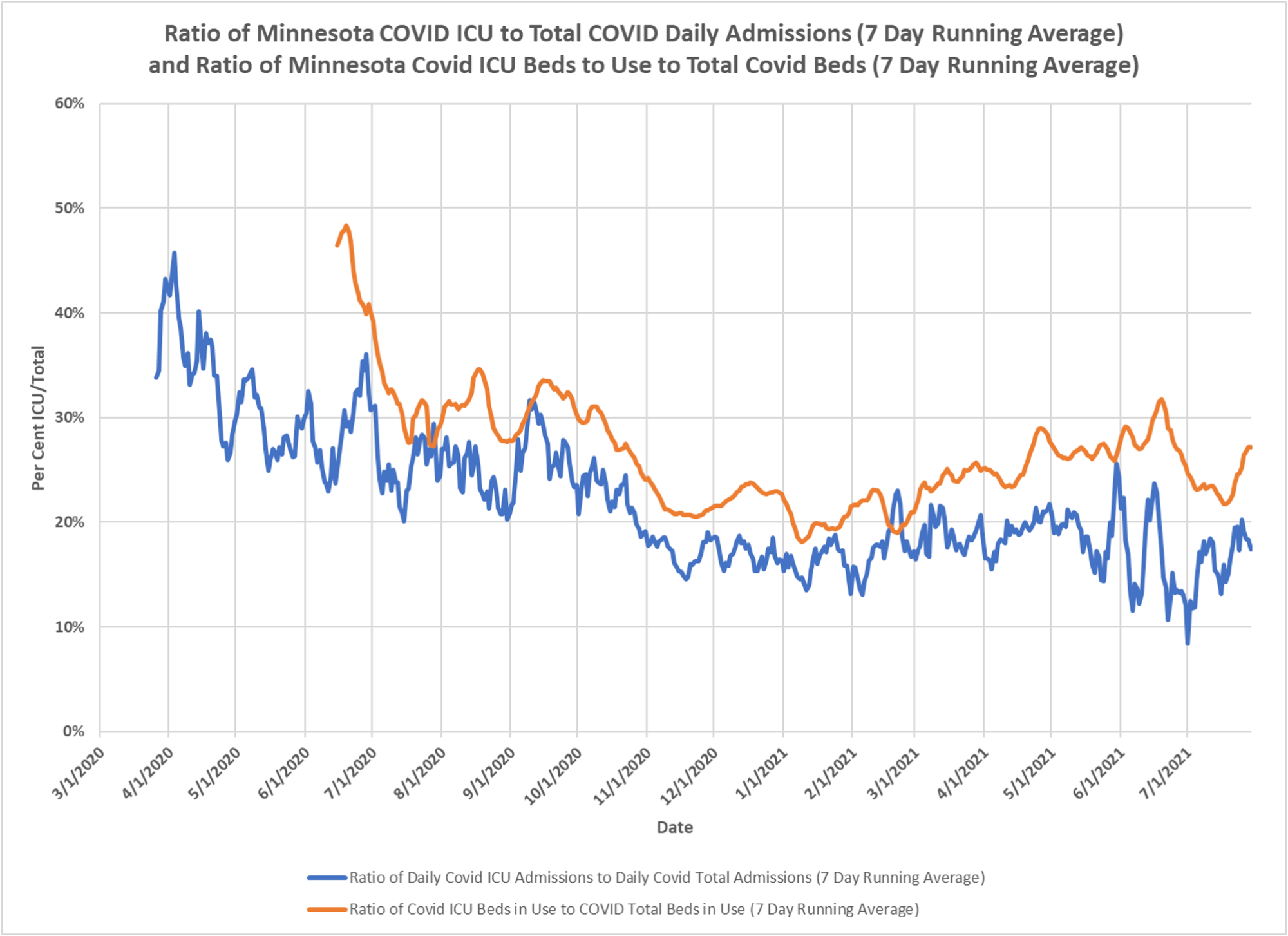
New chart from DD, let’s see if the ratio of ICU beds to non-ICU beds over time shows any particular trend. This might tell us something about the severity of cases. The ratio of ICU/non-ICU admissions (blue line) steadily declined from last fall, due to recognition that mechanical ventilation was bad and admissions for remdesivir, which doesn’t need an ICU bed. Pretty much plateaued for a long while, the wild swings recently are due to such low absolute numbers, but generally a flat trend, so not suggesting more serious cases due to Delta nor is it suggesting that case severity has dropped a lot. The ratio of beds in use per day in ICU compared to non-ICU (orange line) similarly fell in the fall, plateaued but then rose again, indicating likely longer lengths of stay in the ICU or shorter stays in regular beds, feel recently suggesting less days in the ICU and now seems to be bumping up again. Watching the relative divergence of the lines can tell you something about length of stay, unfortunately we don’t know what the combination is between longer or shorter lengths of stay in ICU versus regular beds. But guess what, as usual, the DOH does know and could tell us.

Thanks for the idea. I have started to keep a log of that data for my state.