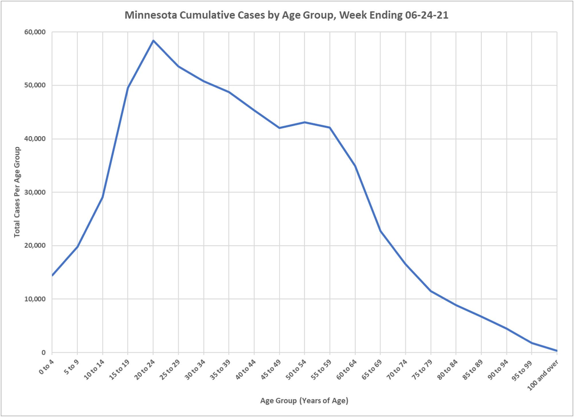
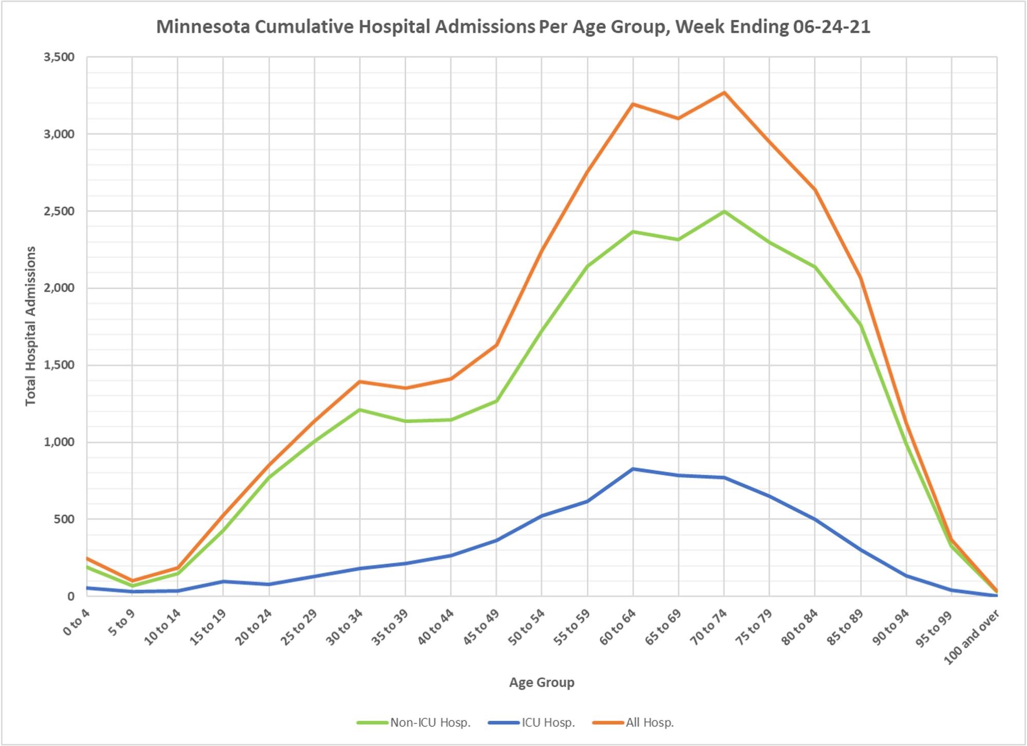
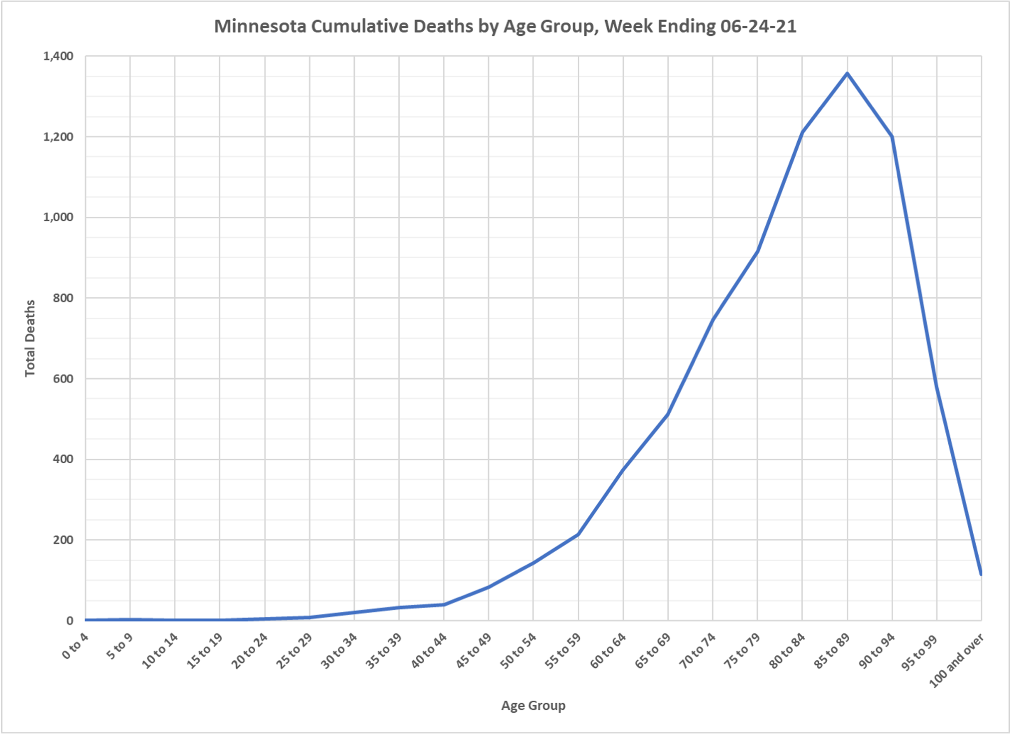
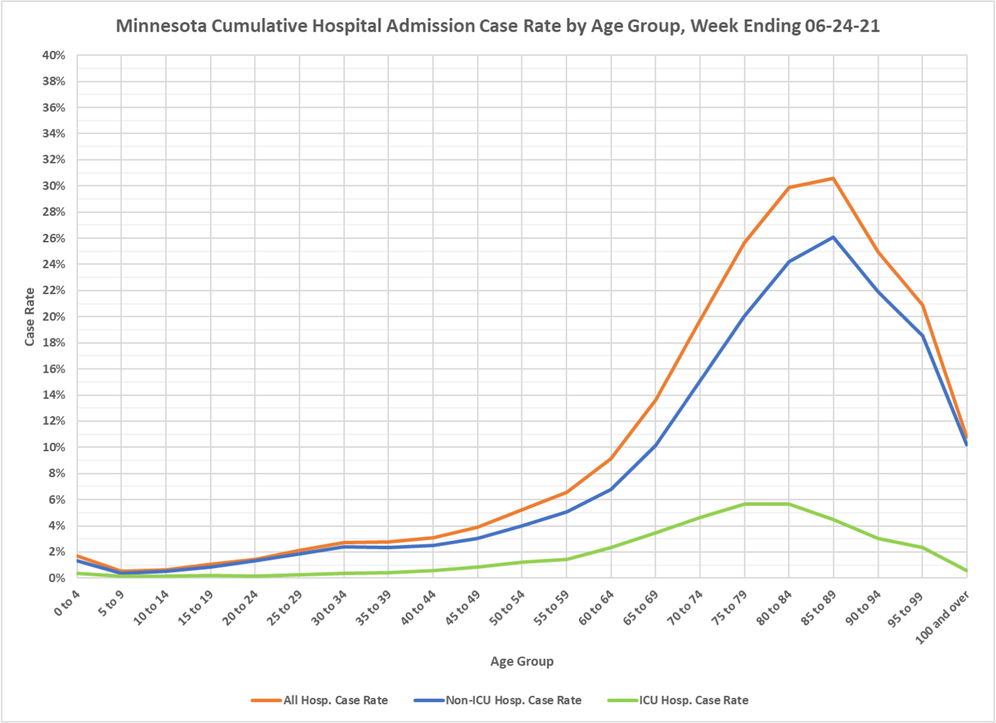
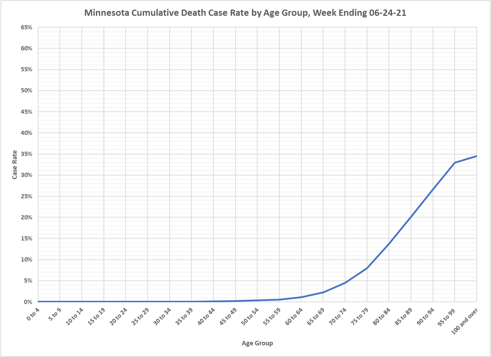
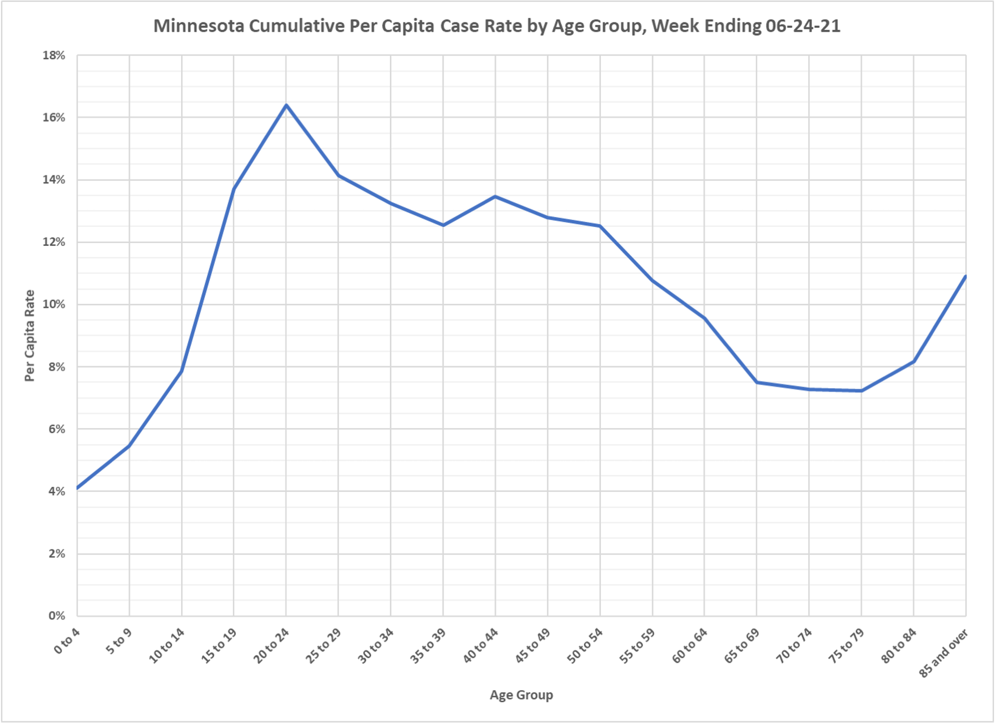
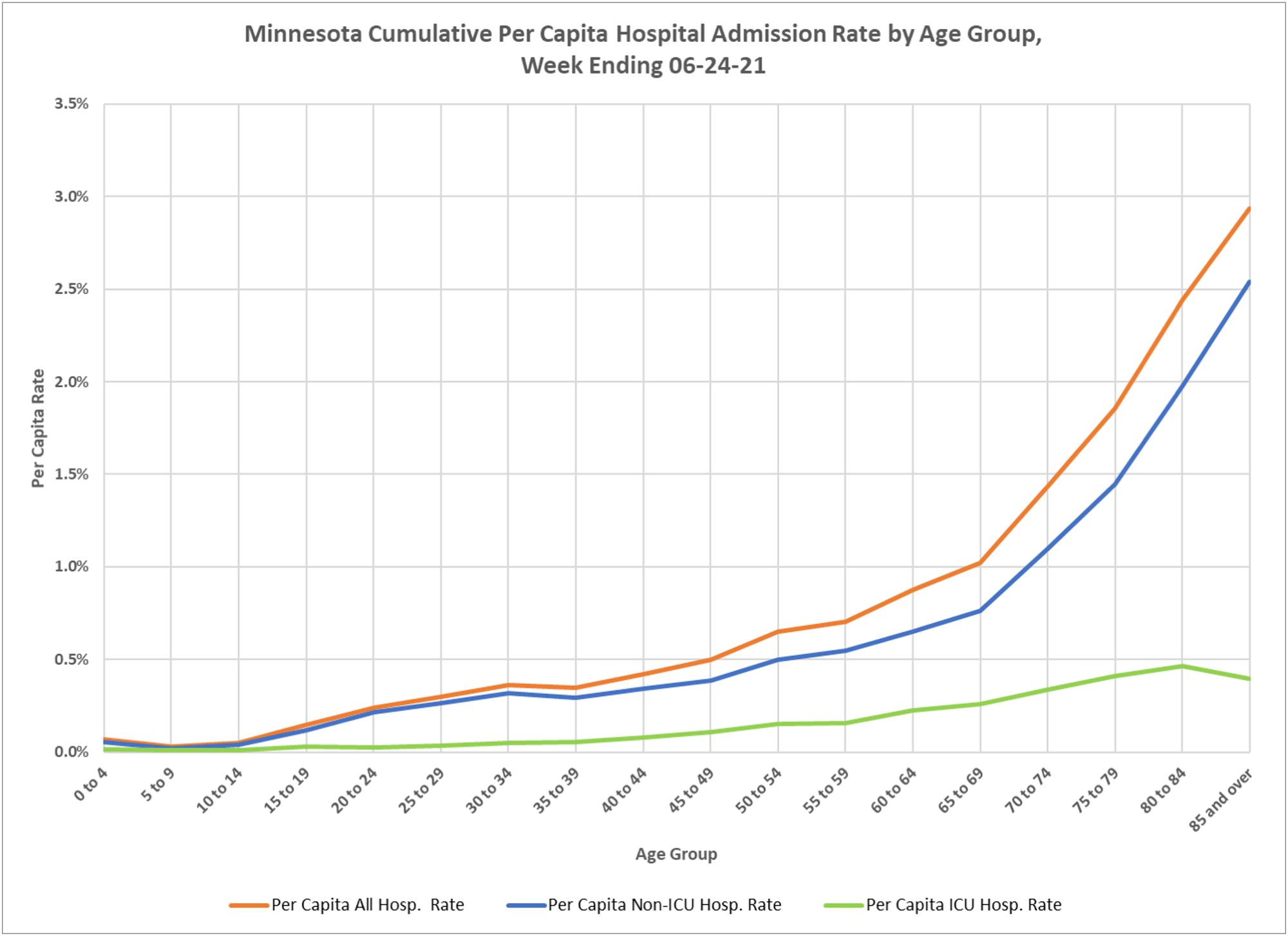
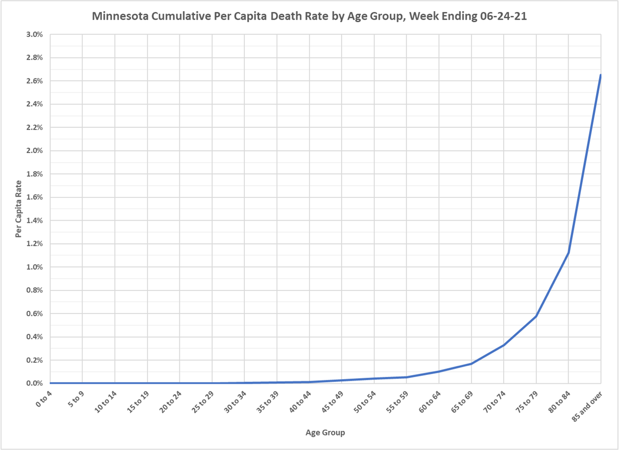
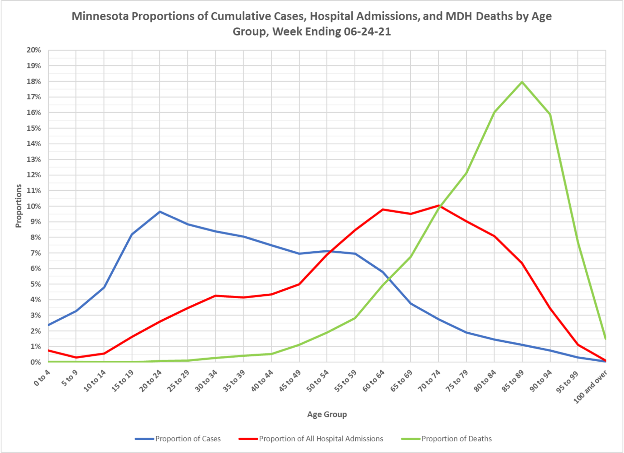
This set of charts shows the current cumulative set of statistics for the epidemic in Minnesota, so it doesn’t show changes over time, the animations that are put up from time-to-time do that, but it shows the overall picture since the beginning. Still very interesting to see how cases skew young, hospitalizations skew old, deaths skew very old. Case rates for hospitalizations and deaths rise with age, as does the per capita rate. This is a disease that has poor outcomes only for the elderly and younger persons with serious health problems. Thanks to DD for the usual sterling work.
✅ Subscribe via Email
About this Blog
Healthy Skeptic Podcast
Research
MedPAC 2019 Report to Congress
June 18, 2019
Headlines
Tags
Access
ACO
Care Management
Chronic Disease
Comparative Effectiveness
Consumer Directed Health
Consumers
Devices
Disease Management
Drugs
EHRs
Elder Care
End-of-Life Care
FDA
Financings
Genomics
Government
Health Care Costs
Health Care Quality
Health Care Reform
Health Insurance
Health Insurance Exchange
HIT
HomeCare
Hospital
Hospital Readmissions
Legislation
M&A
Malpractice
Meaningful Use
Medicaid
Medical Care
Medicare
Medicare Advantage
Mobile
Pay For Performance
Pharmaceutical
Physicians
Providers
Regulation
Repealing Reform
Telehealth
Telemedicine
Wellness and Prevention
Workplace
Related Posts
Commentary
Mixed Economic News
March 18, 2025
Mixed Economic News
Various economic reports and indicators reflect uncertainty.
Commentary
Debunking Climate Hysteria, March 17, 2025
March 17, 2025
Debunking Climate Hysteria, March 17, 2025
Offshore wind farms are a particularly stupid source of unreliable, expensive power.
Commentary
How Altruistic are Doctors?
March 16, 2025
How Altruistic are Doctors?
"Altruistic physicians are less likely than non-altruistic ones to take drug company money or respond…